-
Created by Anonymous, last modified on Dec 10, 2020
Tailwind CSS is a utility-based styling library. In order to streamline and standardize things like colors and spacing within our application, an Electron theme has been created to extend Tailwind's functionality, thus making it easy for us to access some standard Duke colors, fonts, etc. As a result, you will get most of the magic of Tailwind, but with most of the colors, text, and sizing options overwritten to reflect Duke's design aesthetic.
We won't talk too much about the decisions behind why we are using this implementation here, but Chris Greufe has already done an incredible job documenting the ins-and-outs of it . If you want to know more of the granular aspects and philosophy to our approach, you are encouraged to give it a read.
Instead, this doc will mostly focus on how the dev team actually uses this implementation and a bit about our approach, as well as a proposed style guide.
Philosophy and Approach
Tailwind CSS is our primary way of styling within the DXT-JSS-Public React/Nuxt App. A lot of effort and resources have been put into making Tailwind and Electron do as much of the heavy lifting for us as possible, so for maintainability's sake, every effort should be made to find a solution to style your work with Tailwind. If you're hitting a wall trying to figure out an approach that works within Tailwind, don't hesitate to reach out to a teammate. If you find yourself in the rare situation where you encounter something that simply cannot be resolved using Tailwind, we use as our fallback. If you find that you are creating a styled component often to deal with an edge case, it's probably worth documenting .
Tooling
There's not a lot of tooling required for Tailwind but the can be pretty helpful. Once installed, it gives suggestions for Tailwind classes as well as Electron-specific ones. It also shows a preview of the CSS rules that the utility class utilizes.
Enabling Tailwind Properties
Although Tailwind provides the flexibility to apply a wide range of modifiers to a variety of CSS rules, you may occasionally find that a Tailwind class is not behaving the way you expect in a responsive context, or upon hover. This may mean that you will need edit the Tailwind config. Please be careful to , rather than simply adding them to the variant object, which will overwrite all the defaults.
Key Differences
The main difference you'll find between Tailwind's approach and Electron's is that Duke doesn't need an extensive color library. As a result, you'll find that something like text-blue-800 or bg-yellow-200 does not behave as you'd expect. Most likely you will be looking for something like text-blue-dark or bg-yellow. So the color palette will be limited, and rather than a number to modify the color, there will either be no modifier, or a modifier of -light, -lighter, -dark, or -darker.
Style Guide
Because almost all of our styles exist within utility classes, there is often no need for traditional CSS classes to style a block. It's fairly unusual to need to add a class like wrapper or large BEM classes. Occasionally, you may need to add a class to make it easier for unit tests to search for a selector. In such a case, we suggest that you use a js- prefix, and that you place it at the beginning of your utility classes.
example:
|
1
|
<``divclass``=``"js-form text-blue-dark ..."``>
|
Often, the amount of classes you need to style a complex element can be rather long. In this case, it is suggested that you group your classes conceptually. Since Tailwind is a mobile-first framework, it makes sense to start with "base" styles that will be present across all sizes of the component. Of the base styles, start with sizing (height, width, padding, margin) and other fiddly rules so that they are easily accessible to you and anyone who may need to maintain your code in the future. Utility classes that represent rules that are easily identifiable at a glance, such as text color or background color, should come secondary.
- some random guy made a really handy cheatsheet for Tailwind CSS. Obviously, our rules won't be on it, but it's a nice quick reference for a lot of the classes.
- their official docs are better than most
Cheatsheet MD
Tailwind CSS Cheat Sheet
Excerpt
Cheat sheet that provides a quick, interactive reference for all utility classes and CSS properties provided by Tailwind CSS, a utility-first CSS framework.
As we near the end of our React journey (for now at least), we'll add the finishing touches to the main areas of functionality in our Todo list app. This includes allowing you to edit existing tasks, and filtering the list of tasks between all, completed, and incomplete tasks. We'll look at conditional UI rendering along the way.
We don't have a user interface for editing the name of a task yet. We'll get to that in a moment. To start with, we can at least implement an editTask() function in App.js. It'll be similar to deleteTask() because it'll take an id to find its target object, but it'll also take a newName property containing the name to update the task to. We'll use instead of because we want to return a new array with some changes, instead of deleting something from the array.
Add the editTask() function inside your App component, in the same place as the other functions:
Pass editTask into our <Todo /> components as a prop in the same way we did with deleteTask:
Now open Todo.js. We're going to do some refactoring.
In order to allow users to edit a task, we have to provide a user interface for them to do so. First, import useState into the Todo component like we did before with the App component, by updating the first import statement to this:
We'll now use this to set an isEditing state, the default state of which should be false. Add the following line just inside the top of your Todo(props) { … } component definition:
Next, we're going to rethink the <Todo /> component — from now on, we want it to display one of two possible "templates", rather than the single template it's used so far:
The "view" template, when we are just viewing a todo; this is what we've used in the tutorial thus far.
The "editing" template, when we are editing a todo. We're about to create this.
Copy this block of code into the Todo() function, beneath your useState() hook but above the return statement:
We've now got the two different template structures — "edit" and "view" — defined inside two separate constants. This means that the return statement of <Todo /> is now repetitious — it also contains a definition of the "view" template. We can clean this up by using conditional rendering to determine which template the component returns, and is therefore rendered in the UI.
In JSX, we can use a condition to change what is rendered by the browser. To write a condition in JSX, we can use a .
In the case of our <Todo /> component, our condition is "Is this task being edited?" Change the return statement inside Todo() so that it reads like so:
Your browser should render all your tasks just like before. To see the editing template, you will have to change the default isEditing state from false to true in your code for now; we will look at making the edit button toggle this in the next section!
At long last, we are ready to make our final core feature interactive. To start with, we want to call setEditing() with a value of true when a user presses the "Edit" button in our viewTemplate, so that we can switch templates.
Update the "Edit" button in the viewTemplate like so:
Now we'll add the same onClick handler to the "Cancel" button in the editingTemplate, but this time we'll set isEditing to false so that it switches us back to the view template.
Update the "Cancel" button in the editingTemplate like so:
With this code in place, you should be able to press the "Edit" and "Cancel" buttons in your todo items to toggle between templates.
The next step is to actually make the editing functionality work.
Much of what we're about to do will mirror the work we did in Form.js: as the user types in our new input field, we need to track the text they enter; once they submit the form, we need to use a callback prop to update our state with the new name of the task.
We'll start by making a new hook for storing and setting the new name. Still in Todo.js, put the following underneath the existing hook:
Next, create a handleChange() function that will set the new name; put this underneath the hooks but before the templates:
Now we'll update our editingTemplate's <input /> field, setting a value attribute of newName, and binding our handleChange() function to its onChange event. Update it as follows:
Finally, we need to create a function to handle the edit form's onSubmit event; add the following just below the previous function you added:
Remember that our editTask() callback prop needs the ID of the task we're editing as well as its new name.
Bind this function to the form's submit event by adding the following onSubmit handler to the editingTemplate's <form>:
You should now be able to edit a task in your browser!
Now that our main features are complete, we can think about our filter buttons. Currently, they repeat the "All" label, and they have no functionality! We will be reapplying some skills we used in our <Todo /> component to:
Create a hook for storing the active filter.
Render an array of <FilterButton /> elements that allow users to change the active filter between all, completed, and incomplete.
Add a new hook to your App() function that reads and sets a filter. We want the default filter to be All because all of our tasks should be shown initially:
Our goal right now is two-fold:
Each filter should have a unique name.
Each filter should have a unique behavior.
A JavaScript object would be a great way to relate names to behaviors: each key is the name of a filter; each property is the behavior associated with that name.
At the top of App.js, beneath our imports but above our App() function, let's add an object called FILTER_MAP:
The values of FILTER_MAP are functions that we will use to filter the tasks data array:
The All filter shows all tasks, so we return true for all tasks.
The Active filter shows tasks whose completed prop is false.
Beneath our previous addition, add the following — here we are using the method to collect an array of FILTER_NAMES:
Note: We are defining these constants outside our App() function because if they were defined inside it, they would be recalculated every time the <App /> component re-renders, and we don't want that. This information will never change no matter what our application does.
Now that we have the FILTER_NAMES array, we can use it to render all three of our filters. Inside the App() function we can create a constant called filterList, which we will use to map over our array of names and return a <FilterButton /> component. Remember, we need keys here, too.
Add the following underneath your taskList constant declaration:
Now we'll replace the three repeated <FilterButton />s in App.js with this filterList. Replace the following:
With this:
This won't work yet. We've got a bit more work to do first.
To make our filter buttons interactive, we should consider what props they need to utilize.
We know that the <FilterButton /> should report whether it is currently pressed, and it should be pressed if its name matches the current value of our filter state.
We know that the <FilterButton /> needs a callback to set the active filter. We can make direct use of our setFilter hook.
Update your filterList constant as follows:
In the same way as we did earlier with our <Todo /> component, we now have to update FilterButton.js to utilize the props we have given it. Do each of the following, and remember to use curly braces to read these variables!
Replace all with {props.name}.
Set the value of aria-pressed to {props.isPressed}.
With all of that done, your FilterButton() function should read like this:
Visit your browser again. You should see that the different buttons have been given their respective names. When you press a filter button, you should see its text take on a new outline — this tells you it has been selected. And if you look at your DevTool's Page Inspector while clicking the buttons, you'll see the aria-pressed attribute values change accordingly.
However, our buttons still don't actually filter the todos in the UI! Let's finish this off.
Right now, our taskList constant in App() maps over the tasks state and returns a new <Todo /> component for all of them. This is not what we want! A task should only render if it is included in the results of applying the selected filter. Before we map over the tasks state, we should filter it (with ) to eliminate objects we don't want to render.
Update your taskList like so:
In order to decide which callback function to use in Array.prototype.filter(), we access the value in FILTER_MAP that corresponds to the key of our filter state. When filter is All, for example, FILTER_MAP[filter] will evaluate to () => true.
Choosing a filter in your browser will now remove the tasks that do not meet its criteria. The count in the heading above the list will also change to reflect the list!
So that's it — our app is now functionally complete. However, now that we've implemented all of our features, we can make a few improvements to ensure that a wider range of users can use our app. Our next article rounds things off for our React tutorials by looking at including focus management in React, which can improve usability and reduce confusion for both keyboard-only and screenreader users.
Although this tutorial doesn't use this approach, many React applications define their styles on a per-component basis, rather than in a single, monolithic stylesheet.
create-react-app makes it possible to import CSS files into JavaScript modules, so that CSS is only sent to your user when the corresponding component is rendered. For this app, we could have for example written a dedicated Form.css file to house the styles of those respective components, then imported the styles into their respective modules like this:
This approach makes it easy to identify and manage the CSS that belongs to a specific component. However, it also fragments your stylesheet across your codebase, and this fragmentation might not be worthwhile. For larger applications with hundreds of unique views and lots of moving parts, it makes sense to limit the amount of irrelevant code that's sent to your user. You'll likely have app-wide styles and specific component styles that built on top of those.
You can .
We used console.log() to check on the state and props of our application in this tutorial, and you'll also have seen some of the useful warnings and error message that react gives you both in the CLI and your browser's JavaScript console. But there's more we can do here.
The React DevTools utility allows you to inspect the internals of your React application directly in the browser. It adds a new panel to your browser's developer tools, and with it you can inspect the state and props of various components, and even edit state and props to make immediate changes to your application.
This screenshot shows our finished application as it appears in React DevTools:
On the left, we see all of the components that make up our application, including some unique keys for the things that are rendered from arrays. On the right, we see the props and hooks that our App component utilizes. Notice, too, that the Form, FilterButton, and Todo components are indented to the right – this indicates that App is their parent. In more complex apps, this view is great for understanding parent/child relationships at a glance.
React DevTools is available in a number of forms:
A .
A .
A Chromium Edge browser extension (available soon).
Try installing one of these, then using it to inspect the app you've just built!
You can .
The application that we built in this tutorial utilized component props to pass data from its App component to the child components that needed it. Most of the time, props are an appropriate method for sharing data; for complex, deeply nested applications, however, they're not always best.
React provides the as a way to provide data to components that need it without passing props down the component tree. There's also that facilitates this.
If you'd like to try this API for yourself, Smashing Magazine has written an .
Although this tutorial doesn't mention them, it is possible to build React components using ES6 classes – these are called class components. Until the arrival of hooks, ES6 classes were the only way to bring state into components or manage rendering side effects. They're still the only way to handle certain other, more edge-case features, and they're very common in legacy React projects. The official React docs are a great place to start learning about them.
create-react-app provides some tools for testing your application out of the box — you may have deleted the relevant files earlier in the tutorial. The documentation for create-react-app .
While routing is traditionally handled by a server and not an application on the user's computer, it is possible to configure a web application to read and update the browser's location, and render certain user interfaces. This is called client-side routing. It's possible to create many unique routes for your application (such as /home, /dashboard, or login/).
The React community has produced two major libraries for client-side routing: and .
React Router is well-suited to applications with complex routing needs, and it meets some edge cases better than Reach Router. React Router is a larger library, however.
Reach Router is well-suited to simpler applications, and automatically manages focus as the user navigates from page to page.
Focus management is essential in client-side routing — without it, keyboard users can be trapped in focus limbo, and screen-reader users may have no idea that they have moved to a new page. Because Reach Router is better for accessibility, it's a good place to start.
There's one caveat, however: these projects will be . When this merge happens, React Router will be the surviving project (with the addition of the focus management features of Reach).
Animation Add-Ons
Note:
ReactTransitionGroup and ReactCSSTransitionGroup have been moved to the package that is maintained by the community. Its 1.x branch is completely API-compatible with the existing addons. Please file bugs and feature requests in the .
The add-on component is a low-level API for animation, and is an add-on component for easily implementing basic CSS animations and transitions.
Scrum Board
DNT Kanban Board
Quick Filters:
… Show more
You have been disconnected from the estimation session. Reconnecting in 0 seconds. Try now.
Please wait for a moderator to start.
Participants
Connie W.
BA
919-815-0512
Luis R.
Test
JC Davila
Test
(521)811-244-9569
Gisella T.
Test
Juan A.
Test
Smita K.
Test
414-581-6564
Shashi V.
Sitecore
612-807-0325
Franciso R.
Sitecore
(54 1)113-578-5282
Villareal, Gibran
FED
(52 1)811-993-9079
Bob Z.
CI
954-816-6673
954-234-2759
Cam A.
CI
828-514-1158
Jill P.
CI
Guardians of the Galaxy
Michelle R.
PO
980-329-1902
Jayne H.
SM
704-576-1167
Lesley J.
SM
980-221-4948
Alba C.
Test
Julio C.
Test
Paul C.
CI
919-423-3335
Trixie S.
CI
Juan A.
Sitecore
Federico R.
Sitecore
Watchmen
Crystal H.
PO
704-564-5644
Christa B.
SM
704-860-9109
Chaz H.
BA
704-941-7170
Paulo S.
Test
(52 1)818-257-5466
Dilorom T.
Test
443-636-0765
Alejandra V.
Test
(52 1) 811-411-7872
Guillermo D.
Sitecore
(54 9)116-324-5902
Nico
Sitecore
(54 9)113-418-1709
Mike W.
FED
704-726-3405
Bill S.
FED
Jay P.
CI
336-405-9706
Sumedha A.
CI
936-204-1771
Avengers
Melissa P.
PO
704-807-8907
Toni D.
SM
Sagar S.
CI
937-536-4282
Sergio M.
Sitecore
(54 9) 221-505-4818
Lesslie G.
Test
Franciso R.
Test
(52 1)844-442-7835
X-Men
Josh H.
PO
864-219-1489
Liz W.
SM
704-918-5499
704-807-4533
Sarala P.
Test
704-550-8807
Pam K.
Test
919-369-3287
Kayal V.
Test
614-316-0702
Louise C.
FED
704-999-9426
Dilip J.
Sitecore
203-550-4242
Damage Control
Jonathan P.
PO
Scot H.
Build
Satish C.
Build
Alex K.
Build
Femi D.
Build
Stacey K.
SM
Amy B.
Architect
919-819-4471
919-819-4471
Inhumans (CI Team)
Sagar S.
937-536-4282
Bob Z.
954-816-6673
Paul C.
919-423-3335
Anshul R.
704-794-3909
Sanjay R
704-451-7702
Joy V.
704-906-5665
Viswa J.
704-606-3223
Others Members & Support
Karina G.
Test Lead
Sparks, Carlton
Test Manager
704-219-5146
Vaibhav S.
Prod Support
980-474-0974
Nikhil D.
Prod Support
909-553-2052
Adi G.
CI Deployment
704-408-0500
Terry A.
CI Deployment
704-517-8689
Femi D.
CI Deployment
512-920-7275
Courtney I.
Content Team
(Login Boxes)
Jamie Martinez
Customer Connect
Dan Wright
Customer Connect
Kojo Fletcher
Customer Connect
217-220-8055
Taryn Y.
DEC Tester
Angie Doerman
DEMW Tester
Connie W.
DEP Tester
Linda J.
DEF Test
727-580-1637
Amy P.
Legacy Test Liaison
704-490-0523
John H.
DBA
732-500-5522
Cynthia J.
RTE
704-340-0444
Heather M.
Program Manager
704-650-0166
Vaibhav S.
(Retail Supp)
Prod Support
980-474-0974
Breakpoints (screen sizes) that wrap utility classes.
Sets rendering of an element's fragments when broken across multiple lines, columns, or pages.
Sets max-width to match min-width of the current breakpoint.
Sets how the total width and height of an element is calculated.
Sets the display box type of an element.
Sets an element's placement to a side of its container and allows content to wrap around it.
Sets whether an element is moved below preceding floated elements.
Sets whether an element creates a stacking context.
Sets how the content of a replaced element (img or video tag) should be resized.
Sets the alignment of the selected replaced element.
Sets how to handle content that's too big for its container.
Sets browser behavior upon reaching the boundary of a scrolling area.
Sets an element's position.
Sets the placement of a positioned element.
Show or hide without affecting the layout of the document.
Sets the z-order ("stack order") of a positioned element.
Spacing
Controls padding in 0.25rem increments.
Controls margin (and negative margin) in 0.25rem increments.
Sets left or top (x or y) margin between child elements, but skips the first element.
Backgrounds
Sets behavior of background images when scrolling.
Sets where a background extends.
Sets background opacity when used with bg-[color].
Sets the background origin position.
Sets position of a background image.
Sets repetition of a background image.
Sets background size of a background image.
Sets the background color gradients and where to stop.
Tables
Collapse or separate table borders.
Defines the algorithm used to lay out table cells, rows, and columns.
Transforms
Scales an element that has transform applied.
Rotates an element that has transform applied.
Translates an element that has transform applied.
Skews an element that has transform applied.
Sets the origin of an element's transforms. Think of the origin as pushing a thumbtack into the element at the specified position.
Sets the transform of an element.
Effects
Sets the shadow around an element.
Sets the transparency of an element.
Sets how an element blends with the background.
Sets how an element's background images blend with its background color.
Flexbox
Sets element to be a flex container.
Sets direction of flex items.
Creates how flex items wrap.
Controls how flex items grow and shrink.
Controls how flex items grow.
Controls how flex items shrink.
Controls how flex items are ordered.
Sizing
Sets the width of an element.
Sets the minimum width of an element.
Sets the maxiumum width of an element.
Sets the height of an element.
Sets the minimum height of an element.
Sets the maxiumum height of an element.
Borders
Sets border width in increments of 1px.
Sets border opacity when used with border-[color].
Sets left or top (x or y) border width between child elements, but skips the first element.
Sets border color between child elements when using divide width.
Sets border opacity between elements when used with divide-[color].
Sets border style between elements when using divide width.
Sets the width of outline rings using box shadows.
Sets the color of the outline ring.
Sets the opacity of the outline ring.
Sets an offset for outline rings.
Sets the color of the outline ring offset.
Transitions and Animation
Sets the CSS properties affected by transition animations.
Sets the length of time for a transition animations to complete.
transition-timing-function
Sets the easing function of transition animations.
Sets the delay for transitions.
Interactivity
Disables native styling based on the operating system's theme.
Changes the cursor when hovering over an element.
Sets the outline of the element.
Specifies whether an element is the target of mouse events.
Sets whether an element is resizable, along with direction.
Controls whether the user can select text.
Controls whether an element is visually hidden but still accessible to screen readers.
SVG
Sets the color to paint an SVG.
Sets the outline color of an SVG.
Sets the outline width of an SVG.
Grid
Defines columns for grid layout.
Sets a grid item size and location within the grid column.
Defines rows for grid layout.
Sets a grid item size and location within the grid row.
Controls the auto placement of grid elements.
Controls the size of auto-generated (implicit) grid columns.
Controls the size of auto-generated (implicit) grid rows.
Sets the gaps (gutters) between rows and columns.
Box Alignment
Controls how flex items are positioned along container's main axis.
.justify-start
justify-content: flex-start;
.justify-end
justify-content: flex-end;
.justify-center
Controls default alignment for items on the inline axis for grids.
Controls element alignment on the inline axis for a grid item.
Controls how lines are positioned in multi-line flex containers.
.content-start
align-content: flex-start;
Sets flex items position along a contrainer's cross axis.
Controls how an individual flex item is positioned along container's cross axis.
Controls alignment in both directions at once for grid or flexbox.
.place-content-center
place-content: center;
Controls alignment of items in both directions at once for grid or flexbox.
Controls alignment of individual element in both directions at once for grid or flexbox.
ReactCSSTransitionGroup is a high-level API based on ReactTransitionGroup and is an easy way to perform CSS transitions and animations when a React component enters or leaves the DOM. It's inspired by the excellent ng-animate library.
Importing
Note:
You must provide the key attribute for all children of ReactCSSTransitionGroup, even when only rendering a single item. This is how React will determine which children have entered, left, or stayed.
In this component, when a new item is added to ReactCSSTransitionGroup it will get the example-enter CSS class and the example-enter-active CSS class added in the next tick. This is a convention based on the transitionName prop.
You can use these classes to trigger a CSS animation or transition. For example, try adding this CSS and adding a new list item:
You'll notice that animation durations need to be specified in both the CSS and the render method; this tells React when to remove the animation classes from the element and -- if it's leaving -- when to remove the element from the DOM.
Animate Initial Mounting
ReactCSSTransitionGroup provides the optional prop transitionAppear, to add an extra transition phase at the initial mount of the component. There is generally no transition phase at the initial mount as the default value of transitionAppear is false. The following is an example which passes the prop transitionAppear with the value true.
During the initial mount ReactCSSTransitionGroup will get the example-appear CSS class and the example-appear-active CSS class added in the next tick.
At the initial mount, all children of the ReactCSSTransitionGroup will appear but not enter. However, all children later added to an existing ReactCSSTransitionGroup will enter but not appear.
Note:
The prop transitionAppear was added to ReactCSSTransitionGroup in version 0.13. To maintain backwards compatibility, the default value is set to false.
However, the default values of transitionEnter and transitionLeave are true so you must specify transitionEnterTimeout and transitionLeaveTimeout by default. If you don't need either enter or leave animations, pass transitionEnter={false} or transitionLeave={false}.
Custom Classes
It is also possible to use custom class names for each of the steps in your transitions. Instead of passing a string into transitionName you can pass an object containing either the enter and leave class names, or an object containing the enter, enter-active, leave-active, and leave class names. If only the enter and leave classes are provided, the enter-active and leave-active classes will be determined by appending '-active' to the end of the class name. Here are two examples using custom classes:
Animation Group Must Be Mounted To Work
In order for it to apply transitions to its children, the ReactCSSTransitionGroup must already be mounted in the DOM or the prop transitionAppear must be set to true.
The example below would not work, because the ReactCSSTransitionGroup is being mounted along with the new item, instead of the new item being mounted within it. Compare this to the Getting Started section above to see the difference.
Animating One or Zero Items
In the example above, we rendered a list of items into ReactCSSTransitionGroup. However, the children of ReactCSSTransitionGroup can also be one or zero items. This makes it possible to animate a single element entering or leaving. Similarly, you can animate a new element replacing the current element. For example, we can implement a simple image carousel like this:
Disabling Animations
You can disable animating enter or leave animations if you want. For example, sometimes you may want an enter animation and no leave animation, but ReactCSSTransitionGroup waits for an animation to complete before removing your DOM node. You can add transitionEnter={false} or transitionLeave={false} props to ReactCSSTransitionGroup to disable these animations.
Note:
When using ReactCSSTransitionGroup, there's no way for your components to be notified when a transition has ended or to perform any more complex logic around animation. If you want more fine-grained control, you can use the lower-level ReactTransitionGroup API which provides the hooks you need to do custom transitions.
Low-level API: ReactTransitionGroup
Importing
ReactTransitionGroup is the basis for animations. When children are declaratively added or removed from it (as in the example above), special lifecycle methods are called on them.
ReactTransitionGroup renders as a span by default. You can change this behavior by providing a component prop. For example, here's how you would render a <ul>:
Any additional, user-defined, properties will become properties of the rendered component. For example, here's how you would render a <ul> with CSS class:
Every DOM component that React can render is available for use. However, component does not need to be a DOM component. It can be any React component you want; even ones you've written yourself! Just write component={List} and your component will receive this.props.children.
Rendering a Single Child
People often use ReactTransitionGroup to animate mounting and unmounting of a single child such as a collapsible panel. Normally ReactTransitionGroup wraps all its children in a span (or a custom component as described above). This is because any React component has to return a single root element, and ReactTransitionGroup is no exception to this rule.
However if you only need to render a single child inside ReactTransitionGroup, you can completely avoid wrapping it in a <span> or any other DOM component. To do this, create a custom component that renders the first child passed to it directly:
Now you can specify FirstChild as the component prop in <ReactTransitionGroup> props and avoid any wrappers in the result DOM:
This only works when you are animating a single child in and out, such as a collapsible panel. This approach wouldn't work when animating multiple children or replacing the single child with another child, such as an image carousel. For an image carousel, while the current image is animating out, another image will animate in, so <ReactTransitionGroup> needs to give them a common DOM parent. You can't avoid the wrapper for multiple children, but you can customize the wrapper with the component prop as described above.
Reference
componentWillAppear()
This is called at the same time as componentDidMount() for components that are initially mounted in a TransitionGroup. It will block other animations from occurring until callback is called. It is only called on the initial render of a TransitionGroup.
componentDidAppear()
This is called after the callback function that was passed to componentWillAppear is called.
componentWillEnter()
This is called at the same time as componentDidMount() for components added to an existing TransitionGroup. It will block other animations from occurring until callback is called. It will not be called on the initial render of a TransitionGroup.
componentDidEnter()
This is called after the callback function that was passed to componentWillEnter() is called.
componentWillLeave()
This is called when the child has been removed from the ReactTransitionGroup. Though the child has been removed, ReactTransitionGroup will keep it in the DOM until callback is called.
componentDidLeave()
This is called when the willLeavecallback is called (at the same time as componentWillUnmount()).
React.addons entry point is deprecated as of React v15.5. The add-ons have moved to separate modules, and some of them have been deprecated.
The React add-ons are a collection of useful utility modules for building React apps. These should be considered experimental and tend to change more often than the core.
createFragment, to create a set of externally-keyed children.
The add-ons below are in the development (unminified) version of React only:
Perf, a performance profiling tool for finding optimization opportunities.
ReactTestUtils, simple helpers for writing test cases.
Legacy Add-ons
The add-ons below are considered legacy and their use is discouraged. They will keep working in observable future, but there is no further development.
PureRenderMixin. Use React.PureComponent instead.
shallowCompare, a helper function that performs a shallow comparison for props and state in a component to decide if a component should update. We recommend using React.PureComponent instead.
Deprecated Add-ons
LinkedStateMixin has been deprecated.
TransitionGroup and CSSTransitionGroup have been deprecated in favor of .
Using React with Add-ons
You can install the add-ons individually from npm (e.g. npm install react-addons-create-fragment) and import them:
When using React 15 or earlier from a CDN, you can use react-with-addons.js instead of react.js:
The add-ons will be available via the React.addons global (e.g. React.addons.TestUtils).
The versions above are only meant for development, and are not suitable for production. Minified and optimized production versions of React are available at:
To load a specific version of react and react-dom, replace 17 with the version number.
Why the crossorigin Attribute?
If you serve React from a CDN, we recommend to keep the attribute set:
We also recommend to verify that the CDN you are using sets the Access-Control-Allow-Origin: * HTTP header:
This enables a better error handling experience in React 16 and later.
Events and state
With our component plan worked out, it's now time to start updating our app from a completely static UI to one that actually allows us to interact and change things. In this article we'll do this, digging into events and state along the way, and ending up with an app in which we can successfully add and delete tasks, and toggle tasks as completed.
If you've only written vanilla JavaScript before now, you might be used to having a separate JavaScript file, where you query for some DOM nodes and attach listeners to them. For example:
In React, we write event handlers directly on the elements in our JSX, like this:
Note: This may seem counter-intuitive regarding best-practice advice that tends to advise against use of inline event handlers on HTML, but remember that JSX is actually part of your JavaScript.
In the above example, we're adding an onClick attribute to the <button> element. The value of that attribute is a function that triggers a simple alert.
The onClick attribute has special meaning here: it tells React to run a given function when the user clicks on the button. There are a couple of other things to note:
The camel-cased nature of onClick is important — JSX will not recognize onclick (again, it is already used in JavaScript for a specific purpose, which is related but different — standard handler properties).
All browser events follow this format in JSX – on, followed by the name of the event.
Let's apply this to our app, starting in the Form.js component.
At the top of the Form() component function, create a function named handleSubmit(). This function should . After that, it should trigger an alert(), which can say whatever you'd like. It should end up looking something like this:
To use this function, add an onSubmit attribute to the element, and set its value to the handleSubmit function:
Now if you head back to your browser and click on the "Add" button, your browser will show you an alert dialog with the words "Hello, world!" — or whatever you chose to write there.
In React applications, interactivity is rarely confined to just one component: events that happen in one component will affect other parts of the app. When we start giving ourselves the power to make new tasks, things that happen in the <Form /> component will affect the list rendered in <App />.
We want our handleSubmit() function to ultimately help us create a new task, so we need a way to pass information from <Form /> to <App />. We can't pass data from child to parent in the same way as we pass data from parent to child using standard props. Instead, we can write a function in <App /> that will expect some data from our form as an input, then pass that function to <Form /> as a prop. This function-as-a-prop is called a callback prop. Once we have our callback prop, we can call it inside <Form /> to send the right data to <App />.
Inside the top of our App() component function, create a function named addTask() which has a single parameter of name:
Next, we'll pass addTask() into <Form /> as a prop. The prop can have whatever name you want, but pick a name you'll understand later. Something like addTask works, because it matches the name of the function as well as what the function will do. Your <Form /> component call should be updated as follows:
Finally, you can use this prop inside the handleSubmit() function in your <Form /> component! Update it as follows:
Clicking on the "Add" button in your browser will prove that the addTask() callback function works, but it'd be nice if we could get the alert to show us what we're typing in our input field! This is what we'll do next.
Note: We decided to name our callback prop addTask to make it easy to understand what the prop will do. Another common convention you may well come across in React code is to prefix callback prop names with the word on, followed by the name of the event that will cause them to be run. For instance, we could have given our form a prop of onSubmit with the value of addTask.
So far, we've used props to pass data through our components and this has served us just fine. Now that we're dealing with user input and data updates, however, we need something more.
For one thing, props come from the parent of a component. Our <Form /> will not be inheriting a new name for our task; our <input /> element lives directly inside of <Form />, so <Form/> will be directly responsible for creating that new name. We can't ask <Form /> to spontaneously create its own props, but we can ask it to track some of its own data for us. Data such as this, which a component itself owns, is called state. State is another powerful tool for React because components not only own state, but can update it later. It's not possible to update the props a component receives; only to read them.
React provides a variety of special functions that allow us to provide new capabilities to components, like state. These functions are called hooks, and the useState hook, as its name implies, is precisely the one we need in order to give our component some state.
To use a React hook, we need to import it from the react module. In Form.js, change your very first line so that it reads like this:
This allows us to import the useState() function by itself, and utilize it anywhere in this file.
useState() creates a piece of state for a component, and its only parameter determines the initial value of that state. It returns two things: the state, and a function that can be used to update the state later.
This is a lot to take in at once, so let's try it out. We're going to make ourselves a name state, and a function for updating the name state.
Write the following above your handleSubmit() function, inside Form():
What's going on in this line of code?
We are setting the initial name value as "Use hooks!".
We are defining a function whose job is to modify name, called setName().
You can see the name state in action right away. Add a value attribute to the form's input, and set its value to name. Your browser will render "Use hooks!" inside the input.
Change "Use hooks!" to an empty string once you're done; this is what we want for our initial state.
Before we can change the value of name, we need to capture a user's input as they type. For this, we can listen to the onChange event. Let's write a handleChange() function, and listen for it on the <input /> tag.
Currently, your input's value will not change as you type, but your browser will log the word "Typing!" to the JavaScript console, so we know our event listener is attached to the input. In order to change the input's value, we have to use our handleChange() function to update our name state.
To read the contents of the input field as they change, you can access the input's value property. We can do this inside handleChange() by reading e.target.value. e.target represents the element that fired the change event — that's our input. So, value is the text inside it.
You can console.log() this value to see it in your browser's console.
Logging isn't enough — we want to actually store the updated state of the name as the input value changes! Change the console.log() to setName(), as shown below:
Now we need to change our handleSubmit() function so that it calls props.addTask with name as an argument — remember our callback prop? This will serve to send the task back to the App component, so we can add it to our list of tasks at some later date. As a matter of good practice, you should clear the input after your form submits, so we'll call setName() again with an empty string to do so:
At last, you can type something into the input field in your browser and click Add — whatever you typed will appear in an alert dialog.
Your Form.js file should now read like this:
Note: One thing you'll notice is that you are able to submit empty tasks by just pressing the Add button without entering a task name. Can you think of a way to disallow empty tasks from being added? As a hint, you probably need to add some kind of check into the handleSubmit() function.
Now that we've practiced with events, callback props, and hooks we're ready to write functionality that will allow a user to add a new task from their browser.
Import useState into App.js, so that we can store our tasks in state — update your React import line to the following:
We want to pass props.tasks into the useState() hook – this will preserve its initial state. Add the following right at the top of your App() function definition:
Now, we can change our taskList mapping so that it is the result of mapping tasks, instead of props.tasks. Your taskList constant declaration should now look like so:
We've now got a setTasks hook that we can use in our addTask() function to update our list of tasks. There's one problem however: we can't just pass the name argument of addTask() into setTasks, because tasks is an array of objects and name is a string. If we tried to do this, the array would be replaced with the string.
First of all, we need to put name into an object that has the same structure as our existing tasks. Inside of the addTask() function, we will make a newTask object to add to the array.
We then need to make a new array with this new task added to it and then update the state of the tasks data to this new state. To do this, we can use spread syntax to , and add our object at the end. We then pass this array into setTasks() to update the state.
Putting that all together, your addTask() function should read like so:
Now you can use the browser to add a task to our data! Type anything into the form and click "Add" (or press the Enter key) and you'll see your new todo item appear in the UI!
However, we have another problem: our addTask() function is giving each task the same id. This is bad for accessibility, and makes it impossible for React to tell future tasks apart with the key prop. In fact, React will give you a warning in your DevTools console — "Warning: Encountered two children with the same key..."
We need to fix this. Making unique identifiers is a hard problem – one for which the JavaScript community has written some helpful libraries. We'll use because it's tiny, and it works.
Make sure you're in the root directory of your application and run the following terminal command:
Note: If you're using yarn, you'll need the following instead: yarn add nanoid
Now we can import nanoid into the top of App.js so we can use it to create unique IDs for our new tasks. First of all, include the following import line at the top of App.js:
Now let's update addTask() so that each task ID becomes a prefix todo- plus a unique string generated by nanoid. Update your newTask constant declaration to this:
Save everything, and try your app again — now you can add tasks without getting that warning about duplicate IDs.
Now that we can add new tasks, you may notice a problem: our heading reads 3 tasks remaining, no matter how many tasks we have! We can fix this by counting the length of taskList and changing the text of our heading accordingly.
Add this inside your App() definition, before the return statement:
Hrm. This is almost right, except that if our list ever contains a single task, the heading will still use the word "tasks". We can make this a variable, too. Update the code you just added as follows:
Now you can replace the list heading's text content with the headingText variable. Update your <h2> like so:
You might notice that, when you click on a checkbox, it checks and unchecks appropriately. As a feature of HTML, the browser knows how to remember which checkbox inputs are checked or unchecked without our help. This feature hides a problem, however: toggling a checkbox doesn't change the state in our React application. This means that the browser and our app are now out-of-sync. We have to write our own code to put the browser back in sync with our app.
Before we fix the problem, let's observe it happening.
We'll start by writing a toggleTaskCompleted() function in our App() component. This function will have an id parameter, but we're not going to use it yet. For now, we'll log the first task in the array to the console – we're going to inspect what happens when we check or uncheck it in our browser:
Add this just above your taskList constant declaration:
Next, we'll add toggleTaskCompleted to the props of each <Todo /> component rendered inside our taskList; update it like so:
Next, go over to your Todo.js component and add an onChange handler to your <input /> element, which should use an anonymous function to call props.toggleTaskCompleted() with a parameter of props.id. The <input /> should now look like this:
Save everything and return to your browser and notice that our first task, Eat, is checked. Open your JavaScript console, then click on the checkbox next to Eat. It unchecks, as we expect. Your JavaScript console, however, will log something like this:
The checkbox unchecks in the browser, but our console tells us that Eat is still completed. We will fix that next!
Let's revisit our toggleTaskCompleted() function in App.js. We want it to change the completed property of only the task that was toggled, and leave all the others alone. To do this, we'll map() over the task list and just change the one we completed.
Update your toggleTaskCompleted() function to the following:
Here, we define an updatedTasks constant that maps over the original tasks array. If the task's id property matches the id provided to the function, we use to create a new object, and toggle the checked property of that object before returning it. If it doesn't match, we return the original object.
Then we call setTasks() with this new array in order to update our state.
Deleting a task will follow a similar pattern to toggling its completed state: We need to define a function for updating our state, then pass that function into <Todo /> as a prop and call it when the right event happens.
Here we'll start by writing a deleteTask() function in your App component. Like toggleTaskCompleted(), this function will take an id parameter, and we will log that id to the console to start with. Add the following below toggleTaskCompleted():
Next, add another callback prop to our array of <Todo /> components:
In Todo.js, we want to call props.deleteTask() when the "Delete" button is pressed. deleteTask() needs to know the ID of the task that called it, so it can delete the correct task from the state.
Update the "Delete" button inside Todo.js, like so:
Now when you click on any of the "Delete" buttons in the app, your browser console should log the ID of the related task.
Now that we know deleteTask() is invoked correctly, we can call our setTasks() hook in deleteTask() to actually delete that task from the app's state as well as visually in the app UI. Since setTasks() expects an array as an argument, we should provide it with a new array that copies the existing tasks, excluding the task whose ID matches the one passed into deleteTask().
This is a perfect opportunity to use . We can test each task, and exclude a task from the new array if its id prop matches the id parameter passed into deleteTask().
Update the deleteTask() function inside your App.js file as follows:
Try your app out again. Now you should be able to delete a task from your app!
At this point, we've accomplished all of the features we set out to implement. A user can add a new task, check and uncheck tasks, delete tasks, or edit task names. And they can filter their task list by all, active, or completed tasks.
Or, at least: they can do all of these things with a mouse. Unfortunately, these features are not very accessible to keyboard-only users. Let's explore this now.
Start by clicking on the input at the top of our app, as if you're going to add a new task. You'll see a thick, dashed outline around that input. This outline is your visual indicator that the browser is currently focused on this element. Press the Tab key, and you will see the outline appear around the "Add" button beneath the input. This shows you that the browser's focus has moved.
Press Tab a few more times, and you will see this dashed focus indicator move between each of the filter buttons. Keep going until the focus indicator is around the first "Edit" button. Press Enter.
The <Todo /> component will switch templates, as we designed, and you'll see a form that lets us edit the name of the task.
But where did our focus indicator go?
When we switch between templates in our <Todo /> component, we completely remove the elements that were there before to replace them with something else. That means the element that we were focused on vanishes, and nothing is in focus at all. This could confuse a wide variety of users — particularly users who rely on the keyboard, or users who use a screen reader.
To improve the experience for keyboard and screen-reader users, we should manage the browser's focus ourselves.
When a user toggles a <Todo/> template from viewing to editing, we should focus on the <input> used to rename it; when they toggle back from editing to viewing, we should move focus back to the "Edit" button.
In order to focus on an element in our DOM, we need to tell React which element we want to focus on and how to find it. React's hook creates an object with a single property: current. This property can be a reference to anything we want and look that reference up later. It's particularly useful for referring to DOM elements.
Change the import statement at the top of Todo.js so that it includes useRef:
Then, create two new constants beneath the hooks in your Todo() function. Each should be a ref – one for the "Edit" button in the view template and one for the edit field in the editing template.
These refs have a default value of null because they will not have value until we attach them to their respective elements. To do that, we'll add an attribute of ref to each element, and set their values to the appropriately named ref objects.
The textbox <input> in your editing template should be updated like this:
The "Edit" button in your view template should read like this:
To use our refs for their intended purpose, we need to import another React hook: . useEffect() is so named because it runs after React renders a given component, and will run any side-effects that we'd like to add to the render process, which we can't run inside the main function body. useEffect() is useful in the current situation because we cannot focus on an element until after the <Todo /> component renders and React knows where our refs are.
Change the import statement of Todo.js again to add useEffect:
useEffect() takes a function as an argument; this function is executed after the component renders. Let's see this in action; put the following useEffect() call just above the return statement in the body of Todo(), and pass into it a function that logs the words "side effect" to your console:
To illustrate the difference between the main render process and code run inside useEffect(), add another log – put this one below the previous addition:
Now, open the app in your browser. You should see both messages in your console, with each one repeating three times. Note how "main render" logged first, and "side effect" logged second, even though the "side effect" log appears first in the code.
That's it for our experimentation for now. Delete console.log("main render") now, and lets move on to implementing our focus management.
Now that we know our useEffect() hook works, we can manage focus with it. As a reminder, we want to focus on the editing field when we switch to the editing template.
Update your existing useEffect() hook so that it reads like this:
These changes make it so that, if isEditing is true, React reads the current value of the editFieldRef and moves browser focus to it. We also pass an array into useEffect() as a second argument. This array is a list of values useEffect() should depend on. With these values included, useEffect() will only run when one of those values changes. We only want to change focus when the value of isEditing changes.
Try it now, and you'll see that when you click an "Edit" button, focus moves to the corresponding edit <input>!
At first glance, getting React to move focus back to our "Edit" button when the edit is saved or cancelled appears deceptively easy. Surely we could add a condition to our useEffect to focus on the edit button if isEditing is false? Let's try it now — update your useEffect() call like so:
This kind of mostly works. Head back to your browser and you'll see that your focus moves between Edit <input> and "Edit" button as you start and end an edit. However, you may have noticed a new problem — the "Edit" button in the final <Todo /> component is focussed immediately on page load, before we even interact with the app!
Our useEffect() hook is behaving exactly as we designed it: it runs as soon as the component renders, sees that isEditing is false, and focuses the "Edit" button. Because there are three instances of <Todo />, we see focus on the last "Edit" button.
We need to refactor our approach so that focus changes only when isEditing changes from one value to another.
In order to meet our refined criteria, we need to know not just the value of isEditing, but also when that value has changed. In order to do that, we need to be able to read the previous value of the isEditing constant. Using pseudocode, our logic should be something like this:
The React team had discussed , and has provided an example custom hook we can use for the job.
Paste the following code near the top of Todo.js, above your Todo() function.
Now we'll define a wasEditing constant beneath the hooks at the top of Todo(). We want this constant to track the previous value of isEditing, so we call usePrevious with isEditing as an argument:
With this constant, we can update our useEffect() hook to implement the pseudocode we discussed before — update it as follows:
Note that the logic of useEffect() now depends on wasEditing, so we provide it in the array of dependencies.
Again try using the "Edit" and "Cancel" buttons to toggle between the templates of your <Todo /> component; you'll see the browser focus indicator move appropriately, without the problem we discussed at the start of this section.
There's one last keyboard experience gap: when a user deletes a task from the list, the focus vanishes. We're going to follow a pattern similar to our previous changes: we'll make a new ref, and utilize our usePrevious() hook, so that we can focus on the list heading whenever a user deletes a task.
Sometimes, the place we want to send our focus to is obvious: when we toggled our <Todo /> templates, we had an origin point to "go back" to — the "Edit" button. In this case however, since we're completely removing elements from the DOM, we have no place to go back to. The next best thing is an intuitive location somewhere nearby. The list heading is our best choice because it's close to the list item the user will delete, and focusing on it will tell the user how many tasks are left.
Import the useRef() and useEffect() hooks into App.js — you'll need them both below:
Then declare a new ref inside the App() function. Just above the return statement is a good place:
Heading elements like our <h2> are not usually focusable. This isn't a problem — we can make any element programmatically focusable by adding the attribute to it. This means only focusable with JavaScript. You can't press Tab to focus on an element with a tabindex of -1 the same way you could do with a or element (this can be done using tabindex="0", but that's not really appropriate in this case).
Let's add the tabindex attribute — written as tabIndex in JSX — to the heading above our list of tasks, along with our headingRef:
Note: The tabindex attribute is great for accessibility edge-cases, but you should take great care to not overuse it. Only apply a tabindex to an element when you're absolutely sure that making it focusable will benefit your user in some way. In most cases, you should be utilizing elements that can naturally take focus, such as buttons, anchors, and inputs. Irresponsible usage of tabindex could have a profoundly negative impact on keyboard and screen-reader users!
We want to focus on the element associated with our ref (via the ref attribute) only when our user deletes a task from their list. That's going to require the usePrevious() hook we already used earlier on. Add it to the top of your App.js file, just below the imports:
Now add the following, above the return statement inside the App() function:
Here we are invoking usePrevious() to track the length of the tasks state, like so:
Note: Since we're now utilizing usePrevious() in two files, a good efficiency refactor would be to move the usePrevious() function into its own file, export it from that file, and import it where you need it. Try doing this as an exercise once you've got to the end.
Now that we've stored how many tasks we previously had, we can set up a useEffect() hook to run when our number of tasks changes, which will focus the heading if the number of tasks we have now is less than with it previously was — i.e. we deleted a task!
Add the following into the body of your App() function, just below your previous additions:
We only try to focus on our list heading if we have fewer tasks now than we did before. The dependencies passed into this hook ensure it will only try to re-run when either of those values (the number of current tasks, or the number of previous tasks) changes.
Now, when you delete a task in your browser, you will see our dashed focus outline appear around the heading above the list.
Components and Props
Components let you split the UI into independent, reusable pieces, and think about each piece in isolation. This page provides an introduction to the idea of components. You can find a detailed component API reference here.
Conceptually, components are like JavaScript functions. They accept arbitrary inputs (called "props") and return React elements describing what should appear on the screen.
Function and Class Components
The simplest way to define a component is to write a JavaScript function:
This function is a valid React component because it accepts a single "props" (which stands for properties) object argument with data and returns a React element. We call such components "function components" because they are literally JavaScript functions.
You can also use an to define a component:
The above two components are equivalent from React's point of view.
Function and Class components both have some additional features that we will discuss in the next sections.
Rendering a Component
Previously, we only encountered React elements that represent DOM tags:
However, elements can also represent user-defined components:
When React sees an element representing a user-defined component, it passes JSX attributes and children to this component as a single object. We call this object "props".
For example, this code renders "Hello, Sara" on the page:
Let's recap what happens in this example:
We call ReactDOM.render() with the <Welcome name="Sara" /> element.
React calls the Welcome component with {name: 'Sara'} as the props.
Note: Always start component names with a capital letter.
React treats components starting with lowercase letters as DOM tags. For example, <div /> represents an HTML div tag, but <Welcome /> represents a component and requires Welcome to be in scope.
To learn more about the reasoning behind this convention, please read JSX In Depth.
Composing Components
Components can refer to other components in their output. This lets us use the same component abstraction for any level of detail. A button, a form, a dialog, a screen: in React apps, all those are commonly expressed as components.
For example, we can create an App component that renders Welcome many times:
Typically, new React apps have a single App component at the very top. However, if you integrate React into an existing app, you might start bottom-up with a small component like Button and gradually work your way to the top of the view hierarchy.
Extracting Components
Don't be afraid to split components into smaller components.
For example, consider this Comment component:
It accepts author (an object), text (a string), and date (a date) as props, and describes a comment on a social media website.
This component can be tricky to change because of all the nesting, and it is also hard to reuse individual parts of it. Let's extract a few components from it.
First, we will extract Avatar:
The Avatar doesn't need to know that it is being rendered inside a Comment. This is why we have given its prop a more generic name: user rather than author.
We recommend naming props from the component's own point of view rather than the context in which it is being used.
We can now simplify Comment a tiny bit:
Next, we will extract a UserInfo component that renders an Avatar next to the user's name:
This lets us simplify Comment even further:
Extracting components might seem like grunt work at first, but having a palette of reusable components pays off in larger apps. A good rule of thumb is that if a part of your UI is used several times (Button, Panel, Avatar), or is complex enough on its own (App, FeedStory, Comment), it is a good candidate to be extracted to a separate component.
Props are Read-Only
Whether you declare a component , it must never modify its own props. Consider this sum function:
Such functions are called because they do not attempt to change their inputs, and always return the same result for the same inputs.
In contrast, this function is impure because it changes its own input:
React is pretty flexible but it has a single strict rule:
All React components must act like pure functions with respect to their props.
Of course, application UIs are dynamic and change over time. In the next section, we will introduce a new concept of "state". State allows React components to change their output over time in response to user actions, network responses, and anything else, without violating this rule.
Conditional Rendering
In React, you can create distinct components that encapsulate behavior you need. Then, you can render only some of them, depending on the state of your application.
Conditional rendering in React works the same way conditions work in JavaScript. Use JavaScript operators like if or the conditional operator to create elements representing the current state, and let React update the UI to match them.
Consider these two components:
We'll create a Greeting component that displays either of these components depending on whether a user is logged in:
This example renders a different greeting depending on the value of isLoggedIn prop.
Element Variables
You can use variables to store elements. This can help you conditionally render a part of the component while the rest of the output doesn't change.
Consider these two new components representing Logout and Login buttons:
In the example below, we will create a stateful component called LoginControl.
It will render either <LoginButton /> or <LogoutButton /> depending on its current state. It will also render a <Greeting /> from the previous example:
While declaring a variable and using an if statement is a fine way to conditionally render a component, sometimes you might want to use a shorter syntax. There are a few ways to inline conditions in JSX, explained below.
Inline If with Logical && Operator
You may embed expressions in JSX by wrapping them in curly braces. This includes the JavaScript logical && operator. It can be handy for conditionally including an element:
It works because in JavaScript, true && expression always evaluates to expression, and false && expression always evaluates to false.
Therefore, if the condition is true, the element right after && will appear in the output. If it is false, React will ignore and skip it.
Note that returning a falsy expression will still cause the element after && to be skipped but will return the falsy expression. In the example below, <div>0</div> will be returned by the render method.
Inline If-Else with Conditional Operator
Another method for conditionally rendering elements inline is to use the JavaScript conditional operator .
In the example below, we use it to conditionally render a small block of text.
It can also be used for larger expressions although it is less obvious what's going on:
Just like in JavaScript, it is up to you to choose an appropriate style based on what you and your team consider more readable. Also remember that whenever conditions become too complex, it might be a good time to extract a component.
Preventing Component from Rendering
In rare cases you might want a component to hide itself even though it was rendered by another component. To do this return null instead of its render output.
In the example below, the <WarningBanner /> is rendered depending on the value of the prop called warn. If the value of the prop is false, then the component does not render:
Returning null from a component's render method does not affect the firing of the component's lifecycle methods. For instance componentDidUpdate will still be called.
Design Principles
We wrote this document so that you have a better idea of how we decide what React does and what React doesn't do, and what our development philosophy is like. While we are excited to see community contributions, we are not likely to choose a path that violates one or more of these principles.
Note:
This document assumes a strong understanding of React. It describes the design principles of React itself, not React components or applications.
For an introduction to React, check out Thinking in React instead.
Composition
The key feature of React is composition of components. Components written by different people should work well together. It is important to us that you can add functionality to a component without causing rippling changes throughout the codebase.
For example, it should be possible to introduce some local state into a component without changing any of the components using it. Similarly, it should be possible to add some initialization and teardown code to any component when necessary.
There is nothing "bad" about using state or lifecycle methods in components. Like any powerful feature, they should be used in moderation, but we have no intention to remove them. On the contrary, we think they are integral parts of what makes React useful. We might enable in the future, but both local state and lifecycle methods will be a part of that model.
Components are often described as "just functions" but in our view they need to be more than that to be useful. In React, components describe any composable behavior, and this includes rendering, lifecycle, and state. Some external libraries like augment components with other responsibilities such as describing data dependencies. It is possible that those ideas might make it back into React too in some form.
Common Abstraction
In general we that can be implemented in userland. We don't want to bloat your apps with useless library code. However, there are exceptions to this.
For example, if React didn't provide support for local state or lifecycle methods, people would create custom abstractions for them. When there are multiple abstractions competing, React can't enforce or take advantage of the properties of either of them. It has to work with the lowest common denominator.
This is why sometimes we add features to React itself. If we notice that many components implement a certain feature in incompatible or inefficient ways, we might prefer to bake it into React. We don't do it lightly. When we do it, it's because we are confident that raising the abstraction level benefits the whole ecosystem. State, lifecycle methods, cross-browser event normalization are good examples of this.
We always discuss such improvement proposals with the community. You can find some of those discussions by the label on the React issue tracker.
Escape Hatches
React is pragmatic. It is driven by the needs of the products written at Facebook. While it is influenced by some paradigms that are not yet fully mainstream such as functional programming, staying accessible to a wide range of developers with different skills and experience levels is an explicit goal of the project.
If we want to deprecate a pattern that we don't like, it is our responsibility to consider all existing use cases for it and educate the community about the alternatives before we deprecate it. If some pattern that is useful for building apps is hard to express in a declarative way, we will provide an imperative API for it. If we can't figure out a perfect API for something that we found necessary in many apps, we will provide a temporary subpar working API as long as it is possible to get rid of it later and it leaves the door open for future improvements.
Stability
We value API stability. At Facebook, we have more than 50 thousand components using React. Many other companies, including and , are also heavy users of React. This is why we are usually reluctant to change public APIs or behavior.
However we think stability in the sense of "nothing changes" is overrated. It quickly turns into stagnation. Instead, we prefer the stability in the sense of "It is heavily used in production, and when something changes, there is a clear (and preferably automated) migration path."
When we deprecate a pattern, we study its internal usage at Facebook and add deprecation warnings. They let us assess the impact of the change. Sometimes we back out if we see that it is too early, and we need to think more strategically about getting the codebases to the point where they are ready for this change.
If we are confident that the change is not too disruptive and the migration strategy is viable for all use cases, we release the deprecation warning to the open source community. We are closely in touch with many users of React outside of Facebook, and we monitor popular open source projects and guide them in fixing those deprecations.
Given the sheer size of the Facebook React codebase, successful internal migration is often a good indicator that other companies won't have problems either. Nevertheless sometimes people point out additional use cases we haven't thought of, and we add escape hatches for them or rethink our approach.
We don't deprecate anything without a good reason. We recognize that sometimes deprecations warnings cause frustration but we add them because deprecations clean up the road for the improvements and new features that we and many people in the community consider valuable.
For example, we added a warning about unknown DOM props in React 15.2.0. Many projects were affected by this. However fixing this warning is important so that we can introduce the support for to React. There is a reason like this behind every deprecation that we add.
When we add a deprecation warning, we keep it for the rest of the current major version, and change the behavior in the next major version. If there is a lot of repetitive manual work involved, we release a script that automates most of the change. Codemods enable us to move forward without stagnation in a massive codebase, and we encourage you to use them as well.
You can find the codemods that we released in the repository.
Interoperability
We place high value in interoperability with existing systems and gradual adoption. Facebook has a massive non-React codebase. Its website uses a mix of a server-side component system called XHP, internal UI libraries that came before React, and React itself. It is important to us that any product team can rather than rewrite their code to bet on it.
This is why React provides escape hatches to work with mutable models, and tries to work well together with other UI libraries. You can wrap an existing imperative UI into a declarative component, and vice versa. This is crucial for gradual adoption.
Scheduling
Even when your components are described as functions, when you use React you don't call them directly. Every component returns a description of what needs to be rendered, and that description may include both user-written components like <LikeButton> and platform-specific components like <div>. It is up to React to "unroll" <LikeButton> at some point in the future and actually apply changes to the UI tree according to the render results of the components recursively.
This is a subtle distinction but a powerful one. Since you don't call that component function but let React call it, it means React has the power to delay calling it if necessary. In its current implementation React walks the tree recursively and calls render functions of the whole updated tree during a single tick. However in the future it might start .
This is a common theme in React design. Some popular libraries implement the "push" approach where computations are performed when the new data is available. React, however, sticks to the "pull" approach where computations can be delayed until necessary.
React is not a generic data processing library. It is a library for building user interfaces. We think that it is uniquely positioned in an app to know which computations are relevant right now and which are not.
If something is offscreen, we can delay any logic related to it. If data is arriving faster than the frame rate, we can coalesce and batch updates. We can prioritize work coming from user interactions (such as an animation caused by a button click) over less important background work (such as rendering new content just loaded from the network) to avoid dropping frames.
To be clear, we are not taking advantage of this right now. However the freedom to do something like this is why we prefer to have control over scheduling, and why setState() is asynchronous. Conceptually, we think of it as "scheduling an update".
The control over scheduling would be harder for us to gain if we let the user directly compose views with a "push" based paradigm common in some variations of . We want to own the "glue" code.
It is a key goal for React that the amount of the user code that executes before yielding back into React is minimal. This ensures that React retains the capability to schedule and split work in chunks according to what it knows about the UI.
There is an internal joke in the team that React should have been called "Schedule" because React does not want to be fully "reactive".
Developer Experience
Providing a good developer experience is important to us.
For example, we maintain which let you inspect the React component tree in Chrome and Firefox. We have heard that it brings a big productivity boost both to the Facebook engineers and to the community.
We also try to go an extra mile to provide helpful developer warnings. For example, React warns you in development if you nest tags in a way that the browser doesn't understand, or if you make a common typo in the API. Developer warnings and the related checks are the main reason why the development version of React is slower than the production version.
The usage patterns that we see internally at Facebook help us understand what the common mistakes are, and how to prevent them early. When we add new features, we try to anticipate the common mistakes and warn about them.
We are always looking out for ways to improve the developer experience. We love to hear your suggestions and accept your contributions to make it even better.
Debugging
When something goes wrong, it is important that you have breadcrumbs to trace the mistake to its source in the codebase. In React, props and state are those breadcrumbs.
If you see something wrong on the screen, you can open React DevTools, find the component responsible for rendering, and then see if the props and state are correct. If they are, you know that the problem is in the component’s render() function, or some function that is called by render(). The problem is isolated.
If the state is wrong, you know that the problem is caused by one of the setState() calls in this file. This, too, is relatively simple to locate and fix because usually there are only a few setState() calls in a single file.
If the props are wrong, you can traverse the tree up in the inspector, looking for the component that first "poisoned the well" by passing bad props down.
This ability to trace any UI to the data that produced it in the form of current props and state is very important to React. It is an explicit design goal that state is not "trapped" in closures and combinators, and is available to React directly.
While the UI is dynamic, we believe that synchronous render() functions of props and state turn debugging from guesswork into a boring but finite procedure. We would like to preserve this constraint in React even though it makes some use cases, like complex animations, harder.
Configuration
We find global runtime configuration options to be problematic.
For example, it is occasionally requested that we implement a function like React.configure(options) or React.register(component). However this poses multiple problems, and we are not aware of good solutions to them.
What if somebody calls such a function from a third-party component library? What if one React app embeds another React app, and their desired configurations are incompatible? How can a third-party component specify that it requires a particular configuration? We think that global configuration doesn't work well with composition. Since composition is central to React, we don't provide global configuration in code.
We do, however, provide some global configuration on the build level. For example, we provide separate development and production builds. We may also in the future, and we are open to considering other build flags.
Beyond the DOM
We see the value of React in the way it allows us to write components that have fewer bugs and compose together well. DOM is the original rendering target for React but is just as important both to Facebook and the community.
Being renderer-agnostic is an important design constraint of React. It adds some overhead in the internal representations. On the other hand, any improvements to the core translate across platforms.
Having a single programming model lets us form engineering teams around products instead of platforms. So far the tradeoff has been worth it for us.
Implementation
We try to provide elegant APIs where possible. We are much less concerned with the implementation being elegant. The real world is far from perfect, and to a reasonable extent we prefer to put the ugly code into the library if it means the user does not have to write it. When we evaluate new code, we are looking for an implementation that is correct, performant and affords a good developer experience. Elegance is secondary.
We prefer boring code to clever code. Code is disposable and often changes. So it is important that it . Verbose code that is easy to move around, change and remove is preferred to elegant code that is prematurely abstracted and hard to change.
Optimized for Tooling
Some commonly used APIs have verbose names. For example, we use componentDidMount() instead of didMount() or onMount(). This is . The goal is to make the points of interaction with the library highly visible.
In a massive codebase like Facebook, being able to search for uses of specific APIs is very important. We value distinct verbose names, and especially for the features that should be used sparingly. For example, dangerouslySetInnerHTML is hard to miss in a code review.
Optimizing for search is also important because of our reliance on to make breaking changes. We want it to be easy and safe to apply vast automated changes across the codebase, and unique verbose names help us achieve this. Similarly, distinctive names make it easy to write custom about using React without worrying about potential false positives.
JSX plays a similar role. While it is not required with React, we use it extensively at Facebook both for aesthetic and pragmatic reasons.
In our codebase, JSX provides an unambiguous hint to the tools that they are dealing with a React element tree. This makes it possible to add build-time optimizations such as , safely lint and codemod internal component usage, and into the warnings.
Dogfooding
We try our best to address the problems raised by the community. However we are likely to prioritize the issues that people are also experiencing internally at Facebook. Perhaps counter-intuitively, we think this is the main reason why the community can bet on React.
Heavy internal usage gives us the confidence that React won't disappear tomorrow. React was created at Facebook to solve its problems. It brings tangible business value to the company and is used in many of its products. it means that our vision stays sharp and we have a focused direction going forward.
This doesn't mean that we ignore the issues raised by the community. For example, we added support for web components and to React even though we don't rely on either of them internally. We are actively and address them to the best of our ability. The community is what makes React special to us, and we are honored to contribute back.
After releasing many open source projects at Facebook, we have learned that trying to make everyone happy at the same time produced projects with poor focus that didn't grow well. Instead, we found that picking a small audience and focusing on making them happy brings a positive net effect. That's exactly what we did with React, and so far solving the problems encountered by Facebook product teams has translated well to the open source community.
The downside of this approach is that sometimes we fail to give enough focus to the things that Facebook teams don't have to deal with, such as the "getting started" experience. We are acutely aware of this, and we are thinking of how to improve in a way that would benefit everyone in the community without making the same mistakes we did with open source projects before.
This page was about experimental features that aren't yet available in a stable release. It was aimed at early adopters and people who are curious.
Much of the information on this page is now outdated and exists only for archival purposes. Please refer to the React 18 Alpha announcement post for the up-to-date information.
Before React 18 is released, we will replace this page with stable documentation.
This page is an API reference for the React Concurrent Mode. If you're looking for a guided introduction instead, check out Concurrent UI Patterns.
Note: This is a Community Preview and not the final stable version. There will likely be future changes to these APIs. Use at your own risk!
Enabling Concurrent Mode
createRoot
Replaces ReactDOM.render(<App />, rootNode) and enables Concurrent Mode.
For more information on Concurrent Mode, check out the Concurrent Mode documentation.
Suspense API
Suspense
Suspense lets your components "wait" for something before they can render, showing a fallback while waiting.
In this example, ProfileDetails is waiting for an asynchronous API call to fetch some data. While we wait for ProfileDetails and ProfilePhoto, we will show the Loading... fallback instead. It is important to note that until all children inside <Suspense> have loaded, we will continue to show the fallback.
Suspense takes two props:
fallback takes a loading indicator. The fallback is shown until all of the children of the Suspense component have finished rendering.
unstable_avoidThisFallback takes a boolean. It tells React whether to "skip" revealing this boundary during the initial load. This API will likely be removed in a future release.
<SuspenseList>
SuspenseList helps coordinate many components that can suspend by orchestrating the order in which these components are revealed to the user.
When multiple components need to fetch data, this data may arrive in an unpredictable order. However, if you wrap these items in a SuspenseList, React will not show an item in the list until previous items have been displayed (this behavior is adjustable).
SuspenseList takes two props:
revealOrder (forwards, backwards, together) defines the order in which the SuspenseList children should be revealed.
together reveals all of them when they're ready instead of one by one.
Note that SuspenseList only operates on the closest Suspense and SuspenseList components below it. It does not search for boundaries deeper than one level. However, it is possible to nest multiple SuspenseList components in each other to build grids.
useTransition
useTransition allows components to avoid undesirable loading states by waiting for content to load before transitioning to the next screen. It also allows components to defer slower, data fetching updates until subsequent renders so that more crucial updates can be rendered immediately.
The useTransition hook returns two values in an array.
startTransition is a function that takes a callback. We can use it to tell React which state we want to defer.
isPending is a boolean. It's React's way of informing us whether we're waiting for the transition to finish.
If some state update causes a component to suspend, that state update should be wrapped in a transition.
In this code, we've wrapped our data fetching with startTransition. This allows us to start fetching the profile data right away, while deferring the render of the next profile page and its associated Spinner for 2 seconds (the time shown in timeoutMs).
The isPending boolean lets React know that our component is transitioning, so we are able to let the user know this by showing some loading text on the previous profile page.
For an in-depth look at transitions, you can read Concurrent UI Patterns.
useTransition Config
useTransition accepts an optional Suspense Config with a timeoutMs. This timeout (in milliseconds) tells React how long to wait before showing the next state (the new Profile Page in the above example).
Note: We recommend that you share Suspense Config between different modules.
useDeferredValue
Returns a deferred version of the value that may "lag behind" it for at most timeoutMs.
This is commonly used to keep the interface responsive when you have something that renders immediately based on user input and something that needs to wait for a data fetch.
A good example of this is a text input.
This allows us to start showing the new text for the input immediately, which allows the webpage to feel responsive. Meanwhile, MySlowList "lags behind" for up to 2 seconds according to the timeoutMs before updating, allowing it to render with the current text in the background.
For an in-depth look at deferring values, you can read Concurrent UI Patterns.
useDeferredValue Config
useDeferredValue accepts an optional Suspense Config with a timeoutMs. This timeout (in milliseconds) tells React how long the deferred value is allowed to lag behind.
React will always try to use a shorter lag when network and device allows it.
Test Utilities
Importing
Overview
ReactTestUtils makes it easy to test React components in the testing framework of your choice. At Facebook we use Jest for painless JavaScript testing. Learn how to get started with Jest through the Jest website's React Tutorial.
Note:
We recommend using which is designed to enable and encourage writing tests that use your components as the end users do.
For React versions <= 16, the library makes it easy to assert, manipulate, and traverse your React Components' output.
Reference
act()
To prepare a component for assertions, wrap the code rendering it and performing updates inside an act() call. This makes your test run closer to how React works in the browser.
Note
If you use react-test-renderer, it also provides an act export that behaves the same way.
For example, let's say we have this Counter component:
Here is how we can test it:
Don't forget that dispatching DOM events only works when the DOM container is added to the document. You can use a library like to reduce the boilerplate code.
The recipes document contains more details on how act() behaves, with examples and usage.
mockComponent()
Pass a mocked component module to this method to augment it with useful methods that allow it to be used as a dummy React component. Instead of rendering as usual, the component will become a simple <div> (or other tag if mockTagName is provided) containing any provided children.
Note:
mockComponent() is a legacy API. We recommend using instead.
isElement()
Returns true if element is any React element.
isElementOfType()
Returns true if element is a React element whose type is of a React componentClass.
isDOMComponent()
Returns true if instance is a DOM component (such as a <div> or <span>).
isCompositeComponent()
Returns true if instance is a user-defined component, such as a class or a function.
isCompositeComponentWithType()
Returns true if instance is a component whose type is of a React componentClass.
findAllInRenderedTree()
Traverse all components in tree and accumulate all components where test(component) is true. This is not that useful on its own, but it's used as a primitive for other test utils.
scryRenderedDOMComponentsWithClass()
Finds all DOM elements of components in the rendered tree that are DOM components with the class name matching className.
findRenderedDOMComponentWithClass()
Like but expects there to be one result, and returns that one result, or throws exception if there is any other number of matches besides one.
scryRenderedDOMComponentsWithTag()
Finds all DOM elements of components in the rendered tree that are DOM components with the tag name matching tagName.
findRenderedDOMComponentWithTag()
Like but expects there to be one result, and returns that one result, or throws exception if there is any other number of matches besides one.
scryRenderedComponentsWithType()
Finds all instances of components with type equal to componentClass.
findRenderedComponentWithType()
Same as but expects there to be one result and returns that one result, or throws exception if there is any other number of matches besides one.
renderIntoDocument()
Render a React element into a detached DOM node in the document. This function requires a DOM. It is effectively equivalent to:
Note:
You will need to have window, window.document and window.document.createElement globally available before you import React. Otherwise React will think it can't access the DOM and methods like setState won't work.
Other Utilities
Simulate
Simulate an event dispatch on a DOM node with optional eventData event data.
Simulate has a method for every event that React understands.
Clicking an element
Changing the value of an input field and then pressing ENTER.
Note
You will have to provide any event property that you're using in your component (e.g. keyCode, which, etc...) as React is not creating any of these for you.
Styling and CSS
How do I add CSS classes to components?
Pass a string as the className prop:
It is common for CSS classes to depend on the component props or state:
Tip
If you often find yourself writing code like this, package can simplify it.
Can I use inline styles?
Yes, see the docs on styling here.
Are inline styles bad?
CSS classes are generally better for performance than inline styles.
What is CSS-in-JS?
"CSS-in-JS" refers to a pattern where CSS is composed using JavaScript instead of defined in external files.
Note that this functionality is not a part of React, but provided by third-party libraries. React does not have an opinion about how styles are defined; if in doubt, a good starting point is to define your styles in a separate *.css file as usual and refer to them using className.
Can I do animations in React?
React can be used to power animations. See , , , or , for example.
Getting Started
This page is an overview of the React documentation and related resources.
React is a JavaScript library for building user interfaces. Learn what React is all about on our homepage or in the tutorial.
Fragments
A common pattern in React is for a component to return multiple elements. Fragments let you group a list of children without adding extra nodes to the DOM.
There is also a new for declaring them.
Motivation
A common pattern is for a component to return a list of children. Take this example React snippet:
JSX In Depth
Fundamentally, JSX just provides syntactic sugar for the React.createElement(component, props, ...children) function. The JSX code:
compiles into:
You can also use the self-closing form of the tag if there are no children. So:
compiles into:
If you want to test out how some specific JSX is converted into JavaScript, you can try out .
Hooks API Reference
Hooks are a new addition in React 16.8. They let you use state and other React features without writing a class.
This page describes the APIs for the built-in Hooks in React.
If you're new to Hooks, you might want to check out the overview first. You may also find useful information in the frequently asked questions section.
Forms
HTML form elements work a bit differently from other DOM elements in React, because form elements naturally keep some internal state. For example, this form in plain HTML accepts a single name:
This form has the default HTML form behavior of browsing to a new page when the user submits the form. If you want this behavior in React, it just works. But in most cases, it's convenient to have a JavaScript function that handles the submission of the form and has access to the data that the user entered into the form. The standard way to achieve this is with a technique called "controlled components".
Controlled Components
Using the Effect Hook
Hooks are a new addition in React 16.8. They let you use state and other React features without writing a class.
The Effect Hook lets you perform side effects in function components:
This snippet is based on the counter example from the previous page, but we added a new feature to it: we set the document title to a custom message including the number of clicks.
Data fetching, setting up a subscription, and manually changing the DOM in React components are all examples of side effects. Whether or not you're used to calling these operations "side effects" (or just "effects"), you've likely performed them in your components before.
Tip
Legacy Context
Note:
The legacy context API will be removed in a future major version. Use the new context API introduced with version 16.3. The legacy API will continue working for all 16.x releases.
How To Use Context
Lists and Keys
First, let's review how you transform lists in JavaScript.
Given the code below, we use the function to take an array of numbers and double their values. We assign the new array returned by map() to the variable doubled and log it:
This code logs [2, 4, 6, 8, 10] to the console.
In React, transforming arrays into lists of elements is nearly identical.
Portals
Portals provide a first-class way to render children into a DOM node that exists outside the DOM hierarchy of the parent component.
The first argument (child) is any renderable React child, such as an element, string, or fragment. The second argument (container) is a DOM element.
Usage
React Without JSX
JSX is not a requirement for using React. Using React without JSX is especially convenient when you don't want to set up compilation in your build environment.
Each JSX element is just syntactic sugar for calling React.createElement(component, props, ...children). So, anything you can do with JSX can also be done with just plain JavaScript.
For example, this code written with JSX:
can be compiled to this code that does not use JSX:
If you're curious to see more examples of how JSX is converted to JavaScript, you can try out .
PureRenderMixin
Note
The PureRenderMixin mixin predates React.PureComponent. This reference doc is provided for legacy purposes, and you should consider using React.PureComponent instead.
If your React component's render function renders the same result given the same props and state, you can use this mixin for a performance boost in some cases.
Example:
ReactDOM
If you load React from a <script> tag, these top-level APIs are available on the ReactDOM global. If you use ES6 with npm, you can write import ReactDOM from 'react-dom'. If you use ES5 with npm, you can write var ReactDOM = require('react-dom').
Overview
function editTask(id, newName) {
const editedTaskList = tasks.map(task => {
// if this task has the same ID as the edited task
if (id === task.id) {
//
return {...task, name: newName}
}
return task;
});
setTasks(editedTaskList);
}
import ReactTransitionGroup from "react-addons-transition-group"; // ES6
var ReactTransitionGroup = require("react-addons-transition-group"); // ES5 with npm
React has been designed from the start for gradual adoption, and you can use as little or as much React as you need. Whether you want to get a taste of React, add some interactivity to a simple HTML page, or start a complex React-powered app, the links in this section will help you get started.
Online Playgrounds
If you're interested in playing around with React, you can use an online code playground. Try a Hello World template on CodePen, CodeSandbox, or Stackblitz.
If you prefer to use your own text editor, you can also download this HTML file, edit it, and open it from the local filesystem in your browser. It does a slow runtime code transformation, so we'd only recommend using this for simple demos.
Add React to a Website
You can add React to an HTML page in one minute. You can then either gradually expand its presence, or keep it contained to a few dynamic widgets.
Create a New React App
When starting a React project, a simple HTML page with script tags might still be the best option. It only takes a minute to set up!
As your application grows, you might want to consider a more integrated setup. There are several JavaScript toolchains we recommend for larger applications. Each of them can work with little to no configuration and lets you take full advantage of the rich React ecosystem. Learn how.
Learn React
People come to React from different backgrounds and with different learning styles. Whether you prefer a more theoretical or a practical approach, we hope you'll find this section helpful.
If you prefer to learn by doing, start with our practical tutorial.
If you prefer to learn concepts step by step, start with our guide to main concepts.
Like any unfamiliar technology, React does have a learning curve. With practice and some patience, you will get the hang of it.
First Examples
The React homepage contains a few small React examples with a live editor. Even if you don't know anything about React yet, try changing their code and see how it affects the result.
React for Beginners
If you feel that the React documentation goes at a faster pace than you're comfortable with, check out this overview of React by Tania Rascia. It introduces the most important React concepts in a detailed, beginner-friendly way. Once you're done, give the documentation another try!
React for Designers
If you're coming from a design background, these resources are a great place to get started.
JavaScript Resources
The React documentation assumes some familiarity with programming in the JavaScript language. You don't have to be an expert, but it's harder to learn both React and JavaScript at the same time.
We recommend going through this JavaScript overview to check your knowledge level. It will take you between 30 minutes and an hour but you will feel more confident learning React.
Tip
Whenever you get confused by something in JavaScript, MDN and javascript.info are great websites to check. There are also community support forums where you can ask for help.
Practical Tutorial
If you prefer to learn by doing, check out our practical tutorial. In this tutorial, we build a tic-tac-toe game in React. You might be tempted to skip it because you're not into building games -- but give it a chance. The techniques you'll learn in the tutorial are fundamental to building any React apps, and mastering it will give you a much deeper understanding.
Step-by-Step Guide
If you prefer to learn concepts step by step, our guide to main concepts is the best place to start. Every next chapter in it builds on the knowledge introduced in the previous chapters so you won't miss anything as you go along.
Thinking in React
Many React users credit reading Thinking in React as the moment React finally "clicked" for them. It's probably the oldest React walkthrough but it's still just as relevant.
Recommended Courses
Sometimes people find third-party books and video courses more helpful than the official documentation. We maintain a list of commonly recommended resources, some of which are free.
Advanced Concepts
Once you're comfortable with the main concepts and played with React a little bit, you might be interested in more advanced topics. This section will introduce you to the powerful, but less commonly used React features like context and refs.
API Reference
This documentation section is useful when you want to learn more details about a particular React API. For example, React.Component API reference can provide you with details on how setState() works, and what different lifecycle methods are useful for.
Glossary and FAQ
The glossary contains an overview of the most common terms you'll see in the React documentation. There is also a FAQ section dedicated to short questions and answers about common topics, including making AJAX requests, component state, and file structure.
Staying Informed
The React blog is the official source for the updates from the React team. Anything important, including release notes or deprecation notices, will be posted there first.
You can also follow the @reactjs account on Twitter, but you won't miss anything essential if you only read the blog.
This documentation always reflects the latest stable version of React. Since React 16, you can find older versions of the documentation on a separate page. Note that documentation for past versions is snapshotted at the time of the release, and isn't being continuously updated.
React 16 depends on the collection types Map and Set. If you support older browsers and devices which may not yet provide these natively (e.g. IE < 11) or which have non-compliant implementations (e.g. IE 11), consider including a global polyfill in your bundled application, such as core-js.
A polyfilled environment for React 16 using core-js to support older browsers might look like:
import "core-js/es/map";
import "core-js/es/set";
import React from "react";
import ReactDOM from "react-dom";
ReactDOM.render(<h1>Hello, world!</h1>, document.getElementById("root"));
React also depends on requestAnimationFrame (even in test environments).
You can use the raf package to shim requestAnimationFrame:
import "raf/polyfill";
<Columns /> would need to return multiple <td> elements in order for the rendered HTML to be valid. If a parent div was used inside the render() of <Columns />, then the resulting HTML will be invalid.
results in a <Table /> output of:
Fragments solve this problem.
Usage
which results in a correct <Table /> output of:
Short Syntax
There is a new, shorter syntax you can use for declaring fragments. It looks like empty tags:
You can use <></> the same way you'd use any other element except that it doesn't support keys or attributes.
Keyed Fragments
Fragments declared with the explicit <React.Fragment> syntax may have keys. A use case for this is mapping a collection to an array of fragments -- for example, to create a description list:
key is the only attribute that can be passed to Fragment. In the future, we may add support for additional attributes, such as event handlers.
Live Demo
You can try out the new JSX fragment syntax with this CodePen.
The first part of a JSX tag determines the type of the React element.
Capitalized types indicate that the JSX tag is referring to a React component. These tags get compiled into a direct reference to the named variable, so if you use the JSX <Foo /> expression, Foo must be in scope.
React Must Be in Scope
Since JSX compiles into calls to React.createElement, the React library must also always be in scope from your JSX code.
For example, both of the imports are necessary in this code, even though React and CustomButton are not directly referenced from JavaScript:
If you don't use a JavaScript bundler and loaded React from a <script> tag, it is already in scope as the React global.
Using Dot Notation for JSX Type
You can also refer to a React component using dot-notation from within JSX. This is convenient if you have a single module that exports many React components. For example, if MyComponents.DatePicker is a component, you can use it directly from JSX with:
User-Defined Components Must Be Capitalized
When an element type starts with a lowercase letter, it refers to a built-in component like <div> or <span> and results in a string 'div' or 'span' passed to React.createElement. Types that start with a capital letter like <Foo /> compile to React.createElement(Foo) and correspond to a component defined or imported in your JavaScript file.
We recommend naming components with a capital letter. If you do have a component that starts with a lowercase letter, assign it to a capitalized variable before using it in JSX.
For example, this code will not run as expected:
To fix this, we will rename hello to Hello and use <Hello /> when referring to it:
Choosing the Type at Runtime
You cannot use a general expression as the React element type. If you do want to use a general expression to indicate the type of the element, just assign it to a capitalized variable first. This often comes up when you want to render a different component based on a prop:
To fix this, we will assign the type to a capitalized variable first:
Props in JSX
There are several different ways to specify props in JSX.
JavaScript Expressions as Props
You can pass any JavaScript expression as a prop, by surrounding it with {}. For example, in this JSX:
For MyComponent, the value of props.foo will be 10 because the expression 1 + 2 + 3 + 4 gets evaluated.
if statements and for loops are not expressions in JavaScript, so they can't be used in JSX directly. Instead, you can put these in the surrounding code. For example:
You can learn more about conditional rendering and loops in the corresponding sections.
String Literals
You can pass a string literal as a prop. These two JSX expressions are equivalent:
When you pass a string literal, its value is HTML-unescaped. So these two JSX expressions are equivalent:
This behavior is usually not relevant. It's only mentioned here for completeness.
Props Default to "True"
If you pass no value for a prop, it defaults to true. These two JSX expressions are equivalent:
In general, we don't recommend not passing a value for a prop, because it can be confused with the ES6 object shorthand{foo} which is short for {foo: foo} rather than {foo: true}. This behavior is just there so that it matches the behavior of HTML.
Spread Attributes
If you already have props as an object, and you want to pass it in JSX, you can use ... as a "spread" syntax to pass the whole props object. These two components are equivalent:
You can also pick specific props that your component will consume while passing all other props using the spread syntax.
In the example above, the kind prop is safely consumed and is not passed on to the <button> element in the DOM. All other props are passed via the ...other object making this component really flexible. You can see that it passes an onClick and children props.
Spread attributes can be useful but they also make it easy to pass unnecessary props to components that don't care about them or to pass invalid HTML attributes to the DOM. We recommend using this syntax sparingly.
Children in JSX
In JSX expressions that contain both an opening tag and a closing tag, the content between those tags is passed as a special prop: props.children. There are several different ways to pass children:
String Literals
You can put a string between the opening and closing tags and props.children will just be that string. This is useful for many of the built-in HTML elements. For example:
This is valid JSX, and props.children in MyComponent will simply be the string "Hello world!". HTML is unescaped, so you can generally write JSX just like you would write HTML in this way:
JSX removes whitespace at the beginning and ending of a line. It also removes blank lines. New lines adjacent to tags are removed; new lines that occur in the middle of string literals are condensed into a single space. So these all render to the same thing:
JSX Children
You can provide more JSX elements as the children. This is useful for displaying nested components:
You can mix together different types of children, so you can use string literals together with JSX children. This is another way in which JSX is like HTML, so that this is both valid JSX and valid HTML:
A React component can also return an array of elements:
JavaScript Expressions as Children
You can pass any JavaScript expression as children, by enclosing it within {}. For example, these expressions are equivalent:
This is often useful for rendering a list of JSX expressions of arbitrary length. For example, this renders an HTML list:
JavaScript expressions can be mixed with other types of children. This is often useful in lieu of string templates:
Functions as Children
Normally, JavaScript expressions inserted in JSX will evaluate to a string, a React element, or a list of those things. However, props.children works just like any other prop in that it can pass any sort of data, not just the sorts that React knows how to render. For example, if you have a custom component, you could have it take a callback as props.children:
Children passed to a custom component can be anything, as long as that component transforms them into something React can understand before rendering. This usage is not common, but it works if you want to stretch what JSX is capable of.
Booleans, Null, and Undefined Are Ignored
false, null, undefined, and true are valid children. They simply don't render. These JSX expressions will all render to the same thing:
This can be useful to conditionally render React elements. This JSX renders the <Header /> component only if showHeader is true:
One caveat is that some "falsy" values, such as the 0 number, are still rendered by React. For example, this code will not behave as you might expect because 0 will be printed when props.messages is an empty array:
To fix this, make sure that the expression before && is always boolean:
Conversely, if you want a value like false, true, null, or undefined to appear in the output, you have to convert it to a string first:
typically maintain their own state and update it based on user input. In React, mutable state is typically kept in the state property of components, and only updated with
setState()
.
We can combine the two by making the React state be the "single source of truth". Then the React component that renders a form also controls what happens in that form on subsequent user input. An input form element whose value is controlled by React in this way is called a "controlled component".
For example, if we want to make the previous example log the name when it is submitted, we can write the form as a controlled component:
Since the value attribute is set on our form element, the displayed value will always be this.state.value, making the React state the source of truth. Since handleChange runs on every keystroke to update the React state, the displayed value will update as the user types.
With a controlled component, the input's value is always driven by the React state. While this means you have to type a bit more code, you can now pass the value to other UI elements too, or reset it from other event handlers.
The textarea Tag
In HTML, a <textarea> element defines its text by its children:
In React, a <textarea> uses a value attribute instead. This way, a form using a <textarea> can be written very similarly to a form that uses a single-line input:
Notice that this.state.value is initialized in the constructor, so that the text area starts off with some text in it.
The select Tag
In HTML, <select> creates a drop-down list. For example, this HTML creates a drop-down list of flavors:
Note that the Coconut option is initially selected, because of the selected attribute. React, instead of using this selected attribute, uses a value attribute on the root select tag. This is more convenient in a controlled component because you only need to update it in one place. For example:
Overall, this makes it so that <input type="text">, <textarea>, and <select> all work very similarly - they all accept a value attribute that you can use to implement a controlled component.
Note
You can pass an array into the value attribute, allowing you to select multiple options in a select tag:
The file input Tag
In HTML, an <input type="file"> lets the user choose one or more files from their device storage to be uploaded to a server or manipulated by JavaScript via the File API.
Because its value is read-only, it is an uncontrolled component in React. It is discussed together with other uncontrolled components later in the documentation.
Handling Multiple Inputs
When you need to handle multiple controlled input elements, you can add a name attribute to each element and let the handler function choose what to do based on the value of event.target.name.
Note how we used the ES6 computed property name syntax to update the state key corresponding to the given input name:
It is equivalent to this ES5 code:
Also, since setState() automatically merges a partial state into the current state, we only needed to call it with the changed parts.
Controlled Input Null Value
Specifying the value prop on a controlled component prevents the user from changing the input unless you desire so. If you've specified a value but the input is still editable, you may have accidentally set value to undefined or null.
The following code demonstrates this. (The input is locked at first but becomes editable after a short delay.)
Alternatives to Controlled Components
It can sometimes be tedious to use controlled components, because you need to write an event handler for every way your data can change and pipe all of the input state through a React component. This can become particularly annoying when you are converting a preexisting codebase to React, or integrating a React application with a non-React library. In these situations, you might want to check out uncontrolled components, an alternative technique for implementing input forms.
Fully-Fledged Solutions
If you're looking for a complete solution including validation, keeping track of the visited fields, and handling form submission, Formik is one of the popular choices. However, it is built on the same principles of controlled components and managing state — so don't neglect to learn them.
This section documents a legacy API. See the new API.
Suppose you have a structure like:
In this example, we manually thread through a color prop in order to style the Button and Message components appropriately. Using context, we can pass this through the tree automatically:
By adding childContextTypes and getChildContext to MessageList (the context provider), React passes the information down automatically and any component in the subtree (in this case, Button) can access it by defining contextTypes.
If contextTypes is not defined, then context will be an empty object.
Note:
React.PropTypes has moved into a different package since React v15.5. Please use the prop-types library instead to define contextTypes.
We provide a codemod script to automate the conversion.
Parent-Child Coupling
This section documents a legacy API. See the new API.
Context can also let you build an API where parents and children communicate. For example, one library that works this way is React Router V4:
By passing down some information from the Router component, each Link and Route can communicate back to the containing Router.
Before you build components with an API similar to this, consider if there are cleaner alternatives. For example, you can pass entire React components as props if you'd like to.
Referencing Context in Lifecycle Methods
This section documents a legacy API. See the new API.
If contextTypes is defined within a component, the following lifecycle methods will receive an additional parameter, the context object:
As of React 16, componentDidUpdate no longer receives prevContext.
Referencing Context in Function Components
This section documents a legacy API. See the new API.
Function components are also able to reference context if contextTypes is defined as a property of the function. The following code shows a Button component written as a function component.
Updating Context
This section documents a legacy API. See the new API.
Don't do it.
React has an API to update context, but it is fundamentally broken and you should not use it.
The getChildContext function will be called when the state or props changes. In order to update data in the context, trigger a local state update with this.setState. This will trigger a new context and changes will be received by the children.
The problem is, if a context value provided by component changes, descendants that use that value won't update if an intermediate parent returns false from shouldComponentUpdate. This is totally out of control of the components using context, so there's basically no way to reliably update the context. This blog post has a good explanation of why this is a problem and how you might get around it.
Rendering Multiple Components
You can build collections of elements and include them in JSX using curly braces {}.
Below, we loop through the numbers array using the JavaScript map() function. We return a <li> element for each item. Finally, we assign the resulting array of elements to listItems:
We include the entire listItems array inside a <ul> element, and render it to the DOM:
This code displays a bullet list of numbers between 1 and 5.
Basic List Component
Usually you would render lists inside a component.
We can refactor the previous example into a component that accepts an array of numbers and outputs a list of elements.
When you run this code, you'll be given a warning that a key should be provided for list items. A "key" is a special string attribute you need to include when creating lists of elements. We'll discuss why it's important in the next section.
Let's assign a key to our list items inside numbers.map() and fix the missing key issue.
Keys help React identify which items have changed, are added, or are removed. Keys should be given to the elements inside the array to give the elements a stable identity:
The best way to pick a key is to use a string that uniquely identifies a list item among its siblings. Most often you would use IDs from your data as keys:
When you don't have stable IDs for rendered items, you may use the item index as a key as a last resort:
We don't recommend using indexes for keys if the order of items may change. This can negatively impact performance and may cause issues with component state. Check out Robin Pokorny's article for an in-depth explanation on the negative impacts of using an index as a key. If you choose not to assign an explicit key to list items then React will default to using indexes as keys.
Here is an in-depth explanation about why keys are necessary if you're interested in learning more.
Extracting Components with Keys
Keys only make sense in the context of the surrounding array.
For example, if you extract a ListItem component, you should keep the key on the <ListItem /> elements in the array rather than on the <li> element in the ListItem itself.
A good rule of thumb is that elements inside the map() call need keys.
Keys Must Only Be Unique Among Siblings
Keys used within arrays should be unique among their siblings. However, they don't need to be globally unique. We can use the same keys when we produce two different arrays:
Keys serve as a hint to React but they don't get passed to your components. If you need the same value in your component, pass it explicitly as a prop with a different name:
With the example above, the Post component can read props.id, but not props.key.
Embedding map() in JSX
In the examples above we declared a separate listItems variable and included it in JSX:
JSX allows embedding any expression in curly braces so we could inline the map() result:
Sometimes this results in clearer code, but this style can also be abused. Like in JavaScript, it is up to you to decide whether it is worth extracting a variable for readability. Keep in mind that if the map() body is too nested, it might be a good time to extract a component.
Normally, when you return an element from a component's render method, it's mounted into the DOM as a child of the nearest parent node:
However, sometimes it's useful to insert a child into a different location in the DOM:
A typical use case for portals is when a parent component has an overflow: hidden or z-index style, but you need the child to visually "break out" of its container. For example, dialogs, hovercards, and tooltips.
Note:
When working with portals, remember that managing keyboard focus becomes very important.
Even though a portal can be anywhere in the DOM tree, it behaves like a normal React child in every other way. Features like context work exactly the same regardless of whether the child is a portal, as the portal still exists in the React tree regardless of position in the DOM tree.
This includes event bubbling. An event fired from inside a portal will propagate to ancestors in the containing React tree, even if those elements are not ancestors in the DOM tree. Assuming the following HTML structure:
A Parent component in #app-root would be able to catch an uncaught, bubbling event from the sibling node #modal-root.
Catching an event bubbling up from a portal in a parent component allows the development of more flexible abstractions that are not inherently reliant on portals. For example, if you render a <Modal /> component, the parent can capture its events regardless of whether it's implemented using portals.
The component can either be provided as a string, as a subclass of React.Component, or a plain function.
If you get tired of typing React.createElement so much, one common pattern is to assign a shorthand:
If you use this shorthand form for React.createElement, it can be almost as convenient to use React without JSX.
Under the hood, the mixin implements shouldComponentUpdate, in which it compares the current props and state with the next ones and returns false if the equalities pass.
Note:
This only shallowly compares the objects. If these contain complex data structures, it may produce false-negatives for deeper differences. Only mix into components which have simple props and state, or use forceUpdate() when you know deep data structures have changed. Or, consider using immutable objects to facilitate fast comparisons of nested data.
Furthermore, shouldComponentUpdate skips updates for the whole component subtree. Make sure all the children components are also "pure".
var PureRenderMixin = require("react-addons-pure-render-mixin");
var createReactClass = require("create-react-class");
createReactClass({
mixins: [PureRenderMixin],
render: function () {
return <div className={this.props.className}>foo</div>;
},
});
import createFragment from "react-addons-create-fragment"; // ES6
var createFragment = require("react-addons-create-fragment"); // ES5 with npm
// near the top of the `Form` component
function handleChange(e) {
console.log("Typing!");
}
// Down in the return statement
<input
type="text"
id="new-todo-input"
className="input input__lg"
name="text"
autoComplete="off"
value={name}
onChange={handleChange}
/>
function handleChange(e) {
console.log(e.target.value);
}
function handleChange(e) {
setName(e.target.value);
}
function handleSubmit(e) {
e.preventDefault();
props.addTask(name);
setName("");
}
import React, { useState } from "react";
function Form(props) {
const [name, setName] = useState("");
function handleChange(e) {
setName(e.target.value);
}
function handleSubmit(e) {
e.preventDefault();
props.addTask(name);
setName("");
}
return (
<form onSubmit={handleSubmit}>
<h2 className="label-wrapper">
<label htmlFor="new-todo-input" className="label__lg">
What needs to be done?
</label>
</h2>
<input
type="text"
id="new-todo-input"
className="input input__lg"
name="text"
autoComplete="off"
value={name}
onChange={handleChange}
/>
<button type="submit" className="btn btn__primary btn__lg">
Add
</button>
</form>
);
}
export default Form;
function toggleTaskCompleted(id) {
const updatedTasks = tasks.map(task => {
// if this task has the same ID as the edited task
if (id === task.id) {
// use object spread to make a new object
// whose `completed` prop has been inverted
return {...task, completed: !task.completed}
}
return task;
});
setTasks(updatedTasks);
}
function App() {
const [text, setText] = useState("hello");
const deferredText = useDeferredValue(text, { timeoutMs: 2000 });
return (
<div className="App">
{/* Keep passing the current text to the input */}
<input value={text} onChange={handleChange} />
...
{/* But the list is allowed to "lag behind" when necessary */}
<MySlowList text={deferredText} />
</div>
);
}
function Glossary(props) {
return (
<dl>
{props.items.map((item) => (
// Without the `key`, React will fire a key warning
<React.Fragment key={item.id}>
<dt>{item.term}</dt>
<dd>{item.description}</dd>
</React.Fragment>
))}
</dl>
);
}
<MyButton color="blue" shadowSize={2}>
Click Me
</MyButton>
import React from 'react';
import CustomButton from './CustomButton';
function WarningButton() {
// return React.createElement(CustomButton, {color: 'red'}, null);
return <CustomButton color="red" />;
}
import React from 'react';
const MyComponents = {
DatePicker: function DatePicker(props) {
return <div>Imagine a {props.color} datepicker here.</div>;
}
}
function BlueDatePicker() {
return <MyComponents.DatePicker color="blue" />;
}
import React from 'react';
// Wrong! This is a component and should have been capitalized:
function hello(props) {
// Correct! This use of <div> is legitimate because div is a valid HTML tag:
return <div>Hello {props.toWhat}</div>;
}
function HelloWorld() {
// Wrong! React thinks <hello /> is an HTML tag because it's not capitalized:
return <hello toWhat="World" />;
}
import React from 'react';
// Correct! This is a component and should be capitalized:
function Hello(props) {
// Correct! This use of <div> is legitimate because div is a valid HTML tag:
return <div>Hello {props.toWhat}</div>;
}
function HelloWorld() {
// Correct! React knows <Hello /> is a component because it's capitalized.
return <Hello toWhat="World" />;
}
import React from 'react';
import { PhotoStory, VideoStory } from './stories';
const components = {
photo: PhotoStory,
video: VideoStory
};
function Story(props) {
// Wrong! JSX type can't be an expression.
return <components[props.storyType] story={props.story} />;
}
import React from 'react';
import { PhotoStory, VideoStory } from './stories';
const components = {
photo: PhotoStory,
video: VideoStory
};
function Story(props) {
// Correct! JSX type can be a capitalized variable.
const SpecificStory = components[props.storyType];
return <SpecificStory story={props.story} />;
}
<MyComponent foo={1 + 2 + 3 + 4} />
function NumberDescriber(props) {
let description;
if (props.number % 2 == 0) {
description = <strong>even</strong>;
} else {
description = <i>odd</i>;
}
return <div>{props.number} is an {description} number</div>;
}
<div>
Here is a list:
<ul>
<li>Item 1</li>
<li>Item 2</li>
</ul>
</div>
render() {
// No need to wrap list items in an extra element!
return [
// Don't forget the keys :)
<li key="A">First item</li>,
<li key="B">Second item</li>,
<li key="C">Third item</li>,
];
}
function Item(props) {
return <li>{props.message}</li>;
}
function TodoList() {
const todos = ['finish doc', 'submit pr', 'nag dan to review'];
return (
<ul>
{todos.map((message) => <Item key={message} message={message} />)}
</ul>
);
}
function Hello(props) {
return <div>Hello {props.addressee}!</div>;
}
// Calls the children callback numTimes to produce a repeated component
function Repeat(props) {
let items = [];
for (let i = 0; i < props.numTimes; i++) {
items.push(props.children(i));
}
return <div>{items}</div>;
}
function ListOfTenThings() {
return (
<Repeat numTimes={10}>
{(index) => <div key={index}>This is item {index} in the list</div>}
</Repeat>
);
}
render() {
// React mounts a new div and renders the children into it
return (
<div>
{this.props.children}
</div>
);
}
render() {
// React does *not* create a new div. It renders the children into `domNode`.
// `domNode` is any valid DOM node, regardless of its location in the DOM.
return ReactDOM.createPortal(
this.props.children,
domNode
);
}
// These two containers are siblings in the DOM
const appRoot = document.getElementById('app-root');
const modalRoot = document.getElementById('modal-root');
class Modal extends React.Component {
constructor(props) {
super(props);
this.el = document.createElement('div');
}
componentDidMount() {
// The portal element is inserted in the DOM tree after
// the Modal's children are mounted, meaning that children
// will be mounted on a detached DOM node. If a child
// component requires to be attached to the DOM tree
// immediately when mounted, for example to measure a
// DOM node, or uses 'autoFocus' in a descendant, add
// state to Modal and only render the children when Modal
// is inserted in the DOM tree.
modalRoot.appendChild(this.el);
}
componentWillUnmount() {
modalRoot.removeChild(this.el);
}
render() {
return ReactDOM.createPortal(
this.props.children,
this.el
);
}
}
class Parent extends React.Component {
constructor(props) {
super(props);
this.state = {clicks: 0};
this.handleClick = this.handleClick.bind(this);
}
handleClick() {
// This will fire when the button in Child is clicked,
// updating Parent's state, even though button
// is not direct descendant in the DOM.
this.setState(state => ({
clicks: state.clicks + 1
}));
}
render() {
return (
<div onClick={this.handleClick}>
<p>Number of clicks: {this.state.clicks}</p>
<p>
Open up the browser DevTools
to observe that the button
is not a child of the div
with the onClick handler.
</p>
<Modal>
<Child />
</Modal>
</div>
);
}
}
function Child() {
// The click event on this button will bubble up to parent,
// because there is no 'onClick' attribute defined
return (
<div className="modal">
<button>Click</button>
</div>
);
}
ReactDOM.render(<Parent />, appRoot);
Returns a stateful value, and a function to update it.
During the initial render, the returned state (state) is the same as the value passed as the first argument (initialState).
The setState function is used to update the state. It accepts a new state value and enqueues a re-render of the component.
During subsequent re-renders, the first value returned by useState will always be the most recent state after applying updates.
Note
React guarantees that setState function identity is stable and won't change on re-renders. This is why it's safe to omit from the useEffect or useCallback dependency list.
Functional updates
If the new state is computed using the previous state, you can pass a function to setState. The function will receive the previous value, and return an updated value. Here's an example of a counter component that uses both forms of setState:
The "+" and "-" buttons use the functional form, because the updated value is based on the previous value. But the "Reset" button uses the normal form, because it always sets the count back to the initial value.
If your update function returns the exact same value as the current state, the subsequent rerender will be skipped completely.
Note
Unlike the setState method found in class components, useState does not automatically merge update objects. You can replicate this behavior by combining the function updater form with object spread syntax:
Another option is useReducer, which is more suited for managing state objects that contain multiple sub-values.
Lazy initial state
The initialState argument is the state used during the initial render. In subsequent renders, it is disregarded. If the initial state is the result of an expensive computation, you may provide a function instead, which will be executed only on the initial render:
Bailing out of a state update
If you update a State Hook to the same value as the current state, React will bail out without rendering the children or firing effects. (React uses the Object.is comparison algorithm.)
Note that React may still need to render that specific component again before bailing out. That shouldn't be a concern because React won't unnecessarily go "deeper" into the tree. If you're doing expensive calculations while rendering, you can optimize them with useMemo.
useEffect
Accepts a function that contains imperative, possibly effectful code.
Mutations, subscriptions, timers, logging, and other side effects are not allowed inside the main body of a function component (referred to as React's render phase). Doing so will lead to confusing bugs and inconsistencies in the UI.
Instead, use useEffect. The function passed to useEffect will run after the render is committed to the screen. Think of effects as an escape hatch from React's purely functional world into the imperative world.
Often, effects create resources that need to be cleaned up before the component leaves the screen, such as a subscription or timer ID. To do this, the function passed to useEffect may return a clean-up function. For example, to create a subscription:
The clean-up function runs before the component is removed from the UI to prevent memory leaks. Additionally, if a component renders multiple times (as they typically do), the previous effect is cleaned up before executing the next effect. In our example, this means a new subscription is created on every update. To avoid firing an effect on every update, refer to the next section.
Timing of effects
Unlike componentDidMount and componentDidUpdate, the function passed to useEffect fires after layout and paint, during a deferred event. This makes it suitable for the many common side effects, like setting up subscriptions and event handlers, because most types of work shouldn't block the browser from updating the screen.
However, not all effects can be deferred. For example, a DOM mutation that is visible to the user must fire synchronously before the next paint so that the user does not perceive a visual inconsistency. (The distinction is conceptually similar to passive versus active event listeners.) For these types of effects, React provides one additional Hook called useLayoutEffect. It has the same signature as useEffect, and only differs in when it is fired.
Although useEffect is deferred until after the browser has painted, it's guaranteed to fire before any new renders. React will always flush a previous render's effects before starting a new update.
Conditionally firing an effect
The default behavior for effects is to fire the effect after every completed render. That way an effect is always recreated if one of its dependencies changes.
However, this may be overkill in some cases, like the subscription example from the previous section. We don't need to create a new subscription on every update, only if the source prop has changed.
To implement this, pass a second argument to useEffect that is the array of values that the effect depends on. Our updated example now looks like this:
Now the subscription will only be recreated when props.source changes.
Note
If you use this optimization, make sure the array includes all values from the component scope (such as props and state) that change over time and that are used by the effect. Otherwise, your code will reference stale values from previous renders. Learn more about how to deal with functions and what to do when the array values change too often.
If you want to run an effect and clean it up only once (on mount and unmount), you can pass an empty array ([]) as a second argument. This tells React that your effect doesn't depend on any values from props or state, so it never needs to re-run. This isn't handled as a special case -- it follows directly from how the dependencies array always works.
If you pass an empty array ([]), the props and state inside the effect will always have their initial values. While passing [] as the second argument is closer to the familiar componentDidMount and componentWillUnmount mental model, there are usually better solutions to avoid re-running effects too often. Also, don't forget that React defers running useEffect until after the browser has painted, so doing extra work is less of a problem.
We recommend using the rule as part of our package. It warns when dependencies are specified incorrectly and suggests a fix.
The array of dependencies is not passed as arguments to the effect function. Conceptually, though, that's what they represent: every value referenced inside the effect function should also appear in the dependencies array. In the future, a sufficiently advanced compiler could create this array automatically.
useContext
Accepts a context object (the value returned from React.createContext) and returns the current context value for that context. The current context value is determined by the value prop of the nearest <MyContext.Provider> above the calling component in the tree.
When the nearest <MyContext.Provider> above the component updates, this Hook will trigger a rerender with the latest context value passed to that MyContext provider. Even if an ancestor uses React.memo or shouldComponentUpdate, a rerender will still happen starting at the component itself using useContext.
Don't forget that the argument to useContext must be the context object itself:
Correct:useContext(MyContext)
Incorrect:useContext(MyContext.Consumer)
Incorrect:useContext(MyContext.Provider)
A component calling useContext will always re-render when the context value changes. If re-rendering the component is expensive, you can optimize it by using memoization.
Tip
If you're familiar with the context API before Hooks, useContext(MyContext) is equivalent to static contextType = MyContext in a class, or to <MyContext.Consumer>.
useContext(MyContext) only lets you read the context and subscribe to its changes. You still need a <MyContext.Provider> above in the tree to provide the value for this context.
Putting it together with Context.Provider
This example is modified for hooks from a previous example in the Context Advanced Guide, where you can find more information about when and how to use Context.
Additional Hooks
The following Hooks are either variants of the basic ones from the previous section, or only needed for specific edge cases. Don't stress about learning them up front.
useReducer
An alternative to useState. Accepts a reducer of type (state, action) => newState, and returns the current state paired with a dispatch method. (If you're familiar with Redux, you already know how this works.)
useReducer is usually preferable to useState when you have complex state logic that involves multiple sub-values or when the next state depends on the previous one. useReducer also lets you optimize performance for components that trigger deep updates because you can pass dispatch down instead of callbacks.
Here's the counter example from the useState section, rewritten to use a reducer:
Note
React guarantees that dispatch function identity is stable and won't change on re-renders. This is why it's safe to omit from the useEffect or useCallback dependency list.
Specifying the initial state
There are two different ways to initialize useReducer state. You may choose either one depending on the use case. The simplest way is to pass the initial state as a second argument:
Note
React doesn’t use the state = initialState argument convention popularized by Redux. The initial value sometimes needs to depend on props and so is specified from the Hook call instead. If you feel strongly about this, you can call useReducer(reducer, undefined, reducer) to emulate the Redux behavior, but it's not encouraged.
Lazy initialization
You can also create the initial state lazily. To do this, you can pass an init function as the third argument. The initial state will be set to init(initialArg).
It lets you extract the logic for calculating the initial state outside the reducer. This is also handy for resetting the state later in response to an action:
Bailing out of a dispatch
If you return the same value from a Reducer Hook as the current state, React will bail out without rendering the children or firing effects. (React uses the Object.is comparison algorithm.)
Note that React may still need to render that specific component again before bailing out. That shouldn't be a concern because React won't unnecessarily go "deeper" into the tree. If you're doing expensive calculations while rendering, you can optimize them with useMemo.
Pass an inline callback and an array of dependencies. useCallback will return a memoized version of the callback that only changes if one of the dependencies has changed. This is useful when passing callbacks to optimized child components that rely on reference equality to prevent unnecessary renders (e.g. shouldComponentUpdate).
useCallback(fn, deps) is equivalent to useMemo(() => fn, deps).
Note
The array of dependencies is not passed as arguments to the callback. Conceptually, though, that's what they represent: every value referenced inside the callback should also appear in the dependencies array. In the future, a sufficiently advanced compiler could create this array automatically.
We recommend using the exhaustive-deps rule as part of our eslint-plugin-react-hooks package. It warns when dependencies are specified incorrectly and suggests a fix.
Pass a "create" function and an array of dependencies. useMemo will only recompute the memoized value when one of the dependencies has changed. This optimization helps to avoid expensive calculations on every render.
Remember that the function passed to useMemo runs during rendering. Don't do anything there that you wouldn't normally do while rendering. For example, side effects belong in useEffect, not useMemo.
If no array is provided, a new value will be computed on every render.
You may rely on useMemo as a performance optimization, not as a semantic guarantee. In the future, React may choose to "forget" some previously memoized values and recalculate them on next render, e.g. to free memory for offscreen components. Write your code so that it still works without useMemo — and then add it to optimize performance.
Note
The array of dependencies is not passed as arguments to the function. Conceptually, though, that's what they represent: every value referenced inside the function should also appear in the dependencies array. In the future, a sufficiently advanced compiler could create this array automatically.
We recommend using the exhaustive-deps rule as part of our eslint-plugin-react-hooks package. It warns when dependencies are specified incorrectly and suggests a fix.
useRef
useRef returns a mutable ref object whose .current property is initialized to the passed argument (initialValue). The returned object will persist for the full lifetime of the component.
A common use case is to access a child imperatively:
Essentially, useRef is like a "box" that can hold a mutable value in its .current property.
You might be familiar with refs primarily as a way to access the DOM. If you pass a ref object to React with <div ref={myRef} />, React will set its .current property to the corresponding DOM node whenever that node changes.
However, useRef() is useful for more than the ref attribute. It's handy for keeping any mutable value around similar to how you'd use instance fields in classes.
This works because useRef() creates a plain JavaScript object. The only difference between useRef() and creating a {current: ...} object yourself is that useRef will give you the same ref object on every render.
Keep in mind that useRefdoesn't notify you when its content changes. Mutating the .current property doesn't cause a re-render. If you want to run some code when React attaches or detaches a ref to a DOM node, you may want to use a callback ref instead.
useImperativeHandle
useImperativeHandle customizes the instance value that is exposed to parent components when using ref. As always, imperative code using refs should be avoided in most cases. useImperativeHandle should be used with forwardRef:
In this example, a parent component that renders <FancyInput ref={inputRef} /> would be able to call inputRef.current.focus().
useLayoutEffect
The signature is identical to useEffect, but it fires synchronously after all DOM mutations. Use this to read layout from the DOM and synchronously re-render. Updates scheduled inside useLayoutEffect will be flushed synchronously, before the browser has a chance to paint.
Prefer the standard useEffect when possible to avoid blocking visual updates.
Tip
If you're migrating code from a class component, note useLayoutEffect fires in the same phase as componentDidMount and componentDidUpdate. However, we recommend starting with useEffect first and only trying useLayoutEffect if that causes a problem.
If you use server rendering, keep in mind that neitheruseLayoutEffect nor useEffect can run until the JavaScript is downloaded. This is why React warns when a server-rendered component contains useLayoutEffect. To fix this, either move that logic to useEffect (if it isn't necessary for the first render), or delay showing that component until after the client renders (if the HTML looks broken until useLayoutEffect runs).
To exclude a component that needs layout effects from the server-rendered HTML, render it conditionally with showChild && <Child /> and defer showing it with useEffect(() => { setShowChild(true); }, []). This way, the UI doesn't appear broken before hydration.
useDebugValue
useDebugValue can be used to display a label for custom hooks in React DevTools.
For example, consider the useFriendStatus custom Hook described in "Building Your Own Hooks":
Tip
We don't recommend adding debug values to every custom Hook. It's most valuable for custom Hooks that are part of shared libraries.
Defer formatting debug values
In some cases formatting a value for display might be an expensive operation. It's also unnecessary unless a Hook is actually inspected.
For this reason useDebugValue accepts a formatting function as an optional second parameter. This function is only called if the Hooks are inspected. It receives the debug value as a parameter and should return a formatted display value.
For example a custom Hook that returned a Date value could avoid calling the toDateString function unnecessarily by passing the following formatter:
If you're familiar with React class lifecycle methods, you can think of useEffect Hook as componentDidMount, componentDidUpdate, and componentWillUnmount combined.
There are two common kinds of side effects in React components: those that don't require cleanup, and those that do. Let's look at this distinction in more detail.
Effects Without Cleanup
Sometimes, we want to run some additional code after React has updated the DOM. Network requests, manual DOM mutations, and logging are common examples of effects that don't require a cleanup. We say that because we can run them and immediately forget about them. Let's compare how classes and Hooks let us express such side effects.
Example Using Classes
In React class components, the render method itself shouldn't cause side effects. It would be too early -- we typically want to perform our effects after React has updated the DOM.
This is why in React classes, we put side effects into componentDidMount and componentDidUpdate. Coming back to our example, here is a React counter class component that updates the document title right after React makes changes to the DOM:
Note how we have to duplicate the code between these two lifecycle methods in class.
This is because in many cases we want to perform the same side effect regardless of whether the component just mounted, or if it has been updated. Conceptually, we want it to happen after every render -- but React class components don't have a method like this. We could extract a separate method but we would still have to call it in two places.
Now let's see how we can do the same with the useEffect Hook.
Example Using Hooks
We've already seen this example at the top of this page, but let's take a closer look at it:
What does useEffect do? By using this Hook, you tell React that your component needs to do something after render. React will remember the function you passed (we'll refer to it as our "effect"), and call it later after performing the DOM updates. In this effect, we set the document title, but we could also perform data fetching or call some other imperative API.
Why is useEffect called inside a component? Placing useEffect inside the component lets us access the count state variable (or any props) right from the effect. We don't need a special API to read it -- it's already in the function scope. Hooks embrace JavaScript closures and avoid introducing React-specific APIs where JavaScript already provides a solution.
Does useEffect run after every render? Yes! By default, it runs both after the first render and after every update. (We will later talk about how to customize this.) Instead of thinking in terms of "mounting" and "updating", you might find it easier to think that effects happen "after render". React guarantees the DOM has been updated by the time it runs the effects.
Detailed Explanation
Now that we know more about effects, these lines should make sense:
We declare the count state variable, and then we tell React we need to use an effect. We pass a function to the useEffect Hook. This function we pass is our effect. Inside our effect, we set the document title using the document.title browser API. We can read the latest count inside the effect because it's in the scope of our function. When React renders our component, it will remember the effect we used, and then run our effect after updating the DOM. This happens for every render, including the first one.
Experienced JavaScript developers might notice that the function passed to useEffect is going to be different on every render. This is intentional. In fact, this is what lets us read the count value from inside the effect without worrying about it getting stale. Every time we re-render, we schedule a different effect, replacing the previous one. In a way, this makes the effects behave more like a part of the render result -- each effect "belongs" to a particular render. We will see more clearly why this is useful later on this page.
Tip
Unlike componentDidMount or componentDidUpdate, effects scheduled with useEffect don't block the browser from updating the screen. This makes your app feel more responsive. The majority of effects don't need to happen synchronously. In the uncommon cases where they do (such as measuring the layout), there is a separate useLayoutEffect Hook with an API identical to useEffect.
Effects with Cleanup
Earlier, we looked at how to express side effects that don't require any cleanup. However, some effects do. For example, we might want to set up a subscription to some external data source. In that case, it is important to clean up so that we don't introduce a memory leak! Let's compare how we can do it with classes and with Hooks.
Example Using Classes
In a React class, you would typically set up a subscription in componentDidMount, and clean it up in componentWillUnmount. For example, let's say we have a ChatAPI module that lets us subscribe to a friend's online status. Here's how we might subscribe and display that status using a class:
Notice how componentDidMount and componentWillUnmount need to mirror each other. Lifecycle methods force us to split this logic even though conceptually code in both of them is related to the same effect.
Note
Eagle-eyed readers may notice that this example also needs a componentDidUpdate method to be fully correct. We'll ignore this for now but will come back to it in a later section of this page.
Example Using Hooks
Let's see how we could write this component with Hooks.
You might be thinking that we'd need a separate effect to perform the cleanup. But code for adding and removing a subscription is so tightly related that useEffect is designed to keep it together. If your effect returns a function, React will run it when it is time to clean up:
Why did we return a function from our effect? This is the optional cleanup mechanism for effects. Every effect may return a function that cleans up after it. This lets us keep the logic for adding and removing subscriptions close to each other. They're part of the same effect!
When exactly does React clean up an effect? React performs the cleanup when the component unmounts. However, as we learned earlier, effects run for every render and not just once. This is why React also cleans up effects from the previous render before running the effects next time. We'll discuss why this helps avoid bugs and how to opt out of this behavior in case it creates performance issues later below.
Note
We don't have to return a named function from the effect. We called it cleanup here to clarify its purpose, but you could return an arrow function or call it something different.
Recap
We've learned that useEffect lets us express different kinds of side effects after a component renders. Some effects might require cleanup so they return a function:
Other effects might not have a cleanup phase, and don't return anything.
The Effect Hook unifies both use cases with a single API.
If you feel like you have a decent grasp on how the Effect Hook works, or if you feel overwhelmed, you can jump to the next page about Rules of Hooks now.
Tips for Using Effects
We'll continue this page with an in-depth look at some aspects of useEffect that experienced React users will likely be curious about. Don't feel obligated to dig into them now. You can always come back to this page to learn more details about the Effect Hook.
Tip: Use Multiple Effects to Separate Concerns
One of the problems we outlined in the Motivation for Hooks is that class lifecycle methods often contain unrelated logic, but related logic gets broken up into several methods. Here is a component that combines the counter and the friend status indicator logic from the previous examples:
Note how the logic that sets document.title is split between componentDidMount and componentDidUpdate. The subscription logic is also spread between componentDidMount and componentWillUnmount. And componentDidMount contains code for both tasks.
So, how can Hooks solve this problem? Just like you can use the State Hook more than once, you can also use several effects. This lets us separate unrelated logic into different effects:
Hooks let us split the code based on what it is doing rather than a lifecycle method name. React will apply every effect used by the component, in the order they were specified.
Explanation: Why Effects Run on Each Update
If you're used to classes, you might be wondering why the effect cleanup phase happens after every re-render, and not just once during unmounting. Let's look at a practical example to see why this design helps us create components with fewer bugs.
Earlier on this page, we introduced an example FriendStatus component that displays whether a friend is online or not. Our class reads friend.id from this.props, subscribes to the friend status after the component mounts, and unsubscribes during unmounting:
But what happens if the friend prop changes while the component is on the screen? Our component would continue displaying the online status of a different friend. This is a bug. We would also cause a memory leak or crash when unmounting since the unsubscribe call would use the wrong friend ID.
In a class component, we would need to add componentDidUpdate to handle this case:
Forgetting to handle componentDidUpdate properly is a common source of bugs in React applications.
Now consider the version of this component that uses Hooks:
It doesn't suffer from this bug. (But we also didn't make any changes to it.)
There is no special code for handling updates because useEffect handles them by default. It cleans up the previous effects before applying the next effects. To illustrate this, here is a sequence of subscribe and unsubscribe calls that this component could produce over time:
This behavior ensures consistency by default and prevents bugs that are common in class components due to missing update logic.
Tip: Optimizing Performance by Skipping Effects
In some cases, cleaning up or applying the effect after every render might create a performance problem. In class components, we can solve this by writing an extra comparison with prevProps or prevState inside componentDidUpdate:
This requirement is common enough that it is built into the useEffect Hook API. You can tell React to skip applying an effect if certain values haven't changed between re-renders. To do so, pass an array as an optional second argument to useEffect:
In the example above, we pass [count] as the second argument. What does this mean? If the count is 5, and then our component re-renders with count still equal to 5, React will compare [5] from the previous render and [5] from the next render. Because all items in the array are the same (5 === 5), React would skip the effect. That's our optimization.
When we render with count updated to 6, React will compare the items in the [5] array from the previous render to items in the [6] array from the next render. This time, React will re-apply the effect because 5 !== 6. If there are multiple items in the array, React will re-run the effect even if just one of them is different.
This also works for effects that have a cleanup phase:
In the future, the second argument might get added automatically by a build-time transformation.
Note
If you use this optimization, make sure the array includes all values from the component scope (such as props and state) that change over time and that are used by the effect. Otherwise, your code will reference stale values from previous renders. Learn more about how to deal with functions and what to do when the array changes too often.
If you want to run an effect and clean it up only once (on mount and unmount), you can pass an empty array ([]) as a second argument. This tells React that your effect doesn't depend on any values from props or state, so it never needs to re-run. This isn't handled as a special case -- it follows directly from how the dependencies array always works.
If you pass an empty array ([]), the props and state inside the effect will always have their initial values. While passing [] as the second argument is closer to the familiar componentDidMount and componentWillUnmount mental model, there are usually better solutions to avoid re-running effects too often. Also, don't forget that React defers running useEffect until after the browser has painted, so doing extra work is less of a problem.
We recommend using the rule as part of our package. It warns when dependencies are specified incorrectly and suggests a fix.
Next Steps
Congratulations! This was a long page, but hopefully by the end most of your questions about effects were answered. You've learned both the State Hook and the Effect Hook, and there is a lot you can do with both of them combined. They cover most of the use cases for classes -- and where they don't, you might find the additional Hooks helpful.
We're also starting to see how Hooks solve problems outlined in Motivation. We've seen how effect cleanup avoids duplication in componentDidUpdate and componentWillUnmount, brings related code closer together, and helps us avoid bugs. We've also seen how we can separate effects by their purpose, which is something we couldn't do in classes at all.
At this point you might be questioning how Hooks work. How can React know which useState call corresponds to which state variable between re-renders? How does React "match up" previous and next effects on every update? On the next page we will learn about the Rules of Hooks -- they're essential to making Hooks work.
The react-dom package provides DOM-specific methods that can be used at the top level of your app and as an escape hatch to get outside of the React model if you need to. Most of your components should not need to use this module.
React supports all popular browsers, including Internet Explorer 9 and above, although some polyfills are required for older browsers such as IE 9 and IE 10.
Note
We don't support older browsers that don't support ES5 methods, but you may find that your apps do work in older browsers if polyfills such as es5-shim and es5-sham are included in the page. You're on your own if you choose to take this path.
Reference
render()
Render a React element into the DOM in the supplied container and return a reference to the component (or returns null for stateless components).
If the React element was previously rendered into container, this will perform an update on it and only mutate the DOM as necessary to reflect the latest React element.
If the optional callback is provided, it will be executed after the component is rendered or updated.
Note:
ReactDOM.render() controls the contents of the container node you pass in. Any existing DOM elements inside are replaced when first called. Later calls use React’s DOM diffing algorithm for efficient updates.
ReactDOM.render() does not modify the container node (only modifies the children of the container). It may be possible to insert a component to an existing DOM node without overwriting the existing children.
ReactDOM.render() currently returns a reference to the root ReactComponent instance. However, using this return value is legacy and should be avoided because future versions of React may render components asynchronously in some cases. If you need a reference to the root ReactComponent instance, the preferred solution is to attach a callback ref to the root element.
Using ReactDOM.render() to hydrate a server-rendered container is deprecated and will be removed in React 17. Use instead.
hydrate()
Same as render(), but is used to hydrate a container whose HTML contents were rendered by ReactDOMServer. React will attempt to attach event listeners to the existing markup.
React expects that the rendered content is identical between the server and the client. It can patch up differences in text content, but you should treat mismatches as bugs and fix them. In development mode, React warns about mismatches during hydration. There are no guarantees that attribute differences will be patched up in case of mismatches. This is important for performance reasons because in most apps, mismatches are rare, and so validating all markup would be prohibitively expensive.
If a single element's attribute or text content is unavoidably different between the server and the client (for example, a timestamp), you may silence the warning by adding suppressHydrationWarning={true} to the element. It only works one level deep, and is intended to be an escape hatch. Don't overuse it. Unless it's text content, React still won't attempt to patch it up, so it may remain inconsistent until future updates.
If you intentionally need to render something different on the server and the client, you can do a two-pass rendering. Components that render something different on the client can read a state variable like this.state.isClient, which you can set to true in componentDidMount(). This way the initial render pass will render the same content as the server, avoiding mismatches, but an additional pass will happen synchronously right after hydration. Note that this approach will make your components slower because they have to render twice, so use it with caution.
Remember to be mindful of user experience on slow connections. The JavaScript code may load significantly later than the initial HTML render, so if you render something different in the client-only pass, the transition can be jarring. However, if executed well, it may be beneficial to render a "shell" of the application on the server, and only show some of the extra widgets on the client. To learn how to do this without getting the markup mismatch issues, refer to the explanation in the previous paragraph.
unmountComponentAtNode()
Remove a mounted React component from the DOM and clean up its event handlers and state. If no component was mounted in the container, calling this function does nothing. Returns true if a component was unmounted and false if there was no component to unmount.
findDOMNode()
Note:
findDOMNode is an escape hatch used to access the underlying DOM node. In most cases, use of this escape hatch is discouraged because it pierces the component abstraction. It has been deprecated in StrictMode.
If this component has been mounted into the DOM, this returns the corresponding native browser DOM element. This method is useful for reading values out of the DOM, such as form field values and performing DOM measurements. In most cases, you can attach a ref to the DOM node and avoid using findDOMNode at all.
When a component renders to null or false, findDOMNode returns null. When a component renders to a string, findDOMNode returns a text DOM node containing that value. As of React 16, a component may return a fragment with multiple children, in which case findDOMNode will return the DOM node corresponding to the first non-empty child.
Note:
findDOMNode only works on mounted components (that is, components that have been placed in the DOM). If you try to call this on a component that has not been mounted yet (like calling findDOMNode() in render() on a component that has yet to be created) an exception will be thrown.
findDOMNode cannot be used on function components.
createPortal()
Creates a portal. Portals provide a way to render children into a DOM node that exists outside the hierarchy of the DOM component.
Testing Overview
You can test React components similar to testing other JavaScript code.
There are a few ways to test React components. Broadly, they divide into two categories:
Rendering component trees in a simplified test environment and asserting on their output.
Running a complete app in a realistic browser environment (also known as “end-to-end” tests).
This documentation section focuses on testing strategies for the first case. While full end-to-end tests can be very useful to prevent regressions to important workflows, such tests are not concerned with React components in particular, and are out of the scope of this section.
Tradeoffs
When choosing testing tools, it is worth considering a few tradeoffs:
Iteration speed vs Realistic environment: Some tools offer a very quick feedback loop between making a change and seeing the result, but don't model the browser behavior precisely. Other tools might use a real browser environment, but reduce the iteration speed and are flakier on a continuous integration server.
How much to mock: With components, the distinction between a "unit" and "integration" test can be blurry. If you're testing a form, should its test also test the buttons inside of it? Or should a button component have its own test suite? Should refactoring a button ever break the form test?
Different answers may work for different teams and products.
Recommended Tools
is a JavaScript test runner that lets you access the DOM via jsdom. While jsdom is only an approximation of how the browser works, it is often good enough for testing React components. Jest provides a great iteration speed combined with powerful features like mocking modules and timers so you can have more control over how the code executes.
is a set of helpers that let you test React components without relying on their implementation details. This approach makes refactoring a breeze and also nudges you towards best practices for accessibility. Although it doesn't provide a way to "shallowly" render a component without its children, a test runner like Jest lets you do this by mocking.
Learn More
This section is divided in two pages:
Recipes: Common patterns when writing tests for React components.
Environments: What to consider when setting up a testing environment for React components.
React Top-Level API
React is the entry point to the React library. If you load React from a <script> tag, these top-level APIs are available on the React global. If you use ES6 with npm, you can write import React from 'react'. If you use ES5 with npm, you can write var React = require('react').
Overview
Components
React components let you split the UI into independent, reusable pieces, and think about each piece in isolation. React components can be defined by subclassing React.Component or React.PureComponent.
If you don't use ES6 classes, you may use the create-react-class module instead. See Using React without ES6 for more information.
React components can also be defined as functions which can be wrapped:
Creating React Elements
We recommend using JSX to describe what your UI should look like. Each JSX element is just syntactic sugar for calling . You will not typically invoke the following methods directly if you are using JSX.
See Using React without JSX for more information.
Transforming Elements
React provides several APIs for manipulating elements:
Fragments
React also provides a component for rendering multiple elements without a wrapper.
Refs
Suspense
Suspense lets components "wait" for something before rendering. Today, Suspense only supports one use case: loading components dynamically with React.lazy. In the future, it will support other use cases like data fetching.
Hooks
Hooks are a new addition in React 16.8. They let you use state and other React features without writing a class. Hooks have a dedicated docs section and a separate API reference:
Basic Hooks
useState
useEffect
Reference
React.Component
React.Component is the base class for React components when they are defined using :
See the React.Component API Reference for a list of methods and properties related to the base React.Component class.
React.PureComponent
React.PureComponent is similar to . The difference between them is that doesn't implement shouldComponentUpdate(), but React.PureComponent implements it with a shallow prop and state comparison.
If your React component's render() function renders the same result given the same props and state, you can use React.PureComponent for a performance boost in some cases.
Note
React.PureComponent's shouldComponentUpdate() only shallowly compares the objects. If these contain complex data structures, it may produce false-negatives for deeper differences. Only extend PureComponent when you expect to have simple props and state, or use forceUpdate() when you know deep data structures have changed. Or, consider using to facilitate fast comparisons of nested data.
Furthermore, React.PureComponent's shouldComponentUpdate() skips prop updates for the whole component subtree. Make sure all the children components are also "pure".
React.memo
React.memo is a higher order component.
If your component renders the same result given the same props, you can wrap it in a call to React.memo for a performance boost in some cases by memoizing the result. This means that React will skip rendering the component, and reuse the last rendered result.
React.memo only checks for prop changes. If your function component wrapped in React.memo has a useState, useReducer or useContext Hook in its implementation, it will still rerender when state or context change.
By default it will only shallowly compare complex objects in the props object. If you want control over the comparison, you can also provide a custom comparison function as the second argument.
This method only exists as a performance optimization. Do not rely on it to "prevent" a render, as this can lead to bugs.
Note
Unlike the shouldComponentUpdate() method on class components, the areEqual function returns true if the props are equal and false if the props are not equal. This is the inverse from shouldComponentUpdate.
createElement()
Create and return a new React element of the given type. The type argument can be either a tag name string (such as 'div' or 'span'), a React component type (a class or a function), or a type.
Code written with JSX will be converted to use React.createElement(). You will not typically invoke React.createElement() directly if you are using JSX. See React Without JSX to learn more.
cloneElement()
Clone and return a new React element using element as the starting point. config should contain all new props, key, or ref. The resulting element will have the original element's props with the new props merged in shallowly. New children will replace existing children. key and ref from the original element will be preserved if no key and ref present in the config.
React.cloneElement() is almost equivalent to:
However, it also preserves refs. This means that if you get a child with a ref on it, you won't accidentally steal it from your ancestor. You will get the same ref attached to your new element. The new ref or key will replace old ones if present.
This API was introduced as a replacement of the deprecated React.addons.cloneWithProps().
createFactory()
Return a function that produces React elements of a given type. Like , the type argument can be either a tag name string (such as 'div' or 'span'), a React component type (a class or a function), or a type.
This helper is considered legacy, and we encourage you to either use JSX or use React.createElement() directly instead.
You will not typically invoke React.createFactory() directly if you are using JSX. See React Without JSX to learn more.
isValidElement()
Verifies the object is a React element. Returns true or false.
React.Children
React.Children provides utilities for dealing with the this.props.children opaque data structure.
React.Children.map
Invokes a function on every immediate child contained within children with this set to thisArg. If children is an array it will be traversed and the function will be called for each child in the array. If children is null or undefined, this method will return null or undefined rather than an array.
Note
If children is a Fragment it will be treated as a single child and not traversed.
React.Children.forEach
Like but does not return an array.
React.Children.count
Returns the total number of components in children, equal to the number of times that a callback passed to map or forEach would be invoked.
React.Children.only
Verifies that children has only one child (a React element) and returns it. Otherwise this method throws an error.
Note:
React.Children.only() does not accept the return value of because it is an array rather than a React element.
React.Children.toArray
Returns the children opaque data structure as a flat array with keys assigned to each child. Useful if you want to manipulate collections of children in your render methods, especially if you want to reorder or slice this.props.children before passing it down.
Note:
React.Children.toArray() changes keys to preserve the semantics of nested arrays when flattening lists of children. That is, toArray prefixes each key in the returned array so that each element's key is scoped to the input array containing it.
React.Fragment
The React.Fragment component lets you return multiple elements in a render() method without creating an additional DOM element:
You can also use it with the shorthand <></> syntax. For more information, see React v16.2.0: Improved Support for Fragments.
React.createRef
React.createRef creates a ref that can be attached to React elements via the ref attribute. embed:16-3-release-blog-post/create-ref-example.js
React.forwardRef
React.forwardRef creates a React component that forwards the ref attribute it receives to another component below in the tree. This technique is not very common but is particularly useful in two scenarios:
Forwarding refs to DOM components
Forwarding refs in higher-order-components
React.forwardRef accepts a rendering function as an argument. React will call this function with props and ref as two arguments. This function should return a React node.
embed:reference-react-forward-ref.js
In the above example, React passes a ref given to <FancyButton ref={ref}> element as a second argument to the rendering function inside the React.forwardRef call. This rendering function passes the ref to the <button ref={ref}> element.
As a result, after React attaches the ref, ref.current will point directly to the <button> DOM element instance.
For more information, see forwarding refs.
React.lazy
React.lazy() lets you define a component that is loaded dynamically. This helps reduce the bundle size to delay loading components that aren't used during the initial render.
You can learn how to use it from our code splitting documentation. You might also want to check out explaining how to use it in more detail.
Note that rendering lazy components requires that there's a <React.Suspense> component higher in the rendering tree. This is how you specify a loading indicator.
Note
Using React.lazywith dynamic import requires Promises to be available in the JS environment. This requires a polyfill on IE11 and below.
React.Suspense
React.Suspense lets you specify the loading indicator in case some components in the tree below it are not yet ready to render. Today, lazy loading components is the only use case supported by <React.Suspense>:
It is documented in our code splitting guide. Note that lazy components can be deep inside the Suspense tree -- it doesn't have to wrap every one of them. The best practice is to place <Suspense> where you want to see a loading indicator, but to use lazy() wherever you want to do code splitting.
While this is not supported today, in the future we plan to let Suspense handle more scenarios such as data fetching. You can read about this in our roadmap.
Note:
React.lazy() and <React.Suspense> are not yet supported by ReactDOMServer. This is a known limitation that will be resolved in the future.
Release Channels
React relies on a thriving open source community to file bug reports, open pull requests, and submit RFCs. To encourage feedback we sometimes share special builds of React that include unreleased features.
This document will be most relevant to developers who work on frameworks, libraries, or developer tooling. Developers who use React primarily to build user-facing applications should not need to worry about our prerelease channels.
Each of React's release channels is designed for a distinct use case:
Latest is for stable, semver React releases. It's what you get when you install React from npm. This is the channel you're already using today. Use this for all user-facing React applications.
tracks the main branch of the React source code repository. Think of these as release candidates for the next minor semver release. Use this for integration testing between React and third party projects.
includes experimental APIs and features that aren't available in the stable releases. These also track the main branch, but with additional feature flags turned on. Use this to try out upcoming features before they are released.
All releases are published to npm, but only Latest uses semantic versioning. Prereleases (those in the Next and Experimental channels) have versions generated from a hash of their contents and the commit date, e.g. 0.0.0-68053d940-20210623 for Next and 0.0.0-experimental-68053d940-20210623 for Experimental.
The only officially supported release channel for user-facing applications is Latest. Next and Experimental releases are provided for testing purposes only, and we provide no guarantees that behavior won't change between releases. They do not follow the semver protocol that we use for releases from Latest.
By publishing prereleases to the same registry that we use for stable releases, we are able to take advantage of the many tools that support the npm workflow, like and .
Latest Channel
Latest is the channel used for stable React releases. It corresponds to the latest tag on npm. It is the recommended channel for all React apps that are shipped to real users.
If you're not sure which channel you should use, it's Latest. If you're a React developer, this is what you're already using.
You can expect updates to Latest to be extremely stable. Versions follow the semantic versioning scheme. Learn more about our commitment to stability and incremental migration in our versioning policy.
Next Channel
The Next channel is a prerelease channel that tracks the main branch of the React repository. We use prereleases in the Next channel as release candidates for the Latest channel. You can think of Next as a superset of Latest that is updated more frequently.
The degree of change between the most recent Next release and the most recent Latest release is approximately the same as you would find between two minor semver releases. However, the Next channel does not conform to semantic versioning. You should expect occasional breaking changes between successive releases in the Next channel.
Do not use prereleases in user-facing applications.
Releases in Next are published with the next tag on npm. Versions are generated from a hash of the build's contents and the commit date, e.g. 0.0.0-68053d940-20210623.
Using the Next Channel for Integration Testing
The Next channel is designed to support integration testing between React and other projects.
All changes to React go through extensive internal testing before they are released to the public. However, there are a myriad of environments and configurations used throughout the React ecosystem, and it's not possible for us to test against every single one.
If you're the author of a third party React framework, library, developer tool, or similar infrastructure-type project, you can help us keep React stable for your users and the entire React community by periodically running your test suite against the most recent changes. If you're interested, follow these steps:
Set up a cron job using your preferred continuous integration platform. Cron jobs are supported by both and .
In the cron job, update your React packages to the most recent React release in the Next channel, using next tag on npm. Using the npm cli:
Or yarn:
A project that uses this workflow is Next.js. (No pun intended! Seriously!) You can refer to their as an example.
Experimental Channel
Like Next, the Experimental channel is a prerelease channel that tracks the main branch of the React repository. Unlike Next, Experimental releases include additional features and APIs that are not ready for wider release.
Usually, an update to Next is accompanied by a corresponding update to Experimental. They are based on the same source revision, but are built using a different set of feature flags.
Experimental releases may be significantly different than releases to Next and Latest. Do not use Experimental releases in user-facing applications. You should expect frequent breaking changes between releases in the Experimental channel.
Releases in Experimental are published with the experimental tag on npm. Versions are generated from a hash of the build's contents and the commit date, e.g. 0.0.0-experimental-68053d940-20210623.
What Goes Into an Experimental Release?
Experimental features are ones that are not ready to be released to the wider public, and may change drastically before they are finalized. Some experiments may never be finalized -- the reason we have experiments is to test the viability of proposed changes.
For example, if the Experimental channel had existed when we announced Hooks, we would have released Hooks to the Experimental channel weeks before they were available in Latest.
You may find it valuable to run integration tests against Experimental. This is up to you. However, be advised that Experimental is even less stable than Next. We do not guarantee any stability between Experimental releases.
How Can I Learn More About Experimental Features?
Experimental features may or may not be documented. Usually, experiments aren't documented until they are close to shipping in Next or Latest.
If a feature is not documented, they may be accompanied by an .
We will post to the React blog when we're ready to announce new experiments, but that doesn't mean we will publicize every experiment.
You can always refer to our public GitHub repository's for a comprehensive list of changes.
Uncontrolled Components
In most cases, we recommend using controlled components to implement forms. In a controlled component, form data is handled by a React component. The alternative is uncontrolled components, where form data is handled by the DOM itself.
To write an uncontrolled component, instead of writing an event handler for every state update, you can use a ref to get form values from the DOM.
For example, this code accepts a single name in an uncontrolled component:
Since an uncontrolled component keeps the source of truth in the DOM, it is sometimes easier to integrate React and non-React code when using uncontrolled components. It can also be slightly less code if you want to be quick and dirty. Otherwise, you should usually use controlled components.
If it's still not clear which type of component you should use for a particular situation, you might find to be helpful.
Default Values
In the React rendering lifecycle, the value attribute on form elements will override the value in the DOM. With an uncontrolled component, you often want React to specify the initial value, but leave subsequent updates uncontrolled. To handle this case, you can specify a defaultValue attribute instead of value. Changing the value of defaultValue attribute after a component has mounted will not cause any update of the value in the DOM.
Likewise, <input type="checkbox"> and <input type="radio"> support defaultChecked, and <select> and <textarea> supports defaultValue.
The file input Tag
In HTML, an <input type="file"> lets the user choose one or more files from their device storage to be uploaded to a server or manipulated by JavaScript via the .
In React, an <input type="file" /> is always an uncontrolled component because its value can only be set by a user, and not programmatically.
You should use the File API to interact with the files. The following example shows how to create a ref to the DOM node to access file(s) in a submit handler:
embed:uncontrolled-components/input-type-file.js
Babel, JSX, and Build Steps
Do I need to use JSX with React?
No! Check out "React Without JSX" to learn more.
Do I need to use ES6 (+) with React?
No! Check out "React Without ES6" to learn more.
How can I write comments in JSX?
Use Effect (React)
Using the Effect Hook – React
Excerpt
A JavaScript library for building user interfaces
Hooks are a new addition in React 16.8. They let you use state and other React features without writing a class.
The Effect Hook lets you perform side effects in function components:
This snippet is based on the , but we added a new feature to it: we set the document title to a custom message including the number of clicks.
Data fetching, setting up a subscription, and manually changing the DOM in React components are all examples of side effects. Whether or not you’re used to calling these operations “side effects” (or just “effects”), you’ve likely performed them in your components before.
Tip
If you’re familiar with React class lifecycle methods, you can think of useEffect Hook as componentDidMount, componentDidUpdate, and componentWillUnmount combined.
There are two common kinds of side effects in React components: those that don’t require cleanup, and those that do. Let’s look at this distinction in more detail.
Effects Without Cleanup
Sometimes, we want to run some additional code after React has updated the DOM. Network requests, manual DOM mutations, and logging are common examples of effects that don’t require a cleanup. We say that because we can run them and immediately forget about them. Let’s compare how classes and Hooks let us express such side effects.
Example Using Classes
In React class components, the render method itself shouldn’t cause side effects. It would be too early — we typically want to perform our effects after React has updated the DOM.
This is why in React classes, we put side effects into componentDidMount and componentDidUpdate. Coming back to our example, here is a React counter class component that updates the document title right after React makes changes to the DOM:
Note how we have to duplicate the code between these two lifecycle methods in class.
This is because in many cases we want to perform the same side effect regardless of whether the component just mounted, or if it has been updated. Conceptually, we want it to happen after every render — but React class components don’t have a method like this. We could extract a separate method but we would still have to call it in two places.
Now let’s see how we can do the same with the useEffect Hook.
Example Using Hooks
We’ve already seen this example at the top of this page, but let’s take a closer look at it:
What does useEffect do? By using this Hook, you tell React that your component needs to do something after render. React will remember the function you passed (we’ll refer to it as our “effect”), and call it later after performing the DOM updates. In this effect, we set the document title, but we could also perform data fetching or call some other imperative API.
Why is useEffect called inside a component? Placing useEffect inside the component lets us access the count state variable (or any props) right from the effect. We don’t need a special API to read it — it’s already in the function scope. Hooks embrace JavaScript closures and avoid introducing React-specific APIs where JavaScript already provides a solution.
Does useEffect run after every render? Yes! By default, it runs both after the first render and after every update. (We will later talk about .) Instead of thinking in terms of “mounting” and “updating”, you might find it easier to think that effects happen “after render”. React guarantees the DOM has been updated by the time it runs the effects.
Detailed Explanation
Now that we know more about effects, these lines should make sense:
We declare the count state variable, and then we tell React we need to use an effect. We pass a function to the useEffect Hook. This function we pass is our effect. Inside our effect, we set the document title using the document.title browser API. We can read the latest count inside the effect because it’s in the scope of our function. When React renders our component, it will remember the effect we used, and then run our effect after updating the DOM. This happens for every render, including the first one.
Experienced JavaScript developers might notice that the function passed to useEffect is going to be different on every render. This is intentional. In fact, this is what lets us read the count value from inside the effect without worrying about it getting stale. Every time we re-render, we schedule a different effect, replacing the previous one. In a way, this makes the effects behave more like a part of the render result — each effect “belongs” to a particular render. We will see more clearly why this is useful .
Tip
Unlike componentDidMount or componentDidUpdate, effects scheduled with useEffect don’t block the browser from updating the screen. This makes your app feel more responsive. The majority of effects don’t need to happen synchronously. In the uncommon cases where they do (such as measuring the layout), there is a separate Hook with an API identical to useEffect.
Effects with Cleanup
Earlier, we looked at how to express side effects that don’t require any cleanup. However, some effects do. For example, we might want to set up a subscription to some external data source. In that case, it is important to clean up so that we don’t introduce a memory leak! Let’s compare how we can do it with classes and with Hooks.
Example Using Classes
In a React class, you would typically set up a subscription in componentDidMount, and clean it up in componentWillUnmount. For example, let’s say we have a ChatAPI module that lets us subscribe to a friend’s online status. Here’s how we might subscribe and display that status using a class:
Notice how componentDidMount and componentWillUnmount need to mirror each other. Lifecycle methods force us to split this logic even though conceptually code in both of them is related to the same effect.
Note
Eagle-eyed readers may notice that this example also needs a componentDidUpdate method to be fully correct. We’ll ignore this for now but will come back to it in a of this page.
Example Using Hooks
Let’s see how we could write this component with Hooks.
You might be thinking that we’d need a separate effect to perform the cleanup. But code for adding and removing a subscription is so tightly related that useEffect is designed to keep it together. If your effect returns a function, React will run it when it is time to clean up:
Why did we return a function from our effect? This is the optional cleanup mechanism for effects. Every effect may return a function that cleans up after it. This lets us keep the logic for adding and removing subscriptions close to each other. They’re part of the same effect!
When exactly does React clean up an effect? React performs the cleanup when the component unmounts. However, as we learned earlier, effects run for every render and not just once. This is why React also cleans up effects from the previous render before running the effects next time. We’ll discuss and later below.
Note
We don’t have to return a named function from the effect. We called it cleanup here to clarify its purpose, but you could return an arrow function or call it something different.
Recap
We’ve learned that useEffect lets us express different kinds of side effects after a component renders. Some effects might require cleanup so they return a function:
Other effects might not have a cleanup phase, and don’t return anything.
The Effect Hook unifies both use cases with a single API.
If you feel like you have a decent grasp on how the Effect Hook works, or if you feel overwhelmed, you can jump to thenow.
Tips for Using Effects
We’ll continue this page with an in-depth look at some aspects of useEffect that experienced React users will likely be curious about. Don’t feel obligated to dig into them now. You can always come back to this page to learn more details about the Effect Hook.
Tip: Use Multiple Effects to Separate Concerns
One of the problems we outlined in the for Hooks is that class lifecycle methods often contain unrelated logic, but related logic gets broken up into several methods. Here is a component that combines the counter and the friend status indicator logic from the previous examples:
Note how the logic that sets document.title is split between componentDidMount and componentDidUpdate. The subscription logic is also spread between componentDidMount and componentWillUnmount. And componentDidMount contains code for both tasks.
So, how can Hooks solve this problem? Just like , you can also use several effects. This lets us separate unrelated logic into different effects:
Hooks let us split the code based on what it is doing rather than a lifecycle method name. React will apply every effect used by the component, in the order they were specified.
Explanation: Why Effects Run on Each Update
If you’re used to classes, you might be wondering why the effect cleanup phase happens after every re-render, and not just once during unmounting. Let’s look at a practical example to see why this design helps us create components with fewer bugs.
, we introduced an example FriendStatus component that displays whether a friend is online or not. Our class reads friend.id from this.props, subscribes to the friend status after the component mounts, and unsubscribes during unmounting:
But what happens if the friend prop changes while the component is on the screen? Our component would continue displaying the online status of a different friend. This is a bug. We would also cause a memory leak or crash when unmounting since the unsubscribe call would use the wrong friend ID.
In a class component, we would need to add componentDidUpdate to handle this case:
Forgetting to handle componentDidUpdate properly is a common source of bugs in React applications.
Now consider the version of this component that uses Hooks:
It doesn’t suffer from this bug. (But we also didn’t make any changes to it.)
There is no special code for handling updates because useEffect handles them by default. It cleans up the previous effects before applying the next effects. To illustrate this, here is a sequence of subscribe and unsubscribe calls that this component could produce over time:
This behavior ensures consistency by default and prevents bugs that are common in class components due to missing update logic.
Tip: Optimizing Performance by Skipping Effects
In some cases, cleaning up or applying the effect after every render might create a performance problem. In class components, we can solve this by writing an extra comparison with prevProps or prevState inside componentDidUpdate:
This requirement is common enough that it is built into the useEffect Hook API. You can tell React to skip applying an effect if certain values haven’t changed between re-renders. To do so, pass an array as an optional second argument to useEffect:
In the example above, we pass [count] as the second argument. What does this mean? If the count is 5, and then our component re-renders with count still equal to 5, React will compare [5] from the previous render and [5] from the next render. Because all items in the array are the same (5 === 5), React would skip the effect. That’s our optimization.
When we render with count updated to 6, React will compare the items in the [5] array from the previous render to items in the [6] array from the next render. This time, React will re-apply the effect because 5 !== 6. If there are multiple items in the array, React will re-run the effect even if just one of them is different.
This also works for effects that have a cleanup phase:
In the future, the second argument might get added automatically by a build-time transformation.
Note
If you use this optimization, make sure the array includes all values from the component scope (such as props and state) that change over time and that are used by the effect. Otherwise, your code will reference stale values from previous renders. Learn more about and .
If you want to run an effect and clean it up only once (on mount and unmount), you can pass an empty array ([]) as a second argument. This tells React that your effect doesn’t depend on any values from props or state, so it never needs to re-run. This isn’t handled as a special case — it follows directly from how the dependencies array always works.
If you pass an empty array ([]), the props and state inside the effect will always have their initial values. While passing []
Next Steps
Congratulations! This was a long page, but hopefully by the end most of your questions about effects were answered. You’ve learned both the State Hook and the Effect Hook, and there is a lot you can do with both of them combined. They cover most of the use cases for classes — and where they don’t, you might find the helpful.
We’re also starting to see how Hooks solve problems outlined in . We’ve seen how effect cleanup avoids duplication in componentDidUpdate and componentWillUnmount, brings related code closer together, and helps us avoid bugs. We’ve also seen how we can separate effects by their purpose, which is something we couldn’t do in classes at all.
At this point you might be questioning how Hooks work. How can React know which useState call corresponds to which state variable between re-renders? How does React “match up” previous and next effects on every update? On the next page we will learn about the— they’re essential to making Hooks work.
FLEX GUIDE
A Complete Guide to Flexbox | CSS-Tricks - CSS-Tricks
Excerpt
Our comprehensive guide to CSS flexbox layout. This complete guide explains everything about flexbox, focusing on all the different possible properties for the parent element (the flex container) and the child elements (the flex items). It also includes history, demos, patterns, and a browser support chart.
Get the poster!
Reference this guide a lot? Here’s a high-res image you can print!
Background
The Flexbox Layout (Flexible Box) module ( as of October 2017) aims at providing a more efficient way to lay out, align and distribute space among items in a container, even when their size is unknown and/or dynamic (thus the word “flex”).
The main idea behind the flex layout is to give the container the ability to alter its items’ width/height (and order) to best fill the available space (mostly to accommodate to all kind of display devices and screen sizes). A flex container expands items to fill available free space or shrinks them to prevent overflow.
Most importantly, the flexbox layout is direction-agnostic as opposed to the regular layouts (block which is vertically-based and inline which is horizontally-based). While those work well for pages, they lack flexibility (no pun intended) to support large or complex applications (especially when it comes to orientation changing, resizing, stretching, shrinking, etc.).
Note: Flexbox layout is most appropriate to the components of an application, and small-scale layouts, while the layout is intended for larger scale layouts.
Basics and terminology
Since flexbox is a whole module and not a single property, it involves a lot of things including its whole set of properties. Some of them are meant to be set on the container (parent element, known as “flex container”) whereas the others are meant to be set on the children (said “flex items”).
If “regular” layout is based on both block and inline flow directions, the flex layout is based on “flex-flow directions”. Please have a look at this figure from the specification, explaining the main idea behind the flex layout.
Items will be laid out following either the main axis (from main-start to main-end) or the cross axis (from cross-start to cross-end).
main axis – The main axis of a flex container is the primary axis along which flex items are laid out. Beware, it is not necessarily horizontal; it depends on the flex-direction property (see below).
main-start | main-end – The flex items are placed within the container starting from main-start and going to main-end.
main size
Flexbox properties
Properties for the Parent
(flex container)
display
This defines a flex container; inline or block depending on the given value. It enables a flex context for all its direct children.
Note that CSS columns have no effect on a flex container.
flex-direction
This establishes the main-axis, thus defining the direction flex items are placed in the flex container. Flexbox is (aside from optional wrapping) a single-direction layout concept. Think of flex items as primarily laying out either in horizontal rows or vertical columns.
row (default): left to right in ltr; right to left in rtl
row-reverse: right to left in ltr; left to right in rtl
flex-wrap
By default, flex items will all try to fit onto one line. You can change that and allow the items to wrap as needed with this property.
nowrap (default): all flex items will be on one line
wrap: flex items will wrap onto multiple lines, from top to bottom.
wrap-reverse
There are some .
flex-flow
This is a shorthand for the flex-direction and flex-wrap properties, which together define the flex container’s main and cross axes. The default value is row nowrap.
justify-content
This defines the alignment along the main axis. It helps distribute extra free space leftover when either all the flex items on a line are inflexible, or are flexible but have reached their maximum size. It also exerts some control over the alignment of items when they overflow the line.
flex-start (default): items are packed toward the start of the flex-direction.
flex-end: items are packed toward the end of the flex-direction.
start
Note that that browser support for these values is nuanced. For example, space-between never got support from some versions of Edge, and start/end/left/right aren’t in Chrome yet. MDN . The safest values are flex-start, flex-end, and center.
There are also two additional keywords you can pair with these values: safe and unsafe. Using safe ensures that however you do this type of positioning, you can’t push an element such that it renders off-screen (e.g. off the top) in such a way the content can’t be scrolled too (called “data loss”).
align-items
This defines the default behavior for how flex items are laid out along the cross axis on the current line. Think of it as the justify-content version for the cross-axis (perpendicular to the main-axis).
stretch (default): stretch to fill the container (still respect min-width/max-width)
flex-start / start / self-start: items are placed at the start of the cross axis. The difference between these is subtle, and is about respecting the flex-direction rules or the writing-mode
The safe and unsafe modifier keywords can be used in conjunction with all the rest of these keywords (although note ), and deal with helping you prevent aligning elements such that the content becomes inaccessible.
align-content
This aligns a flex container’s lines within when there is extra space in the cross-axis, similar to how justify-content aligns individual items within the main-axis.
Note: This property only takes effect on multi-line flexible containers, where flex-wrap is set to either wrap or wrap-reverse). A single-line flexible container (i.e. where flex-wrap is set to its default value, no-wrap) will not reflect align-content.
normal (default): items are packed in their default position as if no value was set.
flex-start / start: items packed to the start of the container. The (more supported) flex-start honors the flex-direction while start honors the
The safe and unsafe modifier keywords can be used in conjunction with all the rest of these keywords (although note ), and deal with helping you prevent aligning elements such that the content becomes inaccessible.
gap, row-gap, column-gap
explicitly controls the space between flex items. It applies that spacing only between items not on the outer edges.
The behavior could be thought of as a minimum gutter, as if the gutter is bigger somehow (because of something like justify-content: space-between;) then the gap will only take effect if that space would end up smaller.
It is not exclusively for flexbox, gap works in grid and multi-column layout as well.
Properties for the Children
(flex items)
order
By default, flex items are laid out in the source order. However, the order property controls the order in which they appear in the flex container.
Items with the same order revert to source order.
flex-grow
This defines the ability for a flex item to grow if necessary. It accepts a unitless value that serves as a proportion. It dictates what amount of the available space inside the flex container the item should take up.
If all items have flex-grow set to 1, the remaining space in the container will be distributed equally to all children. If one of the children has a value of 2, that child would take up twice as much of the space either one of the others (or it will try, at least).
Negative numbers are invalid.
flex-shrink
This defines the ability for a flex item to shrink if necessary.
Negative numbers are invalid.
flex-basis
This defines the default size of an element before the remaining space is distributed. It can be a length (e.g. 20%, 5rem, etc.) or a keyword. The auto keyword means “look at my width or height property” (which was temporarily done by the main-size keyword until deprecated). The content keyword means “size it based on the item’s content” – this keyword isn’t well supported yet, so it’s hard to test and harder to know what its brethren max-content, min-content, and fit-content do.
If set to 0, the extra space around content isn’t factored in. If set to auto, the extra space is distributed based on its flex-grow value.
flex
This is the shorthand for flex-grow,flex-shrink and flex-basis combined. The second and third parameters (flex-shrink and flex-basis) are optional. The default is 0 1 auto, but if you set it with a single number value, like flex: 5;, that changes the flex-basis to 0%, so it’s like setting flex-grow: 5; flex-shrink: 1; flex-basis: 0%;.
It is recommended that you use this shorthand property rather than set the individual properties. The shorthand sets the other values intelligently.
align-self
This allows the default alignment (or the one specified by align-items) to be overridden for individual flex items.
Please see the align-items explanation to understand the available values.
Note that float, clear and vertical-align have no effect on a flex item.
Prefixing Flexbox
Flexbox requires some vendor prefixing to support the most browsers possible. It doesn’t just include prepending properties with the vendor prefix, but there are actually entirely different property and value names. This is because the Flexbox spec has changed over time, creating an versions.
Perhaps the best way to handle this is to write in the new (and final) syntax and run your CSS through , which handles the fallbacks very well.
Alternatively, here’s a Sass @mixin to help with some of the prefixing, which also gives you an idea of what kind of things need to be done:
Examples
Let’s start with a very very simple example, solving an almost daily problem: perfect centering. It couldn’t be any simpler if you use flexbox.
This relies on the fact a margin set to auto in a flex container absorb extra space. So setting a margin of auto will make the item perfectly centered in both axes.
Now let’s use some more properties. Consider a list of 6 items, all with fixed dimensions, but can be auto-sized. We want them to be evenly distributed on the horizontal axis so that when we resize the browser, everything scales nicely, and without media queries.
Done. Everything else is just some styling concern. Below is a pen featuring this example. Be sure to go to CodePen and try resizing your windows to see what happens.
Let’s try something else. Imagine we have a right-aligned navigation element on the very top of our website, but we want it to be centered on medium-sized screens and single-columned on small devices. Easy enough.
Let’s try something even better by playing with flex items flexibility! What about a mobile-first 3-columns layout with full-width header and footer. And independent from source order.
Flexbox Tricks
Browser support
Desktop
Chrome
Firefox
IE
Edge
Safari
Mobile / Tablet
Android Chrome
Android Firefox
Android
iOS Safari
Bugs
Flexbox is certainly not without its bugs. The best collection of them I’ve seen is Philip Walton and Greg Whitworth’s . It’s an open-source place to track all of them, so I think it’s best to just link to that.
Related properties
More information
Article on Sep 26, 2013
Article on Nov 25, 2013
Article on Dec 23, 2012
Article on Oct 23, 2018
Article on Feb 14, 2019
Article on Feb 23, 2022
Article on Jun 25, 2020
Article on Apr 13, 2016
Article on Aug 13, 2016
Article on Nov 24, 2021
Article on Jan 6, 2020
Article on Apr 10, 2017
Article on Nov 12, 2020
Article on Feb 18, 2019
Article on Aug 13, 2013
Article on Jun 15, 2013
Flex-Shrink
flex-shrink - CSS: Cascading Style Sheets | MDN
Excerpt
The flex-shrink CSS property sets the flex shrink factor of a flex item. If the size of all flex items is larger than the flex container, items shrink to fit according to flex-shrink.
The flex-shrink property sets the flex shrink factor of a flex item. If the size of all flex items is larger than the flex container, items shrink to fit according to flex-shrink.
In use, flex-shrink is used alongside the other flex properties and , and normally defined using the shorthand.
The flex-shrink property is specified as a single <number>.
<number>
See . Negative values are invalid. Defaults to 1.
HTML
CSS
Result
Specification
Legend
Full support
Full support
See implementation notes.
Requires a vendor prefix or different name for use.
The compatibility table on this page is generated from structured data. If you'd like to contribute to the data, please check out and send us a pull request.
CSS Flexbox Guide:
CSS Flexbox Guide:
PureRenderMixin
Note:
PureRenderMixin is a legacy add-on. Use React.PureComponent instead.
Importing
import PureRenderMixin from "react-addons-pure-render-mixin"; // ES6
var PureRenderMixin = require("react-addons-pure-render-mixin"); // ES5 with npm
Overview
If your React component's render function renders the same result given the same props and state, you can use this mixin for a performance boost in some cases.
Example:
Under the hood, the mixin implements shouldComponentUpdate, in which it compares the current props and state with the next ones and returns false if the equalities pass.
Note:
This only shallowly compares the objects. If these contain complex data structures, it may produce false-negatives for deeper differences. Only mix into components which have simple props and state, or use forceUpdate() when you know deep data structures have changed. Or, consider using to facilitate fast comparisons of nested data.
Furthermore, shouldComponentUpdate skips updates for the whole component subtree. Make sure all the children components are also "pure".
Arbitrary Values
Adding Custom Styles - Tailwind CSS
Excerpt
Best practices for adding your own custom styles to Tailwind.
Often the biggest challenge when working with a framework is figuring out what you’re supposed to do when there’s something you need that the framework doesn’t handle for you.
State and Lifecycle
This page introduces the concept of state and lifecycle in a React component. You can find a detailed component API reference here.
Consider the ticking clock example from one of the previous sections. In Rendering Elements, we have only learned one way to update the UI. We call ReactDOM.render() to change the rendered output:
In this section, we will learn how to make the Clock component truly reusable and encapsulated. It will set up its own timer and update itself every second.
We can start by encapsulating how the clock looks:
Scripting
Scripting Documentation
Index
Promises
Asynchronous JavaScript
What would be the output of the below code?
1 2 3 or something else?
setTimeout with 0-millisecond delay is invoked, there won’t be any delay. So 2 should be printed next right?
The actual output is 1 3 2.
const [state, setState] = useState({});
setState((prevState) => {
// Object.assign would also work
return { ...prevState, ...updatedValues };
});
function useFriendStatus(friendID) {
const [isOnline, setIsOnline] = useState(null);
// ...
// Show a label in DevTools next to this Hook
// e.g. "FriendStatus: Online"
useDebugValue(isOnline ? 'Online' : 'Offline');
return isOnline;
}
<div>
{/* Comment goes here */}
Hello, {name}!
</div>
<div>
{/* It also works
for multi-line comments. */}
Hello, {name}!
</div>
as the second argument is closer to the familiar
componentDidMount
and
componentWillUnmount
mental model, there are usually
to avoid re-running effects too often. Also, don’t forget that React defers running useEffect until after the browser has painted, so doing extra work is less of a problem.
We recommend using the exhaustive-deps rule as part of our eslint-plugin-react-hooks package. It warns when dependencies are specified incorrectly and suggests a fix.
Tailwind has been designed from the ground up to be extensible and customizable, so that no matter what you’re building you never feel like you’re fighting the framework.
This guide covers topics like customizing your design tokens, how to break out of those constraints when necessary, adding your own custom CSS, and extending the framework with plugins.
Customizing your theme
If you want to change things like your color palette, spacing scale, typography scale, or breakpoints, add your customizations to the theme section of your tailwind.config.js file:
Learn more about customizing your theme in the Theme Configuration documentation.
Using arbitrary values
While you can usually build the bulk of a well-crafted design using a constrained set of design tokens, once in a while you need to break out of those constraints to get things pixel-perfect.
When you find yourself really needing something like top: 117px to get a background image in just the right spot, use Tailwind’s square bracket notation to generate a class on the fly with any arbitrary value:
This is basically like inline styles, with the major benefit that you can combine it with interactive modifiers like hover and responsive modifiers like lg:
This works for everything in the framework, including things like background colors, font sizes, pseudo-element content, and more:
Arbitrary properties
If you ever need to use a CSS property that Tailwind doesn’t include a utility for out of the box, you can also use square bracket notation to write completely arbitrary CSS:
This is really like inline styles, but again with the benefit that you can use modifiers:
This can be useful for things like CSS variables as well, especially when they need to change under different conditions:
Handling whitespace
When an arbitrary value needs to contain a space, use an underscore (_) instead and Tailwind will automatically convert it to a space at build-time:
In situations where underscores are common but spaces are invalid, Tailwind will preserve the underscore instead of converting it to a space, for example in URLs:
In the rare case that you actually need to use an underscore but it’s ambiguous because a space is valid as well, escape the underscore with a backslash and Tailwind won’t convert it to a space:
Resolving ambiguities
Many utilities in Tailwind share a common namespace but map to different CSS properties. For example text-lg and text-black both share the text- namespace, but one is for font-size and the other is for color.
When using arbitrary values, Tailwind can generally handle this ambiguity automatically based on the value you pass in:
Sometimes it really is ambiguous though, for example when using CSS variables:
In these situations, you can “hint” the underlying type to Tailwind by adding a CSS data type before the value:
Using CSS and @layer
When you need to add truly custom CSS rules to a Tailwind project, the easiest approach is to just add the custom CSS to your stylesheet:
For more power, you can also use the @layer directive to add styles to Tailwind’s base, components, and utilities layers:
Why does Tailwind group styles into "layers"?
In CSS, the order of the rules in your stylesheet decides which declaration wins when two selectors have the same specificity:
Here, both buttons will be black since .bg-black comes after .btn in the CSS:
To manage this, Tailwind organizes the styles it generates into three different “layers” — a concept popularized by ITCSS.
The base layer is for things like reset rules or default styles applied to plain HTML elements.
The components layer is for class-based styles that you want to be able to override with utilities.
The utilities layer is for small, single-purpose classes that should always take precedence over any other styles.
Being explicit about this makes it easier to understand how your styles will interact with each other, and using the @layer directive lets you control the final declaration order while still organizing your actual code in whatever way you like.
The @layer directive helps you control declaration order by automatically relocating your styles to the corresponding @tailwind directive, and also enables features like modifiers and tree-shaking for your own custom CSS.
Adding base styles
If you just want to set some defaults for the page (like the text color, background color, or font family), the easiest option is just adding some classes to the html or body elements:
This keeps your base styling decisions in your markup alongside all of your other styles, instead of hiding them in a separate file.
If you want to add your own default base styles for specific HTML elements, use the @layer directive to add those styles to Tailwind’s base layer:
Use the theme function or @apply directive when adding custom base styles if you want to refer to any of the values defined in your theme.
Adding component classes
Use the components layer for any more complicated classes you want to add to your project that you’d still like to be able to override with utility classes.
Traditionally these would be classes like card, btn, badge — that kind of thing.
By defining component classes in the components layer, you can still use utility classes to override them when necessary:
Using Tailwind you probably don’t need these types of classes as often as you think. Read our guide on Reusing Styles for our recommendations.
The components layer is also a good place to put custom styles for any third-party components you’re using:
Use the theme function or @apply directive when adding custom component styles if you want to refer to any of the values defined in your theme.
Adding custom utilities
Add any of your own custom utility classes to Tailwind’s utilities layer:
This can be useful when there’s a CSS feature you’d like to use in your project that Tailwind doesn’t include utilities for out of the box.
Using modifiers with custom CSS
Any custom styles you add to Tailwind with @layer will automatically support Tailwind’s modifier syntax for handling things like hover states, responsive breakpoints, dark mode, and more.
Any custom styles you add to the base, components, or utilities layers will only be included in your compiled CSS if those styles are actually used in your HTML.
If you want to add some custom CSS that should always be included, add it to your stylesheet without using the @layer directive:
Make sure to put your custom styles where they need to go to get the precedence behavior you want. In the example above, we’ve added the .card class before @tailwind utilities to make sure utilities can still override it.
Using multiple CSS files
If you are writing a lot of CSS and organizing it into multiple files, make sure those files are combined into a single stylesheet before processing them with Tailwind, or you’ll see errors about using @layer without the corresponding @tailwind directive.
The easiest way to do this is using the postcss-import plugin:
Component frameworks like Vue and Svelte support adding per-component styles within a <style> block that lives in each component file.
While you can use features like @apply and theme inside component styles like this, the @layer directive will not work and you’ll see an error about @layer being used without a matching @tailwind directive:
Don't use `@layer` in component styles
This is because under-the-hood, frameworks like Vue and Svelte are processing every single <style> block independently, and running your PostCSS plugin chain against each one in isolation.
That means if you have 10 components that each have a <style> block, Tailwind is being run 10 separate times, and each run has zero knowledge about the other runs. Because of this, Tailwind can’t take the styles you define in a @layer and move them to the corresponding @tailwind directive, because as far as Tailwind can tell there is no @tailwind directive to move it to.
One solution to this is to simply not use @layer inside your component styles:
Add your styles without using `@layer`
You lose the ability to control the precedence of your styles, but unfortunately that’s totally out of our control because of how these tools work.
Our recommendation is that you just don’t use component styles like this at all and instead use Tailwind the way it’s intended to be used — as a single global stylesheet where you use the classes directly in your HTML:
Use Tailwind's utilities instead of component styles
Writing plugins
You can also add custom styles to your project using Tailwind’s plugin system instead of using a CSS file:
Learn more about writing your own plugins in the Plugins documentation.
However, it misses a crucial requirement: the fact that the Clock sets up a timer and updates the UI every second should be an implementation detail of the Clock.
Ideally we want to write this once and have the Clock update itself:
To implement this, we need to add "state" to the Clock component.
State is similar to props, but it is private and fully controlled by the component.
Converting a Function to a Class
You can convert a function component like Clock to a class in five steps:
Create an ES6 class, with the same name, that extends React.Component.
Add a single empty method to it called render().
Move the body of the function into the render() method.
Replace props with this.props in the render() body.
Clock is now defined as a class rather than a function.
The render method will be called each time an update happens, but as long as we render <Clock /> into the same DOM node, only a single instance of the Clock class will be used. This lets us use additional features such as local state and lifecycle methods.
Adding Local State to a Class
We will move the date from props to state in three steps:
Replace this.props.date with this.state.date in the render() method:
Next, we'll make the Clock set up its own timer and update itself every second.
Adding Lifecycle Methods to a Class
In applications with many components, it's very important to free up resources taken by the components when they are destroyed.
We want to set up a timer whenever the Clock is rendered to the DOM for the first time. This is called "mounting" in React.
We also want to clear that timer whenever the DOM produced by the Clock is removed. This is called "unmounting" in React.
We can declare special methods on the component class to run some code when a component mounts and unmounts:
These methods are called "lifecycle methods".
The componentDidMount() method runs after the component output has been rendered to the DOM. This is a good place to set up a timer:
Note how we save the timer ID right on this (this.timerID).
While this.props is set up by React itself and this.state has a special meaning, you are free to add additional fields to the class manually if you need to store something that doesn’t participate in the data flow (like a timer ID).
We will tear down the timer in the componentWillUnmount() lifecycle method:
Finally, we will implement a method called tick() that the Clock component will run every second.
It will use this.setState() to schedule updates to the component local state:
Let's quickly recap what's going on and the order in which the methods are called:
When <Clock /> is passed to ReactDOM.render(), React calls the constructor of the Clock component. Since Clock needs to display the current time, it initializes this.state with an object including the current time. We will later update this state.
React then calls the Clock component's render() method. This is how React learns what should be displayed on the screen. React then updates the DOM to match the Clock's render output.
When the Clock output is inserted in the DOM, React calls the componentDidMount() lifecycle method. Inside it, the Clock component asks the browser to set up a timer to call the component's tick() method once a second.
Every second the browser calls the tick() method. Inside it, the Clock component schedules a UI update by calling setState() with an object containing the current time. Thanks to the setState() call, React knows the state has changed, and calls the render() method again to learn what should be on the screen. This time, this.state.date in the render() method will be different, and so the render output will include the updated time. React updates the DOM accordingly.
If the Clock component is ever removed from the DOM, React calls the componentWillUnmount() lifecycle method so the timer is stopped.
Using State Correctly
There are three things you should know about setState().
Do Not Modify State Directly
For example, this will not re-render a component:
Instead, use setState():
The only place where you can assign this.state is the constructor.
State Updates May Be Asynchronous
React may batch multiple setState() calls into a single update for performance.
Because this.props and this.state may be updated asynchronously, you should not rely on their values for calculating the next state.
For example, this code may fail to update the counter:
To fix it, use a second form of setState() that accepts a function rather than an object. That function will receive the previous state as the first argument, and the props at the time the update is applied as the second argument:
We used an arrow function above, but it also works with regular functions:
State Updates are Merged
When you call setState(), React merges the object you provide into the current state.
For example, your state may contain several independent variables:
Then you can update them independently with separate setState() calls:
The merging is shallow, so this.setState({comments}) leaves this.state.posts intact, but completely replaces this.state.comments.
The Data Flows Down
Neither parent nor child components can know if a certain component is stateful or stateless, and they shouldn't care whether it is defined as a function or a class.
This is why state is often called local or encapsulated. It is not accessible to any component other than the one that owns and sets it.
A component may choose to pass its state down as props to its child components:
The FormattedDate component would receive the date in its props and wouldn't know whether it came from the Clock's state, from the Clock's props, or was typed by hand:
This is commonly called a "top-down" or "unidirectional" data flow. Any state is always owned by some specific component, and any data or UI derived from that state can only affect components "below" them in the tree.
If you imagine a component tree as a waterfall of props, each component's state is like an additional water source that joins it at an arbitrary point but also flows down.
To show that all components are truly isolated, we can create an App component that renders three <Clock>s:
Each Clock sets up its own timer and updates independently.
In React apps, whether a component is stateful or stateless is considered an implementation detail of the component that may change over time. You can use stateless components inside stateful components, and vice versa.
function MyComponent(props) {
/* render using props */
}
function areEqual(prevProps, nextProps) {
/*
return true if passing nextProps to render would return
the same result as passing prevProps to render,
otherwise return false
*/
}
export default React.memo(MyComponent, areEqual);
<p>The width of content is 500px; the flex-basis of the flex items is 120px.</p>
<p>A, B, C have flex-shrink:1 set. D and E have flex-shrink:2 set</p>
<p>The width of D and E is less than the others.</p>
<div id="content">
<div class="box" style="background-color:red;">A</div>
<div class="box" style="background-color:lightblue;">B</div>
<div class="box" style="background-color:yellow;">C</div>
<div class="box1" style="background-color:brown;">D</div>
<div class="box1" style="background-color:lightgreen;">E</div>
</div>
<!-- Will generate a font-size utility -->
<div class="text-[22px]">...</div>
<!-- Will generate a color utility -->
<div class="text-[#bada55]">...</div>
<div class="text-[var(--my-var)]">...</div>
<!-- Will generate a font-size utility -->
<div class="text-[length:var(--my-var)]">...</div>
<!-- Will generate a color utility -->
<div class="text-[color:var(--my-var)]">...</div>
– A flex item’s width or height, whichever is in the main dimension, is the item’s main size. The flex item’s main size property is either the ‘width’ or ‘height’ property, whichever is in the main dimension.
cross axis – The axis perpendicular to the main axis is called the cross axis. Its direction depends on the main axis direction.
cross-start | cross-end – Flex lines are filled with items and placed into the container starting on the cross-start side of the flex container and going toward the cross-end side.
cross size – The width or height of a flex item, whichever is in the cross dimension, is the item’s cross size. The cross size property is whichever of ‘width’ or ‘height’ that is in the cross dimension.
column: same as row but top to bottom
column-reverse: same as row-reverse but bottom to top
: flex items will wrap onto multiple lines from bottom to top.
: items are packed toward the start of the
writing-mode
direction.
end: items are packed toward the end of the writing-mode direction.
left: items are packed toward left edge of the container, unless that doesn’t make sense with the flex-direction, then it behaves like start.
right: items are packed toward right edge of the container, unless that doesn’t make sense with the flex-direction, then it behaves like end.
center: items are centered along the line
space-between: items are evenly distributed in the line; first item is on the start line, last item on the end line
space-around: items are evenly distributed in the line with equal space around them. Note that visually the spaces aren’t equal, since all the items have equal space on both sides. The first item will have one unit of space against the container edge, but two units of space between the next item because that next item has its own spacing that applies.
space-evenly: items are distributed so that the spacing between any two items (and the space to the edges) is equal.
rules.
flex-end / end / self-end: items are placed at the end of the cross axis. The difference again is subtle and is about respecting flex-direction rules vs. writing-mode rules.
center: items are centered in the cross-axis
baseline: items are aligned such as their baselines align
writing-mode
direction.
flex-end / end: items packed to the end of the container. The (more support) flex-end honors the flex-direction while end honors the writing-mode direction.
center: items centered in the container
space-between: items evenly distributed; the first line is at the start of the container while the last one is at the end
space-around: items evenly distributed with equal space around each line
space-evenly: items are evenly distributed with equal space around them
stretch: lines stretch to take up the remaining space
A diagram explaining flexbox terminology. The size across the main axis of flexbox is called the main size, the other direction is the cross size. Those sizes have a main start, main end, cross start, and cross end.
the four possible values of flex-direction being shown: top to bottom, bottom to top, right to left, and left to right
two rows of boxes, the first wrapping down onto the second
flex items within a flex container demonstrating the different spacing options
demonstration of differnet alignment options, like all boxes stuck to the top of a flex parent, the bottom, stretched out, or along a baseline
examples of the align-content property where a group of items cluster at the top or bottom, or stretch out to fill the space, or have spacing.
Diagram showing flexbox order. A container with the items being 1 1 1 2 3, -1 1 2 5, and 2 2 99.
two rows of items, the first has all equally-sized items with equal flex-grow numbers, the second with the center item at twice the width because its value is 2 instead of 1.
One item with a align-self value is positioned along the bottom of a flex parent instead of the top where all the rest of the items are.
Tooling
General ES6
Naming
Spacing and Syntax
Third party JS libraries
Typescript
Scoping and Initialization
Conditionals
Miscellaneous Code Smells
Resources
Tooling
Tools to help your team comply with Electron coding standards.
EditorConfig
Add the .editorconfig file to the root of your project. Download and install the EditorConfig plugin on your text editor (if it does not natively support it).
To run ESLint manually, you will have to refer to the local version of ESLint in your project. You can do this one of two ways:
Use the npm script provided in the package
Note: This will run but it will output an NPM error. This is due to ESLint returning a non-zero exit code.
Reference the local ESLint file directly.
In addition to being able to lint manually, linting can also be run automatically via the use of git hooks. To use git hooks, either clone the template project (TBD) or:
Copy the package.json file
Run npm install to install husky, Prettier, and lint-staged
Run git add after making changes
Run git commit -m "Message". Prettier will automatically format the files and the linter will run, preventing commits if there are errors.
Also see the Prettier documentation for more information on formatting and linting with git hooks.
General ES6
Do use ES6 functionality when possible.
Why? This keeps our codebase consistent, cleaner, more concise, and more readable.
Do use an eslint or tslint file for your code.
Do use the .editorconfig file provided [link here].
Do use the ES6 array methods, such as .forEach, .map, .filter in lieu of a regular JS for loop with conditionals.
Don’t use bracket notation to get properties of objects unless it's a reserved keyword, includes improper syntax (I.e., a hyphen), or is a variable.
Code Examples:
Do this:
Not this:
Don’t set the value of a parameter in a function call; assign it to a variable and then pass it as a parameter. (Example: multiplyNumbers(10, x _ 2) should contain a variable called secondNumber where secondNumber = x _ 2).
Why? It makes it less readable.
Why? It makes it harder to debug.
Code Examples:
Do this:
Not this:
Naming
Do use intuitive names for variables and functions to describe the intent (what it does) or what data it holds.
Code Examples:
Do this:
Not this:
Do use lowerCamelCase for variables and UpperCamelCase for classes.
Do examine the reasons why you want to introduce another JavaScript library.
Do research ways to write the functionality without using a third party library.
Do install third party libraries using NPM and save them in the package.json file.
Do check the approved third party libraries list before installing it.
TSLint:import-blacklist could do: bootstrap, jQuery (only for Angular projects)
Do add polyfills or uncomment the polyfills in the polyfills.ts file to ensure cross-browser functionality.
Do use vanilla ES6 over lodash when possible.
Why? Using ES6 ensures we’re all on the same page and consistent.
Why? Installing lodash without utilizing the more customized functions adds bloat and dependencies to the codebase.
Consider using another third party library if it contains multiple pieces of functionality you need for the application versus one method.
Don’t mix jQuery in with Angular.
TLint:import-blacklist could do: bootstrap, jQuery (only for Angular projects)
Why? jQuery is a heavy library and adds a lot of bloat to the codebase.
Why? Angular has much of the same functionality baked in (i.e., animations, Ajax calls).
Why? Many of the reasons for integrating jQuery is for one method (i.e., the .toggle() ) which could easily be replicated with vanilla JavaScript or Angular Animations.
Why? jQuery and Angular event handling tends to clash with each other.
Don’t use JavaScript if you can use CSS to provide the same interaction (I.e., transitions).
Typescript
Do use Typescript extensions for Angular and Sharepoint projects.
Consider creating models and interfaces to assign to variables instead of defaulting to a type of any.
Why? Creating models and interfaces allows us to prototype and extend classes.
Why? Creating models and interfaces acts as living documentation for the app so new developers know what properties belong on an object and how to use it.
Don’t use optional parameters in callbacks unless you mean it.
Why? It makes it difficult to tell what data is needed and what will be returned.
Why? You can pass in less arguments instead.
Don’t use types of String, Boolean, Number, and Object; instead use: string, boolean, number, object.
Why? It is unnecessary lines of code since a return exits the current code block and if the statement is not true, then the code will continue executing.
Code Examples:
Do this:
Not this:
Do keep conditionals as flat as possible (don’t nest multiple conditionals if possible).
Why? Nested conditional statements and code blocks introduce cyclomatic complexity, making it difficult to read, understand, and maintain.
Code Examples:
Do this:
Not this:
Miscellaneous Code Smells
Do try to avoid coercing a variable from one type to another.
Do avoid coercing a variable to another type and then back to the original type.
Do keep functions and classes small and simple – they should perform one action.
Why? This follows the single responsibility principle (SRP).
Why? It makes code readable and maintainable.
Why? It makes code reusable.
Why? It makes code testable.
Do use a debouncer and subscription on API calls on key events.
Why? It keeps the program from being too chatty.
Why? Using a subscription means we can cancel the previous subscription when we call the API again.
Do refactor similar code structures to utilize a reusable function.
Code Examples:
Do this:
Not this:
Do refactor code if you find yourself adding too many comments about what it does.
Why? Explaining what a piece of code does via comments indicates the code is too complex to be readable or understandable.
Why? Self documenting code is more valuable than lines of comments.
That’s how Asynchronous JS Works. When the JavaScript Engine encounters a function that is to be executed not right away, but at some point in the future, instead of waiting/blocking the thread at that point, it will queue that function. And when it is time to execute the function, JS Engine will take it out of the queue and execute it.
So, setTimeout will be queued irrespective of its delay and the rest of the code will be executed. And once the wait time is over, the function inside setTimeout will be taken up from the queue and executed.
I’m not going to go into details. That is a topic for another day. But I hope the basic idea is clear. Now, what has this got to do anything with promises you may ask. This is the basis of Asynchronous JS and you have to understand it in order to understand the next topic
Callbacks and Callback Hell
A callback function is a function passed into another function as an argument and will be executed inside it.
The arrow function with a simple console.log that was passed into the setTimeout function in our previous example is in fact a callback. After a specified amount of wait time, the callback (arrow function) was executed.
So what is callback hell?
Suppose we have a function that loads a script from the server.
_loadScript_(fileName, callBack);
fileName is the name of the file to be loaded. And callBack is the function that will be executed (called back) once the file is loaded or if an error occurs.
After the 1st file is loaded, if there is no error, we need to load the second script file. The code would look like this
You would feel some unease seeing this. If not, suppose we have to load 10 or 15 files, the functions will be nested and nested and it would resemble what is called a “pyramid of doom”. And the code that is to be executed after all those files will be under all that nested code and it is not only hard to maintain but also very difficult to understand/read the code. This is termed “Callback Hell”.
From these examples, it can be understood that a better approach is required to handle asynchronous codes.
Enter Promises
Now that we have understood the “Why”, let’s learn the “How”. Click here to go to the next part, which explains that.
If you have found this article helpful, make sure to clap and share it with your friends. Make sure to follow me for more simplified explanations.
---
So what is a promise?
Imagine one morning at work, your colleague calls you up and asks you to do a favor. He needs you to go to the office parking lot and check whether there is an open spot. Since the parking space is limited, if no space is available he need not waste time and could park somewhere else.
You PROMISE you would do that.
You go to the parking lot to check for an open spot.
What are the different scenarios that could play out?
There is either an open spot or not. You call your colleague and let him know.
In any case, your promise has been fulfilled.
Is there another scenario? Imagine the lift is broken when you are on your way to the parking lot. And your office is on the topmost floor of the building. If you are like me, then you have no problem going down the stairs, but coming back up… that's a whole another thing. So you call back your colleague and let him know that you couldn’t actually check for an open parking spot since the lift was broken.
In this case, your promise to your colleague has failed.
Although very crude, this is what promises are in a nutshell.
Now let's get into the technical side of things using the above example.
As per MDN:
The Promise object represents the eventual completion (or failure) of an asynchronous operation and its resulting value.
We have already touched upon Asynchronous functions. And you know that an asynchronous function will be queued and eventually executed(completed). Once your asynchronous function is completed it will return with a result, if any. This is what a promise object represents.
What does it mean in the context of our example?
Here, the Promise object refers to the actual promise that you have made to your colleague to check for an open parking space.
The task of you going to the parking lot, checking for an open space, calling back your colleague letting him know about the spot availability can be considered an Asynchronous operation. The resulting value can be either true/false based on the availability of the space.
How would it look like in code? Let's take a look
Let's break it down
You can create a Promise object using the new keyword.
The function passed to the constructor is called executor.
When a new Promise is created, the executor runs automatically. It contains the code which should eventually produce the result. In our case, going to the parking lot and checking for an open space.
We have wrapped the executor inside a setTimout function so that it is executed asynchronously.
Executor has 2 parameters resolve and reject respectively. They are callbacks and will be executed once our executor function has a result. As per our example: once you understand that whether a spot is available/not.
Based on the availability of the parking space, you call resolve(true) or resolve(false). This means, you have gone to the parking lot and returned with a result. You have fulfilled your promise.
But as we have discussed, there is a 3rd option where your promise might have failed. Let's take a look at the code for that
In this case, you are not returning with a result. Instead, you are throwing an error. So, your promise is rejected.
The promise object returned by calling the new Promise constructor has 2 internal properties:
state: Initially the state is pending. Based on which callback is invoked, either resolve/reject, the state will change to fulfilled/rejected respectively.
result: The value that is passed on to the callback. In our case, true/false.
It’s important to note that a promise can only resolve or reject
Also any state change is final and all further calls of resolve and reject are ignored.
This means, If we omit the return statement in the above example, the executor will execute until the last statement, (i.e. either resolve(true) or resolve(false)). But irrespective of that, the state of the promise will still be rejected and result will be the Error object created.
Alright, we have learned to create a promise. We know that the promise object represents the value returned by the eventual completion of our asynchronous operation (copy-pasted from above ;) ). But how can that value be consumed?
In our example, the consumer is our colleague, who asked us to perform this whole task. How will he be able to consume the promise once it is fulfilled/rejected?
To create a consumer, we use the then/catch/finally methods.
The syntax of thenis as follows:
then method has 2 arguments. Both are functions.
The first function runs when the promise is resolved.
The second function runs when the promise is rejected.
result/error will be the value returned from the promise.
catch method has only 1 argument, which will be executed if the promise is rejected.
Confusing? Let’s take a look at how our consumer function will be written.
As we can see, we have applied methods then and catch to the promise object (previous example).
Once the executor finishes and resolves/rejects with a value, based on the callback invoked, either then or catch will be executed.
If we could check for the parking spot, promise will be resolved with either true/false. In that case, the first function in then method will be executed.
If the lift was broken, promise will be rejected and an error object returned. In that case, the function in catch method will be executed.
You could also completely omit the catch block and handle both cases using then method itself. Which would look like this
Whether to use a catch block, or handle the error in then block, depends on our requirements and whether the promises are chained together. We will be diving into Promise chaining in the next section. For now, just remember that it is possible to handle the error in then block itself.
Now, let’s finish with a Practical Example
fetch API allows us to make network requests. The response from fetch() will be a promise with value being the response sent from the server.
If we get a valid response from the server, function in then method will be executed and if the server responds with an error, the function in catch method will be executed.
Promise is a powerful API and I hope you got a basic understanding of it.There is much to be covered, like Promise chaining and different methods like Promise.all(), Promise.any() which we will see in the upcoming parts.
Click here to go to the next part where we understand Promise chaining.
If you have found this article helpful, make sure to clap and share it with your friends. Make sure to follow me as I Promise to provide more simplified explanations ;)
This is an important concept to understand, one which is at the base of further asynchronous JS concepts like async/await.
Up until this point, we have only talked about a single asynchronous task being carried out. But what if, we have to do multiple asynchronous tasks in succession, each after the previous one finishes?
To understand that, we have to be absolutely clear about one thing
Any value returned from a promise’s handlers will be wrapped as a promise
This means, if we return a value from a promise handler like — then, catch or finally, it will be wrapped as a promise.
Let's try an example. Try writing the below code excerpt in the console.
Try logging the variable secondObjectin the console, to check its type. You will get the below output
From this example, it is clear, that the secondObject is not a number and is in fact a promise, reiterating our earlier point:
Any value returned from a promise’s handlers will be wrapped as a promise
Then, how do we consume the promise returned from the handler? Simple. Like we consume any other promises — with the then/catch/finally handlers.
So, if we want to get the value 2 from the previous example, apply another then handler to the promise secondObject or better yet, simply add the new then handler to the previous then handler like below
Now 2 will be printed.
This process of chaining multiple promises together is termed as Promise Chaining.
Using Promise Chaining, we can handle multiple successive asynchronous operations as each handler will only be executed once its immediate predecessor completes.
Let's look at a real-world example.
Consider you are building a social media application where users can create posts, add comments to it. Kind of like Facebook. But not toxic :D. As an admin user, you want to see all the users in the system and all the posts by the first user in your dashboard.
You have to do 2 things in succession:
Fetch all the users
Fetch all the posts associated with the first user
Pretty normal stuff. We pass the URL to retrieve a list of users to the fetch method. fetch makes the network call and returns a promise, which we access using the then handler.
But notice how we use promise chaining here itself.
This is because, the response from fetch API will be of type Response.
To extract the JSON body content from the response, we use the [.json()](https://developer.mozilla.org/en-US/docs/Web/API/Body/json) method which returns a promise, wrapping the JSON body. So our users Array will be available in the 2nd then handler.
Now let's take a look at the code to access the different posts by a user
Similar to the previous code. The only difference being the use of implicit return in arrow functions.
Now we have two separate promise chains that do 2 different asynchronous operations. We need to combine them together to achieve our goal. How do you do that?
In our second then handler we are returning the fetch operation to fetch posts by the user(line no 6). By using this simple step, we are chaining and executing multiple asynchronous operations in succession.
Error Handling
What if something goes wrong? How do you handle errors in Promise chaining?
Remember in the 2nd part of this series, we have touched upon it. Go check it out if you haven’t already.
Whether to use a catch block, or handle the error in then block, depends on our requirements and whether the promises are chained together. We will be diving into Promise chaining in the next section. For now, just remember that it is possible to handle the error in then block itself.
In a promise chain, if an error occurs in a then block, it can be handled in the failure handler of a followingthen block or in a following catch block. But which should you choose? It depends on the answer to the question
Should the error break the entire promise chain ?
If the error shouldn't break the chain, handle the error in one of the following then blocks.
If the error should break the chain, don’t add a failure handler in the then block and instead provide a catch block.
Lets see both in action
First, let’s produce an error. Replace the URL in our previous promise chain with a non-existent URL. So that the initial fetch itself fails. Execute the code. You will get the following error.
We haven’t handled the error, so after the error occurs, no then handlers are executed.
Now let’s handle the error.
Handle Error by NOT Breaking the Promise Chain
If an error occurs while fetching the users, then instead of fetching the posts by the first user, you want to fetch all the posts in the system. In other words, we want the promise chain to resume from a certain point if an error occurs prior to that. How do you do that?
We add a function (line no 7) to handle the error case to the 2nd then (line no 3) in the chain.
If you observe, the error is not handled in the immediate then block. Meaning, If an error occurs in a promise chain (while fetching the users in our case), the error will be propagated through the chain until it reaches the error handling function (if any), which then gets executed and normal chain execution resumes.
Execute the code and you will see normal chain execution resumed.
Handle Error by Breaking the Promise Chain
But what if we don't want any block to be executed once an error occurs?
To do that, add a catch block to the end of the chain which will act as a global error handler for the promise chain.
Here, we are using a catch block at the end of the chain to handle any error in the promise chain.
Execute the code and you will see the chain broke once the error occurred.
In this article, we learned what Promise chaining is, how to chain promises together, and the different error handling methods in promise chaining.
If you have found this article helpful, make sure to clap and share it with your friends. If you have any suggestions/comments let me know. Make sure to follow me as we will be building on this by understanding the different promise methods Promise.any() , Promise.all() as well as async/await.
Promise.all
The **Promise.all()** method takes an iterable of promises as the input, and returns a single Promise
This returned promise will only resolve when all of the input promises have resolved and its value will be an array of the results of the input promises.
If any of the input promises reject or throws an error, the returned promise will immediately reject with that error/message.
In the above example, we have 3 variables passed into the Promise.all method.
Promise that will resolve immediately with value 3
This is not a promise. which means we can also pass non-promise values into the Promise.all method.
Promise that will resolve after 1 second with the value foo .
If you execute the above code, you will get a response — _[3, 42, "foo"]_ after 1 second.
Why 1 second?
Because Promise.all will only resolve once all the input promises resolve. Here, the 3rd promise (using setTimeout) takes 1 second to resolve. And it is the last resolved promise. So Promise.all resolves after 1s.
As you can understand from the example, the response is an array of the results of the input promises.
Promise.all is used when you have multiple asynchronous operations that needs to be run in parallel, and once ALL of those operations are finished, you want to perform some operations.
Promise.any
Promise.any can be considered the functional opposite of Promise.all .
This too takes an iterable of promises as the input, and returns a single Promise
The returned promise will resolve as soon as one of the input promises fulfills (resolves).
The returned promise WILL NOT REJECT if any of the input promises reject.
However, if none of the input promises resolves, the returned promise will reject with an [AggregateError](https://developer.mozilla.org/en-US/docs/Web/JavaScript/Reference/Global_Objects/AggregateError)
In the example, we have 3 promises
Promise that will reject immediately with value 3
Promise that will resolve after 2 seconds with value ‘resolved second’
Promise that will resolve after 1 second with value ‘resolved first’
When you execute the above code, you will get the output ‘resolved first’ after 1 second (the first resolved promise), even though the first input promise rejects immediately.
Promise.any is used when you have multiple asynchronous operations that needs to be run in parallel, and you have to perform some operation once ANY of the input promises resolve, irrespective of the status of other input promises.
Promise.race
Promise.race is similar to Promise.any.
Unlike Promise.any which waits for any of the input promises to resolve, this method resolves/rejects as soon as one of the input promise resolves/rejects.
A race of promises if you will, where the first to either resolve/reject is the winner.
As you can understand from the example, the output will be — second Promise, since it resolves faster than the first promise.
Change the resolve to reject in the second promise, and the catch block will be executing.
Promise.race is used when you have multiple asynchronous operations that needs to be run in parallel, and you need to perform operations as soon as any one of the inputs resolves/rejects.
Summary
In this article, we learned about the different promise APIs available. Specifically, Promise.all, Promise.any and Promise.race.
To read the final article of the series, regarding async/await, click here.
If you have found this article helpful, make sure to clap and share it with your friends. If you have any suggestions/comments let me know. Make sure to follow me so you don’t miss any articles.
.container {
display: flex; /* or inline-flex */
}
.flex-container {
/* We first create a flex layout context */
display: flex;
/* Then we define the flow direction
and if we allow the items to wrap
* Remember this is the same as:
* flex-direction: row;
* flex-wrap: wrap;
*/
flex-flow: row wrap;
/* Then we define how is distributed the remaining space */
justify-content: space-around;
}
/* Large */
.navigation {
display: flex;
flex-flow: row wrap;
/* This aligns items to the end line on main-axis */
justify-content: flex-end;
}
/* Medium screens */
@media all and (max-width: 800px) {
.navigation {
/* When on medium sized screens, we center it by evenly distributing empty space around items */
justify-content: space-around;
}
}
/* Small screens */
@media all and (max-width: 500px) {
.navigation {
/* On small screens, we are no longer using row direction but column */
flex-direction: column;
}
}
.wrapper {
display: flex;
flex-flow: row wrap;
}
/* We tell all items to be 100% width, via flex-basis */
.wrapper > * {
flex: 1 100%;
}
/* We rely on source order for mobile-first approach
* in this case:
* 1. header
* 2. article
* 3. aside 1
* 4. aside 2
* 5. footer
*/
/* Medium screens */
@media all and (min-width: 600px) {
/* We tell both sidebars to share a row */
.aside { flex: 1 auto; }
}
/* Large screens */
@media all and (min-width: 800px) {
/* We invert order of first sidebar and main
* And tell the main element to take twice as much width as the other two sidebars
*/
.main { flex: 2 0px; }
.aside-1 { order: 1; }
.main { order: 2; }
.aside-2 { order: 3; }
.footer { order: 4; }
}
const loggedIn = true;
const role = 'admin';
const currentPage = 'adminDashboard';
const notAuthorized = loggedIn && role !== 'admin' && currentPage === 'adminDashboard';
if (!loggedIn || notAuthorized) return;
if (role === 'admin' && currentPage !== 'adminDashboard') {
// let the user see the admin sidebar
} else {
// let the user access the page
}
const loggedIn = true;
const role = 'admin';
const currentPage = 'adminDashboard';
if (loggedIn == true) {
if (role == 'admin') {
if (currentPage == 'adminDashboard') {
// let the user access the page
} else {
// let the user see the admin sidebar
}
} else {
if (currentPage == 'adminDashboard') {
// kick them back
} else {
// let them access the page
}
}
} else {
// kick them back
}


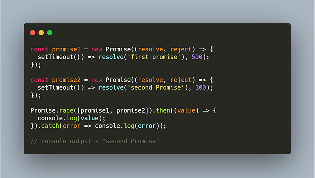


