Advanced
Accessibility
Why Accessibility?
Web accessibility (also referred to as a11y) is the design and creation of websites that can be used by everyone. Accessibility support is necessary to allow assistive technology to interpret web pages.
React fully supports building accessible websites, often by using standard HTML techniques.
Standards and Guidelines
WCAG
The Web Content Accessibility Guidelines provides guidelines for creating accessible web sites.
The following WCAG checklists provide an overview:
WAI-ARIA
The Web Accessibility Initiative - Accessible Rich Internet Applications document contains techniques for building fully accessible JavaScript widgets.
Note that all aria-* HTML attributes are fully supported in JSX. Whereas most DOM properties and attributes in React are camelCased, these attributes should be hyphen-cased (also known as kebab-case, lisp-case, etc) as they are in plain HTML:
<input type="text" aria-label={labelText} aria-required="true" onChange={onchangeHandler}value={inputValue}name="name"/>
Semantic HTML
Semantic HTML is the foundation of accessibility in a web application. Using the various HTML elements to reinforce the meaning of information in our websites will often give us accessibility for free.
Sometimes we break HTML semantics when we add <div> elements to our JSX to make our React code work, especially when working with lists (<ol>, <ul> and <dl>) and the HTML <table>. In these cases we should rather use React Fragments to group together multiple elements.
For example,
`import React, { Fragment } from 'react';function ListItem({ item }) { return ( <Fragment> <dt>{item.term}</dt> <dd>{item.description}</dd> </Fragment> ); }
function Glossary(props) { return ( <dl> {props.items.map(item => ( <ListItem item={item} key={item.id} />))} </dl>); }`
You can map a collection of items to an array of fragments as you would any other type of element as well:
function Glossary(props) { return ( <dl> {props.items.map(item => ( // Fragments should also have akeyprop when mapping collections <Fragment key={item.id}> <dt>{item.term}</dt> <dd>{item.description}</dd> </Fragment> ))} </dl>); }
When you don’t need any props on the Fragment tag you can use the short syntax, if your tooling supports it:
function ListItem({ item }) { return ( <> <dt>{item.term}</dt> <dd>{item.description}</dd> </> ); }
For more info, see the Fragments documentation.
Accessible Forms
Labeling
Every HTML form control, such as <input> and <textarea>, needs to be labeled accessibly. We need to provide descriptive labels that are also exposed to screen readers.
The following resources show us how to do this:
Although these standard HTML practices can be directly used in React, note that the for attribute is written as htmlFor in JSX:
<label htmlFor="namedInput">Name:</label><input id="namedInput" type="text" name="name"/>
Notifying the user of errors
Error situations need to be understood by all users. The following link shows us how to expose error texts to screen readers as well:
Focus Control
Ensure that your web application can be fully operated with the keyboard only:
Keyboard focus and focus outline
Keyboard focus refers to the current element in the DOM that is selected to accept input from the keyboard. We see it everywhere as a focus outline similar to that shown in the following image:
Only ever use CSS that removes this outline, for example by setting outline: 0, if you are replacing it with another focus outline implementation.
Mechanisms to skip to desired content
Provide a mechanism to allow users to skip past navigation sections in your application as this assists and speeds up keyboard navigation.
Skiplinks or Skip Navigation Links are hidden navigation links that only become visible when keyboard users interact with the page. They are very easy to implement with internal page anchors and some styling:
Also use landmark elements and roles, such as <main> and <aside>, to demarcate page regions as assistive technology allow the user to quickly navigate to these sections.
Read more about the use of these elements to enhance accessibility here:
Programmatically managing focus
Our React applications continuously modify the HTML DOM during runtime, sometimes leading to keyboard focus being lost or set to an unexpected element. In order to repair this, we need to programmatically nudge the keyboard focus in the right direction. For example, by resetting keyboard focus to a button that opened a modal window after that modal window is closed.
MDN Web Docs takes a look at this and describes how we can build keyboard-navigable JavaScript widgets.
To set focus in React, we can use Refs to DOM elements.
Using this, we first create a ref to an element in the JSX of a component class:
class CustomTextInput extends React.Component { constructor(props) { super(props); // Create a ref to store the textInput DOM element this.textInput = React.createRef(); } render() { // Use therefcallback to store a reference to the text input DOM // element in an instance field (for example, this.textInput). return ( <input type="text" ref={this.textInput} />); } }
Then we can focus it elsewhere in our component when needed:
focus() { // Explicitly focus the text input using the raw DOM API // Note: we're accessing "current" to get the DOM node this.textInput.current.focus(); }
Sometimes a parent component needs to set focus to an element in a child component. We can do this by exposing DOM refs to parent components through a special prop on the child component that forwards the parent’s ref to the child’s DOM node.
`function CustomTextInput(props) { return ( <div> <input ref={props.inputRef} /> </div>); }
class Parent extends React.Component { constructor(props) { super(props); this.inputElement = React.createRef(); } render() { return ( <CustomTextInput inputRef={this.inputElement} /> ); } }
// Now you can set focus when required. this.inputElement.current.focus();`
When using a HOC to extend components, it is recommended to forward the ref to the wrapped component using the forwardRef function of React. If a third party HOC does not implement ref forwarding, the above pattern can still be used as a fallback.
A great focus management example is the react-aria-modal. This is a relatively rare example of a fully accessible modal window. Not only does it set initial focus on the cancel button (preventing the keyboard user from accidentally activating the success action) and trap keyboard focus inside the modal, it also resets focus back to the element that initially triggered the modal.
Note:While this is a very important accessibility feature, it is also a technique that should be used judiciously. Use it to repair the keyboard focus flow when it is disturbed, not to try and anticipate how users want to use applications.
Mouse and pointer events
Ensure that all functionality exposed through a mouse or pointer event can also be accessed using the keyboard alone. Depending only on the pointer device will lead to many cases where keyboard users cannot use your application.
To illustrate this, let’s look at a prolific example of broken accessibility caused by click events. This is the outside click pattern, where a user can disable an opened popover by clicking outside the element.

This is typically implemented by attaching a click event to the window object that closes the popover:
`class OuterClickExample extends React.Component { constructor(props) { super(props);
}
componentDidMount() { window.addEventListener('click', this.onClickOutsideHandler); }componentWillUnmount() { window.removeEventListener('click', this.onClickOutsideHandler); }
onClickHandler() { this.setState(currentState => ({ isOpen: !currentState.isOpen })); }
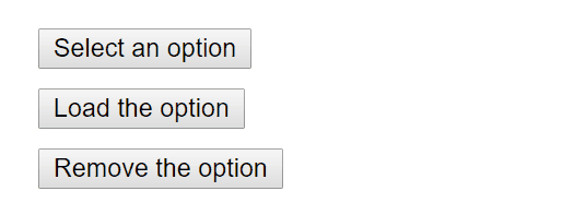
onClickOutsideHandler(event) { if (this.state.isOpen && !this.toggleContainer.current.contains(event.target)) { this.setState({ isOpen: false }); } }render() { return ( <div ref={this.toggleContainer}> <button onClick={this.onClickHandler}>Select an option</button> {this.state.isOpen && ( <ul> <li>Option 1</li> <li>Option 2</li> <li>Option 3</li> </ul>)} </div>); } }`
This may work fine for users with pointer devices, such as a mouse, but operating this with the keyboard alone leads to broken functionality when tabbing to the next element as the window object never receives a click event. This can lead to obscured functionality which blocks users from using your application.
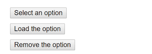
The same functionality can be achieved by using appropriate event handlers instead, such as onBlur and onFocus:
`class BlurExample extends React.Component { constructor(props) { super(props);
}
onClickHandler() { this.setState(currentState => ({ isOpen: !currentState.isOpen })); }
// We close the popover on the next tick by using setTimeout. // This is necessary because we need to first check if // another child of the element has received focus as // the blur event fires prior to the new focus event. onBlurHandler() { this.timeOutId = setTimeout(() => { this.setState({ isOpen: false }); }); } // If a child receives focus, do not close the popover. onFocusHandler() { clearTimeout(this.timeOutId); }render() { // React assists us by bubbling the blur and // focus events to the parent. return ( <div onBlur={this.onBlurHandler} onFocus={this.onFocusHandler}> <button onClick={this.onClickHandler}aria-haspopup="true"aria-expanded={this.state.isOpen}> Select an option </button> {this.state.isOpen && ( <ul> <li>Option 1</li> <li>Option 2</li> <li>Option 3</li> </ul>)} </div>); } }`
This code exposes the functionality to both pointer device and keyboard users. Also note the added aria-* props to support screen-reader users. For simplicity’s sake the keyboard events to enable arrow key interaction of the popover options have not been implemented.
This is one example of many cases where depending on only pointer and mouse events will break functionality for keyboard users. Always testing with the keyboard will immediately highlight the problem areas which can then be fixed by using keyboard aware event handlers.
More Complex Widgets
A more complex user experience should not mean a less accessible one. Whereas accessibility is most easily achieved by coding as close to HTML as possible, even the most complex widget can be coded accessibly.
Here we require knowledge of ARIA Roles as well as ARIA States and Properties. These are toolboxes filled with HTML attributes that are fully supported in JSX and enable us to construct fully accessible, highly functional React components.
Each type of widget has a specific design pattern and is expected to function in a certain way by users and user agents alike:
Other Points for Consideration
Setting the language
Indicate the human language of page texts as screen reader software uses this to select the correct voice settings:
Setting the document title
Set the document <title> to correctly describe the current page content as this ensures that the user remains aware of the current page context:
We can set this in React using the React Document Title Component.
Color contrast
Ensure that all readable text on your website has sufficient color contrast to remain maximally readable by users with low vision:
It can be tedious to manually calculate the proper color combinations for all cases in your website so instead, you can calculate an entire accessible color palette with Colorable.
Both the aXe and WAVE tools mentioned below also include color contrast tests and will report on contrast errors.
If you want to extend your contrast testing abilities you can use these tools:
Development and Testing Tools
There are a number of tools we can use to assist in the creation of accessible web applications.
The keyboard
By far the easiest and also one of the most important checks is to test if your entire website can be reached and used with the keyboard alone. Do this by:
Disconnecting your mouse.
Using
TabandShift+Tabto browse.Using
Enterto activate elements.Where required, using your keyboard arrow keys to interact with some elements, such as menus and dropdowns.
Development assistance
We can check some accessibility features directly in our JSX code. Often intellisense checks are already provided in JSX aware IDE’s for the ARIA roles, states and properties. We also have access to the following tool:
eslint-plugin-jsx-a11y
The eslint-plugin-jsx-a11y plugin for ESLint provides AST linting feedback regarding accessibility issues in your JSX. Many IDE’s allow you to integrate these findings directly into code analysis and source code windows.
Create React App has this plugin with a subset of rules activated. If you want to enable even more accessibility rules, you can create an .eslintrc file in the root of your project with this content:
Testing accessibility in the browser
A number of tools exist that can run accessibility audits on web pages in your browser. Please use them in combination with other accessibility checks mentioned here as they can only test the technical accessibility of your HTML.
aXe, aXe-core and react-axe
Deque Systems offers aXe-core for automated and end-to-end accessibility tests of your applications. This module includes integrations for Selenium.
The Accessibility Engine or aXe, is an accessibility inspector browser extension built on aXe-core.
You can also use the react-axe module to report these accessibility findings directly to the console while developing and debugging.
WebAIM WAVE
The Web Accessibility Evaluation Tool is another accessibility browser extension.
Accessibility inspectors and the Accessibility Tree
The Accessibility Tree is a subset of the DOM tree that contains accessible objects for every DOM element that should be exposed to assistive technology, such as screen readers.
In some browsers we can easily view the accessibility information for each element in the accessibility tree:
Screen readers
Testing with a screen reader should form part of your accessibility tests.
Please note that browser / screen reader combinations matter. It is recommended that you test your application in the browser best suited to your screen reader of choice.
Commonly Used Screen Readers
NVDA in Firefox
NonVisual Desktop Access or NVDA is an open source Windows screen reader that is widely used.
Refer to the following guides on how to best use NVDA:
VoiceOver in Safari
VoiceOver is an integrated screen reader on Apple devices.
Refer to the following guides on how to activate and use VoiceOver:
JAWS in Internet Explorer
Job Access With Speech or JAWS, is a prolifically used screen reader on Windows.
Refer to the following guides on how to best use JAWS:
Other Screen Readers
ChromeVox in Google Chrome
ChromeVox is an integrated screen reader on Chromebooks and is available as an extension for Google Chrome.
Refer to the following guides on how best to use ChromeVox:
Code-Splitting
Bundling
Most React apps will have their files “bundled” using tools like Webpack, Rollup or Browserify. Bundling is the process of following imported files and merging them into a single file: a “bundle”. This bundle can then be included on a webpage to load an entire app at once.
Example
App:
Bundle:
Note:Your bundles will end up looking a lot different than this.
If you’re using Create React App, Next.js, Gatsby, or a similar tool, you will have a Webpack setup out of the box to bundle your app.
If you aren’t, you’ll need to set up bundling yourself. For example, see the Installation and Getting Started guides on the Webpack docs.
Code Splitting
Bundling is great, but as your app grows, your bundle will grow too. Especially if you are including large third-party libraries. You need to keep an eye on the code you are including in your bundle so that you don’t accidentally make it so large that your app takes a long time to load.
To avoid winding up with a large bundle, it’s good to get ahead of the problem and start “splitting” your bundle. Code-Splitting is a feature supported by bundlers like Webpack, Rollup and Browserify (via factor-bundle) which can create multiple bundles that can be dynamically loaded at runtime.
Code-splitting your app can help you “lazy-load” just the things that are currently needed by the user, which can dramatically improve the performance of your app. While you haven’t reduced the overall amount of code in your app, you’ve avoided loading code that the user may never need, and reduced the amount of code needed during the initial load.
import()
import()The best way to introduce code-splitting into your app is through the dynamic import() syntax.
Before:
After:
When Webpack comes across this syntax, it automatically starts code-splitting your app. If you’re using Create React App, this is already configured for you and you can start using it immediately. It’s also supported out of the box in Next.js.
If you’re setting up Webpack yourself, you’ll probably want to read Webpack’s guide on code splitting. Your Webpack config should look vaguely like this.
When using Babel, you’ll need to make sure that Babel can parse the dynamic import syntax but is not transforming it. For that you will need @babel/plugin-syntax-dynamic-import.
React.lazy
React.lazyNote:React.lazy and Suspense are not yet available for server-side rendering. If you want to do code-splitting in a server rendered app, we recommend Loadable Components. It has a nice guide for bundle splitting with server-side rendering.
The React.lazy function lets you render a dynamic import as a regular component.
Before:
After:
This will automatically load the bundle containing the OtherComponent when this component is first rendered.
React.lazy takes a function that must call a dynamic import(). This must return a Promise which resolves to a module with a default export containing a React component.
The lazy component should then be rendered inside a Suspense component, which allows us to show some fallback content (such as a loading indicator) while we’re waiting for the lazy component to load.
The fallback prop accepts any React elements that you want to render while waiting for the component to load. You can place the Suspense component anywhere above the lazy component. You can even wrap multiple lazy components with a single Suspense component.
Error boundaries
If the other module fails to load (for example, due to network failure), it will trigger an error. You can handle these errors to show a nice user experience and manage recovery with Error Boundaries. Once you’ve created your Error Boundary, you can use it anywhere above your lazy components to display an error state when there’s a network error.
Route-based code splitting
Deciding where in your app to introduce code splitting can be a bit tricky. You want to make sure you choose places that will split bundles evenly, but won’t disrupt the user experience.
A good place to start is with routes. Most people on the web are used to page transitions taking some amount of time to load. You also tend to be re-rendering the entire page at once so your users are unlikely to be interacting with other elements on the page at the same time.
Here’s an example of how to setup route-based code splitting into your app using libraries like React Router with React.lazy.
Named Exports
React.lazy currently only supports default exports. If the module you want to import uses named exports, you can create an intermediate module that reexports it as the default. This ensures that tree shaking keeps working and that you don’t pull in unused components.
Context
Context provides a way to pass data through the component tree without having to pass props down manually at every level.
In a typical React application, data is passed top-down (parent to child) via props, but such usage can be cumbersome for certain types of props (e.g. locale preference, UI theme) that are required by many components within an application. Context provides a way to share values like these between components without having to explicitly pass a prop through every level of the tree.
When to Use Context
Context is designed to share data that can be considered “global” for a tree of React components, such as the current authenticated user, theme, or preferred language. For example, in the code below we manually thread through a “theme” prop in order to style the Button component:
Using context, we can avoid passing props through intermediate elements:
Before You Use Context
Context is primarily used when some data needs to be accessible by many components at different nesting levels. Apply it sparingly because it makes component reuse more difficult.
If you only want to avoid passing some props through many levels, component composition is often a simpler solution than context.
For example, consider a Page component that passes a user and avatarSize prop several levels down so that deeply nested Link and Avatar components can read it:
It might feel redundant to pass down the user and avatarSize props through many levels if in the end only the Avatar component really needs it. It’s also annoying that whenever the Avatar component needs more props from the top, you have to add them at all the intermediate levels too.
One way to solve this issue without context is to pass down the Avatar component itself so that the intermediate components don’t need to know about the user or avatarSize props:
With this change, only the top-most Page component needs to know about the Link and Avatar components’ use of user and avatarSize.
This inversion of control can make your code cleaner in many cases by reducing the amount of props you need to pass through your application and giving more control to the root components. Such inversion, however, isn’t the right choice in every case; moving more complexity higher in the tree makes those higher-level components more complicated and forces the lower-level components to be more flexible than you may want.
You’re not limited to a single child for a component. You may pass multiple children, or even have multiple separate “slots” for children, as documented here:
This pattern is sufficient for many cases when you need to decouple a child from its immediate parents. You can take it even further with render props if the child needs to communicate with the parent before rendering.
However, sometimes the same data needs to be accessible by many components in the tree, and at different nesting levels. Context lets you “broadcast” such data, and changes to it, to all components below. Common examples where using context might be simpler than the alternatives include managing the current locale, theme, or a data cache.
API
React.createContext
React.createContextCreates a Context object. When React renders a component that subscribes to this Context object it will read the current context value from the closest matching Provider above it in the tree.
The defaultValue argument is only used when a component does not have a matching Provider above it in the tree. This default value can be helpful for testing components in isolation without wrapping them. Note: passing undefined as a Provider value does not cause consuming components to use defaultValue.
Context.Provider
Context.ProviderEvery Context object comes with a Provider React component that allows consuming components to subscribe to context changes.
The Provider component accepts a value prop to be passed to consuming components that are descendants of this Provider. One Provider can be connected to many consumers. Providers can be nested to override values deeper within the tree.
All consumers that are descendants of a Provider will re-render whenever the Provider’s value prop changes. The propagation from Provider to its descendant consumers (including [.contextType](<https://reactjs.org/docs/context.html#classcontexttype>) and [useContext](<https://reactjs.org/docs/hooks-reference.html#usecontext>)) is not subject to the shouldComponentUpdate method, so the consumer is updated even when an ancestor component skips an update.
Changes are determined by comparing the new and old values using the same algorithm as [Object.is](<https://developer.mozilla.org/en-US/docs/Web/JavaScript/Reference/Global_Objects/Object/is#Description>).
NoteThe way changes are determined can cause some issues when passing objects as value: see Caveats.
Class.contextType
Class.contextTypeThe contextType property on a class can be assigned a Context object created by [React.createContext()](<https://reactjs.org/docs/context.html#reactcreatecontext>). Using this property lets you consume the nearest current value of that Context type using this.context. You can reference this in any of the lifecycle methods including the render function.
Note:You can only subscribe to a single context using this API. If you need to read more than one see Consuming Multiple Contexts.If you are using the experimental public class fields syntax, you can use a static class field to initialize your contextType.
Context.Consumer
Context.ConsumerA React component that subscribes to context changes. Using this component lets you subscribe to a context within a function component.
Requires a function as a child. The function receives the current context value and returns a React node. The value argument passed to the function will be equal to the value prop of the closest Provider for this context above in the tree. If there is no Provider for this context above, the value argument will be equal to the defaultValue that was passed to createContext().
NoteFor more information about the ‘function as a child’ pattern, see render props.
Context.displayName
Context.displayNameContext object accepts a displayName string property. React DevTools uses this string to determine what to display for the context.
For example, the following component will appear as MyDisplayName in the DevTools:
Examples
Dynamic Context
A more complex example with dynamic values for the theme:
theme-context.js
themed-button.js
app.js
Updating Context from a Nested Component
It is often necessary to update the context from a component that is nested somewhere deeply in the component tree. In this case you can pass a function down through the context to allow consumers to update the context:
theme-context.js
theme-toggler-button.js
app.js
Consuming Multiple Contexts
To keep context re-rendering fast, React needs to make each context consumer a separate node in the tree.
If two or more context values are often used together, you might want to consider creating your own render prop component that provides both.
Caveats
Because context uses reference identity to determine when to re-render, there are some gotchas that could trigger unintentional renders in consumers when a provider’s parent re-renders. For example, the code below will re-render all consumers every time the Provider re-renders because a new object is always created for value:
To get around this, lift the value into the parent’s state:
Legacy API
NoteReact previously shipped with an experimental context API. The old API will be supported in all 16.x releases, but applications using it should migrate to the new version. The legacy API will be removed in a future major React version. Read the legacy context docs here.
Fragments
A common pattern in React is for a component to return multiple elements. Fragments let you group a list of children without adding extra nodes to the DOM.
There is also a new short syntax for declaring them.
Motivation
A common pattern is for a component to return a list of children. Take this example React snippet:
<Columns /> would need to return multiple <td> elements in order for the rendered HTML to be valid. If a parent div was used inside the render() of <Columns />, then the resulting HTML will be invalid.
results in a <Table /> output of:
Fragments solve this problem.
Usage
which results in a correct <Table /> output of:
Short Syntax
There is a new, shorter syntax you can use for declaring fragments. It looks like empty tags:
You can use <></> the same way you’d use any other element except that it doesn’t support keys or attributes.
Keyed Fragments
Fragments declared with the explicit <React.Fragment> syntax may have keys. A use case for this is mapping a collection to an array of fragments — for example, to create a description list:
key is the only attribute that can be passed to Fragment. In the future, we may add support for additional attributes, such as event handlers.
Live Demo
You can try out the new JSX fragment syntax with this CodePen.
Higher-Order Components
A higher-order component (HOC) is an advanced technique in React for reusing component logic. HOCs are not part of the React API, per se. They are a pattern that emerges from React’s compositional nature.
Concretely, a higher-order component is a function that takes a component and returns a new component.
const EnhancedComponent = higherOrderComponent(WrappedComponent);
Whereas a component transforms props into UI, a higher-order component transforms a component into another component.
HOCs are common in third-party React libraries, such as Redux’s [connect](<https://github.com/reduxjs/react-redux/blob/master/docs/api/connect.md#connect>) and Relay’s [createFragmentContainer](<https://relay.dev/docs/v10.1.3/fragment-container/#createfragmentcontainer>).
In this document, we’ll discuss why higher-order components are useful, and how to write your own.
Use HOCs For Cross-Cutting Concerns
NoteWe previously recommended mixins as a way to handle cross-cutting concerns. We’ve since realized that mixins create more trouble than they are worth. Read more about why we’ve moved away from mixins and how you can transition your existing components.
Components are the primary unit of code reuse in React. However, you’ll find that some patterns aren’t a straightforward fit for traditional components.
For example, say you have a CommentList component that subscribes to an external data source to render a list of comments:
Later, you write a component for subscribing to a single blog post, which follows a similar pattern:
CommentList and BlogPost aren’t identical — they call different methods on DataSource, and they render different output. But much of their implementation is the same:
On mount, add a change listener to
DataSource.Inside the listener, call
setStatewhenever the data source changes.On unmount, remove the change listener.
You can imagine that in a large app, this same pattern of subscribing to DataSource and calling setState will occur over and over again. We want an abstraction that allows us to define this logic in a single place and share it across many components. This is where higher-order components excel.
We can write a function that creates components, like CommentList and BlogPost, that subscribe to DataSource. The function will accept as one of its arguments a child component that receives the subscribed data as a prop. Let’s call the function withSubscription:
The first parameter is the wrapped component. The second parameter retrieves the data we’re interested in, given a DataSource and the current props.
When CommentListWithSubscription and BlogPostWithSubscription are rendered, CommentList and BlogPost will be passed a data prop with the most current data retrieved from DataSource:
Note that a HOC doesn’t modify the input component, nor does it use inheritance to copy its behavior. Rather, a HOC composes the original component by wrapping it in a container component. A HOC is a pure function with zero side-effects.
And that’s it! The wrapped component receives all the props of the container, along with a new prop, data, which it uses to render its output. The HOC isn’t concerned with how or why the data is used, and the wrapped component isn’t concerned with where the data came from.
Because withSubscription is a normal function, you can add as many or as few arguments as you like. For example, you may want to make the name of the data prop configurable, to further isolate the HOC from the wrapped component. Or you could accept an argument that configures shouldComponentUpdate, or one that configures the data source. These are all possible because the HOC has full control over how the component is defined.
Like components, the contract between withSubscription and the wrapped component is entirely props-based. This makes it easy to swap one HOC for a different one, as long as they provide the same props to the wrapped component. This may be useful if you change data-fetching libraries, for example.
Don’t Mutate the Original Component. Use Composition.
Resist the temptation to modify a component’s prototype (or otherwise mutate it) inside a HOC.
There are a few problems with this. One is that the input component cannot be reused separately from the enhanced component. More crucially, if you apply another HOC to EnhancedComponent that also mutates componentDidUpdate, the first HOC’s functionality will be overridden! This HOC also won’t work with function components, which do not have lifecycle methods.
Mutating HOCs are a leaky abstraction—the consumer must know how they are implemented in order to avoid conflicts with other HOCs.
Instead of mutation, HOCs should use composition, by wrapping the input component in a container component:
This HOC has the same functionality as the mutating version while avoiding the potential for clashes. It works equally well with class and function components. And because it’s a pure function, it’s composable with other HOCs, or even with itself.
You may have noticed similarities between HOCs and a pattern called container components. Container components are part of a strategy of separating responsibility between high-level and low-level concerns. Containers manage things like subscriptions and state, and pass props to components that handle things like rendering UI. HOCs use containers as part of their implementation. You can think of HOCs as parameterized container component definitions.
Convention: Pass Unrelated Props Through to the Wrapped Component
HOCs add features to a component. They shouldn’t drastically alter its contract. It’s expected that the component returned from a HOC has a similar interface to the wrapped component.
HOCs should pass through props that are unrelated to its specific concern. Most HOCs contain a render method that looks something like this:
This convention helps ensure that HOCs are as flexible and reusable as possible.
Convention: Maximizing Composability
Not all HOCs look the same. Sometimes they accept only a single argument, the wrapped component:
Usually, HOCs accept additional arguments. In this example from Relay, a config object is used to specify a component’s data dependencies:
The most common signature for HOCs looks like this:
What?! If you break it apart, it’s easier to see what’s going on.
In other words, connect is a higher-order function that returns a higher-order component!
This form may seem confusing or unnecessary, but it has a useful property. Single-argument HOCs like the one returned by the connect function have the signature Component => Component. Functions whose output type is the same as its input type are really easy to compose together.
(This same property also allows connect and other enhancer-style HOCs to be used as decorators, an experimental JavaScript proposal.)
The compose utility function is provided by many third-party libraries including lodash (as [lodash.flowRight](<https://lodash.com/docs/#flowRight>)), Redux, and Ramda.
Convention: Wrap the Display Name for Easy Debugging
The container components created by HOCs show up in the React Developer Tools like any other component. To ease debugging, choose a display name that communicates that it’s the result of a HOC.
The most common technique is to wrap the display name of the wrapped component. So if your higher-order component is named withSubscription, and the wrapped component’s display name is CommentList, use the display name WithSubscription(CommentList):
Caveats
Higher-order components come with a few caveats that aren’t immediately obvious if you’re new to React.
Don’t Use HOCs Inside the render Method
React’s diffing algorithm (called Reconciliation) uses component identity to determine whether it should update the existing subtree or throw it away and mount a new one. If the component returned from render is identical (===) to the component from the previous render, React recursively updates the subtree by diffing it with the new one. If they’re not equal, the previous subtree is unmounted completely.
Normally, you shouldn’t need to think about this. But it matters for HOCs because it means you can’t apply a HOC to a component within the render method of a component:
The problem here isn’t just about performance — remounting a component causes the state of that component and all of its children to be lost.
Instead, apply HOCs outside the component definition so that the resulting component is created only once. Then, its identity will be consistent across renders. This is usually what you want, anyway.
In those rare cases where you need to apply a HOC dynamically, you can also do it inside a component’s lifecycle methods or its constructor.
Static Methods Must Be Copied Over
Sometimes it’s useful to define a static method on a React component. For example, Relay containers expose a static method getFragment to facilitate the composition of GraphQL fragments.
When you apply a HOC to a component, though, the original component is wrapped with a container component. That means the new component does not have any of the static methods of the original component.
To solve this, you could copy the methods onto the container before returning it:
However, this requires you to know exactly which methods need to be copied. You can use hoist-non-react-statics to automatically copy all non-React static methods:
Another possible solution is to export the static method separately from the component itself.
Refs Aren’t Passed Through
While the convention for higher-order components is to pass through all props to the wrapped component, this does not work for refs. That’s because ref is not really a prop — like key, it’s handled specially by React. If you add a ref to an element whose component is the result of a HOC, the ref refers to an instance of the outermost container component, not the wrapped component.
The solution for this problem is to use the React.forwardRef API (introduced with React 16.3). Learn more about it in the forwarding refs section.
JSX In Depth
Fundamentally, JSX just provides syntactic sugar for the React.createElement(component, props, ...children) function. The JSX code:
React.createElement(component, props, ...children) function. The JSX code:compiles into:
You can also use the self-closing form of the tag if there are no children. So:
compiles into:
If you want to test out how some specific JSX is converted into JavaScript, you can try out the online Babel compiler.
Specifying The React Element Type
The first part of a JSX tag determines the type of the React element.
Capitalized types indicate that the JSX tag is referring to a React component. These tags get compiled into a direct reference to the named variable, so if you use the JSX <Foo /> expression, Foo must be in scope.
React Must Be in Scope
Since JSX compiles into calls to React.createElement, the React library must also always be in scope from your JSX code.
For example, both of the imports are necessary in this code, even though React and CustomButton are not directly referenced from JavaScript:
If you don’t use a JavaScript bundler and loaded React from a <script> tag, it is already in scope as the React global.
Using Dot Notation for JSX Type
You can also refer to a React component using dot-notation from within JSX. This is convenient if you have a single module that exports many React components. For example, if MyComponents.DatePicker is a component, you can use it directly from JSX with:
User-Defined Components Must Be Capitalized
When an element type starts with a lowercase letter, it refers to a built-in component like <div> or <span> and results in a string 'div' or 'span' passed to React.createElement. Types that start with a capital letter like <Foo /> compile to React.createElement(Foo) and correspond to a component defined or imported in your JavaScript file.
We recommend naming components with a capital letter. If you do have a component that starts with a lowercase letter, assign it to a capitalized variable before using it in JSX.
For example, this code will not run as expected:
To fix this, we will rename hello to Hello and use <Hello /> when referring to it:
Choosing the Type at Runtime
You cannot use a general expression as the React element type. If you do want to use a general expression to indicate the type of the element, just assign it to a capitalized variable first. This often comes up when you want to render a different component based on a prop:
To fix this, we will assign the type to a capitalized variable first:
Props in JSX
There are several different ways to specify props in JSX.
JavaScript Expressions as Props
You can pass any JavaScript expression as a prop, by surrounding it with {}. For example, in this JSX:
<MyComponent foo={1 + 2 + 3 + 4} />
For MyComponent, the value of props.foo will be 10 because the expression 1 + 2 + 3 + 4 gets evaluated.
if statements and for loops are not expressions in JavaScript, so they can’t be used in JSX directly. Instead, you can put these in the surrounding code. For example:
You can learn more about conditional rendering and loops in the corresponding sections.
String Literals
You can pass a string literal as a prop. These two JSX expressions are equivalent:
<MyComponent message="hello world" /><MyComponent message={'hello world'} />
When you pass a string literal, its value is HTML-unescaped. So these two JSX expressions are equivalent:
<MyComponent message="<3" /><MyComponent message={'<3'} />
This behavior is usually not relevant. It’s only mentioned here for completeness.
Props Default to “True”
If you pass no value for a prop, it defaults to true. These two JSX expressions are equivalent:
<MyTextBox autocomplete /><MyTextBox autocomplete={true} />
In general, we don’t recommend not passing a value for a prop, because it can be confused with the ES6 object shorthand {foo} which is short for {foo: foo} rather than {foo: true}. This behavior is just there so that it matches the behavior of HTML.
Spread Attributes
If you already have props as an object, and you want to pass it in JSX, you can use ... as a “spread” operator to pass the whole props object. These two components are equivalent:
You can also pick specific props that your component will consume while passing all other props using the spread operator.
In the example above, the kind prop is safely consumed and is not passed on to the <button> element in the DOM. All other props are passed via the ...other object making this component really flexible. You can see that it passes an onClick and children props.
Spread attributes can be useful but they also make it easy to pass unnecessary props to components that don’t care about them or to pass invalid HTML attributes to the DOM. We recommend using this syntax sparingly.
Children in JSX
In JSX expressions that contain both an opening tag and a closing tag, the content between those tags is passed as a special prop: props.children. There are several different ways to pass children:
String Literals
You can put a string between the opening and closing tags and props.children will just be that string. This is useful for many of the built-in HTML elements. For example:
<MyComponent>Hello world!</MyComponent>
This is valid JSX, and props.children in MyComponent will simply be the string "Hello world!". HTML is unescaped, so you can generally write JSX just like you would write HTML in this way:
<div>This is valid HTML & JSX at the same time.</div>
JSX removes whitespace at the beginning and ending of a line. It also removes blank lines. New lines adjacent to tags are removed; new lines that occur in the middle of string literals are condensed into a single space. So these all render to the same thing:
JSX Children
You can provide more JSX elements as the children. This is useful for displaying nested components:
You can mix together different types of children, so you can use string literals together with JSX children. This is another way in which JSX is like HTML, so that this is both valid JSX and valid HTML:
A React component can also return an array of elements:
render() { // No need to wrap list items in an extra element! return [ // Don't forget the keys :) <li key="A">First item</li>, <li key="B">Second item</li>, <li key="C">Third item</li>, ]; }
JavaScript Expressions as Children
You can pass any JavaScript expression as children, by enclosing it within {}. For example, these expressions are equivalent:
<MyComponent>foo</MyComponent><MyComponent>{'foo'}</MyComponent>
This is often useful for rendering a list of JSX expressions of arbitrary length. For example, this renders an HTML list:
JavaScript expressions can be mixed with other types of children. This is often useful in lieu of string templates:
Functions as Children
Normally, JavaScript expressions inserted in JSX will evaluate to a string, a React element, or a list of those things. However, props.children works just like any other prop in that it can pass any sort of data, not just the sorts that React knows how to render. For example, if you have a custom component, you could have it take a callback as props.children:
Children passed to a custom component can be anything, as long as that component transforms them into something React can understand before rendering. This usage is not common, but it works if you want to stretch what JSX is capable of.
Booleans, Null, and Undefined Are Ignored
false, null, undefined, and true are valid children. They simply don’t render. These JSX expressions will all render to the same thing:
This can be useful to conditionally render React elements. This JSX renders the <Header /> component only if showHeader is true:
One caveat is that some “falsy” values, such as the 0 number, are still rendered by React. For example, this code will not behave as you might expect because 0 will be printed when props.messages is an empty array:
To fix this, make sure that the expression before && is always boolean:
Conversely, if you want a value like false, true, null, or undefined to appear in the output, you have to convert it to a string first:
Optimizing Performance
Internally, React uses several clever techniques to minimize the number of costly DOM operations required to update the UI. For many applications, using React will lead to a fast user interface without doing much work to specifically optimize for performance. Nevertheless, there are several ways you can speed up your React application.
Use the Production Build
If you’re benchmarking or experiencing performance problems in your React apps, make sure you’re testing with the minified production build.
By default, React includes many helpful warnings. These warnings are very useful in development. However, they make React larger and slower so you should make sure to use the production version when you deploy the app.
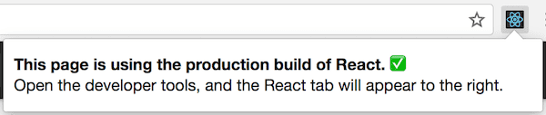
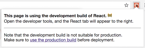
If you aren’t sure whether your build process is set up correctly, you can check it by installing React Developer Tools for Chrome. If you visit a site with React in production mode, the icon will have a dark background:
If you visit a site with React in development mode, the icon will have a red background:
It is expected that you use the development mode when working on your app, and the production mode when deploying your app to the users.
You can find instructions for building your app for production below.
Create React App
If your project is built with Create React App, run:
This will create a production build of your app in the build/ folder of your project.
Remember that this is only necessary before deploying to production. For normal development, use npm start.
Single-File Builds
We offer production-ready versions of React and React DOM as single files:
Remember that only React files ending with .production.min.js are suitable for production.
Brunch
For the most efficient Brunch production build, install the [terser-brunch](<https://github.com/brunch/terser-brunch>) plugin:
Then, to create a production build, add the -p flag to the build command:
Remember that you only need to do this for production builds. You shouldn’t pass the -p flag or apply this plugin in development, because it will hide useful React warnings and make the builds much slower.
Browserify
For the most efficient Browserify production build, install a few plugins:
To create a production build, make sure that you add these transforms (the order matters):
The
[envify](<https://github.com/hughsk/envify>)transform ensures the right build environment is set. Make it global (g).The
[uglifyify](<https://github.com/hughsk/uglifyify>)transform removes development imports. Make it global too (g).Finally, the resulting bundle is piped to
[terser](<https://github.com/terser-js/terser>)for mangling (read why).
For example:
Remember that you only need to do this for production builds. You shouldn’t apply these plugins in development because they will hide useful React warnings, and make the builds much slower.
Rollup
For the most efficient Rollup production build, install a few plugins:
To create a production build, make sure that you add these plugins (the order matters):
The
[replace](<https://github.com/rollup/rollup-plugin-replace>)plugin ensures the right build environment is set.The
[commonjs](<https://github.com/rollup/rollup-plugin-commonjs>)plugin provides support for CommonJS in Rollup.The
[terser](<https://github.com/TrySound/rollup-plugin-terser>)plugin compresses and mangles the final bundle.
For a complete setup example see this gist.
Remember that you only need to do this for production builds. You shouldn’t apply the terser plugin or the replace plugin with 'production' value in development because they will hide useful React warnings, and make the builds much slower.
webpack
Note:If you’re using Create React App, please follow the instructions above.This section is only relevant if you configure webpack directly.
Webpack v4+ will minify your code by default in production mode.
You can learn more about this in webpack documentation.
Remember that you only need to do this for production builds. You shouldn’t apply TerserPlugin in development because it will hide useful React warnings, and make the builds much slower.
Profiling Components with the DevTools Profiler
react-dom 16.5+ and react-native 0.57+ provide enhanced profiling capabilities in DEV mode with the React DevTools Profiler. An overview of the Profiler can be found in the blog post “Introducing the React Profiler”. A video walkthrough of the profiler is also available on YouTube.
If you haven’t yet installed the React DevTools, you can find them here:
NoteA production profiling bundle of react-dom is also available as react-dom/profiling. Read more about how to use this bundle at fb.me/react-profiling
NoteBefore React 17, we use the standard User Timing API to profile components with the chrome performance tab. For a more detailed walkthrough, check out this article by Ben Schwarz.
Virtualize Long Lists
If your application renders long lists of data (hundreds or thousands of rows), we recommend using a technique known as “windowing”. This technique only renders a small subset of your rows at any given time, and can dramatically reduce the time it takes to re-render the components as well as the number of DOM nodes created.
react-window and react-virtualized are popular windowing libraries. They provide several reusable components for displaying lists, grids, and tabular data. You can also create your own windowing component, like Twitter did, if you want something more tailored to your application’s specific use case.
Avoid Reconciliation
React builds and maintains an internal representation of the rendered UI. It includes the React elements you return from your components. This representation lets React avoid creating DOM nodes and accessing existing ones beyond necessity, as that can be slower than operations on JavaScript objects. Sometimes it is referred to as a “virtual DOM”, but it works the same way on React Native.
When a component’s props or state change, React decides whether an actual DOM update is necessary by comparing the newly returned element with the previously rendered one. When they are not equal, React will update the DOM.
Even though React only updates the changed DOM nodes, re-rendering still takes some time. In many cases it’s not a problem, but if the slowdown is noticeable, you can speed all of this up by overriding the lifecycle function shouldComponentUpdate, which is triggered before the re-rendering process starts. The default implementation of this function returns true, leaving React to perform the update:
If you know that in some situations your component doesn’t need to update, you can return false from shouldComponentUpdate instead, to skip the whole rendering process, including calling render() on this component and below.
In most cases, instead of writing shouldComponentUpdate() by hand, you can inherit from [React.PureComponent](<https://reactjs.org/docs/react-api.html#reactpurecomponent>). It is equivalent to implementing shouldComponentUpdate() with a shallow comparison of current and previous props and state.
shouldComponentUpdate In Action
Here’s a subtree of components. For each one, SCU indicates what shouldComponentUpdate returned, and vDOMEq indicates whether the rendered React elements were equivalent. Finally, the circle’s color indicates whether the component had to be reconciled or not.
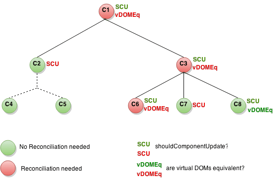
Since shouldComponentUpdate returned false for the subtree rooted at C2, React did not attempt to render C2, and thus didn’t even have to invoke shouldComponentUpdate on C4 and C5.
For C1 and C3, shouldComponentUpdate returned true, so React had to go down to the leaves and check them. For C6 shouldComponentUpdate returned true, and since the rendered elements weren’t equivalent React had to update the DOM.
The last interesting case is C8. React had to render this component, but since the React elements it returned were equal to the previously rendered ones, it didn’t have to update the DOM.
Note that React only had to do DOM mutations for C6, which was inevitable. For C8, it bailed out by comparing the rendered React elements, and for C2’s subtree and C7, it didn’t even have to compare the elements as we bailed out on shouldComponentUpdate, and render was not called.
Examples
If the only way your component ever changes is when the props.color or the state.count variable changes, you could have shouldComponentUpdate check that:
In this code, shouldComponentUpdate is just checking if there is any change in props.color or state.count. If those values don’t change, the component doesn’t update. If your component got more complex, you could use a similar pattern of doing a “shallow comparison” between all the fields of props and state to determine if the component should update. This pattern is common enough that React provides a helper to use this logic - just inherit from React.PureComponent. So this code is a simpler way to achieve the same thing:
Most of the time, you can use React.PureComponent instead of writing your own shouldComponentUpdate. It only does a shallow comparison, so you can’t use it if the props or state may have been mutated in a way that a shallow comparison would miss.
This can be a problem with more complex data structures. For example, let’s say you want a ListOfWords component to render a comma-separated list of words, with a parent WordAdder component that lets you click a button to add a word to the list. This code does not work correctly:
The problem is that PureComponent will do a simple comparison between the old and new values of this.props.words. Since this code mutates the words array in the handleClick method of WordAdder, the old and new values of this.props.words will compare as equal, even though the actual words in the array have changed. The ListOfWords will thus not update even though it has new words that should be rendered.
The Power Of Not Mutating Data
The simplest way to avoid this problem is to avoid mutating values that you are using as props or state. For example, the handleClick method above could be rewritten using concat as:
ES6 supports a spread syntax for arrays which can make this easier. If you’re using Create React App, this syntax is available by default.
You can also rewrite code that mutates objects to avoid mutation, in a similar way. For example, let’s say we have an object named colormap and we want to write a function that changes colormap.right to be 'blue'. We could write:
function updateColorMap(colormap) { colormap.right = 'blue'; }
To write this without mutating the original object, we can use Object.assign method:
updateColorMap now returns a new object, rather than mutating the old one. Object.assign is in ES6 and requires a polyfill.
Object spread syntax makes it easier to update objects without mutation as well:
This feature was added to JavaScript in ES2018.
If you’re using Create React App, both Object.assign and the object spread syntax are available by default.
When you deal with deeply nested objects, updating them in an immutable way can feel convoluted. If you run into this problem, check out Immer or immutability-helper. These libraries let you write highly readable code without losing the benefits of immutability.
Is this page useful?Edit this page
Render Props
The term “render prop” refers to a technique for sharing code between React components using a prop whose value is a function.
A component with a render prop takes a function that returns a React element and calls it instead of implementing its own render logic.
Libraries that use render props include React Router, Downshift and Formik.
In this document, we’ll discuss why render props are useful, and how to write your own.
Use Render Props for Cross-Cutting Concerns
Components are the primary unit of code reuse in React, but it’s not always obvious how to share the state or behavior that one component encapsulates to other components that need that same state.
For example, the following component tracks the mouse position in a web app:
As the cursor moves around the screen, the component displays its (x, y) coordinates in a <p>.
Now the question is: How can we reuse this behavior in another component? In other words, if another component needs to know about the cursor position, can we encapsulate that behavior so that we can easily share it with that component?
Since components are the basic unit of code reuse in React, let’s try refactoring the code a bit to use a <Mouse> component that encapsulates the behavior we need to reuse elsewhere.
Now the <Mouse> component encapsulates all behavior associated with listening for mousemove events and storing the (x, y) position of the cursor, but it’s not yet truly reusable.
For example, let’s say we have a <Cat> component that renders the image of a cat chasing the mouse around the screen. We might use a <Cat mouse={{ x, y }}> prop to tell the component the coordinates of the mouse so it knows where to position the image on the screen.
As a first pass, you might try rendering the <Cat> inside <Mouse>’s render method, like this:
This approach will work for our specific use case, but we haven’t achieved the objective of truly encapsulating the behavior in a reusable way. Now, every time we want the mouse position for a different use case, we have to create a new component (i.e. essentially another <MouseWithCat>) that renders something specifically for that use case.
Here’s where the render prop comes in: Instead of hard-coding a <Cat> inside a <Mouse> component, and effectively changing its rendered output, we can provide <Mouse> with a function prop that it uses to dynamically determine what to render–a render prop.
Now, instead of effectively cloning the <Mouse> component and hard-coding something else in its render method to solve for a specific use case, we provide a render prop that <Mouse> can use to dynamically determine what it renders.
More concretely, a render prop is a function prop that a component uses to know what to render.
This technique makes the behavior that we need to share extremely portable. To get that behavior, render a <Mouse> with a render prop that tells it what to render with the current (x, y) of the cursor.
One interesting thing to note about render props is that you can implement most higher-order components (HOC) using a regular component with a render prop. For example, if you would prefer to have a withMouse HOC instead of a <Mouse> component, you could easily create one using a regular <Mouse> with a render prop:
So using a render prop makes it possible to use either pattern.
Using Props Other Than render
renderIt’s important to remember that just because the pattern is called “render props” you don’t have to use a prop named render to use this pattern. In fact, *any* prop that is a function that a component uses to know what to render is technically a “render prop”.
Although the examples above use render, we could just as easily use the children prop!
And remember, the children prop doesn’t actually need to be named in the list of “attributes” in your JSX element. Instead, you can put it directly inside the element!
You’ll see this technique used in the react-motion API.
Since this technique is a little unusual, you’ll probably want to explicitly state that children should be a function in your propTypes when designing an API like this.
Caveats
Be careful when using Render Props with React.PureComponent
Using a render prop can negate the advantage that comes from using [React.PureComponent](<https://reactjs.org/docs/react-api.html#reactpurecomponent>) if you create the function inside a render method. This is because the shallow prop comparison will always return false for new props, and each render in this case will generate a new value for the render prop.
For example, continuing with our <Mouse> component from above, if Mouse were to extend React.PureComponent instead of React.Component, our example would look like this:
In this example, each time <MouseTracker> renders, it generates a new function as the value of the <Mouse render> prop, thus negating the effect of <Mouse> extending React.PureComponent in the first place!
To get around this problem, you can sometimes define the prop as an instance method, like so:
In cases where you cannot define the prop statically (e.g. because you need to close over the component’s props and/or state) <Mouse> should extend React.Component instead.
Last updated