
Create React App
Getting Started with Create React App
This project was bootstrapped with Create React App.
Available Scripts
In the project directory, you can run:
npm start
Runs the app in the development mode. Open http://localhost:3000 to view it in your browser.
The page will reload when you make changes. You may also see any lint errors in the console.
npm test
Launches the test runner in the interactive watch mode. See the section about running tests for more information.
npm run build
Builds the app for production to the build folder. It correctly bundles React in production mode and optimizes the build for the best performance.
The build is minified and the filenames include the hashes. Your app is ready to be deployed!
See the section about deployment for more information.
npm run eject
Note: this is a one-way operation. Once you eject, you can't go back!
If you aren't satisfied with the build tool and configuration choices, you can eject at any time. This command will remove the single build dependency from your project.
Instead, it will copy all the configuration files and the transitive dependencies (webpack, Babel, ESLint, etc) right into your project so you have full control over them. All of the commands except eject will still work, but they will point to the copied scripts so you can tweak them. At this point you're on your own.
You don't have to ever use eject. The curated feature set is suitable for small and middle deployments, and you shouldn't feel obligated to use this feature. However we understand that this tool wouldn't be useful if you couldn't customize it when you are ready for it.
Learn More
You can learn more in the Create React App documentation.
To learn React, check out the React documentation.
Code Splitting
This section has moved here: https://facebook.github.io/create-react-app/docs/code-splitting
Analyzing the Bundle Size
This section has moved here: https://facebook.github.io/create-react-app/docs/analyzing-the-bundle-size
Making a Progressive Web App
This section has moved here: https://facebook.github.io/create-react-app/docs/making-a-progressive-web-app
Advanced Configuration
This section has moved here: https://facebook.github.io/create-react-app/docs/advanced-configuration
Deployment
This section has moved here: https://facebook.github.io/create-react-app/docs/deployment
npm run build fails to minify
This section has moved here: https://facebook.github.io/create-react-app/docs/troubleshooting#npm-run-build-fails-to-minify
frameborder="no" height="600" style="width: 100%;" scrolling="yes" title="Untitled" loading="lazy" allowtransparency="true" allowfullscreen="true">
Hello World
The smallest React example looks like this:
It displays a heading saying "Hello, world!" on the page.
Click the link above to open an online editor. Feel free to make some changes, and see how they affect the output. Most pages in this guide will have editable examples like this one.
How to Read This Guide
In this guide, we will examine the building blocks of React apps: elements and components. Once you master them, you can create complex apps from small reusable pieces.
TipThis guide is designed for people who prefer learning concepts step by step. If you prefer to learn by doing, check out our practical tutorial. You might find this guide and the tutorial complementary to each other.
This is the first chapter in a step-by-step guide about main React concepts. You can find a list of all its chapters in the navigation sidebar. If you're reading this from a mobile device, you can access the navigation by pressing the button in the bottom right corner of your screen.
Every chapter in this guide builds on the knowledge introduced in earlier chapters. You can learn most of React by reading the "Main Concepts" guide chapters in the order they appear in the sidebar. For example, "Introducing JSX" is the next chapter after this one.
Knowledge Level Assumptions
React is a JavaScript library, and so we'll assume you have a basic understanding of the JavaScript language. If you don't feel very confident, we recommend going through a JavaScript tutorial to check your knowledge level and enable you to follow along this guide without getting lost. It might take you between 30 minutes and an hour, but as a result you won't have to feel like you're learning both React and JavaScript at the same time.
NoteThis guide occasionally uses some newer JavaScript syntax in the examples. If you haven't worked with JavaScript in the last few years, these three points should get you most of the way.
Introducing JSX
Consider this variable declaration:
This funny tag syntax is neither a string nor HTML.
It is called JSX, and it is a syntax extension to JavaScript. We recommend using it with React to describe what the UI should look like. JSX may remind you of a template language, but it comes with the full power of JavaScript.
JSX produces React "elements". We will explore rendering them to the DOM in the next section. Below, you can find the basics of JSX necessary to get you started.
Why JSX?
React embraces the fact that rendering logic is inherently coupled with other UI logic: how events are handled, how the state changes over time, and how the data is prepared for display.
Instead of artificially separating technologies by putting markup and logic in separate files, React separates concerns with loosely coupled units called "components" that contain both. We will come back to components in a further section, but if you're not yet comfortable putting markup in JS, this talk might convince you otherwise.
React doesn't require using JSX, but most people find it helpful as a visual aid when working with UI inside the JavaScript code. It also allows React to show more useful error and warning messages.
With that out of the way, let's get started!
Embedding Expressions in JSX
In the example below, we declare a variable called name and then use it inside JSX by wrapping it in curly braces:
You can put any valid JavaScript expression inside the curly braces in JSX. For example, 2 + 2, user.firstName, or formatName(user) are all valid JavaScript expressions.
In the example below, we embed the result of calling a JavaScript function, formatName(user), into an <h1> element.
We split JSX over multiple lines for readability. While it isn't required, when doing this, we also recommend wrapping it in parentheses to avoid the pitfalls of automatic semicolon insertion.
JSX is an Expression Too
After compilation, JSX expressions become regular JavaScript function calls and evaluate to JavaScript objects.
This means that you can use JSX inside of if statements and for loops, assign it to variables, accept it as arguments, and return it from functions:
Specifying Attributes with JSX
You may use quotes to specify string literals as attributes:
You may also use curly braces to embed a JavaScript expression in an attribute:
Don't put quotes around curly braces when embedding a JavaScript expression in an attribute. You should either use quotes (for string values) or curly braces (for expressions), but not both in the same attribute.
Warning:Since JSX is closer to JavaScript than to HTML, React DOM uses camelCase property naming convention instead of HTML attribute names.For example, class becomes className in JSX, and tabindex becomes tabIndex.
Specifying Children with JSX
If a tag is empty, you may close it immediately with />, like XML:
JSX tags may contain children:
JSX Prevents Injection Attacks
It is safe to embed user input in JSX:
By default, React DOM escapes any values embedded in JSX before rendering them. Thus it ensures that you can never inject anything that's not explicitly written in your application. Everything is converted to a string before being rendered. This helps prevent XSS (cross-site-scripting) attacks.
JSX Represents Objects
Babel compiles JSX down to React.createElement() calls.
These two examples are identical:
React.createElement() performs a few checks to help you write bug-free code but essentially it creates an object like this:
These objects are called "React elements". You can think of them as descriptions of what you want to see on the screen. React reads these objects and uses them to construct the DOM and keep it up to date.
We will explore rendering React elements to the DOM in the next section.
Tip:We recommend using the "Babel" language definition for your editor of choice so that both ES6 and JSX code is properly highlighted.
Rendering Elements
Elements are the smallest building blocks of React apps.
An element describes what you want to see on the screen:
const element = <h1>Hello, world</h1>;
Unlike browser DOM elements, React elements are plain objects, and are cheap to create. React DOM takes care of updating the DOM to match the React elements.
Note:One might confuse elements with a more widely known concept of "components". We will introduce components in the next section. Elements are what components are "made of", and we encourage you to read this section before jumping ahead.
Rendering an Element into the DOM
Let's say there is a <div> somewhere in your HTML file:
We call this a "root" DOM node because everything inside it will be managed by React DOM.
Applications built with just React usually have a single root DOM node. If you are integrating React into an existing app, you may have as many isolated root DOM nodes as you like.
To render a React element into a root DOM node, pass both to [ReactDOM.render()](<https://reactjs.org/docs/react-dom.html#render>):
It displays "Hello, world" on the page.
Updating the Rendered Element
React elements are immutable. Once you create an element, you can't change its children or attributes. An element is like a single frame in a movie: it represents the UI at a certain point in time.
With our knowledge so far, the only way to update the UI is to create a new element, and pass it to [ReactDOM.render()](<https://reactjs.org/docs/react-dom.html#render>).
Consider this ticking clock example:
It calls [ReactDOM.render()](<https://reactjs.org/docs/react-dom.html#render>) every second from a [setInterval()](<https://developer.mozilla.org/en-US/docs/Web/API/WindowTimers/setInterval>) callback.
Note:In practice, most React apps only call ReactDOM.render() once. In the next sections we will learn how such code gets encapsulated into stateful components.We recommend that you don't skip topics because they build on each other.
React Only Updates What's Necessary
React DOM compares the element and its children to the previous one, and only applies the DOM updates necessary to bring the DOM to the desired state.
You can verify by inspecting the last example with the browser tools:

Even though we create an element describing the whole UI tree on every tick, only the text node whose contents have changed gets updated by React DOM.
In our experience, thinking about how the UI should look at any given moment, rather than how to change it over time, eliminates a whole class of bugs.
Components and Props
Components let you split the UI into independent, reusable pieces, and think about each piece in isolation. This page provides an introduction to the idea of components. You can find a detailed component API reference here.
Conceptually, components are like JavaScript functions. They accept arbitrary inputs (called "props") and return React elements describing what should appear on the screen.
Function and Class Components
The simplest way to define a component is to write a JavaScript function:
This function is a valid React component because it accepts a single "props" (which stands for properties) object argument with data and returns a React element. We call such components "function components" because they are literally JavaScript functions.
You can also use an ES6 class to define a component:
The above two components are equivalent from React's point of view.
Function and Class components both have some additional features that we will discuss in the next sections.
Rendering a Component
Previously, we only encountered React elements that represent DOM tags:
However, elements can also represent user-defined components:
When React sees an element representing a user-defined component, it passes JSX attributes and children to this component as a single object. We call this object "props".
For example, this code renders "Hello, Sara" on the page:
Let's recap what happens in this example:
We call ReactDOM.render() with the <Welcome name="Sara" /> element.
React calls the Welcome component with {name: 'Sara'} as the props.
Our Welcome component returns a <h1>Hello, Sara</h1> element as the result.
React DOM efficiently updates the DOM to match <h1>Hello, Sara</h1>.
Note: Always start component names with a capital letter.React treats components starting with lowercase letters as DOM tags. For example,
Composing Components
Components can refer to other components in their output. This lets us use the same component abstraction for any level of detail. A button, a form, a dialog, a screen: in React apps, all those are commonly expressed as components.
For example, we can create an App component that renders Welcome many times:
Typically, new React apps have a single App component at the very top. However, if you integrate React into an existing app, you might start bottom-up with a small component like Button and gradually work your way to the top of the view hierarchy.
Extracting Components
Don't be afraid to split components into smaller components.
For example, consider this Comment component:
It accepts author (an object), text (a string), and date (a date) as props, and describes a comment on a social media website.
This component can be tricky to change because of all the nesting, and it is also hard to reuse individual parts of it. Let's extract a few components from it.
First, we will extract Avatar:
The Avatar doesn't need to know that it is being rendered inside a Comment. This is why we have given its prop a more generic name: user rather than author.
We recommend naming props from the component's own point of view rather than the context in which it is being used.
We can now simplify Comment a tiny bit:
Next, we will extract a UserInfo component that renders an Avatar next to the user's name:
function UserInfo(props) { return ( <div className="UserInfo"> <Avatar user={props.user} /> <div className="UserInfo-name"> {props.user.name} </div> </div> ); }
This lets us simplify Comment even further:
Extracting components might seem like grunt work at first, but having a palette of reusable components pays off in larger apps. A good rule of thumb is that if a part of your UI is used several times (Button, Panel, Avatar), or is complex enough on its own (App, FeedStory, Comment), it is a good candidate to be extracted to a separate component.
Props are Read-Only
Whether you declare a component as a function or a class, it must never modify its own props. Consider this sum function:
Such functions are called "pure" because they do not attempt to change their inputs, and always return the same result for the same inputs.
In contrast, this function is impure because it changes its own input:
React is pretty flexible but it has a single strict rule:
All React components must act like pure functions with respect to their props.
Of course, application UIs are dynamic and change over time. In the next section, we will introduce a new concept of "state". State allows React components to change their output over time in response to user actions, network responses, and anything else, without violating this rule.
State and Lifecycle
This page introduces the concept of state and lifecycle in a React component. You can find a detailed component API reference here.
Consider the ticking clock example from one of the previous sections. In Rendering Elements, we have only learned one way to update the UI. We call ReactDOM.render() to change the rendered output:
In this section, we will learn how to make the Clock component truly reusable and encapsulated. It will set up its own timer and update itself every second.
We can start by encapsulating how the clock looks:
However, it misses a crucial requirement: the fact that the Clock sets up a timer and updates the UI every second should be an implementation detail of the Clock.
Ideally we want to write this once and have the Clock update itself:
To implement this, we need to add "state" to the Clock component.
State is similar to props, but it is private and fully controlled by the component.
Converting a Function to a Class
You can convert a function component like Clock to a class in five steps:
Create an ES6 class, with the same name, that extends React.Component.
Add a single empty method to it called render().
Move the body of the function into the render() method.
Replace props with this.props in the render() body.
Delete the remaining empty function declaration.
Clock is now defined as a class rather than a function.
The render method will be called each time an update happens, but as long as we render <Clock /> into the same DOM node, only a single instance of the Clock class will be used. This lets us use additional features such as local state and lifecycle methods.
Adding Local State to a Class
We will move the date from props to state in three steps:
Replace this.props.date with this.state.date in the render() method:
Add a class constructor that assigns the initial this.state:
Note how we pass props to the base constructor:
Class components should always call the base constructor with props.
Remove the date prop from the <Clock /> element:
We will later add the timer code back to the component itself.
The result looks like this:
Next, we'll make the Clock set up its own timer and update itself every second.
Adding Lifecycle Methods to a Class
In applications with many components, it's very important to free up resources taken by the components when they are destroyed.
We want to set up a timer whenever the Clock is rendered to the DOM for the first time. This is called "mounting" in React.
We also want to clear that timer whenever the DOM produced by the Clock is removed. This is called "unmounting" in React.
We can declare special methods on the component class to run some code when a component mounts and unmounts:
These methods are called "lifecycle methods".
The componentDidMount() method runs after the component output has been rendered to the DOM. This is a good place to set up a timer:
Note how we save the timer ID right on this (this.timerID).
While this.props is set up by React itself and this.state has a special meaning, you are free to add additional fields to the class manually if you need to store something that doesn't participate in the data flow (like a timer ID).
We will tear down the timer in the componentWillUnmount() lifecycle method:
Finally, we will implement a method called tick() that the Clock component will run every second.
It will use this.setState() to schedule updates to the component local state:
Now the clock ticks every second.
Let's quickly recap what's going on and the order in which the methods are called:
When <Clock /> is passed to ReactDOM.render(), React calls the constructor of the Clock component. Since Clock needs to display the current time, it initializes this.state with an object including the current time. We will later update this state.
React then calls the Clock component's render() method. This is how React learns what should be displayed on the screen. React then updates the DOM to match the Clock's render output.
When the Clock output is inserted in the DOM, React calls the componentDidMount() lifecycle method. Inside it, the Clock component asks the browser to set up a timer to call the component's tick() method once a second.
Every second the browser calls the tick() method. Inside it, the Clock component schedules a UI update by calling setState() with an object containing the current time. Thanks to the setState() call, React knows the state has changed, and calls the render() method again to learn what should be on the screen. This time, this.state.date in the render() method will be different, and so the render output will include the updated time. React updates the DOM accordingly.
If the Clock component is ever removed from the DOM, React calls the componentWillUnmount() lifecycle method so the timer is stopped.
Using State Correctly
There are three things you should know about setState().
Do Not Modify State Directly
For example, this will not re-render a component:
Instead, use setState():
The only place where you can assign this.state is the constructor.
State Updates May Be Asynchronous
React may batch multiple setState() calls into a single update for performance.
Because this.props and this.state may be updated asynchronously, you should not rely on their values for calculating the next state.
For example, this code may fail to update the counter:
To fix it, use a second form of setState() that accepts a function rather than an object. That function will receive the previous state as the first argument, and the props at the time the update is applied as the second argument:
We used an arrow function above, but it also works with regular functions:
State Updates are Merged
When you call setState(), React merges the object you provide into the current state.
For example, your state may contain several independent variables:
Then you can update them independently with separate setState() calls:
The merging is shallow, so this.setState({comments}) leaves this.state.posts intact, but completely replaces this.state.comments.
The Data Flows Down
Neither parent nor child components can know if a certain component is stateful or stateless, and they shouldn't care whether it is defined as a function or a class.
This is why state is often called local or encapsulated. It is not accessible to any component other than the one that owns and sets it.
A component may choose to pass its state down as props to its child components:
The FormattedDate component would receive the date in its props and wouldn't know whether it came from the Clock's state, from the Clock's props, or was typed by hand:
This is commonly called a "top-down" or "unidirectional" data flow. Any state is always owned by some specific component, and any data or UI derived from that state can only affect components "below" them in the tree.
If you imagine a component tree as a waterfall of props, each component's state is like an additional water source that joins it at an arbitrary point but also flows down.
To show that all components are truly isolated, we can create an App component that renders three <Clock>s:
Each Clock sets up its own timer and updates independently.
In React apps, whether a component is stateful or stateless is considered an implementation detail of the component that may change over time. You can use stateless components inside stateful components, and vice versa.
Handling Events
Handling events with React elements is very similar to handling events on DOM elements. There are some syntax differences:
React events are named using camelCase, rather than lowercase.
With JSX you pass a function as the event handler, rather than a string.
For example, the HTML:
is slightly different in React:
Another difference is that you cannot return false to prevent default behavior in React. You must call preventDefault explicitly. For example, with plain HTML, to prevent the default form behavior of submitting, you can write:
In React, this could instead be:
Here, e is a synthetic event. React defines these synthetic events according to the W3C spec, so you don't need to worry about cross-browser compatibility. React events do not work exactly the same as native events. See the [SyntheticEvent](<https://reactjs.org/docs/events.html>) reference guide to learn more.
When using React, you generally don't need to call addEventListener to add listeners to a DOM element after it is created. Instead, just provide a listener when the element is initially rendered.
When you define a component using an ES6 class, a common pattern is for an event handler to be a method on the class. For example, this Toggle component renders a button that lets the user toggle between "ON" and "OFF" states:
You have to be careful about the meaning of this in JSX callbacks. In JavaScript, class methods are not bound by default. If you forget to bind this.handleClick and pass it to onClick, this will be undefined when the function is actually called.
This is not React-specific behavior; it is a part of how functions work in JavaScript. Generally, if you refer to a method without () after it, such as onClick={this.handleClick}, you should bind that method.
If calling bind annoys you, there are two ways you can get around this. If you are using the experimental public class fields syntax, you can use class fields to correctly bind callbacks:
This syntax is enabled by default in Create React App.
If you aren't using class fields syntax, you can use an arrow function in the callback:
The problem with this syntax is that a different callback is created each time the LoggingButton renders. In most cases, this is fine. However, if this callback is passed as a prop to lower components, those components might do an extra re-rendering. We generally recommend binding in the constructor or using the class fields syntax, to avoid this sort of performance problem.
Passing Arguments to Event Handlers
Inside a loop, it is common to want to pass an extra parameter to an event handler. For example, if id is the row ID, either of the following would work:
<button onClick={(e) => this.deleteRow(id, e)}>Delete Row</button><button onClick={this.deleteRow.bind(this, id)}>Delete Row</button>
The above two lines are equivalent, and use arrow functions and [Function.prototype.bind](<https://developer.mozilla.org/en-US/docs/Web/JavaScript/Reference/Global_objects/Function/bind>) respectively.
In both cases, the e argument representing the React event will be passed as a second argument after the ID. With an arrow function, we have to pass it explicitly, but with bind any further arguments are automatically forwarded.
Conditional Rendering
In React, you can create distinct components that encapsulate behavior you need. Then, you can render only some of them, depending on the state of your application.
Conditional rendering in React works the same way conditions work in JavaScript. Use JavaScript operators like [if](<https://developer.mozilla.org/en-US/docs/Web/JavaScript/Reference/Statements/if...else>) or the conditional operator to create elements representing the current state, and let React update the UI to match them.
Consider these two components:
We'll create a Greeting component that displays either of these components depending on whether a user is logged in:
This example renders a different greeting depending on the value of isLoggedIn prop.
Element Variables
You can use variables to store elements. This can help you conditionally render a part of the component while the rest of the output doesn't change.
Consider these two new components representing Logout and Login buttons:
In the example below, we will create a stateful component called LoginControl.
It will render either <LoginButton /> or <LogoutButton /> depending on its current state. It will also render a <Greeting /> from the previous example:
While declaring a variable and using an if statement is a fine way to conditionally render a component, sometimes you might want to use a shorter syntax. There are a few ways to inline conditions in JSX, explained below.
Inline If with Logical && Operator
You may embed expressions in JSX by wrapping them in curly braces. This includes the JavaScript logical && operator. It can be handy for conditionally including an element:
It works because in JavaScript, true && expression always evaluates to expression, and false && expression always evaluates to false.
Therefore, if the condition is true, the element right after && will appear in the output. If it is false, React will ignore and skip it.
Note that returning a falsy expression will still cause the element after && to be skipped but will return the falsy expression. In the example below, <div>0</div> will be returned by the render method.
Inline If-Else with Conditional Operator
Another method for conditionally rendering elements inline is to use the JavaScript conditional operator [condition ? true : false](<https://developer.mozilla.org/en/docs/Web/JavaScript/Reference/Operators/Conditional_Operator>).
In the example below, we use it to conditionally render a small block of text.
It can also be used for larger expressions although it is less obvious what's going on:
Just like in JavaScript, it is up to you to choose an appropriate style based on what you and your team consider more readable. Also remember that whenever conditions become too complex, it might be a good time to extract a component.
Preventing Component from Rendering
In rare cases you might want a component to hide itself even though it was rendered by another component. To do this return null instead of its render output.
In the example below, the <WarningBanner /> is rendered depending on the value of the prop called warn. If the value of the prop is false, then the component does not render:
Returning null from a component's render method does not affect the firing of the component's lifecycle methods. For instance componentDidUpdate will still be called.
Lists and Keys
First, let's review how you transform lists in JavaScript.
Given the code below, we use the [map()](<https://developer.mozilla.org/en-US/docs/Web/JavaScript/Reference/Global_Objects/Array/map>) function to take an array of numbers and double their values. We assign the new array returned by map() to the variable doubled and log it:
This code logs [2, 4, 6, 8, 10] to the console.
In React, transforming arrays into lists of elements is nearly identical.
Rendering Multiple Components
You can build collections of elements and include them in JSX using curly braces {}.
Below, we loop through the numbers array using the JavaScript [map()](<https://developer.mozilla.org/en-US/docs/Web/JavaScript/Reference/Global_Objects/Array/map>) function. We return a <li> element for each item. Finally, we assign the resulting array of elements to listItems:
We include the entire listItems array inside a <ul> element, and render it to the DOM:
This code displays a bullet list of numbers between 1 and 5.
Basic List Component
Usually you would render lists inside a component.
We can refactor the previous example into a component that accepts an array of numbers and outputs a list of elements.
When you run this code, you'll be given a warning that a key should be provided for list items. A "key" is a special string attribute you need to include when creating lists of elements. We'll discuss why it's important in the next section.
Let's assign a key to our list items inside numbers.map() and fix the missing key issue.
Keys
Keys help React identify which items have changed, are added, or are removed. Keys should be given to the elements inside the array to give the elements a stable identity:
The best way to pick a key is to use a string that uniquely identifies a list item among its siblings. Most often you would use IDs from your data as keys:
When you don't have stable IDs for rendered items, you may use the item index as a key as a last resort:
We don't recommend using indexes for keys if the order of items may change. This can negatively impact performance and may cause issues with component state. Check out Robin Pokorny's article for an in-depth explanation on the negative impacts of using an index as a key. If you choose not to assign an explicit key to list items then React will default to using indexes as keys.
Here is an in-depth explanation about why keys are necessary if you're interested in learning more.
Extracting Components with Keys
Keys only make sense in the context of the surrounding array.
For example, if you extract a ListItem component, you should keep the key on the <ListItem /> elements in the array rather than on the <li> element in the ListItem itself.
Example: Incorrect Key Usage
Example: Correct Key Usage
A good rule of thumb is that elements inside the map() call need keys.
Keys Must Only Be Unique Among Siblings
Keys used within arrays should be unique among their siblings. However, they don't need to be globally unique. We can use the same keys when we produce two different arrays:
Keys serve as a hint to React but they don't get passed to your components. If you need the same value in your component, pass it explicitly as a prop with a different name:
With the example above, the Post component can read props.id, but not props.key.
Embedding map() in JSX
In the examples above we declared a separate listItems variable and included it in JSX:
JSX allows embedding any expression in curly braces so we could inline the map() result:
Sometimes this results in clearer code, but this style can also be abused. Like in JavaScript, it is up to you to decide whether it is worth extracting a variable for readability. Keep in mind that if the map() body is too nested, it might be a good time to extract a component.
Forms
HTML form elements work a bit differently from other DOM elements in React, because form elements naturally keep some internal state. For example, this form in plain HTML accepts a single name:
This form has the default HTML form behavior of browsing to a new page when the user submits the form. If you want this behavior in React, it just works. But in most cases, it's convenient to have a JavaScript function that handles the submission of the form and has access to the data that the user entered into the form. The standard way to achieve this is with a technique called "controlled components".
Controlled Components
In HTML, form elements such as <input>, <textarea>, and <select> typically maintain their own state and update it based on user input. In React, mutable state is typically kept in the state property of components, and only updated with [setState()](<https://reactjs.org/docs/react-component.html#setstate>).
We can combine the two by making the React state be the "single source of truth". Then the React component that renders a form also controls what happens in that form on subsequent user input. An input form element whose value is controlled by React in this way is called a "controlled component".
For example, if we want to make the previous example log the name when it is submitted, we can write the form as a controlled component:
Since the value attribute is set on our form element, the displayed value will always be this.state.value, making the React state the source of truth. Since handleChange runs on every keystroke to update the React state, the displayed value will update as the user types.
With a controlled component, the input's value is always driven by the React state. While this means you have to type a bit more code, you can now pass the value to other UI elements too, or reset it from other event handlers.
The textarea Tag
In HTML, a <textarea> element defines its text by its children:
In React, a <textarea> uses a value attribute instead. This way, a form using a <textarea> can be written very similarly to a form that uses a single-line input:
Notice that this.state.value is initialized in the constructor, so that the text area starts off with some text in it.
The select Tag
In HTML, <select> creates a drop-down list. For example, this HTML creates a drop-down list of flavors:
<select><option value="grapefruit">Grapefruit</option><option value="lime">Lime</option><option selected value="coconut">Coconut</option><option value="mango">Mango</option></select>
Note that the Coconut option is initially selected, because of the selected attribute. React, instead of using this selected attribute, uses a value attribute on the root select tag. This is more convenient in a controlled component because you only need to update it in one place. For example:
Overall, this makes it so that <input type="text">, <textarea>, and <select> all work very similarly - they all accept a value attribute that you can use to implement a controlled component.
NoteYou can pass an array into the value attribute, allowing you to select multiple options in a select tag:<select multiple={true} value={['B', 'C']}>
The file input Tag
In HTML, an <input type="file"> lets the user choose one or more files from their device storage to be uploaded to a server or manipulated by JavaScript via the File API.
<input type="file" />
Because its value is read-only, it is an uncontrolled component in React. It is discussed together with other uncontrolled components later in the documentation.
Handling Multiple Inputs
When you need to handle multiple controlled input elements, you can add a name attribute to each element and let the handler function choose what to do based on the value of event.target.name.
For example:
Note how we used the ES6 computed property name syntax to update the state key corresponding to the given input name:
It is equivalent to this ES5 code:
Also, since setState() automatically merges a partial state into the current state, we only needed to call it with the changed parts.
Controlled Input Null Value
Specifying the value prop on a controlled component prevents the user from changing the input unless you desire so. If you've specified a value but the input is still editable, you may have accidentally set value to undefined or null.
The following code demonstrates this. (The input is locked at first but becomes editable after a short delay.)
Alternatives to Controlled Components
It can sometimes be tedious to use controlled components, because you need to write an event handler for every way your data can change and pipe all of the input state through a React component. This can become particularly annoying when you are converting a preexisting codebase to React, or integrating a React application with a non-React library. In these situations, you might want to check out uncontrolled components, an alternative technique for implementing input forms.
Fully-Fledged Solutions
If you're looking for a complete solution including validation, keeping track of the visited fields, and handling form submission, Formik is one of the popular choices. However, it is built on the same principles of controlled components and managing state --- so don't neglect to learn them.
Lifting State Up
Often, several components need to reflect the same changing data. We recommend lifting the shared state up to their closest common ancestor. Let's see how this works in action.
In this section, we will create a temperature calculator that calculates whether the water would boil at a given temperature.
We will start with a component called BoilingVerdict. It accepts the celsius temperature as a prop, and prints whether it is enough to boil the water:
Next, we will create a component called Calculator. It renders an <input> that lets you enter the temperature, and keeps its value in this.state.temperature.
Additionally, it renders the BoilingVerdict for the current input value.
Adding a Second Input
Our new requirement is that, in addition to a Celsius input, we provide a Fahrenheit input, and they are kept in sync.
We can start by extracting a TemperatureInput component from Calculator. We will add a new scale prop to it that can either be "c" or "f":
We can now change the Calculator to render two separate temperature inputs:
We have two inputs now, but when you enter the temperature in one of them, the other doesn't update. This contradicts our requirement: we want to keep them in sync.
We also can't display the BoilingVerdict from Calculator. The Calculator doesn't know the current temperature because it is hidden inside the TemperatureInput.
Writing Conversion Functions
First, we will write two functions to convert from Celsius to Fahrenheit and back:
These two functions convert numbers. We will write another function that takes a string temperature and a converter function as arguments and returns a string. We will use it to calculate the value of one input based on the other input.
It returns an empty string on an invalid temperature, and it keeps the output rounded to the third decimal place:
For example, tryConvert('abc', toCelsius) returns an empty string, and tryConvert('10.22', toFahrenheit) returns '50.396'.
Lifting State Up
Currently, both TemperatureInput components independently keep their values in the local state:
However, we want these two inputs to be in sync with each other. When we update the Celsius input, the Fahrenheit input should reflect the converted temperature, and vice versa.
In React, sharing state is accomplished by moving it up to the closest common ancestor of the components that need it. This is called "lifting state up". We will remove the local state from the TemperatureInput and move it into the Calculator instead.
If the Calculator owns the shared state, it becomes the "source of truth" for the current temperature in both inputs. It can instruct them both to have values that are consistent with each other. Since the props of both TemperatureInput components are coming from the same parent Calculator component, the two inputs will always be in sync.
Let's see how this works step by step.
First, we will replace this.state.temperature with this.props.temperature in the TemperatureInput component. For now, let's pretend this.props.temperature already exists, although we will need to pass it from the Calculator in the future:
We know that props are read-only. When the temperature was in the local state, the TemperatureInput could just call this.setState() to change it. However, now that the temperature is coming from the parent as a prop, the TemperatureInput has no control over it.
In React, this is usually solved by making a component "controlled". Just like the DOM <input> accepts both a value and an onChange prop, so can the custom TemperatureInput accept both temperature and onTemperatureChange props from its parent Calculator.
Now, when the TemperatureInput wants to update its temperature, it calls this.props.onTemperatureChange:
Note:There is no special meaning to either temperature or onTemperatureChange prop names in custom components. We could have called them anything else, like name them value and onChange which is a common convention.
The onTemperatureChange prop will be provided together with the temperature prop by the parent Calculator component. It will handle the change by modifying its own local state, thus re-rendering both inputs with the new values. We will look at the new Calculator implementation very soon.
Before diving into the changes in the Calculator, let's recap our changes to the TemperatureInput component. We have removed the local state from it, and instead of reading this.state.temperature, we now read this.props.temperature. Instead of calling this.setState() when we want to make a change, we now call this.props.onTemperatureChange(), which will be provided by the Calculator:
Now let's turn to the Calculator component.
We will store the current input's temperature and scale in its local state. This is the state we "lifted up" from the inputs, and it will serve as the "source of truth" for both of them. It is the minimal representation of all the data we need to know in order to render both inputs.
For example, if we enter 37 into the Celsius input, the state of the Calculator component will be:
If we later edit the Fahrenheit field to be 212, the state of the Calculator will be:
We could have stored the value of both inputs but it turns out to be unnecessary. It is enough to store the value of the most recently changed input, and the scale that it represents. We can then infer the value of the other input based on the current temperature and scale alone.
The inputs stay in sync because their values are computed from the same state:
Now, no matter which input you edit, this.state.temperature and this.state.scale in the Calculator get updated. One of the inputs gets the value as is, so any user input is preserved, and the other input value is always recalculated based on it.
Let's recap what happens when you edit an input:
React calls the function specified as onChange on the DOM <input>. In our case, this is the handleChange method in the TemperatureInput component.
The handleChange method in the TemperatureInput component calls this.props.onTemperatureChange() with the new desired value. Its props, including onTemperatureChange, were provided by its parent component, the Calculator.
When it previously rendered, the Calculator had specified that onTemperatureChange of the Celsius TemperatureInput is the Calculator's handleCelsiusChange method, and onTemperatureChange of the Fahrenheit TemperatureInput is the Calculator's handleFahrenheitChange method. So either of these two Calculator methods gets called depending on which input we edited.
Inside these methods, the Calculator component asks React to re-render itself by calling this.setState() with the new input value and the current scale of the input we just edited.
React calls the Calculator component's render method to learn what the UI should look like. The values of both inputs are recomputed based on the current temperature and the active scale. The temperature conversion is performed here.
React calls the render methods of the individual TemperatureInput components with their new props specified by the Calculator. It learns what their UI should look like.
React calls the render method of the BoilingVerdict component, passing the temperature in Celsius as its props.
React DOM updates the DOM with the boiling verdict and to match the desired input values. The input we just edited receives its current value, and the other input is updated to the temperature after conversion.
Every update goes through the same steps so the inputs stay in sync.
Lessons Learned
There should be a single "source of truth" for any data that changes in a React application. Usually, the state is first added to the component that needs it for rendering. Then, if other components also need it, you can lift it up to their closest common ancestor. Instead of trying to sync the state between different components, you should rely on the top-down data flow.
Lifting state involves writing more "boilerplate" code than two-way binding approaches, but as a benefit, it takes less work to find and isolate bugs. Since any state "lives" in some component and that component alone can change it, the surface area for bugs is greatly reduced. Additionally, you can implement any custom logic to reject or transform user input.
If something can be derived from either props or state, it probably shouldn't be in the state. For example, instead of storing both celsiusValue and fahrenheitValue, we store just the last edited temperature and its scale. The value of the other input can always be calculated from them in the render() method. This lets us clear or apply rounding to the other field without losing any precision in the user input.
When you see something wrong in the UI, you can use React Developer Tools to inspect the props and move up the tree until you find the component responsible for updating the state. This lets you trace the bugs to their source:

Composition vs Inheritance
React has a powerful composition model, and we recommend using composition instead of inheritance to reuse code between components.
In this section, we will consider a few problems where developers new to React often reach for inheritance, and show how we can solve them with composition.
Containment
Some components don't know their children ahead of time. This is especially common for components like Sidebar or Dialog that represent generic "boxes".
We recommend that such components use the special children prop to pass children elements directly into their output:
This lets other components pass arbitrary children to them by nesting the JSX:
Anything inside the <FancyBorder> JSX tag gets passed into the FancyBorder component as a children prop. Since FancyBorder renders {props.children} inside a <div>, the passed elements appear in the final output.
While this is less common, sometimes you might need multiple "holes" in a component. In such cases you may come up with your own convention instead of using children:
React elements like <Contacts /> and <Chat /> are just objects, so you can pass them as props like any other data. This approach may remind you of "slots" in other libraries but there are no limitations on what you can pass as props in React.
Specialization
Sometimes we think about components as being "special cases" of other components. For example, we might say that a WelcomeDialog is a special case of Dialog.
In React, this is also achieved by composition, where a more "specific" component renders a more "generic" one and configures it with props:
Composition works equally well for components defined as classes:
So What About Inheritance?
At Facebook, we use React in thousands of components, and we haven't found any use cases where we would recommend creating component inheritance hierarchies.
Props and composition give you all the flexibility you need to customize a component's look and behavior in an explicit and safe way. Remember that components may accept arbitrary props, including primitive values, React elements, or functions.
If you want to reuse non-UI functionality between components, we suggest extracting it into a separate JavaScript module. The components may import it and use that function, object, or a class, without extending it.
Thinking in React
React is, in our opinion, the premier way to build big, fast Web apps with JavaScript. It has scaled very well for us at Facebook and Instagram.
One of the many great parts of React is how it makes you think about apps as you build them. In this document, we'll walk you through the thought process of building a searchable product data table using React.
Start With A Mock
Imagine that we already have a JSON API and a mock from our designer. The mock looks like this:

Our JSON API returns some data that looks like this:
Step 1: Break The UI Into A Component Hierarchy
The first thing you'll want to do is to draw boxes around every component (and subcomponent) in the mock and give them all names. If you're working with a designer, they may have already done this, so go talk to them! Their Photoshop layer names may end up being the names of your React components!
But how do you know what should be its own component? Use the same techniques for deciding if you should create a new function or object. One such technique is the single responsibility principle, that is, a component should ideally only do one thing. If it ends up growing, it should be decomposed into smaller subcomponents.
Since you're often displaying a JSON data model to a user, you'll find that if your model was built correctly, your UI (and therefore your component structure) will map nicely. That's because UI and data models tend to adhere to the same information architecture. Separate your UI into components, where each component matches one piece of your data model.

You'll see here that we have five components in our app. We've italicized the data each component represents.
FilterableProductTable (orange): contains the entirety of the example
SearchBar (blue): receives all user input
ProductTable (green): displays and filters the data collection based on user input
ProductCategoryRow (turquoise): displays a heading for each category
ProductRow (red): displays a row for each product
If you look at ProductTable, you'll see that the table header (containing the "Name" and "Price" labels) isn't its own component. This is a matter of preference, and there's an argument to be made either way. For this example, we left it as part of ProductTable because it is part of rendering the data collection which is ProductTable's responsibility. However, if this header grows to be complex (e.g., if we were to add affordances for sorting), it would certainly make sense to make this its own ProductTableHeader component.
Now that we've identified the components in our mock, let's arrange them into a hierarchy. Components that appear within another component in the mock should appear as a child in the hierarchy:
FilterableProductTable
SearchBar
ProductTable
ProductCategoryRow
ProductRow
Step 2: Build A Static Version in React
See the Pen Thinking In React: Step 2 on CodePen.
Now that you have your component hierarchy, it's time to implement your app. The easiest way is to build a version that takes your data model and renders the UI but has no interactivity. It's best to decouple these processes because building a static version requires a lot of typing and no thinking, and adding interactivity requires a lot of thinking and not a lot of typing. We'll see why.
To build a static version of your app that renders your data model, you'll want to build components that reuse other components and pass data using props. props are a way of passing data from parent to child. If you're familiar with the concept of state, don't use state at all to build this static version. State is reserved only for interactivity, that is, data that changes over time. Since this is a static version of the app, you don't need it.
You can build top-down or bottom-up. That is, you can either start with building the components higher up in the hierarchy (i.e. starting with FilterableProductTable) or with the ones lower in it (ProductRow). In simpler examples, it's usually easier to go top-down, and on larger projects, it's easier to go bottom-up and write tests as you build.
At the end of this step, you'll have a library of reusable components that render your data model. The components will only have render() methods since this is a static version of your app. The component at the top of the hierarchy (FilterableProductTable) will take your data model as a prop. If you make a change to your underlying data model and call ReactDOM.render() again, the UI will be updated. You can see how your UI is updated and where to make changes. React's one-way data flow (also called one-way binding) keeps everything modular and fast.
Refer to the React docs if you need help executing this step.
A Brief Interlude: Props vs State
There are two types of "model" data in React: props and state. It's important to understand the distinction between the two; skim the official React docs if you aren't sure what the difference is. See also FAQ: What is the difference between state and props?
Step 3: Identify The Minimal (but complete) Representation Of UI State
To make your UI interactive, you need to be able to trigger changes to your underlying data model. React achieves this with state.
To build your app correctly, you first need to think of the minimal set of mutable state that your app needs. The key here is DRY: Don't Repeat Yourself. Figure out the absolute minimal representation of the state your application needs and compute everything else you need on-demand. For example, if you're building a TODO list, keep an array of the TODO items around; don't keep a separate state variable for the count. Instead, when you want to render the TODO count, take the length of the TODO items array.
Think of all the pieces of data in our example application. We have:
The original list of products
The search text the user has entered
The value of the checkbox
The filtered list of products
Let's go through each one and figure out which one is state. Ask three questions about each piece of data:
Is it passed in from a parent via props? If so, it probably isn't state.
Does it remain unchanged over time? If so, it probably isn't state.
Can you compute it based on any other state or props in your component? If so, it isn't state.
The original list of products is passed in as props, so that's not state. The search text and the checkbox seem to be state since they change over time and can't be computed from anything. And finally, the filtered list of products isn't state because it can be computed by combining the original list of products with the search text and value of the checkbox.
So finally, our state is:
The search text the user has entered
The value of the checkbox
Step 4: Identify Where Your State Should Live
See the Pen Thinking In React: Step 4 on CodePen.
OK, so we've identified what the minimal set of app state is. Next, we need to identify which component mutates, or owns, this state.
Remember: React is all about one-way data flow down the component hierarchy. It may not be immediately clear which component should own what state. This is often the most challenging part for newcomers to understand, so follow these steps to figure it out:
For each piece of state in your application:
Identify every component that renders something based on that state.
Find a common owner component (a single component above all the components that need the state in the hierarchy).
Either the common owner or another component higher up in the hierarchy should own the state.
If you can't find a component where it makes sense to own the state, create a new component solely for holding the state and add it somewhere in the hierarchy above the common owner component.
Let's run through this strategy for our application:
ProductTable needs to filter the product list based on state and SearchBar needs to display the search text and checked state.
The common owner component is FilterableProductTable.
It conceptually makes sense for the filter text and checked value to live in FilterableProductTable
Cool, so we've decided that our state lives in FilterableProductTable. First, add an instance property this.state = {filterText: '', inStockOnly: false} to FilterableProductTable's constructor to reflect the initial state of your application. Then, pass filterText and inStockOnly to ProductTable and SearchBar as a prop. Finally, use these props to filter the rows in ProductTable and set the values of the form fields in SearchBar.
You can start seeing how your application will behave: set filterText to "ball" and refresh your app. You'll see that the data table is updated correctly.
Step 5: Add Inverse Data Flow
See the Pen Thinking In React: Step 5 on CodePen.
So far, we've built an app that renders correctly as a function of props and state flowing down the hierarchy. Now it's time to support data flowing the other way: the form components deep in the hierarchy need to update the state in FilterableProductTable.
React makes this data flow explicit to help you understand how your program works, but it does require a little more typing than traditional two-way data binding.
If you try to type or check the box in the current version of the example, you'll see that React ignores your input. This is intentional, as we've set the value prop of the input to always be equal to the state passed in from FilterableProductTable.
Let's think about what we want to happen. We want to make sure that whenever the user changes the form, we update the state to reflect the user input. Since components should only update their own state, FilterableProductTable will pass callbacks to SearchBar that will fire whenever the state should be updated. We can use the onChange event on the inputs to be notified of it. The callbacks passed by FilterableProductTable will call setState(), and the app will be updated.
And That's It
Hopefully, this gives you an idea of how to think about building components and applications with React. While it may be a little more typing than you're used to, remember that code is read far more than it's written, and it's less difficult to read this modular, explicit code. As you start to build large libraries of components, you'll appreciate this explicitness and modularity, and with code reuse, your lines of code will start to shrink. :)
Getting Startednpx create-react-app my-appcd my-appnpm startnpx create-react-app my-appnpm init react-app my-appyarn create react-app my-appnpx create-react-app my-app --template [template-name]npx create-react-app my-app --template typescriptnpx create-react-app my-app --use-npmmy-app├── README.md├── node_modules├── package.json├── .gitignore├── public│ ├── favicon.ico│ ├── index.html│ ├── logo192.png│ ├── logo512.png│ ├── manifest.json│ └── robots.txt└── src ├── App.css ├── App.js ├── App.test.js ├── index.css ├── index.js ├── logo.svg ├── serviceWorker.js └── setupTests.jscd my-app
Create React App is an officially supported way to create single-page React applications. It offers a modern build setup with no configuration.
Quick Start#
If you've previously installed create-react-app globally via npm install -g create-react-app, we recommend you uninstall the package using npm uninstall -g create-react-app or yarn global remove create-react-app to ensure that npx always uses the latest version.
(npx* comes with npm 5.2+ and higher, see instructions for older npm versions)*
Then open http://localhost:3000/ to see your app.
When you’re ready to deploy to production, create a minified bundle with npm run build.

Get Started Immediately#
You don’t need to install or configure tools like webpack or Babel. They are preconfigured and hidden so that you can focus on the code.
Create a project, and you’re good to go.
Creating an App#
You’ll need to have Node >= 10 on your local development machine (but it’s not required on the server). You can use nvm (macOS/Linux) or nvm-windows to switch Node versions between different projects.
To create a new app, you may choose one of the following methods:
npx#
(npx* comes with npm 5.2+ and higher, see instructions for older npm versions)*
npm#
npm init <initializer> is available in npm 6+
Yarn#
yarn create is available in Yarn 0.25+
Selecting a template#
You can now optionally start a new app from a template by appending --template [template-name] to the creation command.
If you don't select a template, we'll create your project with our base template.
Templates are always named in the format cra-template-[template-name], however you only need to provide the [template-name] to the creation command.
You can find a list of available templates by searching for "cra-template-*" on npm.
Our Custom Templates documentation describes how you can build your own template.
Creating a TypeScript app#
You can start a new TypeScript app using templates. To use our provided TypeScript template, append --template typescript to the creation command.
If you already have a project and would like to add TypeScript, see our Adding TypeScript documentation.
Selecting a package manager#
When you create a new app, the CLI will use Yarn to install dependencies (when available). If you have Yarn installed, but would prefer to use npm, you can append --use-npm to the creation command. For example:
Output#
Running any of these commands will create a directory called my-app inside the current folder. Inside that directory, it will generate the initial project structure and install the transitive dependencies:
No configuration or complicated folder structures, only the files you need to build your app. Once the installation is done, you can open your project folder:
Scripts#
Inside the newly created project, you can run some built-in commands:
npm start or yarn start#
Runs the app in development mode. Open http://localhost:3000 to view it in the browser.
The page will automatically reload if you make changes to the code. You will see the build errors and lint warnings in the console.

npm test or yarn test#
Runs the test watcher in an interactive mode. By default, runs tests related to files changed since the last commit.
npm run build or yarn build#
Builds the app for production to the build folder. It correctly bundles React in production mode and optimizes the build for the best performance.
The build is minified and the filenames include the hashes.
Your app is ready to be deployed.
Folder Structuremy-app/ README.md node_modules/ package.json public/ index.html favicon.ico src/ App.css App.js App.test.js index.css index.js logo.svg
After creation, your project should look like this:
For the project to build, these files must exist with exact filenames:
public/index.html is the page template;
src/index.js is the JavaScript entry point.
You can delete or rename the other files.
You may create subdirectories inside src. For faster rebuilds, only files inside src are processed by webpack. You need to put any JS and CSS files inside src, otherwise webpack won’t see them.
Only files inside public can be used from public/index.html. Read instructions below for using assets from JavaScript and HTML.
You can, however, create more top-level directories. They will not be included in the production build so you can use them for things like documentation.
If you have Git installed and your project is not part of a larger repository, then a new repository will be initialized resulting in an additional top-level .git directory.
Developing Components in Isolationnpx -p @storybook/cli sb initnpm install --save react-styleguidistyarn add react-styleguidist "scripts": {+ "styleguide": "styleguidist server",+ "styleguide:build": "styleguidist build", "start": "react-scripts start",npm run styleguide
Usually, in an app, you have a lot of UI components, and each of them has many different states. For an example, a basic button component could have the following states:
In a regular state, with a text label.
In the disabled mode.
In a loading state.
Usually, it’s hard to see these states without running a sample app or some examples.
Create React App doesn’t include any tools for this by default, but you can add Storybook for React (source) or React Styleguidist (source) to your project. These are third-party tools that let you develop components and see all their states in isolation from your app.
You can also deploy your Storybook or style guide as a static app. This way, everyone in your team can view and review different states of UI components without starting a backend server or creating an account in your app.
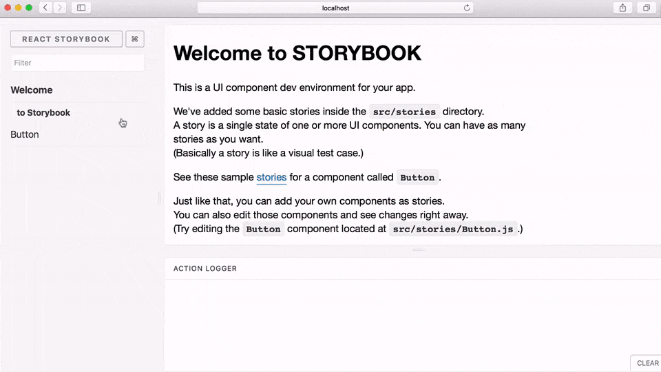
Getting Started with Storybook#
Storybook is a development environment for React UI components. It allows you to browse a component library, view the different states of each component, and interactively develop and test components.
Run the following command inside your app’s directory:
After that, follow the instructions on the screen.
Learn more about React Storybook:
Snapshot Testing UI with Storybook + addon/storyshot
Getting Started with Styleguidist#
Styleguidist combines a style guide, where all your components are presented on a single page with their props documentation and usage examples, with an environment for developing components in isolation, similar to Storybook. In Styleguidist you write examples in Markdown, where each code snippet is rendered as a live editable playground.
First, install Styleguidist:
Alternatively you may use yarn:
Then, add these scripts to your package.json:
Then, run the following command inside your app’s directory:
After that, follow the instructions on the screen.
Learn more about React Styleguidist:
Using HTTPS in Developmentset HTTPS=true&&npm start($env:HTTPS = "true") -and (npm start)HTTPS=true npm startHTTPS=true SSL_CRT_FILE=cert.crt SSL_KEY_FILE=cert.key npm startCopy{ "start": "HTTPS=true react-scripts start"}
Note: this feature is available with react-scripts@0.4.0 and higher.
You may require the dev server to serve pages over HTTPS. One particular case where this could be useful is when using the "proxy" feature to proxy requests to an API server when that API server is itself serving HTTPS.
To do this, set the HTTPS environment variable to true, then start the dev server as usual with npm start:
Windows (cmd.exe)#
(Note: the lack of whitespace is intentional.)
Windows (Powershell)#
Linux, macOS (Bash)#
Note that the server will use a self-signed certificate, so your web browser will almost definitely display a warning upon accessing the page.
Custom SSL certificate#
To set a custom certificate, set the SSL_CRT_FILE and SSL_KEY_FILE environment variables to the path of the certificate and key files in the same way you do for HTTPS above. Note that you will also need to set HTTPS=true.
Linux, macOS (Bash)#
To avoid having to set the environment variable each time, you can either include in the npm start script like so:
Or you can create a .env file with HTTPS=true set. Learn more about environment variables in CRA.
Adding a Stylesheet.Button { padding: 20px;}import React, { Component } from 'react';import './Button.css'; // Tell webpack that Button.js uses these stylesclass Button extends Component { render() { // You can use them as regular CSS styles return <div className="Button" />; }}
This project setup uses webpack for handling all assets. webpack offers a custom way of “extending” the concept of import beyond JavaScript. To express that a JavaScript file depends on a CSS file, you need to import the CSS from the JavaScript file:
Button.css#
Button.js#
This is not required for React but many people find this feature convenient. You can read about the benefits of this approach here. However you should be aware that this makes your code less portable to other build tools and environments than webpack.
In development, expressing dependencies this way allows your styles to be reloaded on the fly as you edit them. In production, all CSS files will be concatenated into a single minified .css file in the build output.
If you are concerned about using webpack-specific semantics, you can put all your CSS right into src/index.css. It would still be imported from src/index.js, but you could always remove that import if you later migrate to a different build tool.
Adding Images, Fonts, and Files_import_ React from 'react';import logo from './logo.png'; // Tell webpack this JS file uses this image_console.log(logo); // /logo.84287d09.pngfunction Header() { // Import result is the URL of your image _return <img src={logo} alt="Logo" />;}export default Header;.Logo { background-image: url(./logo.png);}import { ReactComponent as Logo } from './logo.svg';function App() { return ( <div> {/* Logo is an actual React component */} <Logo /> </div> );}
With webpack, using static assets like images and fonts works similarly to CSS.
You can import a file right in a JavaScript module. This tells webpack to include that file in the bundle. Unlike CSS imports, importing a file gives you a string value. This value is the final path you can reference in your code, e.g. as the src attribute of an image or the href of a link to a PDF.
To reduce the number of requests to the server, importing images that are less than 10,000 bytes returns a data URI instead of a path. This applies to the following file extensions: bmp, gif, jpg, jpeg, and png. SVG files are excluded due to #1153. You can control the 10,000 byte threshold by setting the IMAGE_INLINE_SIZE_LIMIT environment variable as documented in our advanced configuration.
Here is an example:
This ensures that when the project is built, webpack will correctly move the images into the build folder, and provide us with correct paths.
This works in CSS too:
webpack finds all relative module references in CSS (they start with ./) and replaces them with the final paths from the compiled bundle. If you make a typo or accidentally delete an important file, you will see a compilation error, like when you import a non-existent JavaScript module. The final filenames in the compiled bundle are generated by webpack from content hashes. If the file content changes in the future, webpack will give it a different name in production so you don’t need to worry about long-term caching of assets.
Please be advised that this is also a custom feature of webpack.
It is not required for React but many people enjoy it (and React Native uses a similar mechanism for images).
An alternative way of handling static assets is described in the next section.
Adding SVGs#
Note: this feature is available with react-scripts@2.0.0 and higher, and react@16.3.0 and higher.
One way to add SVG files was described in the section above. You can also import SVGs directly as React components. You can use either of the two approaches. In your code it would look like this:
This is handy if you don't want to load SVG as a separate file. Don't forget the curly braces in the import! The ReactComponent import name is significant and tells Create React App that you want a React component that renders an SVG, rather than its filename.
Tip: The imported SVG React Component accepts a title prop along with other props that a svg element accepts. Use this prop to add an accessible title to your svg component.
My (now) Depreciated Blog: https://web-dev-resource-hub.netlify.app/[Git](https://github.com/bgoonz)[tools](https://preview--alternate-blog-theme-8d58b.stackbit.dev/posts/react/?edit=1&stackbit=false#)
Last updated