
More Notes
Before you Start
Who can use this feature
Users with View or edit access to a File can select objects in the Canvas or Layers Panel
Before you can update any properties associated with an object or layer, you will need to select it. We'll cover all the basics for selecting objects, as well as some lesser known tips and tricks.
You can select layers in the canvas itself, or from the Layers Panel. Click on an object in the canvas to select it.

Select nested layers
If you're working on more complex designs, you may have objects nested within groups or frames.
We refer to nested objects as children, and the Frames or Groups that they nest within as parents. Learn more about parent, child and sibling relationships.
When you click on an object that is part of a group or frame, we'll select the parent by default.
Double-click on the object - or press the enter key - to select one level of nesting down. Repeat this process until you select the correct child elements.
Deep Select
If there are many levels of nesting, you can use Deep select to select a nested child layer. Hold down the modifier key to select a nested layer or object.
macOS: ⌘
Windows: Ctrl
We have a couple of different ways to select nested objects. The Select Layer menu allows you to choose which specific you'd like to select, in the canvas.
Right-click to open the context menu:
Hover over the Select layer option.
Select a layer from a list of layers underneath the cursor's location. We show the layer name and icon in the same order as the Layers panel.
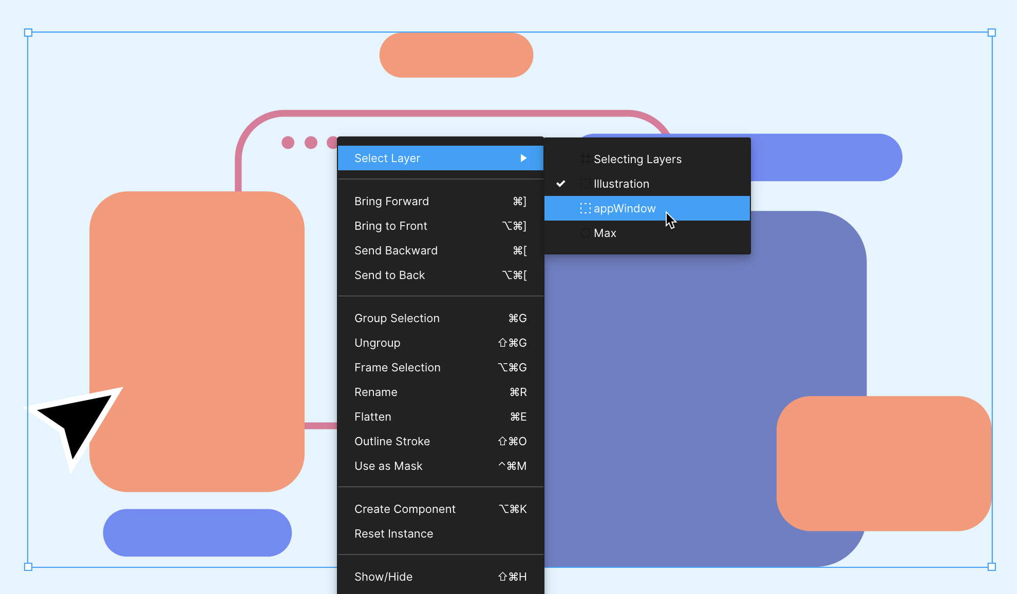
Tip! Move between nested objects using the keyboard shortcuts:
Select Child enter
Select Parent shift enter
Select Next Sibling tab
Select Previous Sibling shift tab
Layers Panel
Every object in the canvas will have a corresponding layer in the Layers Panel.
Click the Layers tab in the left sidebar to open the layers panel. Or, use the keyboard shortcut:
MacOS: Option 1
Windows: Ctrl 1
If you hover over the layer in the panel, a blue box will highlight that layer's location on the Canvas.
Click on the layer name in the layers panel to select it.
If there are any Frames or Groups on the canvas, we will nest the child objects within the parent. Click the arrow next to a Frame, Group, or Component to view any child layers.
Can't see the layer highlight on hover? Adjust your preferences in the menu: select Preferences > Highlight on hover.
You can also select more than one object or layer at a time.
This is great when you want to:
Update a property across more than one layer
Resize layers in bulk
Move a collection of objects
Create a Group, Frame, or Component from the selection
Note: When you select more than one layer, you can access Selection Colors in the Properties Panel.
This allows you to update individual Fills, Styles and Strokes in a mixed selection. Learn more in our View and adjust colors in a mixed selection article.
Canvas
Select an object in the Canvas.
Hold down the Shift key and click on another object.
This will allow you to select as many objects as you like.
Tip! Click an object a second time while holding Shift to remove it from from the current selection.
Selection marquee
The marquee tool allows you to select all objects in a specific area of the canvas.
Click and hold on a empty part of the canvas.
Drag the cursor across any objects you'd like to select.
A blue box will appear around each object are in the selection.
To select nested layers, hold down the modifier key and drag the marquee across the objects:
Mac: ⌘
Windows: Ctrl
To remove an object from the selection, hold down the Shift key and click on the object.

Note: It's possible to select nested objects without selecting the parent object. This is something to be mindful of, especially when selecting objects to move them!
When you select a parent object, this also selects any child objects. This allows you to move everything at once.
Select multiple layers in the Layers Panel
When you select layers in the Layers Panel, there are some different rules:
To select every layers between two layers:
Click on the first layer to select
Hold down the Shift key
Select the last layer.
Figma will select every layer between those two layers in the Layers Panel.
To select individual layers:
Click on the first layer to select
Hold down the modifier key
MacOS: ⌘
Windows: Ctrl (Windows)
Select any other layers you want to select
The Edit menu allows to select multiple objects based on their properties. This allows you to select all layers in your file that have the same properties.
This is super handy when you want to adjust the properties of all those layers at once.
Select a layer or layers in the
Go to the File menu ☰ and select Edit from the options.
Choose to Select All other layers that have the same:
Properties
Fill
Stroke
Effect
Text Properties
Font
or another Instance

Want to select everything on the canvas? Use the keyboard shortcut: macOS: ⌘ A Windows: Ctrl A
If you hide a layer we won't show in the Select Layer menu. You will need to toggle visibility on to select it.
If you lock an object or layer, you can't select it via the normal left-click selection process. However, you can select it via the Select Layer process.
We include locked layers in the Select Layer menu with a padlock icon.
Tip! Smart Selection allows you to select 2 or more objects in the canvas. From there you can adjust their arrangement, or the spacing between them.
Create a 1D Smart Selection from a list of objects that align on one axis, like a column or row. Or, a 2D Smart Selection of objects in a grid or gallery-like structure.
To clear your selection entirely:
Click anywhere on the canvas
Use the keyboard shortcut: Esc
To remove an object from a selection:
Hold down the Shift key and click on the object again
Note: If you click on a parent object, this will deselect the parent and any child objects within it.
To select the inverse of your current selection:
Use the keyboard shortcut:
macOS: ⌘ A Shift
Windows: Ctrl A Shift
This removes the current selection, then selects everything on the canvas you didn't select before.
There are a few ways to select objects in a file, but for collaborators with can view access, the experience is a bit different.
When you make your selection in the canvas, Figma will:
Outline your selection using a solid purple box.
Outline the parent of your current selection using a dashed purple box.
Show the name of the selected layer(s) at the top of the Inspect panel in the right sidebar.
Show the Parent Component underneath the selected layer in the Inspect panel. Click the in the Inspect panel to select the parent component.
 Before you start
Who can use this feature
Anyone with can view access can copy objects in a file
Anyone with can edit access can paste objects in a file
When you copy and paste an object in your canvas, Figma considers your intended placement of the object while keeping you aware of your location and view of the canvas.
Paste placement
Pasted objects try to maintain the same x and y positions within the destination frame relative to its position in the group or frame it was copied from. If the destination group or frame can't accommodate either of the object's x or y position in its previous container, Figma will paste the object in the center of the new frame.
In the example below, Frame 1 contains a purple ellipse, red star, and green square located at the top left, bottom left, and bottom right corners respectively.
When we copy the objects from Frame 1 to Frame 2:
the purple ellipse keeps its original position because both its
xandycoordinates can be matched in Frame 2the red star can only be matched with its original
xcoordinate and is centered on theyaxisthe green square is centered on both axes because neither its original coordinates can be accommodated in Frame 2.

When we copy the objects from Frame 1 to Frame 3 below:
the purple ellipse keeps its original position because both its
xandycoordinates can be matched in Frame 3the red star keeps its original position because both its
xandycoordinates can be matched in Frame 3the green square is centered along the
xaxis because it can only be matched to itsycoordinate in Frame 1.

Canvas view
If you have a frame selected while pasting a copied object, Figma considers your current view of the canvas to determine where to paste the object and whether to adjust your viewing area.
If your current view of the canvas is far from the selected frame, Figma will paste the object in the center of your current view to avoid moving you too far from your intended paste area or disorienting you within the canvas.
If the selected frame is just outside your current view, Figma will paste the object into the selected frame and adjust your viewing area slightly to bring the pasted object into view.
If the object being pasted is larger than your current view of the canvas, Figma will adjust your view's zoom level so you can see the full pasted object.
If the object is being pasted into a selected frame larger than your view of the canvas, Figma will place it inside the frame in a centered position to keep you within your viewing area.
Note: Figma considers an area 50% larger than your current view of the canvas to determine whether to adjust your view after pasting an object. If your pasted object is placed within that area, Figma will adjust your view. Otherwise, Figma will paste your object on the canvas, centered to your current view, and adjust your zoom level to depending on the object's size.
Paste to replace
Use the Paste to replace function to remove a selected object from your canvas or frame and replace it with the object copied to your clipboard. This is useful when you want to replace placeholder items in a frame or populate low fidelity wireframes with assets.

Select and copy an object using the keyboard shortcut:
Mac: ⌘ CommandC
Windows: Control+C
Select the objects you'd like to replace with the copied object.
Right-click your selection and click Paste to replace from the menu. You can also use the keyboard shortcut:
Mac:⌘ Command⌥ Option⇧ ShiftV
Windows: Control+Alt+Shift+V
Paste over selection
The Paste over selection option will place a copied object on top of a selected frame, not inside it. The pasted object will match the x, y position of the selected object.
Select and copy an object using the keyboard shortcut:
Mac: ⌘ CommandC
Windows: Control+C
Select the frame you want to paste the copied object on top of.
Click to open the file menu > Edit > Paste over selection. You can also use the keyboard shortcut:
Mac: ⌘ Command⇧ ShiftV
Windows: Control+Shift+V
Multi-paste
Multi-paste is useful when you want to add an object to multiple frames at the same time. For example, adding a navigation bar to multiple mobile wireframes or a footer to slides in a presentation deck.

Select and copy an object using the keyboard shortcut:
Mac: ⌘ CommandC
Windows: Control+C
Select the frames you want to paste your copied object to.
Paste the object using the keyboard shortcut:
Mac: ⌘ CommandV
Windows: Control+V
Paste here
The Paste here option lets you choose the exact placement for a pasted object. The object is placed in the location of your cursor on the canvas or in a frame.

Select and copy an object using the keyboard shortcut:
Mac: ⌘ CommandC
Windows: Control+C
Position your cursor where you want the top left of your copied object to be placed.
Right-click and select Paste here.
Note: When you use Paste here with an auto layout frame, the object will be pasted on top of the frame, not inside it.
Paste to clipped frames
Copy pasting objects that are inside a frame, but visually outside the frame bounds will honor the outside position whether the destination frame is clipped or not.
This is handy for placing objects outside of the frame that will be animated into or out of a frame in a prototype with smart animate.
Copy as PNG
You can copy a selected object as a PNG image to your clipboard to paste inside Figma or other applications. Images created using Copy as PNG will default to a 2× size image output.
Select an object.
Right-click the object and select Copy as PNG. You can also use the keyboard shortcut:
Mac: ⌘ Command⇧ShiftC
Windows: Control+Shift+C
Paste the image using the keyboard shortcut:
Mac: ⌘ Command⇧ShiftV
Windows: Control+Shift+V
Copy and paste image fills
Images in Figma behave as fills that can be layered and applied to shapes objects. You can select an image fill on a shape and copy paste it onto another shape.
In the Fill section of the right sidebar, select the area just to the left of the image preview.
Copy the fill using the keyboard shortcut:
Mac: ⌘ CommandC
Windows: Control+C
Select the shape you want to add the copied fill to.
Paste the copied image using the keyboard shortcut:
Mac: ⌘ CommandV
Windows: Control+V
Learn more about how copy and paste works in our playground file →Before you start
Who can use this feature
Users with can edit access to a file can apply and adjust text properties.
Text is a crucial aspect of interface design. Everything from the placement to font choice, has a part to play.
Text properties allows you to control everything from the appearance and position of text, to resizing behavior and OpenType features.
In this article, we'll take you through all the properties available for text. As there are a number of properties available we've grouped them by location.
Apply and adjust text properties in the Text section of the properties panel.
Use the annotated image below to identify each property in the properties panel. Click the link to learn more about each property.
Click the icon to view, create and apply Text Styles
Click the arrow to browse a list of web, local and shared fonts to find a typeface or font family
Use the arrow to select a font style or weight
Use the arrow to adjust the size of your text
Adjust the vertical distance between lines of text using the line height field.
Adjust the horizontal distance between letters with letter spacing
Adjust the vertical distance between paragraphs with paragraph spacing.
Select how text overflows or wraps with resizing behavior.
Adjust the horizontal alignment of text within the text box.
Adjust the vertical alignment of text within the text box.
Click to open the type details menu and explore more text properties.

Font family
There are a few terms associated with a font:
A typeface is a set of letterforms and glyphs with similar design features.
A font is a file containing the visual details that make up the design of each glyph or letter in that typeface.
A font family is the collection of styles that make up a typeface.For example: Helvetica, Times New Roman and Roboto are all font families.
Figma will use Roboto as the default font for new text layers. You can select another font family using the font picker. Click the arrow to explore styles for thee selected font.
Font weight
A typeface can have any number of styles or weights. Every font family will come with its own selection of styles. Some of the styles for the Roboto font family are: thin, light, regular, and medium.
You can access weights once you select the font family. Adjust the font weight using the field directly below the font family.
Click the arrow to explore styles for thee selected font.
Use the keyboard shortcuts to increase and decrease the font weight.
Mac: Hold down ⌥ Option ⌘ Command and < to increase or > to decrease.
Windows: Hold down Ctrl Alt and < to increase or > to decrease.
Font size
Font size controls the scale of your text. Figma represents font size in density-independent pixels.
Adjust the font size using the field next to the font style. There are a few ways to adjust font size:
Click the arrow to select a default font size.
Enter your own number in the field.
Use the keyboard shortcuts:
Mac: Hold down Shift ⌘ Command and < to increase or > to decrease.
Windows: Hold down Ctrl Shift and < to increase or > to decrease.
Figma represents text sizes in a few different ways.
If you're translating your designs to code, your screen resolution will determine the actual size of any text. You can view the CSS pixel value (px) of any text in the Inspect panel.
If you're exporting your designs to PDF, Figma will render font size using traditional print points (pt).
Line height
Line height allows you to control the vertical distance between lines of text in a paragraph. This can help to balance designs and improve readability of your copy. This is the same as line spacing.
Small line heights can make text difficult to read. Large line heights can make text look messy and disjointed.
Use the field to adjust the vertical space between lines of text, or use the keyboard shortcuts:
Mac: Hold down ⇧ Shift ⌥ Option and < to increase or > to decrease.
Windows: Hold down Alt Shift and < to increase or > to decrease.
Figma allows you to set a fixed line height in pixels (px) or a line height that's a percentage of the font size (%).
Figma uses a font's intrinsic line height as the default value(Auto), which varies between typefaces. You can switch between fixed and percentage line heights and Figma will convert the value for you, to the nearest pixel.
Translating line height: The Inspect panel allows you to view your designs as code. Each platform has a different way of representing line height.
Figma includes the appropriate values and measurements for each platform, as well as alternative units of measurement.
Letter spacing
Letter spacing lets you define the space between characters in a word, line, or paragraph. This can determine how easy your text is to read.
This is not to be confused with kerning, which refers to the process of adjusting space between individual characters in a typeface.
Adjust the letter spacing for an entire text layer, or a selection of text. To replicate kerning, place the cursor between two letters and adjust the letter spacing.
Use the field to adjust letter spacing for your selection, or use the keyboard shortcuts:
Mac: Hold down ⌥ Option and < to increase or > to decrease.
Windows: Hold down Alt and < to increase or > to decrease.
If you select text with different letter spacing values, Figma will scale the letter spacing proportionally.
Tip! Tracking describes the letter spacing process in pre-digital systems and is usually represented in pixels (px). Use this formula to convert tracking to letter spacing: 1000px tracking = 100% letter spacing = 1em letter-spacing (CSS)
Paragraph spacing
Paragraph spacing lets you control the distance between paragraphs. This can increase or reduce the whitespace around text in your design. White space can help to focus the viewer's attention, as well as increase legibility and readability.
Figma represents paragraph in pixels (px). Enter a px value in the paragraph spacing field. Or hover above the icon and drag to decrease (left) or increase (right) the value.
Note: Figma will create a new paragraph when you use the Enter or Return keys. This is something to bear in mind if your text resizing is set to Auto Width.
List spacing
List spacing lets you control the distance between each line item in a bulleted or numbered list. By default, list spacing is set to 0 when creating a new list and for any existing text styles. Figma represents list spacing in pixels (px).
To adjust list item spacing:
Select text in a list or a text layer with only list text.
Use the field to enter a px value. Or hover above the icon and drag to decrease (left) or increase (right) the value.
You can also adjust list spacing from the Type details panel by clicking in the Text section of the right sidebar.
Learn more about creating bulleted or numbered lists →
Resizing
The resizing property controls how a text layer shrinks or grows to accommodate its contents. There are three settings available:
Auto Width: The width of the text layer will grow so that all the content fits within the layer's bounds. Figma will create new lines of text when you use the Return or Enter key.
Auto Height: The height of the text layer will grow to fit its contents. Figma will wrap any lines that extend beyond the original width of the text layer to a new line.
Fixed Size: Both the width and height of the text layer will stay the same, regardless of the layer's contents. Figma will wrap any additional text that extends beyond the layer's horizontal bounds. Text can still extend beyond the text layer's vertical bounds without clipping. This can make aligning this with other layers difficult.
Note: When you click in the canvas to create a text layer, Figma uses Auto Width. If you click and drag in the canvas, Figma will use Fixed Size. If you adjust the size of a text layer after it is created, Figma updates the resizing to Fixed Size.
Horizontal alignment
Alignment determines how we distribute text within its bounding box. Horizontal alignment defines how you align the text along the x axis (horizontal).
Left-aligned text is commonly used for paragraph text. Whereas center-aligned text is often used for shorter lines of text, like headings.
Use the icons to select the horizontal alignment. Choose from:
Left
Center
Right
Justify*
Justify aligns the first word in each line of text to the left-most edge, and the last to the right-most edge. Figma spaces each word in a line of justified text uniformly.
Vertical alignment
Alignment determines how we distribute text within its bounding box. Vertical alignment aligns text along the y axis (vertical).
Use the alignment icons to select a vertical alignment. Choose from:
Top
Middle
Bottom
Note: It's only possible to vertically align text in text layers with a Fixed Size. Layers with resizing set to Auto Width or Auto Height will ignore alignment.
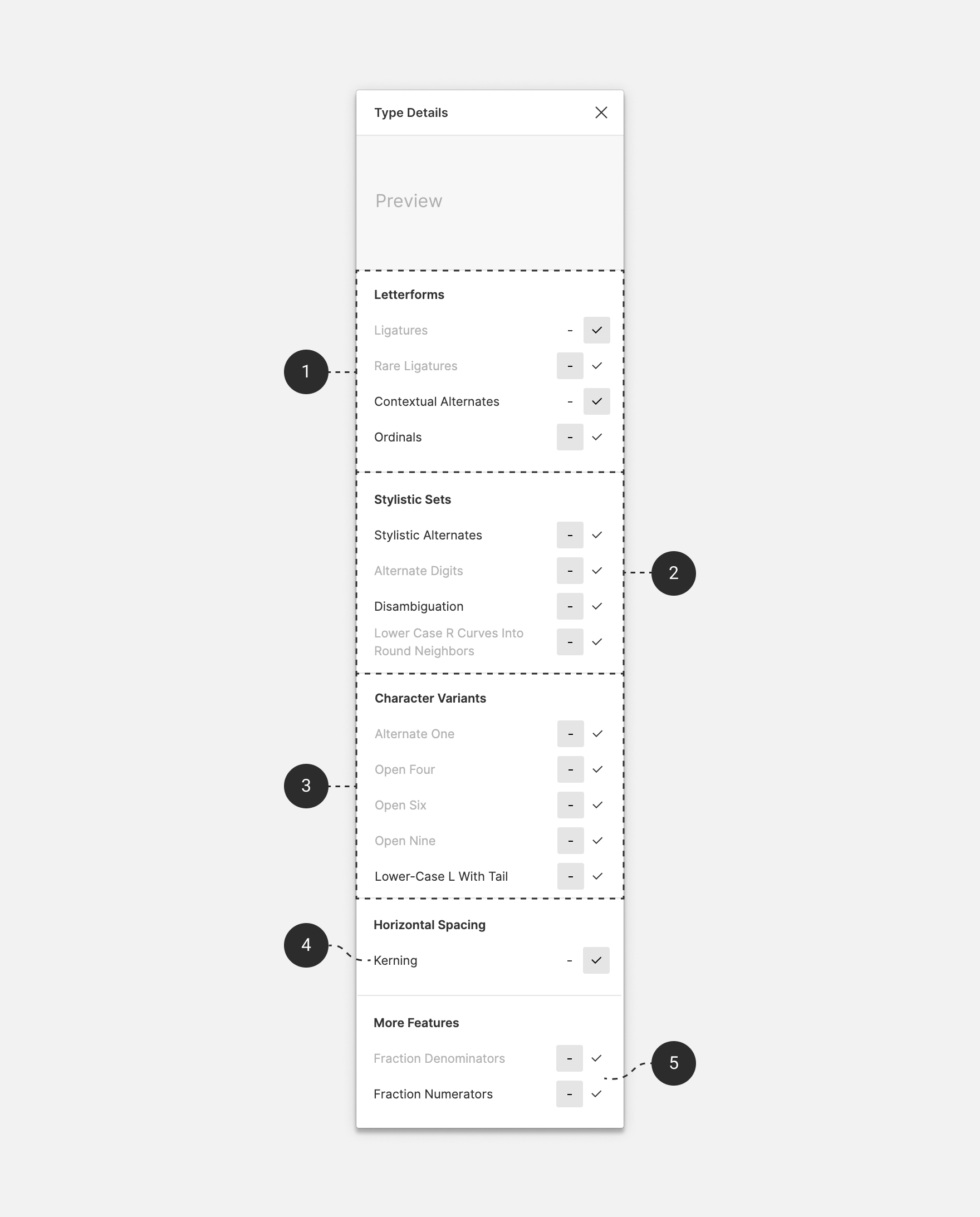
The Type Details Panel gives you access to some extra Text properties. You can also access any OpenType features from this panel.
To open the Type Details panel, click the three dots in the bottom-right corner of the Text section.
View a preview of any text properties
Adjust the horizontal alignment of text
Apply decoration to text, which includes:
Underline
Strikethrough
Offset the first line of text with paragraph indentation
Adjust the letter case. Choose from Uppercase, Lowercase, Capitalize and Small Caps.
Apply any number settings, including: Style, Position, Fractions and any related OpenType features.
Access any OpenType features.
Click to close the Type Details panel.

Preview
Use the preview at the top of the type details panel to see how a particular property or OpenType feature looks. Hover over any feature or property to see the preview.
Figma will display sample text that best suits the feature you're previewing. This includes:
Blocks of text for alignment, spacing and indentation.
Numerals for any number properties.
Letters (or combinations of letters) affected by ligatures or stylistic alternatives.
Decoration
Apply text decoration to an entire text layer, or to selected text. You have two types of decoration available:
Strikethrough
Strikethrough adds a horizontal line through the center of your text.
Use strikethrough to indicate obsolete or inaccurate information. This allows you to convey its state, without redacting or obscuring the original text.
Click the icon to apply strikethrough to selected text.
Underline
Underline adds a horizontal line along the baseline of your text. Use underline to place emphasis on a particular section of the text, or show that it includes a link.
Underlining links is considered good practice in web design. If applied consistently, this can help to improve the accessibility of your design.
Click the icon to apply underline to selected text.
Tip! Apply an underline to selected text using the keyboard shortcut:
Mac: Option U
Windows: Ctrl U
Paragraph indentation
Paragraph indentation offsets the text in the first line to the right. You can only apply Paragraph indentation to text that uses Text-Align Left.
A good rule of thumb is to avoid indentations greater than 4 x the font size. We also recommend taking the width of the text layer into account - the wider the layer, the larger the indentation.
Figma represents paragraph indentation as a pixel (px) value. Use the Paragraph Indent field to adjust paragraph indentation.
Tip! Paragraph indentation applies to all paragraphs in a text layer. If you wish to indent a single paragraph, you will need to create a separate text layer for it.
Letter case
Letter case allows you to change the case of selected text. This is super handy when you want to switch between cases without having to delete and retype your text. Choose from:
Uppercase: transforms text to
UPPER CASELowercase: transforms your text to
lower caseCapitalize: transforms the first character of every word to upper case. You may know this as
Title caseSmall Caps : transform text into
Small Caps. This displays uppercase letters inline with lowercase letters. While this looks like an UPPERCASE transformation, it's a little different. Small Caps characters usually have different proportions (e.g. weight, aspect ratio).
Number
The number section includes any properties or features for numerical figures. The properties in this section will depend on the font family you are using.
Change the figure Style options including: Proportional or Tabular Lining; and Proportional or Tabular Old Style.
Offset numbers as subscript or superscript
Create fractions from numbers. Enter a fraction as
X/X
OpenType can refer to a format, or a set of features or functions available in a font. In this article, we're referring to OpenType features.
Figma supports OpenType features across all fonts. Not all fonts support the same OpenType features.
Typeface creator's have full control over which OpenType features they support. They could be popular features - like kerning, case or numerical figures. Or, custom features like alternative characters or glyphs, and stylistic alternatives.
OpenType features vary between fonts, so we won't post a list of possible features.
Instead, we'll show you how to use the Type details panel. This will allow you to explore and interpret a font's available OpenType features.
Explore OpenType features from the Type Details panel.
We display any OpenType features that the font supports below the Numbers setting.
We will grey out the OpenType feature if a font does not support it.
Hover over a feature's button to view a preview of the feature.
We group OpenType features accordingly:
Letterforms including:
Ligatures
Rare Ligatures
Contextual Alternates
Ordinals
Stylistic Sets
ssxxvary greatly - in name and availability - between fonts. A font can support up to 20 stylistic sets. Some examples include:Stylistic Alternates
Alternate Digits
Disambiguation
Lower case R curves into rounded neighbors
Character Variants
cvxxvary greatly - in name and availability - between fonts. These are at the discretion of the typeface creator. They could include the following types of variations:Open Four
Closed lower case G
Closed lower case A
Horizontal Spacing like: kerning.
More features like: Fraction denominators and numerators.
You can also apply other properties to text layers.
Fill
Use the Fill property to apply paints to text.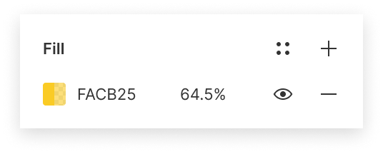
Find the Fill section of the Properties Panel.
Click the Fill thumbnail to open the Color Picker.
You can then:
Select a color from the canvas using the Eyedropper
Explore colors and opacities using the sliders
Select a color from your available Styles, or from the document's colors
Enter a specific HEX or color profile code in the field provided
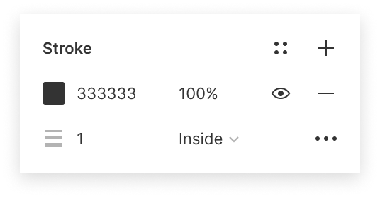
Stroke
Apply stroke properties to text. This will apply a stroke around every character in your selection.
Fill
Weight
Distribution
Cap
Join
Dashes
Miter Angle
Effects
Text layers also support shadow and blur effects.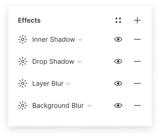
Click the next to the Effects property to add an effect.
Figma will apply Drop Shadow by default. Click the to select another effect:
Drop Shadow
Inner Shadow
Layer Blur
Background Blur
Adjust any settings as desired.When designing for the screen, there are any number of layouts to contend with. To allow our designs to adapt, we need both precision and flexibility.
The pixel grid gives us precision and control over placement. A layout grid gives us greater flexibility in implementing our designs.
Learn more about layout grids
Check out our answers to Frequently asked questions at the bottom of this page.
Learn more about how you can use layout grids in our blog post: Grid Pro Quo.
Layout grids help us to align objects within a frame. They provide visual structure to our designs. They help our designs remain logical and consistent across different platforms and devices. Layout grids aren't reliant on the pixel grid. This means they aren't dependent on a specific resolution or dimensions. You can only apply layout grids to frames. This could be a top-level frame, or a frame nested within another frame. 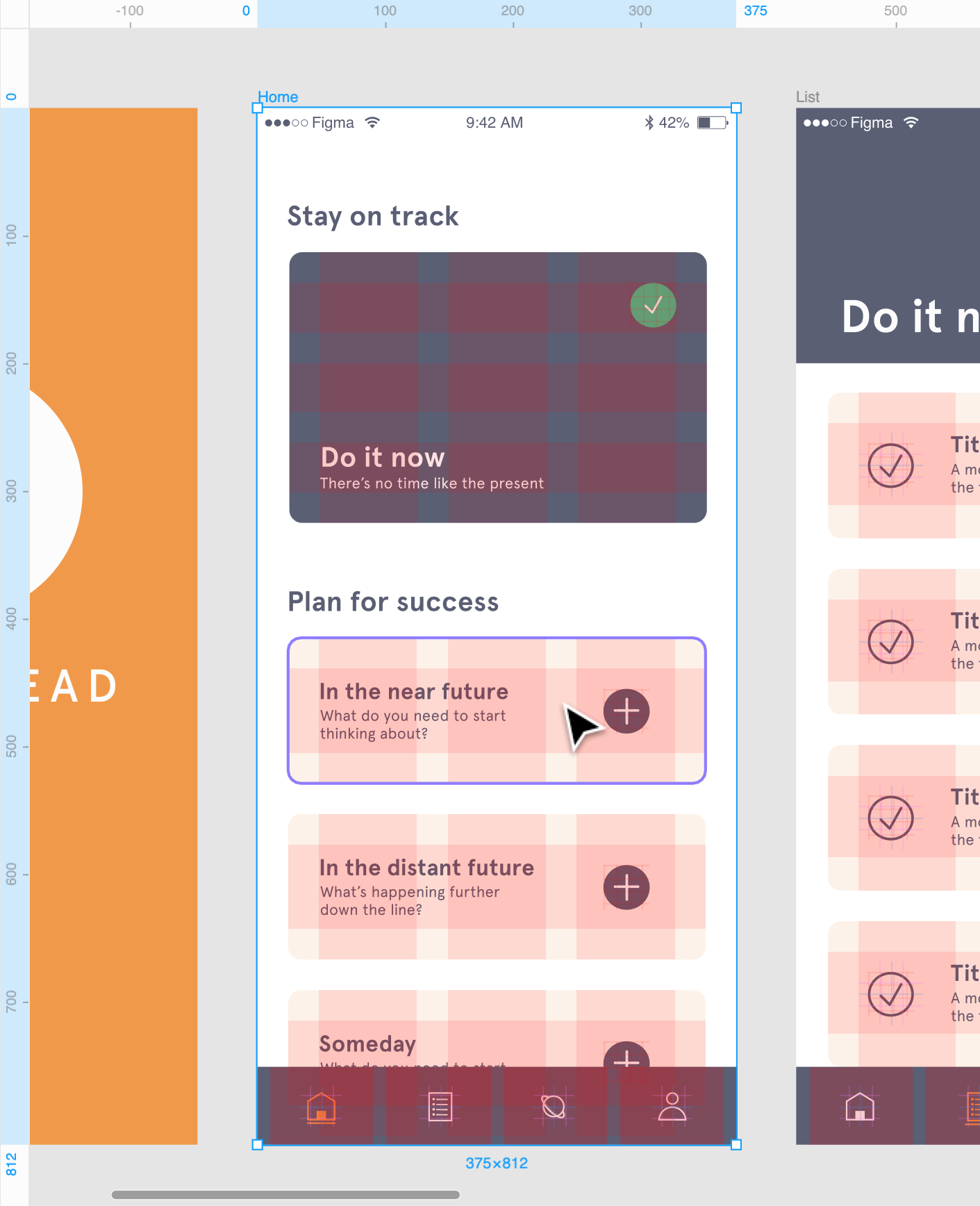 Layout grids let you: - Establish consistency across multiple platforms. - Make fewer decisions when defining layouts. - Reduce the time taken to define layouts for mock-ups or wireframes. - Support diverse layout techniques like galleries, icons, or entire page layouts. You can apply a layout grid to any frame. Remember that components are also frames, so you can apply them to components too. You can find the layout grid settings in the right sidebar: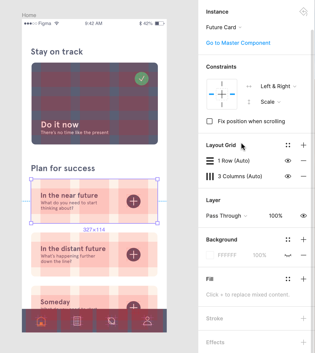 To apply a layout grid: 1. Select the frame in the canvas or the **Layers** panel of the left sidebar:  2. Click next to **Layout grids** in the right sidebar: 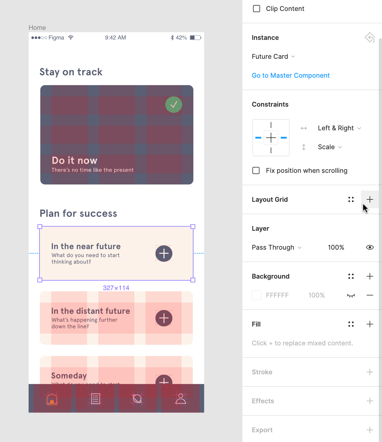 3. A uniform grid will be applied to the frame by default: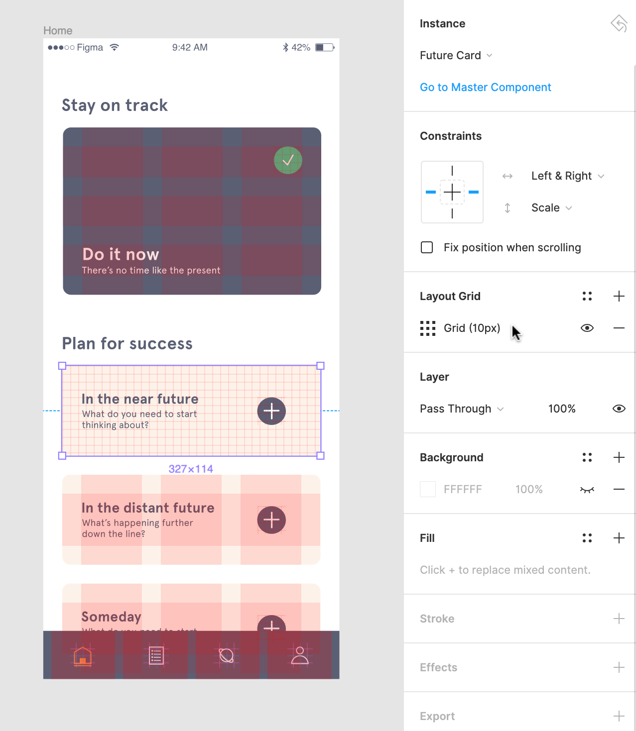 4. You can then click to open the layout grid settings and update any properties: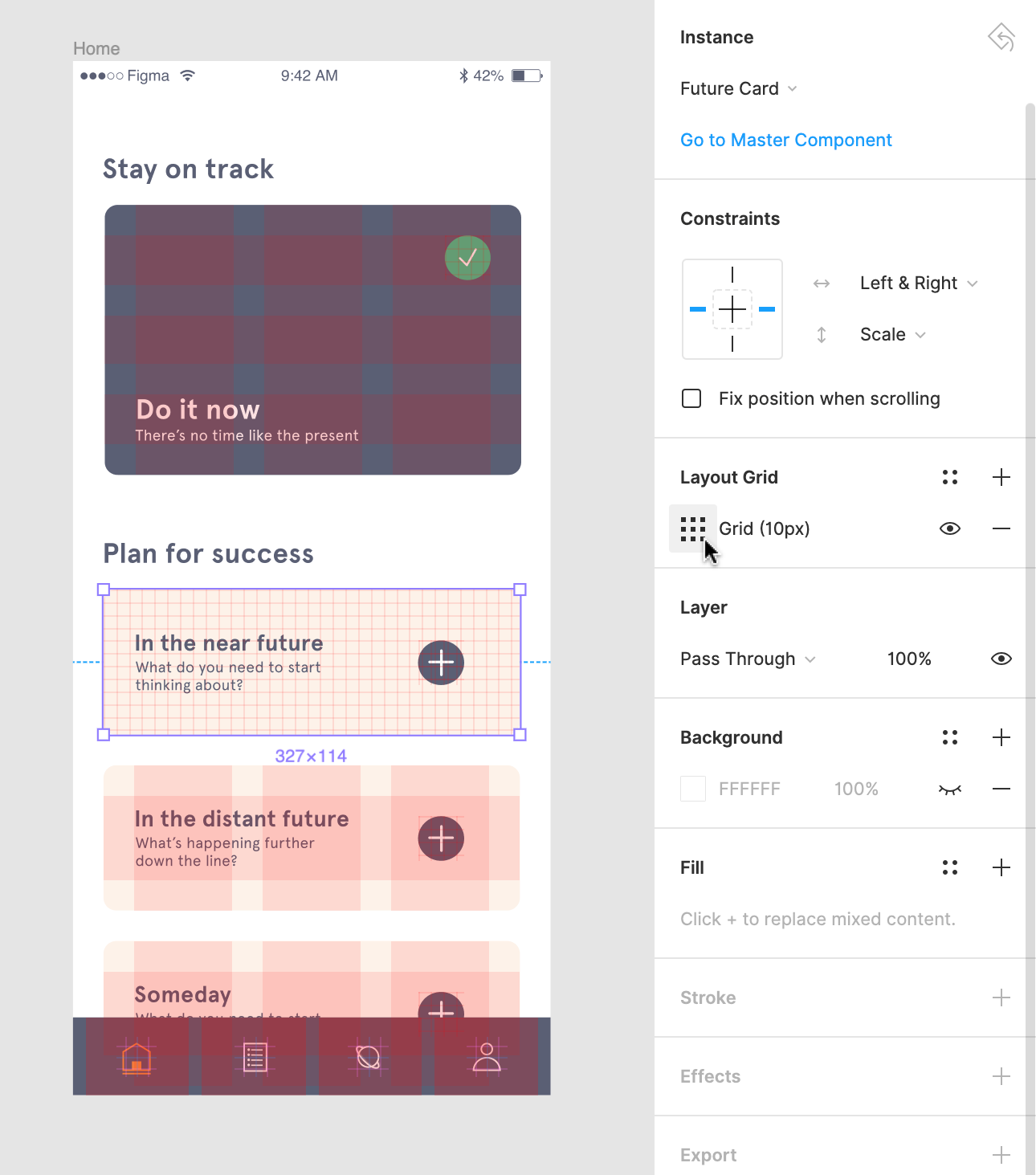 There are three types of layout grids available; a uniform square **Grid**_,_ **Columns**, and **Rows**. Uniform grids let you define both the size and color of the grid. Square grids are great for situations requiring precision, like designing symbols or icons. With column and row grids, you can define the width or height of the grid, as well as your gutter and margins. They are ideal for designing responsive interfaces for web and mobile. You can use grids on their own or combine them to support more complex layouts. **[Learn more about Combining layout grids ↓](https://help.figma.com/article/55-layout-grids#combine)** ## Changing the layout grid To select the grid type: 1. Click in the right sidebar:  2. Click in the layout grid properties window: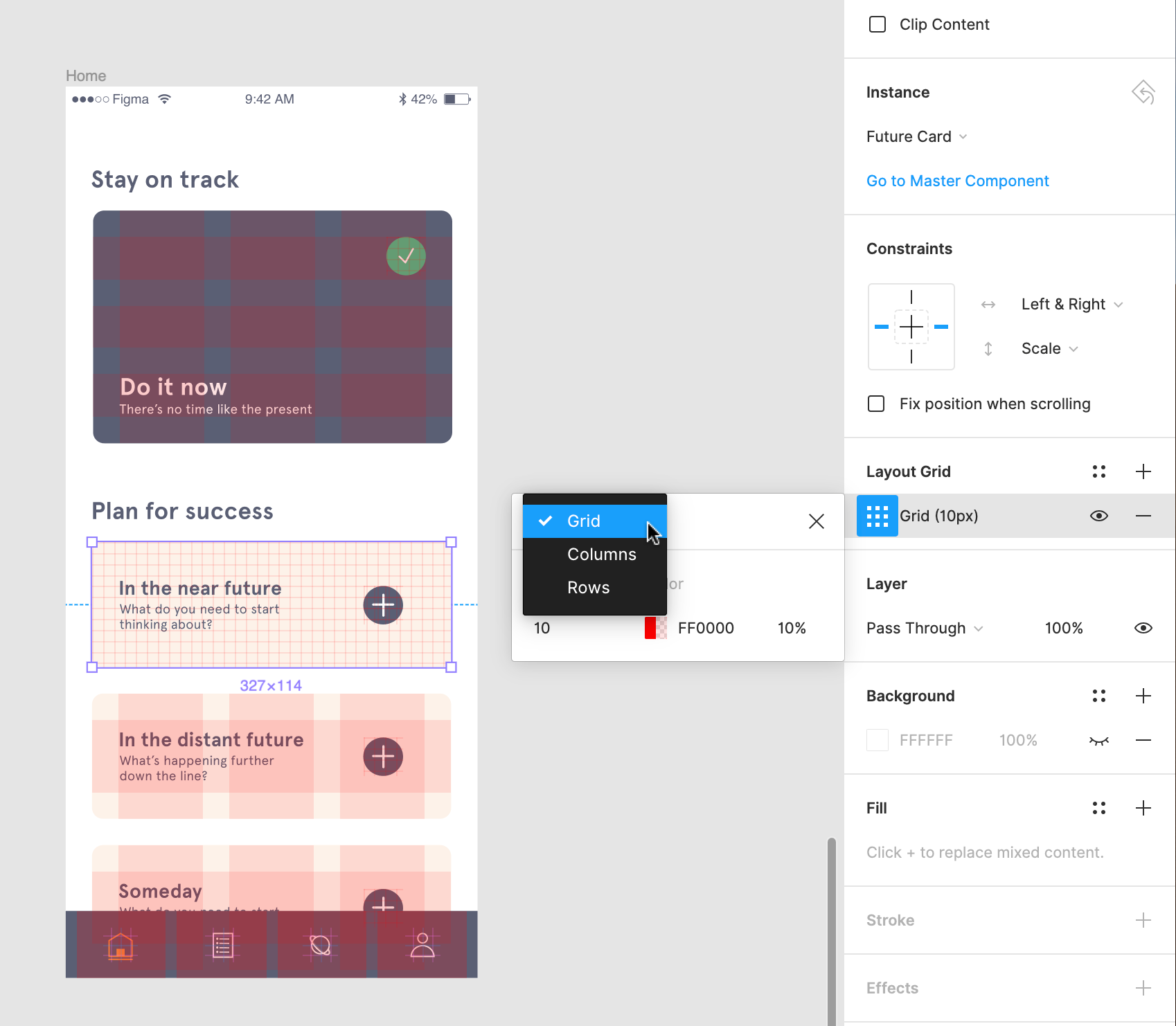 3. You can choose a: - Uniform **Grid** - Grid with **Columns** - Grid with **Rows** ## Uniform grid properties If you select a uniform grid, you can choose the size of the grid. This determines how many pixels each square will contain. For example: In a default **10pt** grid, each square of the grid will contain 100 pixels (10px by 10px). 1. Click to open the layout grid settings. 2. Update the **Size** field to the desired dimensions: 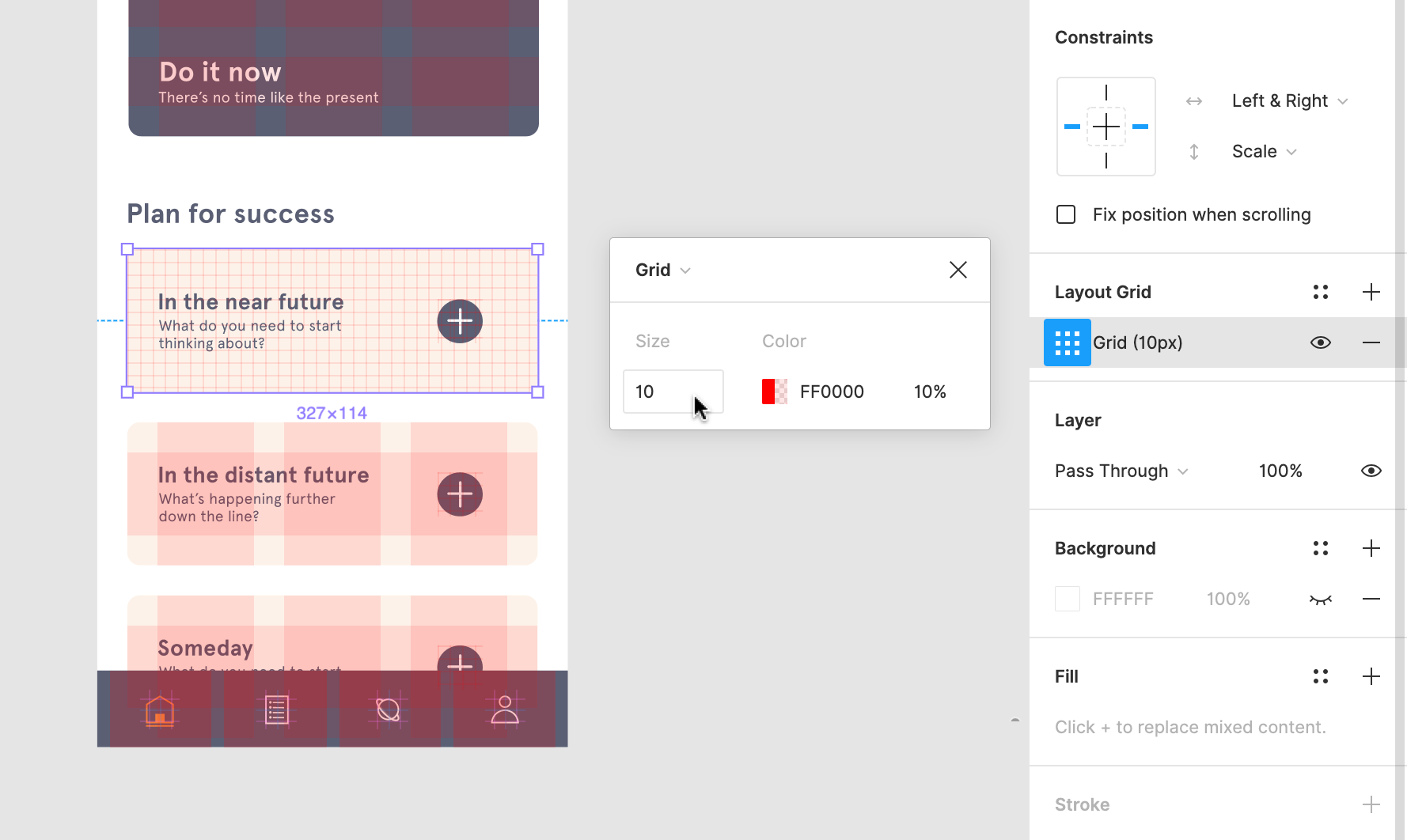 3. Click to close the window and return to the canvas: 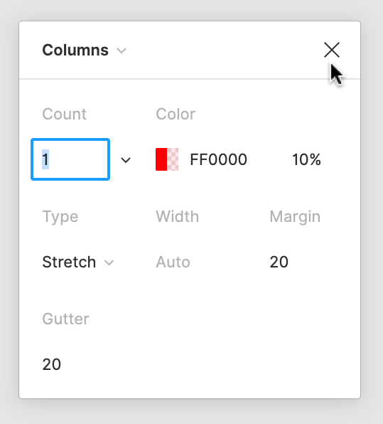 ## Column and row properties You can apply layout grids as columns, rows, or have both. Column and row grids give you greater control and flexibility over your layout. You can define the following properties of your grid: ### Grid properties 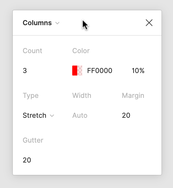 - The **Count** determines how many columns or rows there are in the grid. - The **Gutter** defines the distance between each column or row. - The **Margin** is the distance from the edge that the column or row starts. This applies to **Stretch** grids only. - The **Offset** is the distance from the top or left the column or row starts from. This applies to rows set to top and columns set to left. ### Grid type There are two different types of layout grids: **Fixed** and **Stretchy**. For **Fixed** layout grids, you can determine both the **Width** (of the columns) or **Height** (of the rows), as well as the **Count** (number) of columns or rows. The layout grid can be fixed to: - The **Top** or the **Center** of the frame for **Rows** - The **Left** or the **Center** of the frame for **Columns** 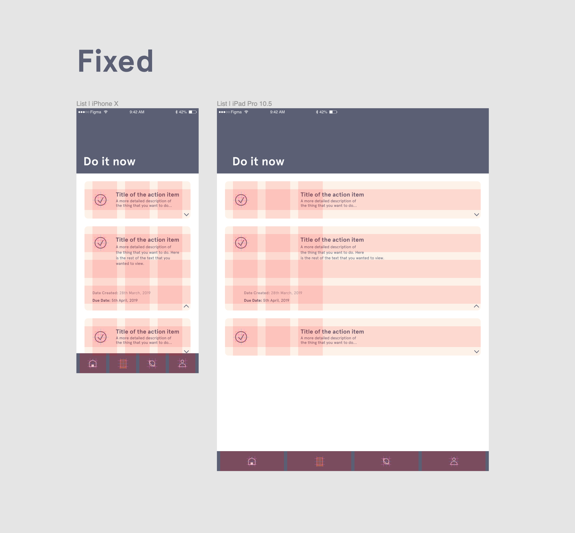 **Stretchy** grids will adapt to the size of the frame. This allows your designs to respond accordingly when the frame is resized. The **Width** or **Height** of the grid will be automatically determined, based on the frame size. 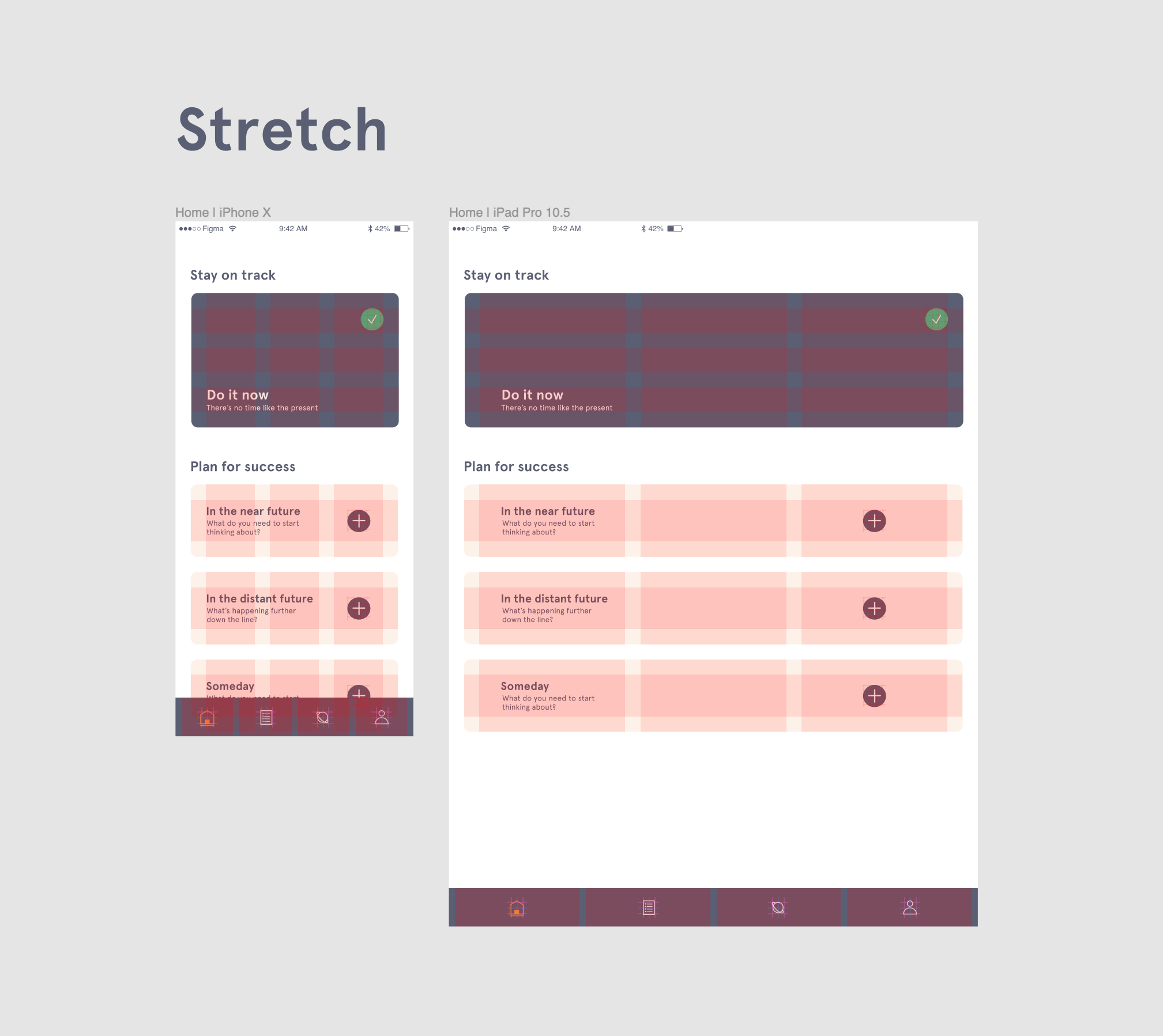 ### Color The default color of a layout grid is red (#FF0000), with an opacity of 10%. You are able to change the **Color** and **Opacity** of any layout grid: 1. Click in the right sidebar. 2. Click on the **Color** swatch: 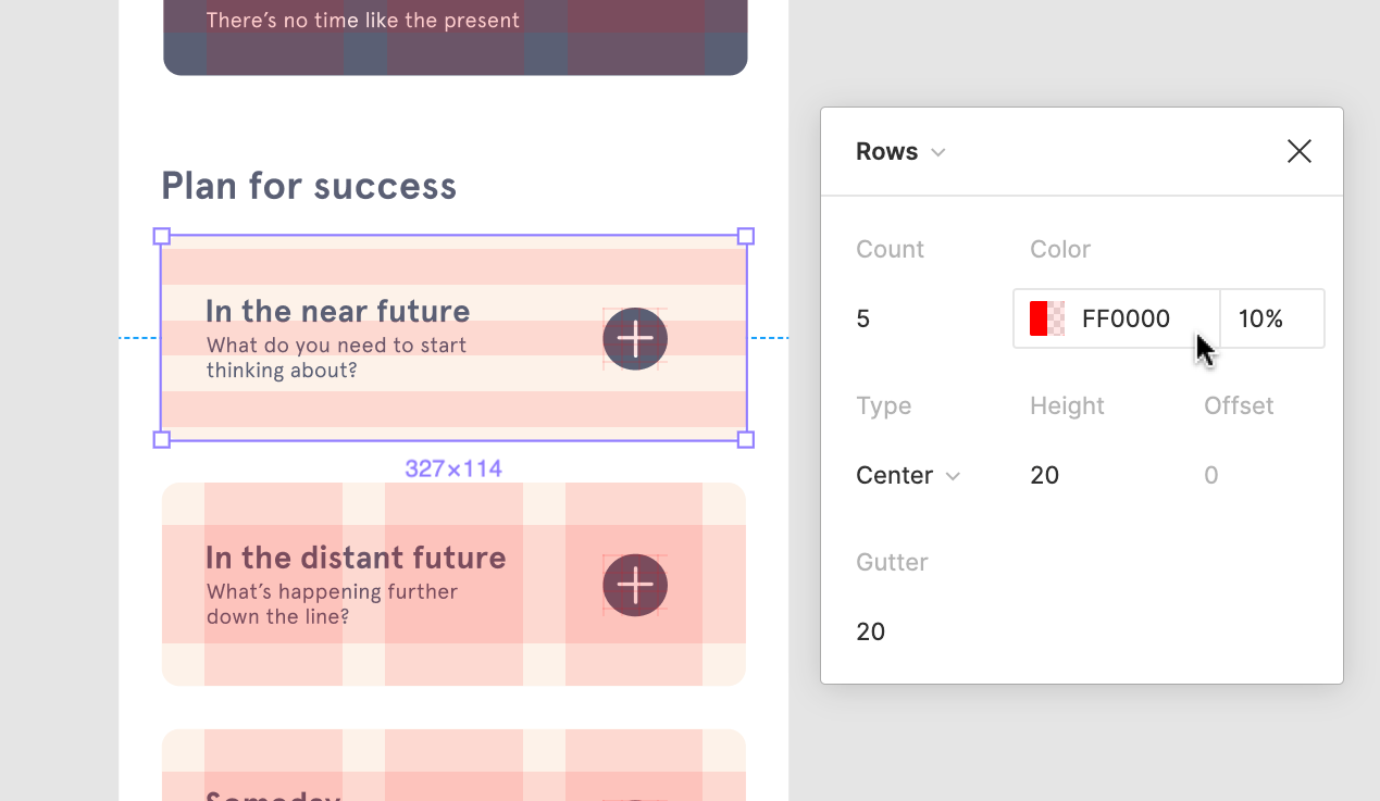 3. Use the color picker to select a new color: 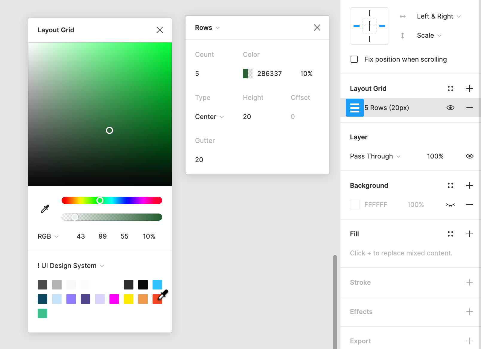 4. Adjust the opacity if needed. ## Combine layout grids As we mentioned above, you can apply many layout grids to a single frame. This is handy when developing more complex Layouts. For example: You can apply both **Column** and **Row** layout grids for more control over vertical and horizontal alignment._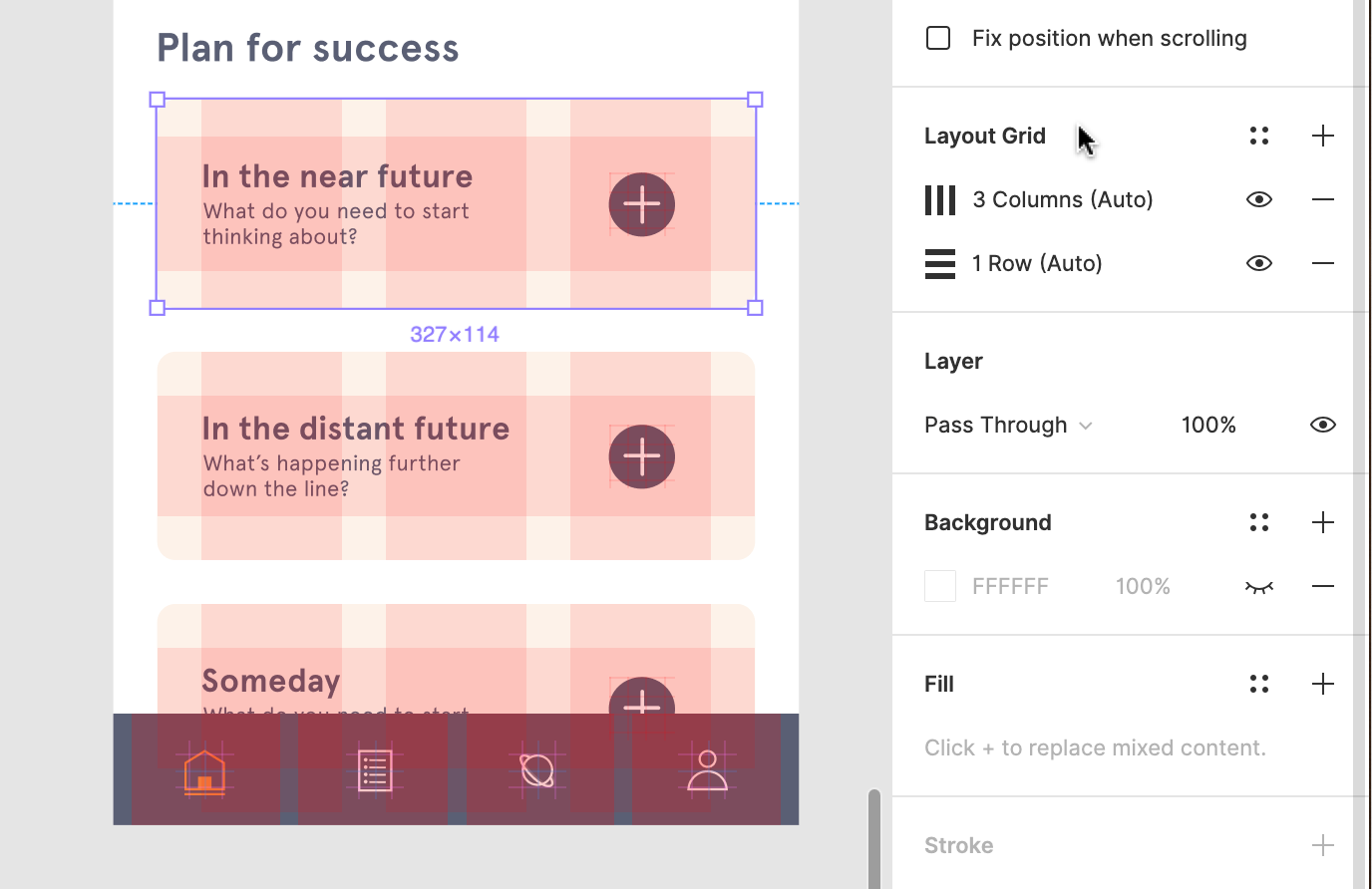_ 1. Select the frame you would like to add another layout grid to. 2. Click next to **Layout grids** in the right sidebar. 3. Select the layout grid in the dropdown provided. 4. Define any other relevant properties. 5. Repeat to add more layout grids to the frame. You can toggle the visibility of your layout grids. This is great for situations when you need to hide your layout grids, without removing them entirely. Layout grids will still work, even when they aren't visible. ## Toggle all layout grids You can toggle the visibility on all layout grids in your file, at once. 1. Click on the Zoom percentage in the top-right corner of your screen. This will open the View Settings menu. 2. If there is no check next to the **Layout grids** option, clicking this will display them. 3. If there is a check already showing, clicking **Layout grids** will hide them: 4. Or, you can use the Keyboard Shortcuts to toggle layout grids off and on: - Mac: ⌃ Control – G - Windows: Control + Shift + 4 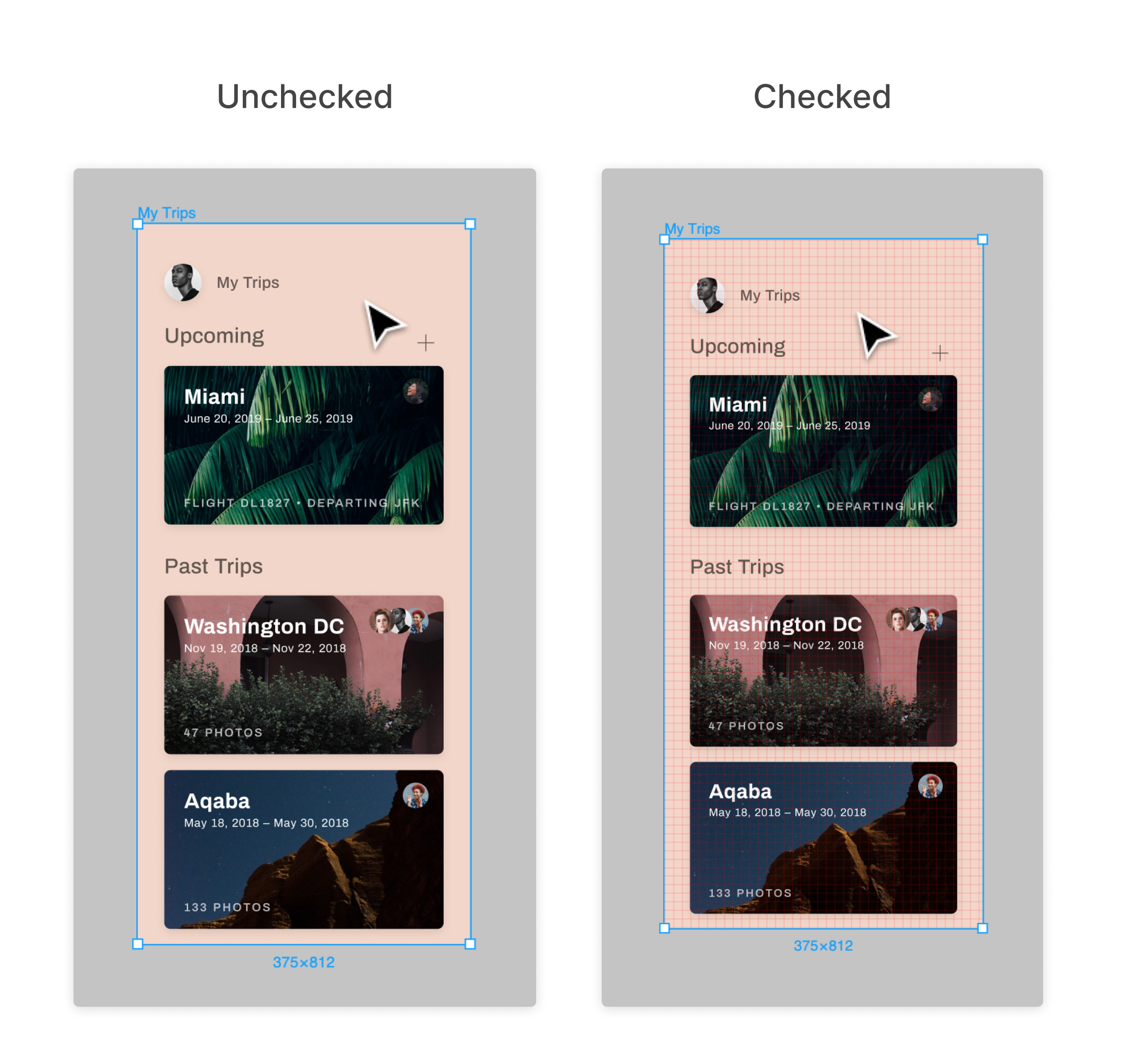 ## Toggle individual layout grids If you would like to enable or disable a single layout grid, you can do this in the Properties Panel. 1. Select the relevant frame. 2. Find the **Layout grids** section in the right sidebar. 3. Click next to the layout grid to toggle it off: 4. Click next to the layout grid to toggle it on:  Once you have perfected the ideal layout grid, you can create a Style to reuse it across your designs. [**Learn more about creating styles →**](https://help.figma.com/hc/en-us/articles/360040316193) ## Create a layout style 1. Select a frame in the canvas with the layout grid(s) applied. 2. Click in the **Layout grid** section of the right sidebar. 3. Click in the **Grid styles** window: 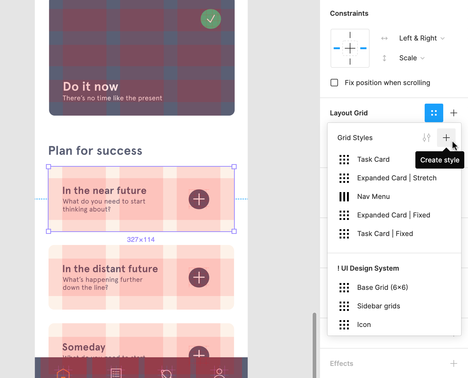 4. Give the layout grid style a memorable name: 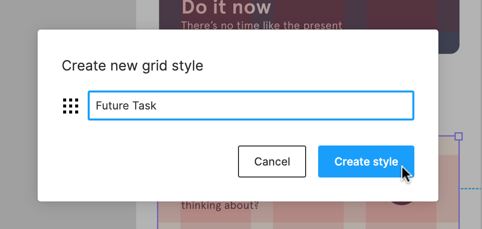 5. Click **Create style** to complete the process. ## Apply a layout style 1. Create or select a frame in the canvas. 2. In the right sidebar, click . 3. Select a layout grid style from the window: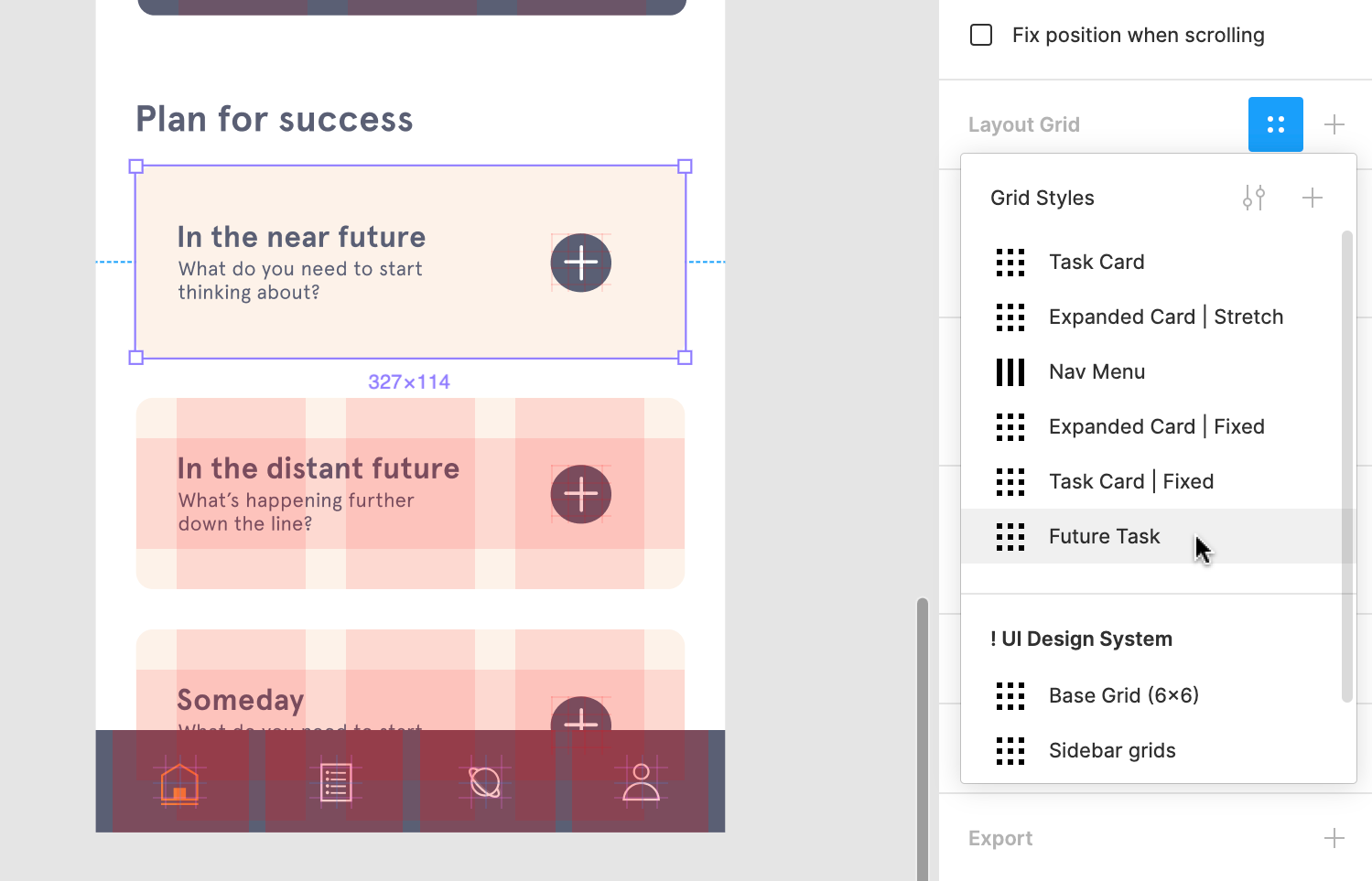 4. The layout grid will be applied to the selected frame:  Note: Related Components will be determined by: 1. Select the frame you want to copy. 2. Click on the layout grid in the right sidebar. 3. When it is highlighted, use the keyboard shortcuts to copy the layout grid: - **Mac**: ⌘ Command + C - **Windows**: Ctrl + C 4. Select the frame you want to apply the layout grid to. 5. Use the keyboard shortcut to paste the layout grid: - **Mac**: ⌘ Command + V - **Windows**: Ctrl + V For more complex designs, we need precision and flexibility to ensure our designs behave when resized. Constraints are great at giving you a basic framework for where objects are positioned within a frame. When combined with layout grids, they provide the framework for a powerful layout system. [**Learn more about combining grids and constraints →**](https://help.figma.com/hc/en-us/articles/360039957934) ## 8-point grid The 8-point grid system is a popular tool for designing UI layouts. It involves using multiples of 8 to define the placement of objects within your design. You can use this system when designing for fixed constraints, like a mobile app. But it can also be a useful tool when designing responsive layouts. There are two common methods for implementing the 8-point system: - **Hard grid**: This involves placing objects on a fixed grid with 8-point increments. In Figma, this would involve applying a uniform grid to the frame with a size of **8**. - **Soft grid:** This involves placing objects at distances from each other that are divisible by 8. This would involve applying a row or column layout grid with properties divisible by 8. [**Learn more about the 8-point grid in this Spec.fm post →**](https://spec.fm/specifics/8-pt-grid) ### Can I toggle all layout grids at once? Yes. This can be done from the View Settings menu in the top-right corner of Figma. [**Learn more in the Toggling layout grids section ↑**](https://help.figma.com/hc/en-us/articles/360040450513-Create-layout-grids-with-grids-columns-and-rows#h_fa39b302-65b2-4cb7-9153-25ddcf76929f) ### Why aren't my layout grids showing? There are a couple of reasons why a layout grid may not be showing: - The layout grid has been toggled **off** in the right sidebar. - Layout grids have been toggled **off** globally. - The selected layer isn't a frame. Layout grids can only be applied to frames. - The frame has been rotated. Make sure your objects have their **rotation** set to 0º before applying a layout grid. ### How do I copy layout grids? You can copy a single layout grid and apply this to another Frame. Or, you can create a layout grid style that can be reused across your designs. [**Learn more in our Layout grid styles section ↑**](https://help.figma.com/hc/en-us/articles/360040450513-Create-layout-grids-with-grids-columns-and-rows#h_01F1ZKBDKC6KA06QJF6EA24EGQ)Before you start Who can use this feature Users with can edit access can interact with all aspects of the Layers panel Users with can view access can only view the Layer list When you're in the Editor, you will see a sidebar on each side of the canvas. Along with the toolbar, these sidebars make up the Figma UI. The Figma UI allows you to access, create and adjust elements of your design. - The sidebar on the **Right** allows you to view and adjust the properties of any object. You can also access the file's prototype settings and view the code of any selected object(s). We refer to this as the **Properties panel**. You can learn more about the [Properties panel](https://help.figma.com/hc/en-us/articles/360039832014). - The sidebar on the **Left** gives you access to the layers, assets and pages included in your file. We call this the **Layers** panel. In this article, we're going to get you up to speed using the sidebar on the left: the **Layers** panel. There are three heading at the top the **Layers** panel. You can use these to switch between each tab, or use the keyboard shortcuts: #### Mac - **Layers panel** and **Page List**: ⌥ Option - 1 - **Assets panel:** ⌥ Option - 2 #### Windows - **Layers panel** and **Page List**: Alt + 1 - **Assets panel:** Alt + 2  Tip! You can toggle visibility of the **Layers** panel using the keyboard shortcut: - **Mac:** ⌘ Command - Shift - \\ - **Windows:** Ctrl + Shift + \\ You can also toggle the visibility of the entire Figma UI by using the Show/Hide UI keyboard shortcut: - **Mac**: ⌘ Command - \\ - **Windows**: Ctrl + \\ This allows you to view your designs in the canvas, without the Figma UI.  Any Frames, Groups or Objects you add to the canvas will be visible in the **Layers** panel. You can determine if a Layer is a Frame, Group or a specific type of Object by the icon next to it:  Figma nests any child objects within their parent Group or Frame. This allows you to collapse and expand layers within a group or Frame. New Layers will be added to the top of the list, or the top of the Group or Frame it is contained within. Or, just above the layer you currently have selected. There are lots of interactions you can have in the **Layers** panel: - [Select layers, groups and Frames](https://help.figma.com/hc/en-us/articles/360040449873) - [Adjust the z-index with layer order](https://help.figma.com/hc/en-us/articles/360041596453) - [Rename layers](https://help.figma.com/hc/en-us/articles/360039958934) - [Toggle layer visibility](https://help.figma.com/hc/en-us/articles/360041112614) - [Lock and unlock layers](https://help.figma.com/hc/en-us/articles/360041596573) **Tip!** You can adjust the width of the **Layers** panel: 1. Hover your cursor over the right-edge of the sidebar. A bidirectional arrow will appear. 2. Click and drag to adjust the width of the panel. 3. Release to set the sidebar width. **Tip!** You can enable or disable the **Highlight Layers on Hover** setting. Search for **Highlight** in the menu. Or head to **Menu > Preferences > Highlight Layers on Hover** [Components](https://help.figma.com/hc/en-us/articles/360038662654) are aspects of your designs that you can reuse. These could be buttons or icons, or more complex UI elements like navigation menus or status bars. The **Assets** panel is where you can find all of your **Components**. You can drag any Component from the **Assets** panel into the canvas to create an Instance. To open the **Assets** panel, click on the **Assets** heading in the **Layers** panel. Or, use the keyboard shortcut: - **Mac**: ⌥ Option - 2 - **Windows**: Alt + 2 Once you've opened the **Assets** panel, you can: 1. Use the **Search** field to find a specific Component. We look for Components in the current file, as well as any Libraries you have access to. 2. Switch between a **Grid** and **List** view of Components 3. Open the [Team Library](https://help.figma.com/hc/en-us/articles/360041051154) modal 4. View **Local Components** that were created in the current file 5. View Components that are **Private to this file** 6. View Components that are **Used in the file** 7. Explore **Enabled Libraries** 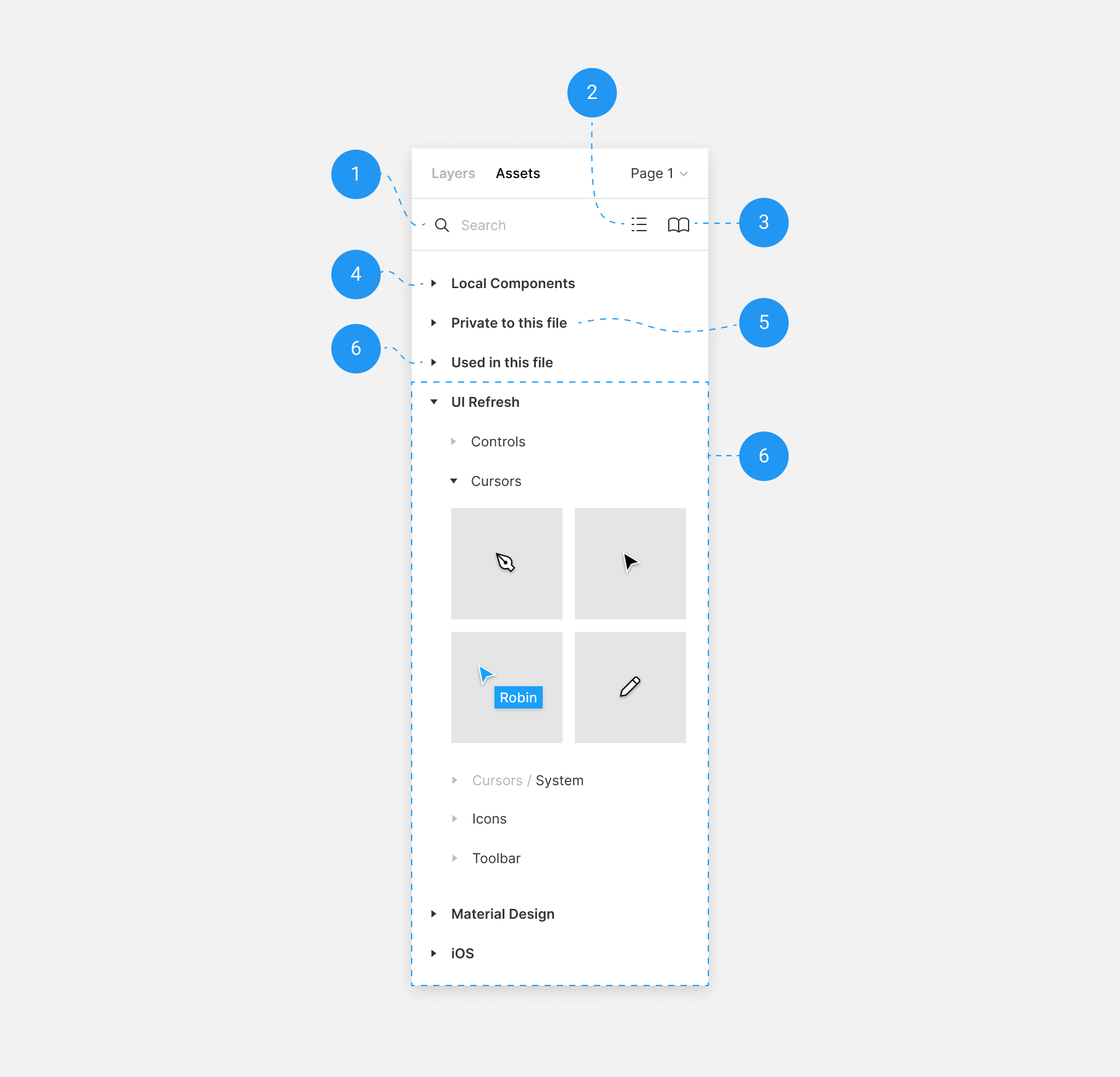 **Note:** We group Components in the **Assets** panel by heading. If you have many Components, we present them as a path: **file > page > Frame** - Explore a file, page or Frame by clicking on the arrow to expand it - Collapse each heading to create more space in the **Assets** panel - We list enabled Team Libraries in the **Assets** panel - Create a Component Instance by dragging a Component from the **Assets** panel over the canvas Team Library allows you to publish Components from your files to your Library. You can then create Instances of your Components and use these in other files. If you are in a Professional Team, you can also access the Team Library from the **Assets** panel. Click the icon to open the Library modal. Learn more in our [Getting started with Team Library](https://help.figma.com/hc/en-us/articles/360039162113) article. Within a file, you can create as many **Pages** as you need. Each page has its own Canvas, where you can explore and iterate on your designs. You can even create separate [Prototypes](https://help.figma.com/hc/en-us/articles/360040314193) on each page. Learn more about using pages in our [Create and manage pages](https://help.figma.com/hc/en-us/articles/360038511293) article.Before you start Who can use this feature Anyone with can edit access to a file can create and edit styles. Anyone with can view access to a published file can use styles from that library in files where they can edit. Styles allow you to define a set of properties of an object, that can be reused across your designs. Create styles for: - **Paints**: fill, stroke, background color - **Text**: font family, size, line height, spacing - **Effects**: drop shadow, inner shadow, layer blur, background blur - **Layout grids**: row, column, grid
Tip! You can give Styles both a name and a description. We recommend using the name and description to communicate how Styles should be used in your designs, versus simply using a description of the color.
To make finding and selecting styles easier, you can also organize your styles into folders. Learn more about naming, managing, and sharing styles →
Color styles can be applied to fills, strokes, backgrounds and text. You can even create color styles for images or gradients.
To create a color style:
Select the object you'd like to create a style for.
In the properties panel, click the icon next to the property you would like to save.
Click the icon in the Color styles panel to create a new style.
Give the style a name and description and click Create style. Descriptions display when hovering over the style in the style picker.
**Note:** When creating a style for a gradient, both the colors used and the gradient direction, or angle, will be saved to the style. Styles can also be applied to text. This is great when you want to set different properties for different blocks of text. You can apply a **Text style** to an entire block of text, or apply it to just some of the text within a block. This is perfect for defining the style of your headers and body text; as well as determining how to style text within a paragraph like linked text. Note: Text alignment can't be set via a **Text style**. You will need to set the alignment of each text block individually. The process for creating text styles is the same as a color style: 1. Select the text you’d like to create a style for. 2. In the **Text** section of the properties panel, click the icon. 3. Click the icon in the **Text styles** menu. 4. Give the style a name and description and click **Create style**. Descriptions display when hovering over the style in the style picker. You can also create styles for any effects, like drop shadows and blurs. This allows you to save those settings for future use. 1. Select the object(s) you’d like to create a style for. 2. If you haven’t already, add any effects you’d like to save to the object. 3. In the **Effects** section of the Properties panel, click the icon. 4. Click the icon in the **Effect styles** menu. 5. Give the style a name and description and click **Create style**. Descriptions display when hovering over the style in the style picker. Shadow styles are represented in the **Effects** section of the right sidebar according to their direction. For example, drop shadows are displayed as above, right, below, and left. These icons can also vary between drop or inner shadows and their x, y values. Tip! You can create styles for objects with multiple effects applied and all effects will be included in the final style. For example: If you have multiple properties applied to an object (e.g. two drop shadow effects and an inner shadow), then all of those properties will be saved to the style. You can also create styles for [layout grids](https://help.figma.com/hc/en-us/articles/360040450513-Create-Layout-Grids-with-grids-columns-and-rows). This is useful if you’re wanting to replicate a specific format or structure across multiple designs. 1. Create (or select) a frame in the canvas. 2. In the Properties panel, add a layout grid to the frame. 3. Update the layout grid to match the properties you’re wanting to save to a style. 4. In the **Layout grid** section of the Properties panel, click the icon. 5. Click the icon to create a new style. 6. Give the style a name and description and click **Create style**. Descriptions display when hovering over the style in the style picker. [Learn about managing, naming, and sharing styles →](https://help.figma.com/hc/en-us/articles/360039820134-Manage-and-share-Styles)We're exploring other ways of learning and exploring Figma. This article is a written version of our [**Figma for Beginners: Build prototypes**](https://youtu.be/lTIeZ2ahEkQ) video tutorial!
In the last tutorial of our Figma for beginners series, we created a single screen of our app. To save time, we've built out the other screens in our application, including a menu, profile, and an interface for searching the app. Let's create an interactive prototype to put it all together.
Prototypes are a great way for us to visualize how our final app will look. They let us define pathways, explore interactions, and test out ideas, before we invest in building the real thing. Guide to prototyping in Figma →
We can create multiple prototypes within a file and keep them organized on different pages. Let's duplicate the page of our existing designs to get started.
Create prototypes
Click on the Prototype tab in the right sidebar to switch to prototype mode. Here we create connections between frames so users can navigate the prototype, like a real application.
Prototype connections are made up of three parts. A hotspot where the connection begins, the connection itself which stores the interaction details, and the destination.
Top-level frames are frames directly on the canvas. In a prototype, this would be an individual screen in your design. For Figma to consider a frame as a top-level frame, you must not place it within other layers, such a group.
The destination has to be a top-level frame, but a hotspot can be any layer: a top-level frame, a nested frame or component, a group, or a single layer.
Create connections
We want to create an interaction from the menu icon to the menu page. Because the menu icon is nested, we need to double-click to select it.
Once the connection node appears, click the connection icon to create an arrow and drag it over the destination frame. Release to complete the connection.
Let's create an interaction from the menu back to the home page. Select the home text layer, click and drag the arrow back to the home page.
Set interaction
Currently, our connection use the default Instant interaction setting. We'll cover the specifics of these interactions a little later on. Let's see how our prototype looks so far. With the home frame selected, click the present icon to open it in presentation view.
At the bottom of the page we can see we only have two frames in our prototype, instead of all four. Once you add at least one prototype connection, Figma will only include frames with connections in presentation view.
If we click on the menu icon, Figma switches to the menu frame. If we click the home option on the menu, it switches back to the home page. Great! Now that we have the basic mechanics working, we can customize the interaction.
Back in the editor, we can view other aspects of the connection in the Interaction details menu. Here, we can select a trigger for the transition - like tap, click, or hover - as well as the action and destination.
Choose transition animations
We want users to be able to access the menu from a few places in the app, so this interaction needs to feel accessible. With the default instant animation, we lose the context of where we were in the app, and how we got there.
Animations guide users through flows, and communicate relationships between different parts of our application.
There's a few ways we could tackle this problem in Figma. We could create an overlay that makes the menu appear above our other screens. Or we could use smart animate to reveal the menu when you drag the current screen to the right.
Both approaches make our menu feel easily accessible, and establish a hierarchy that positions the menu on a different level than our other screens.
This also allows us to explore some of Figma's super cool prototyping features. But, they would take us well off the beginners path.
Move in animates the menu so that it appears over the top of our existing screen. We're being shown some more information, but we don't feel like we've moved to a new location. This feels like a good fit.
The menu icon is on the left-side of our screen, so our menu should move in from the left. Click in the interaction details panel to set the direction.
We can set the duration to control how the speed of the transition, and use easing to make our animation feel less robotic. Learn more about prototype easing curves →
When we return back to the home frame, the animation should be the reverse. We'll select Move out and choose the to move the menu back out.
Now we have our first set of interactions!
We can access the menu from both the search and profile screens, so let's create those interactions next. The Interaction details menu shows our last animation settings, let's update these to match the interaction.
We'll repeat this process for the profile screen. We don't need to update the animation as Figma had applied the most recent one again.
Now we'll create the interaction going back from the menu to the profile page, updating the animation to match.
We can only access search from the home screen. We'll create a connection from the search icon that opens the search page. We'll use the push animation to make it feel like we are moving laterally between these two screens.
Tapping cancel should take us back to the home page. We'll create a connection with a push animation that moves in that direction.
Now that we have a working prototype, we're ready to get some feedback from the other members of our team. We can invite them to the prototype itself.
We can share our prototype with our team by sending them a link.
Click the Share button in the toolbar.
Update the link sharing setting from only people invited to the file to Anyone with the link and set to can view.
Click copy link to add the link to our clipboard.
Share this with the team.
Our team members avatars will show up in the toolbar as they join. We can click on someone's avatar to observe their actions as they move through the prototype. Observation mode is great when you're running a usability test!
Anyone can add feedback, suggestions, or questions to prototypes using comments. Select to access the comment tool. Now we can click on a spot in the prototype to share our thoughts.
It looks like Jenny is adding some questions around the other pages listed in the menu. She's also pointed out that there is no way to interact with posts on the feed.
Rhyan's made a great observation that we're missing a back icon on the menu page, which might make it easier for users to dismiss the menu.
Stella loves this photo of Yuna!
If we switch back to the editor and press C to select the comment tool, we can see the comments our team made on the prototype on our frames. This allows us to collect feedback in one place, incorporate advice, and resolve any outstanding comments.
Incorporate feedback
As Jenny mentioned, we want a way for our users to interact with posts. Let's add some icons to allow users to like, comment, and bookmark posts. Let's go to the components page.
Here's some components we created earlier. We've placed them in a horizontal auto layout frame, and made them into a component. We can then place an instance of this component inside our the post component.
When we switch back to our prototype, we can see the changes we made to the main component reflected in our instances. And because we built our feed using auto layout, our posts have adjusted accordingly.
We'll finish up by incorporating Rhyan's feedback. We'll drag a back icon from the Assets panel into our menu frame. Then we'll switch to the prototype tab and add an interaction to this icon. We'll also update the action to Back.
Note: Users can access the menu from any page. The Back action allows us to automatically return users to the previous page, without having to create separate connections.
We did it! We built an interactive prototype of our designs, explored animations, and incorporated feedback from our design team.
In our next video, we'll prepare our file for sharing assets with our writers and developers. We'll explore creating thumbnails, navigating the file as a viewer, copying code from the inspect tab, and exporting assets for production.
Design is a collaborative process that involves stakeholders and collaborators across your company.
PMs can use Figma or FigJam for brainstorming or to give feedback through comments.
Writers can leave suggestions for copy, or edit it directly.
Researchers and designers can share and test prototypes.
And developers can inspect properties, copy code, and export assets.
In this Figma for beginners series, we've demystified this process by following the evolution of a mobile app from initial wireframes to interactive prototype.
Sharing early and often encourages collaboration with the right people, at the right time. There are a few things we can do to set up our files and make this a seamless process. Prepare files for handoff →
Custom file thumbnails
With the growing popularity of open design, members of your team might view and contribute to files at any point in time. To help orient people to our files, we can create custom thumbnails.
This frame has the thumbnail dimensions of 1920 x 960. Anything within the 1600 pixel safe area, in the center of our frame, is usually visible in the file browser. We can include information like:
The current status of the file
An image or illustration of the file's contents
Information about our team
Hyperlinks to pages, frames, or external documentation, like specifications and requirements.
Right-click on a frame in the canvas and choose Set as thumbnail. Now, when your team members see your file in the file browser, or open it in the editor, they can easily see that information. Set custom thumbnails →
Invites and sharing permissions
When and how you invite your teammates to your file may vary.
Invite developers early to give feedback on the viability of your explorations or, near the end of the process when you're ready to handoff designs for production.
Invite collaborators to your files with edit or view access. Viewers can still comment on files and prototypes and export static assets. They're also free!
Embed files and prototypes in other websites, like your product management tools, or design systems documentation.
View only editor
If you join the file as a viewer, Figma will look a little different.
The simplified toolbar gives us access to the move tool to select layers, the comment tool to leave comments, and the hand tool to pan around the canvas.
Viewers can also access presentation view to preview frames and interact with prototypes. As well as other settings like toggling layout grids, rulers, or pixel preview.
Instead of the Design and Prototype panels in the right sidebar, we have access to the Inspect and Export panels.
Inspect tab, documentation, and code
When we select objects on the canvas, the Inspect tab displays the name of the selected layer, read-only properties, and code snippets for that object.
Click Copy next to a property to add code snippets to your clipboard.
If a component is using styles, Figma will display the style name in the corresponding field. This is useful if you want to use semantic naming that matches your production code.
If you've added descriptions to your component, or links to documentation, you can see them in the inspect panel when you select an instance.
Set up exports and exporting
Viewers can also export assets. As a developer, we want to export these icons for development.
We can select the icon, go to the Exports tab, and click the + icon to add a new export setting.
Figma will create a default export setting of 1x PNG. Your designs aren't set to a specific resolution. You can change the size of the export using the multiplier. If you want to export assets at multiple resolutions, you can add another export setting.
You can also change the export format. Figma supports exports in PNG, PDF, JPEG, and SVG. We'll change this to SVG and click Export to download a copy of this icon.
If you want to share files with viewers, but prevent them from copying frames from the canvas or using Figma's export function, you can disable this setting in the share modal. Guide to exports in Figma →
Congratulations! You reached the end of our Figma for Beginner's tutorial series! We covered a lot of topics during this video series, and there's no shortage of features to explore.
The best way to improve at using Figma, is to get in there and play. For more inspiration of how others are using Figma, check out the Figma Community.
If you get stuck, click the question mark in the bottom right corner of Figma to access our Help Center and video tutorials.
Thanks for joining us! Let us know what you learned, or would like to see more of in the future, and subscribe to Figma on Youtube for the latest product and community news.Before you Start
Who can use this feature
Users with Edit access to a File can create and edit Guides.
Users with View access to a File can toggle Rulers on and off to show/hide Guides.
Guides are helpful when you're trying to precisely position layers or objects in your designs. They can be added to Frames to create useful templates to align content that might be changing.
Video Tutorial
## Adding Guides ### Toggle Rulers In order to use Guides, you will first need to toggle Rulers "on". You can do this with the Shift + R keyboard shortcut, or by: 1. Clicking the menu icon in the upper left corner of the Editor 2. Search for _“Rulers”_ 3. Choose the option for **Rulers** from the menu. 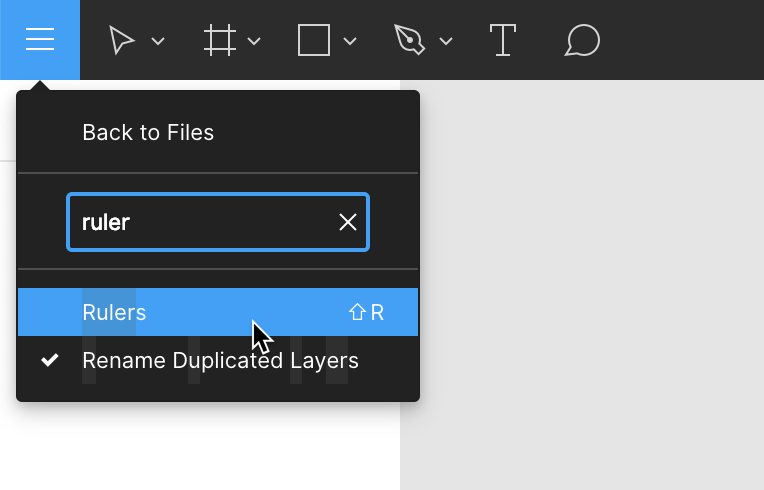 ### Create a new guide Click and drag on the horizontal and vertical rulers to pull guides onto your canvas. 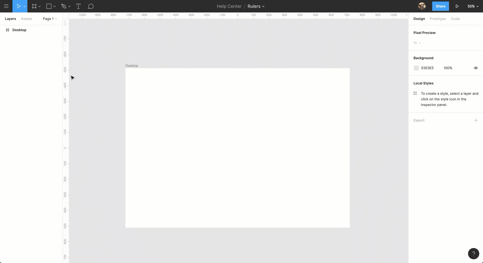 Figma has both Canvas _and_ Frame level Guides for positioning and aligning objects in your designs. The dotted line acts as visual indicator that your guide is intersecting with a frame on the canvas. 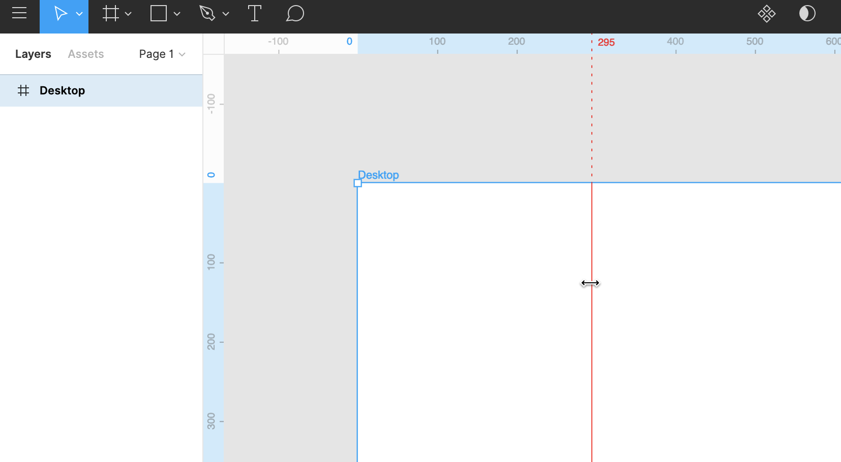 ## Viewing Distances (Redlines) With a top level frame selected, hold Option (macOS) or Control (Windows) as you click and drag out a guide. You will see the distance (in pixels) between your guide and the frame. This distance is also reflected in the ruler. When the guide intersects your frame it will begin measuring distances between the guide and objects in the frame. In addition, with a frame selected the rulers highlight in blue, calling attention to the coordinates of the frame on your canvas. When you select objects in the frame, you'll see the same blue highlights for the selected object.  Guides inside frames are recognized as another object in the frame. This means you can view redline distances between the guide itself and other elements in the frame, as well as the parent frame. ## Removing Guides In addition to clicking and dragging the guide back to the rulers, you can also: 1. Hover over the guide to reveal the double-sided arrow 2. Single click (the guide will turn blue) 3. Use Delete on your keyboard to remove the guideWho can use this feature Supported on Education, Professional, and Organization, [plans](https://help.figma.com/hc/en-us/articles/360040328273) Anyone with can edit access to a file can insert components into a file. Components let you create and reuse elements of your designs to speed up the process and keep things consistent. When building interfaces, we often switch between instances of these components for objects like icons, buttons, and cards. The Instance menu lets you quickly search, preview, and swap one component for another. There are a few ways you replace or swap instances in Figma. **Want to swap instances in bulk?** Use the **Swap libraries** feature to replace local instances with components from another library. [**Swap libraries →**](https://help.figma.com/hc/en-us/articles/4404856784663) The Instance menu allows you to find component replacements from the current file and any of your [enabled team libraries](https://help.figma.com/hc/en-us/articles/360039234953-Enable-Libraries-in-the-Assets-Panel-for-a-Team). Access the Instance menu from the properties panel in the right sidebar, when you have a component selected. 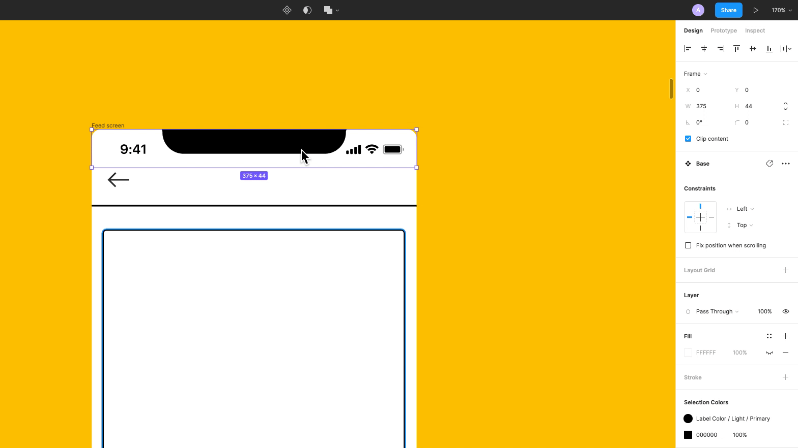 Figma orders components in the Instance menu based on the component's **Name** and **Location**. - Related components are components that share the same hierarchy. This includes components in the same file, page, and frame. For example: you can have a **file** containing your app's UI design system, a **page** for each operating system, and **frames** within each page where your components are grouped by type. - Figma also groups related components organized using the slash naming structure. For example: Figma considers `UI/Button/Active`, `UI/Button/Hover`, and `UI/Button/Inactive` as related components.  [Learn how to name and organize components →](https://help.figma.com/hc/en-us/articles/360038663994-Name-and-organize-Components) To swap an instance using the **Instance** menu: 1. Select the instance you want to replace. Figma will display the name of the component in the Instance section of the right sidebar. 2. Click the name of the component to open the Instance menu. 3. Use the menu to navigate through components: 1. Select from the group of related components for your selection. 2. Use the field to search a component by name. 3. Click to switch between [enabled libraries](https://help.figma.com/hc/en-us/articles/360039234953-Enable-Libraries-in-the-Assets-Panel-for-a-Team). 4. Click to navigate to a different group of components. 5. Use the and to switch between grid and list view. 4. Select an instance to replace the current selection.  ## Assets panel The **Assets** panel in the left sidebar allows you to search for components to add to your file. You can find components from any libraries you have access to. You can drag a component onto the canvas to create an instance of that component. If you use the modifier key while dragging a component from the Assets panel, you can replace the existing component. 1. Open the **Assets** panel and find the component. 2. Hold down the modifier key: If the component **isn't nested** within another frame or component - **Mac**: ⌥ Option - **Windows**: Alt If the component **is nested** within another Frame or component - **Mac**: ⌥ Option - ⌘ Command - **Windows**: Alt + Control 3. Drag the component above the instance you want to swap in the canvas. 4. Release the mouse, then release the modifier key. If you release the modifier key first, Figma will only add the new component, not replace. Note: Figma only preserves text overrides. To keep any changes you've made to text layers, [rename the layers](https://help.figma.com/hc/en-us/articles/360039958934-Rename-Layers) so they're unique. If you swap a component with other overrides applied, we won't apply these to the new component. Learn more about [overriding properties of an instance](https://help.figma.com/hc/en-us/articles/360039150733). ## Quick insert Swap instances of components from your keyboard using **quick insert**. Quick insert opens a **Components** modal where you can find and view components from enabled libraries. The Components modal mirrors what you'd see in the Assets panel. You can keep the modal open while you explore layers in the Layers panel. Select or hover over a layer or instance to replace it with another component. 1. Select the layer or instance you want to swap. 2. Use the keyboard shortcut Shift I to open quick insert. - Use the search field to find a specific component. Use your mouse or arrow keys to navigate to the relevant component. - Use the and icons to switch between grid and list view. - Select from Recent components used across your files, or select from an enabled library. If a library isn't showing up here, you'll need to enable the library first. [Manage libraries in design files →](https://help.figma.com/hc/en-us/articles/1500008731201) 3. Hold down ⌥ Option (Mac) or Ctrl (Windows). Press Enter to replace the component. 4. Click or press Shift I to close quick insert menu. 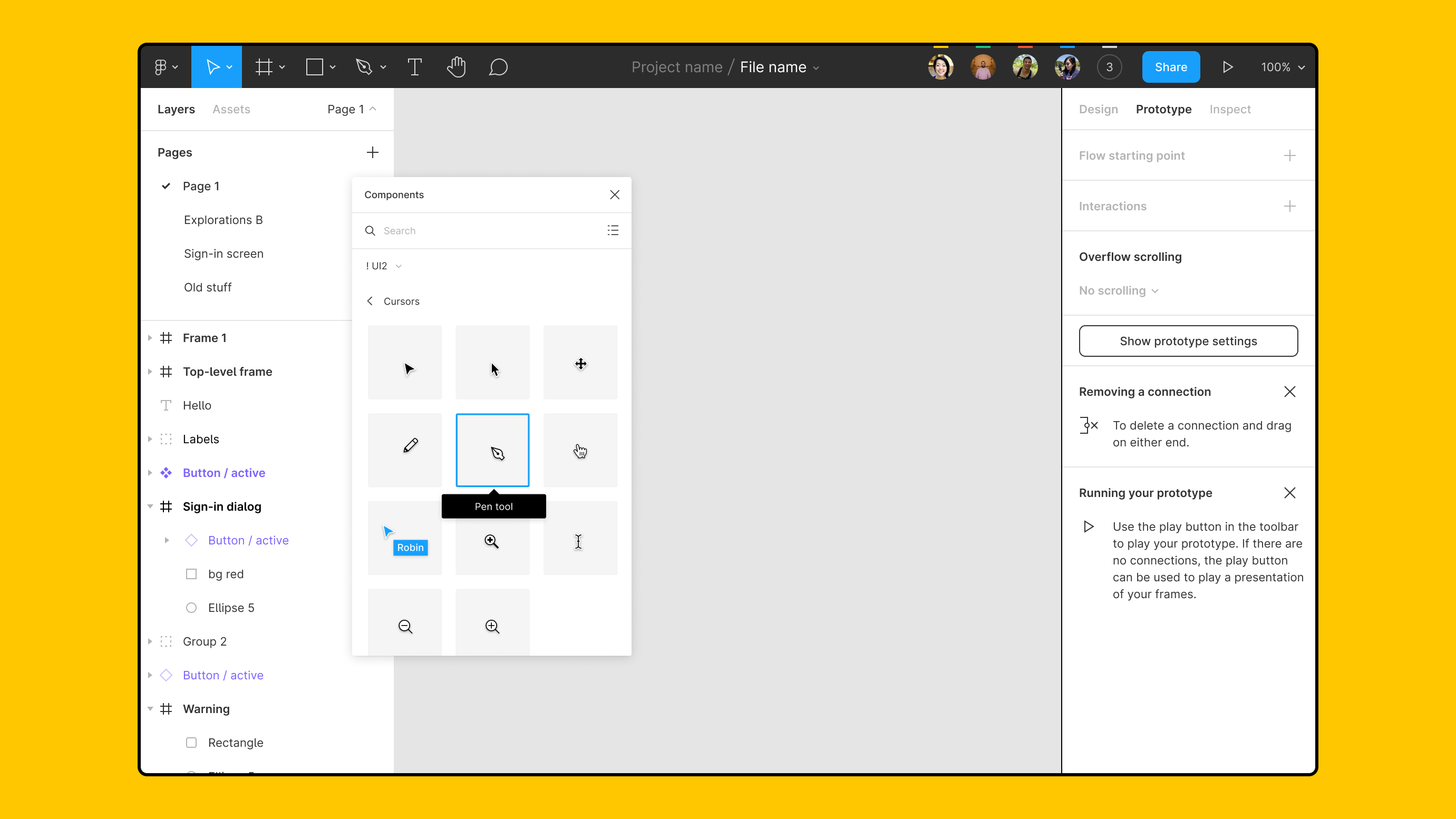 **Tip!** You can keep the quick insert modal open and move it around within the file, allowing you to quickly assess components when editing files. It's not possible to minimize the modal. ## Right-click menu You can also use the right-click menu to switch between related components. This will only allow you to select components in the same frame or hierarchy. 1. Right-click on the instance in the canvas. 2. Hover over the **Swap Instance** option. 3. Select an instance from the list of related components. 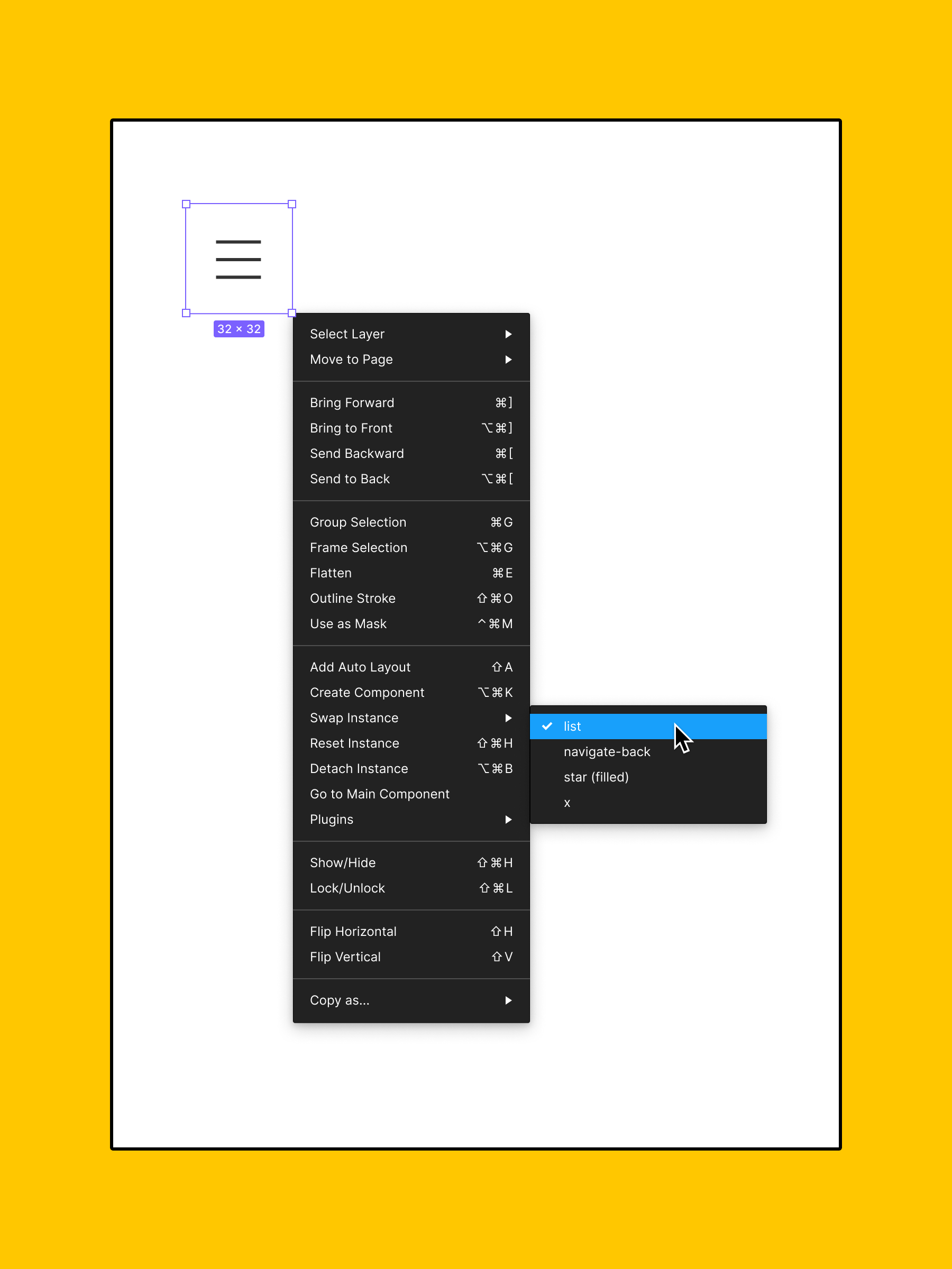- ## [Get started with Figma design](https://help.figma.com/hc/en-us/sections/360006537574-Get-started-with-Figma-design) ### [Articles](https://help.figma.com/hc/en-us/sections/4403928559639-Articles) - [Access design tools from the toolbar](https://help.figma.com/hc/en-us/articles/360041064174-Access-design-tools-from-the-toolbar "Access design tools from the toolbar") - [Explore the canvas](https://help.figma.com/hc/en-us/articles/360041064814-Explore-the-canvas "Explore the canvas") - [Select layers and objects](https://help.figma.com/hc/en-us/articles/360040449873-Select-layers-and-objects "Select layers and objects") - [View layers, pages and components (left sidebar)](https://help.figma.com/hc/en-us/articles/360039831974-View-layers-pages-and-components-left-sidebar- "View layers, pages and components (left sidebar)") - [Copy and paste objects in the canvas](https://help.figma.com/hc/en-us/articles/4409078832791-Copy-and-paste-objects-in-the-canvas "Copy and paste objects in the canvas") - [See all 9 articles](https://help.figma.com/hc/en-us/sections/4403928559639-Articles) ### [Figma for Beginners tutorial](https://help.figma.com/hc/en-us/sections/4405269443991-Figma-for-Beginners-tutorial) - [▶️ Beginner 1: Explore ideas](https://help.figma.com/hc/en-us/articles/4405269899287--Beginner-1-Explore-ideas "▶️ Beginner 1: Explore ideas") - [▶️ Beginner 2: Create designs](https://help.figma.com/hc/en-us/articles/4405328886935--Beginner-2-Create-designs "▶️ Beginner 2: Create designs") - [▶️ Beginner 3: Build prototypes](https://help.figma.com/hc/en-us/articles/4405337257751--Beginner-3-Build-prototypes "▶️ Beginner 3: Build prototypes") - [▶️ Beginner 4: Prepare for handoff](https://help.figma.com/hc/en-us/articles/4405338399895--Beginner-4-Prepare-for-handoff- "▶️ Beginner 4: Prepare for handoff ") - ## [Import and export](https://help.figma.com/hc/en-us/sections/360006620214-Import-and-export) - [Imports in Figma design](https://help.figma.com/hc/en-us/articles/360040027794-Imports-in-Figma-design "Imports in Figma design") - [Guide to exports in Figma](https://help.figma.com/hc/en-us/articles/360040028114-Guide-to-exports-in-Figma "Guide to exports in Figma") - [Import files into Figma](https://help.figma.com/hc/en-us/articles/360041003114-Import-files-into-Figma "Import files into Figma") - [Import Sketch files](https://help.figma.com/hc/en-us/articles/360040514273-Import-Sketch-files "Import Sketch files") - [Copy assets between design tools](https://help.figma.com/hc/en-us/articles/360040030374-Copy-assets-between-design-tools "Copy assets between design tools") - ## [Images, shapes and tools](https://help.figma.com/hc/en-us/sections/360006574934-Images-shapes-and-tools) ### [Shapes and tools](https://help.figma.com/hc/en-us/sections/4403912808599-Shapes-and-tools) - [Sketch on the canvas with the pencil tool](https://help.figma.com/hc/en-us/articles/4402723791511-Sketch-on-the-canvas-with-the-pencil-tool "Sketch on the canvas with the pencil tool") - [Vector Networks](https://help.figma.com/hc/en-us/articles/360040450213-Vector-Networks "Vector Networks") - [Frames in Figma](https://help.figma.com/hc/en-us/articles/360041539473-Frames-in-Figma "Frames in Figma") - [Frames and Groups](https://help.figma.com/hc/en-us/articles/360039832054-Frames-and-Groups "Frames and Groups") - [Using Shape Tools](https://help.figma.com/hc/en-us/articles/360040450133-Using-Shape-Tools "Using Shape Tools") - [See all 10 articles](https://help.figma.com/hc/en-us/sections/4403912808599-Shapes-and-tools) ### [Images](https://help.figma.com/hc/en-us/sections/4403912803607-Images) - [Add Images to your designs](https://help.figma.com/hc/en-us/articles/360040028034-Add-Images-to-your-designs "Add Images to your designs") - [Add animated GIFs to prototypes](https://help.figma.com/hc/en-us/articles/360041486873-Add-animated-GIFs-to-prototypes "Add animated GIFs to prototypes") - [Upload an image as a fill](https://help.figma.com/hc/en-us/articles/360041090073-Upload-an-image-as-a-fill "Upload an image as a fill") - [Add images in bulk with Place image](https://help.figma.com/hc/en-us/articles/360041089973-Add-images-in-bulk-with-Place-image "Add images in bulk with Place image") - [Paste images in the canvas](https://help.figma.com/hc/en-us/articles/360040615014-Paste-images-in-the-canvas "Paste images in the canvas") - [See all 7 articles](https://help.figma.com/hc/en-us/sections/4403912803607-Images) - ## [Text and fonts](https://help.figma.com/hc/en-us/sections/360006606853-Text-and-fonts) ### [Text](https://help.figma.com/hc/en-us/sections/4403906499479-Text) - [Getting started with text](https://help.figma.com/hc/en-us/articles/360039956434-Getting-started-with-text "Getting started with text") - [Create type layers with the text tool](https://help.figma.com/hc/en-us/articles/360039956474-Create-type-layers-with-the-text-tool "Create type layers with the text tool") - [Edit text layers](https://help.figma.com/hc/en-us/articles/360041059634-Edit-text-layers "Edit text layers") - [Explore text properties](https://help.figma.com/hc/en-us/articles/360039956634-Explore-text-properties "Explore text properties") - [Bulleted and numbered lists](https://help.figma.com/hc/en-us/articles/360040449773-Bulleted-and-numbered-lists "Bulleted and numbered lists") - [See all 12 articles](https://help.figma.com/hc/en-us/sections/4403906499479-Text) ### [Fonts](https://help.figma.com/hc/en-us/sections/4403906498071-Fonts) - [Access local fonts on your computer](https://help.figma.com/hc/en-us/articles/360039956894-Access-local-fonts-on-your-computer "Access local fonts on your computer") - [Add icons to text layers with icon fonts](https://help.figma.com/hc/en-us/articles/360040449513-Add-icons-to-text-layers-with-icon-fonts "Add icons to text layers with icon fonts") - [Manage missing fonts](https://help.figma.com/hc/en-us/articles/360039956994-Manage-missing-fonts "Manage missing fonts") - [Manage conflicting fonts](https://help.figma.com/hc/en-us/articles/4403175325719-Manage-conflicting-fonts "Manage conflicting fonts") - [Troubleshoot font issues](https://help.figma.com/hc/en-us/articles/4403018301079-Troubleshoot-font-issues "Troubleshoot font issues") - ## [Layer properties and settings](https://help.figma.com/hc/en-us/sections/360006798733-Layer-properties-and-settings) ### [Properties](https://help.figma.com/hc/en-us/sections/4403936088215-Properties) - [Adjust alignment, rotation, and position](https://help.figma.com/hc/en-us/articles/360039956914-Adjust-alignment-rotation-and-position "Adjust alignment, rotation, and position") - [Paints in Figma](https://help.figma.com/hc/en-us/articles/360041003694-Paints-in-Figma "Paints in Figma") - [Apply paints with the color picker](https://help.figma.com/hc/en-us/articles/360041003774-Apply-paints-with-the-color-picker "Apply paints with the color picker") - [Add fills to text and shape layers](https://help.figma.com/hc/en-us/articles/360040623954-Add-fills-to-text-and-shape-layers "Add fills to text and shape layers") - [Apply and adjust stroke properties](https://help.figma.com/hc/en-us/articles/360049283914-Apply-and-adjust-stroke-properties "Apply and adjust stroke properties") - [See all 9 articles](https://help.figma.com/hc/en-us/sections/4403936088215-Properties) ### [Layer settings](https://help.figma.com/hc/en-us/sections/4403928548759-Layer-settings) - [Set small and big nudge values](https://help.figma.com/hc/en-us/articles/4404575206295-Set-small-and-big-nudge-values "Set small and big nudge values") - [Rename Layers](https://help.figma.com/hc/en-us/articles/360039958934-Rename-Layers "Rename Layers") - [Lock and unlock layers](https://help.figma.com/hc/en-us/articles/360041596573-Lock-and-unlock-layers "Lock and unlock layers") - [Toggle visibility to hide layers](https://help.figma.com/hc/en-us/articles/360041112614-Toggle-visibility-to-hide-layers "Toggle visibility to hide layers") ### [Layout tools](https://help.figma.com/hc/en-us/sections/4403936089623-Layout-tools) - [Measure distances between layers](https://help.figma.com/hc/en-us/articles/360039956974-Measure-distances-between-layers "Measure distances between layers") - [Create dynamic designs with auto layout](https://help.figma.com/hc/en-us/articles/360040451373-Create-dynamic-designs-with-auto-layout "Create dynamic designs with auto layout") - [Arrange layers with Smart selection](https://help.figma.com/hc/en-us/articles/360040450233-Arrange-layers-with-Smart-selection "Arrange layers with Smart selection") - [Add Guides to the Canvas or a Frame](https://help.figma.com/hc/en-us/articles/360040449713-Add-Guides-to-the-Canvas-or-a-Frame "Add Guides to the Canvas or a Frame") - [Create layout grids with grids, columns, and rows](https://help.figma.com/hc/en-us/articles/360040450513-Create-layout-grids-with-grids-columns-and-rows "Create layout grids with grids, columns, and rows") - [See all 7 articles](https://help.figma.com/hc/en-us/sections/4403936089623-Layout-tools) - ## [Components and styles](https://help.figma.com/hc/en-us/sections/360006233714-Components-and-styles) ### [Styles](https://help.figma.com/hc/en-us/sections/4403928368535-Styles) - [Styles in Figma](https://help.figma.com/hc/en-us/articles/360039238753-Styles-in-Figma "Styles in Figma") - [Create color, text, effect and layout grid styles](https://help.figma.com/hc/en-us/articles/360038746534-Create-color-text-effect-and-layout-grid-styles "Create color, text, effect and layout grid styles") - [Apply Styles to layers and objects](https://help.figma.com/hc/en-us/articles/360040316193-Apply-Styles-to-layers-and-objects "Apply Styles to layers and objects") - [Manage and share styles](https://help.figma.com/hc/en-us/articles/360039820134-Manage-and-share-styles "Manage and share styles") ### [Components](https://help.figma.com/hc/en-us/sections/4403935997847-Components) - [Guide to Components in Figma](https://help.figma.com/hc/en-us/articles/360038662654-Guide-to-Components-in-Figma) - [Name and organize components](https://help.figma.com/hc/en-us/articles/360038663994-Name-and-organize-components) - [Create components to reuse in designs](https://help.figma.com/hc/en-us/articles/360038663154-Create-components-to-reuse-in-designs) - [Create and insert component instances](https://help.figma.com/hc/en-us/articles/360039150173-Create-and-insert-component-instances) - [Create and use variants](https://help.figma.com/hc/en-us/articles/360056440594-Create-and-use-variants) - [Create interactive components with variants](https://help.figma.com/hc/en-us/articles/360061175334-Create-interactive-components-with-variants) - [Swap components and instances](https://help.figma.com/hc/en-us/articles/360039150413-Swap-components-and-instances) - [Apply overrides to instances](https://help.figma.com/hc/en-us/articles/360039150733-Apply-overrides-to-instances) - [Edit main components](https://help.figma.com/hc/en-us/articles/360038665934-Edit-main-components) - [Detach an instance from the component](https://help.figma.com/hc/en-us/articles/360038665754-Detach-an-instance-from-the-component) - [Prepare for variants](https://help.figma.com/hc/en-us/articles/360055471353-Prepare-for-variants) ### [Libraries](https://help.figma.com/hc/en-us/sections/4403936000407-Libraries-) - [Swap style and component libraries](https://help.figma.com/hc/en-us/articles/4404856784663-Swap-style-and-component-libraries "Swap style and component libraries") - [Move published components](https://help.figma.com/hc/en-us/articles/4404848314647-Move-published-components "Move published components") - [Guide to libraries in Figma](https://help.figma.com/hc/en-us/articles/360041051154-Guide-to-libraries-in-Figma "Guide to libraries in Figma") - [Publish styles and components](https://help.figma.com/hc/en-us/articles/360025508373-Publish-styles-and-components "Publish styles and components") - [Review and accept library updates](https://help.figma.com/hc/en-us/articles/360039234193-Review-and-accept-library-updates "Review and accept library updates") - [See all 12 articles](https://help.figma.com/hc/en-us/sections/4403936000407-Libraries-) - ## [Prototypes and animations](https://help.figma.com/hc/en-us/sections/360006534454-Prototypes-and-animations) ### [Build prototypes](https://help.figma.com/hc/en-us/sections/4403936156695-Build-prototypes) - [Guide to prototyping in Figma](https://help.figma.com/hc/en-us/articles/360040314193-Guide-to-prototyping-in-Figma "Guide to prototyping in Figma") - [Prototype interactions and animations](https://help.figma.com/hc/en-us/articles/360040315773-Prototype-interactions-and-animations "Prototype interactions and animations") - [Prototype scrolling with overflow behavior](https://help.figma.com/hc/en-us/articles/360039818734-Prototype-scrolling-with-overflow-behavior "Prototype scrolling with overflow behavior") - [Preserve scroll position in prototypes](https://help.figma.com/hc/en-us/articles/360051747774-Preserve-scroll-position-in-prototypes "Preserve scroll position in prototypes") - [Create advanced animations with Smart Animate](https://help.figma.com/hc/en-us/articles/360039818874-Create-advanced-animations-with-Smart-Animate "Create advanced animations with Smart Animate") - [See all 7 articles](https://help.figma.com/hc/en-us/sections/4403936156695-Build-prototypes) ### [Presets](https://help.figma.com/hc/en-us/sections/4403928630295-Presets) - [Prototype triggers](https://help.figma.com/hc/en-us/articles/360040035834-Prototype-triggers "Prototype triggers") - [Prototype actions](https://help.figma.com/hc/en-us/articles/360040035874-Prototype-actions "Prototype actions") - [Prototype animations](https://help.figma.com/hc/en-us/articles/360040522373-Prototype-animations "Prototype animations") - [Prototype easing curves](https://help.figma.com/hc/en-us/articles/360051748654-Prototype-easing-curves "Prototype easing curves") ### [View prototypes](https://help.figma.com/hc/en-us/sections/4403928648983-View-prototypes) - [Present designs and prototypes](https://help.figma.com/hc/en-us/articles/360040318013-Present-designs-and-prototypes "Present designs and prototypes") - [View prototypes on a mobile device](https://help.figma.com/hc/en-us/articles/360040321093-View-prototypes-on-a-mobile-device "View prototypes on a mobile device") - [Preview designs and prototypes with Figma Mirror app](https://help.figma.com/hc/en-us/articles/360039829534-Preview-designs-and-prototypes-with-Figma-Mirror-app "Preview designs and prototypes with Figma Mirror app") - [Comment on prototypes](https://help.figma.com/hc/en-us/articles/360039824594-Comment-on-prototypes "Comment on prototypes") - ## [Collaborative tools](https://help.figma.com/hc/en-us/sections/360006780134-Collaborative-tools) ### [Comments](https://help.figma.com/hc/en-us/sections/4403928709911-Comments) - [Getting started with comments](https://help.figma.com/hc/en-us/articles/360039825314-Getting-started-with-comments "Getting started with comments") - [Add comments to files](https://help.figma.com/hc/en-us/articles/360041068574-Add-comments-to-files "Add comments to files") - [View and manage comments](https://help.figma.com/hc/en-us/articles/360041547593-View-and-manage-comments "View and manage comments") - [Move or edit comments](https://help.figma.com/hc/en-us/articles/360041547853-Move-or-edit-comments "Move or edit comments") - [Adjust comment notification settings](https://help.figma.com/hc/en-us/articles/360041547813-Adjust-comment-notification-settings "Adjust comment notification settings") ### [Handoff](https://help.figma.com/hc/en-us/sections/4403928745111-Handoff) - [Use the Inspect panel](https://help.figma.com/hc/en-us/articles/360055203533-Use-the-Inspect-panel "Use the Inspect panel") - [Optimize design files for developer handoff](https://help.figma.com/hc/en-us/articles/360040521453-Optimize-design-files-for-developer-handoff "Optimize design files for developer handoff") ### [Tools](https://help.figma.com/hc/en-us/sections/4403928746647-Tools) - [Follow along with observation mode](https://help.figma.com/hc/en-us/articles/360040322673-Follow-along-with-observation-mode "Follow along with observation mode") - [Use cursor chat in Figma design](https://help.figma.com/hc/en-us/articles/4403130802199-Use-cursor-chat-in-Figma-design "Use cursor chat in Figma design")Before you Start Who can use this feature Users with Edit access to a File can create, edit, and remove Groups and Frames. [Groups](https://help.figma.com/hc/en-us/articles/360039832054-Frames-and-Groups#h_a4b01a8f-859e-4478-a2af-4a2b802701a3) and [Frames](https://help.figma.com/hc/en-us/articles/360039832054-Frames-and-Groups#h_36d74f7b-db28-47f3-adc9-b860be71c1b0) allow you to combine layers together so that they can be treated like a single layer. By default, groups take on the combined dimensions of their children. - To make a group, select some layers and choose “Group”, or use: - macOS: Command-G - Windows: Control + G - The first time you click on a layer in this group, the entire group will be selected. - To select a single layer within this group, double-click the item, or choose it from the layers panel. - As the layers within a group are moved around, the bounds of the group will adjust to fit the layers within. - You can move things into and out of this group by dragging layers within the layers panel. - You are allowed to nest groups inside other groups. - To un-group, select the group and choose “Ungroup”, or use: - macOS: Shift-Command-G - Windows: Shift + Control + G Sometimes, it is useful to have a layer whose size is explicitly set by you. These are called Frames. - To make a frame, choose the Frame Tool F and drag out an area of the screen, or use: - macOS: Command-Option-G - Windows: Control + Alt + G - To add layers to this group, just drag them in. - To remove layers from this group, just drag them out. - Selecting and moving items within a Frame works exactly the same way as groups. - To un-group, select the group and choose “Ungroup”, or use: - macOS: Shift-Command-G - Windows: Shift + Control + G Frames are drawn directly on the canvas and we draw them in a special way to make them easier to see and work with.Before you start Who can use this feature Anyone with Can edit access to a file can create variants and component sets in that file. Anyone with Can view access to a file can use components or components sets from that [library](https://help.figma.com/hc/en-us/articles/360025508373). As you create components and build out your design system, you'll find the need for components that are similar to each other, with only slight differences. For example: you might have multiple components for buttons, with separate components for various states and sizes, as well as light and dark modes. Variants allow you to group and organize similar components into a single container. This simplifies your component library and makes it easier for everyone to find what they need. Customize the properties and values of your variants, to take the guesswork out of your design system and bring your components closer to front-end code.
Note: We don't recommend using variants to group different icons.If you have different sizes of the same icon, then you could combine these as variants instead.
Properties and values
Properties and their values allow you to define attributes of your variants.
You can add as many properties and values as you need, and customize them to suit your design system. You can even map your properties and values to code components in your design system.
Properties are the variable aspects of our component. For example: the properties of a button component could be the
type,size,state, or whether it has anicon.Values are the different options available for each property. For example: the state property could have
default,hover,pressed, anddisabledvalues.
All variants within the component set will use the same properties and values, but each variant needs to be a unique combination of them. You don’t need to have a component for every possible combination of properties and values.
Properties and values in action
Let's take a look at an example! We have a button component that has 24 unique variants. The image below shows all of the variants for this component inside a single component set.

There are four properties in our button component set, each with its own set of values.
Type property with Primary and Secondary values.
Size property with Large and Small values.
State property with Default, Pressed, and Inactive values.
Icon property has True and False values.
Figma uses these properties and values to determine which variant we need from the component set. In the image below, we've created an instance of our component set and configured the following values:
Type: Primary
Size: Large
State: Default
Icon: False (or off)

Layer names and syntax
Layer naming is an important aspect of creating and managing variants. Unlike other layer names in Figma, which can be mostly arbitrary, the names of variants in a component set have a very specific syntax.
This includes information about the properties and values of that variant. You can only see this syntax when you try to rename a variant in the layers panel.
Variant names follow this structure: Property1=value, Property2=value, Property3=value

Caution: When you add an instance with variants to a file, Figma will import every variant in that component set. Importing large component sets will impact Figma's speed and performance.
If you already have component libraries in Figma, you can combine your components as variants. The general process looks like this:
Rename your components so they use the slash naming convention
Organize your components on the canvas
Combine components as variants
Give your properties descriptive names
Note: Figma only looks at layer names when combining components as variants, not page and frame names. If you were using pages or frames to organize components, these will become redundant on conversion.
You’ll still be able to use pages and top-level frames to create extra levels of hierarchy. This makes for better component organization in the Assets panel and Instance menu.
Rename your components
Figma uses the slash naming system to organize components in the Assets panel and Instance menu. Each / in a component's name will create another level of hierarchy.
This makes it easier to navigate your library, or find and swap related components. Learn how to name and organize components →
You can also use this naming system to convert your existing components to variants. To be accurately converted, component names need to follow this structure:
componentName/property1value/property2value/property3value
The text before the first
/will become the name of the component set.Figma will create a new property for every other
/in the component's name, then add the attribute as a value.If you have used suffixes in your naming system, you will need to add these to the component's name, separated by a
/.
Caution: To make sure your values match up with the same property, every component you are combining needs to have the same number of slashes.
A button component with the name Button/Primary/Large/Default/False will have the following properties and values:
Component set name: Button Variant: Primary Property 2: Large Property 3: Default Property 4: False
In the image below, we can see how the rest of our component names (on the left) are converted to variant values (on the right).
Organize components on the canvas
Note: Component sets can only contain components, so it's not possible to add text or annotations, nest frames, or group a subset of variants inside a component set.
When combining components as variants, Figma will apply your existing layout and spacing to variants inside the component set. We recommend organizing your components before converting them, to save you having to rearrange them after.
If you have a lot of variants for a particular component, you may want to organize your components in rows, columns, or grids.
This will help to communicate their multi-dimensional nature to anyone who's using your design system. You can also add text layers beside your component set to annotate the relevant properties and values.
In our example below, we've arranged our button variants in a grid. We've also added text layers to the canvas that correspond to a property's values.
Tip! By default, component sets have a dashed-purple stroke and no fill. You can adjust the fill and stroke properties of the component set to better suit your brand or design system.
Combine as variants
Select the components you want to combine. Learn how to select layers and objects →
In the right sidebar, click the Combine as Variants button.
Figma will add all components to a single component set.

Give properties descriptive names
As part of the conversion process, Figma will create generic properties and add any attributes you added to the component's name as values.
As Figma doesn't know the names of the properties, it will name the first property Variant, then number them sequentially: Property 2, then Property 3, and so on.
You'll need to rename those properties to something more descriptive.
Select the component set.
View the current properties in the Variants section in the right sidebar.
Hover over the property so a grey box appears around it.
Click to edit the property and give it a more descriptive name.
Click outside the property to apply.
Repeat for the remaining properties.

Note: Figma handles component sets the same way as regular components. You can add descriptions and links to documentation to them. You can also drag them into the canvas from the Assets panel, and swap between instances of them.
Note: Figma places variants in a single container called a component set. Component sets can only contain components. Click Create component in the toolbar, or use the keyboard shortcut to turn your selection into a component:
Mac: ⌥ Option ⌘ Command K
Windows: Ctrl + Alt + K
Learn how to create components →
Select a component
Rename the component so it uses the slash naming convention (recommended).
In the right sidebar, click the under the Variants section to add your first variant.
Figma will do a few things:
Make an identical component with the same properties
Add both components as variants to a component set
If you used the slash naming convention, the text before the / will become the name of the component set and the attributes after will be used as values.
Make any visual changes to the variant as required.
Tip! By default, component sets have a dashed-purple stroke and no fill. You can adjust the fill and stroke properties of the component set to better suit your brand or style guide.
Add properties and values
Add properties and values to your variants when you first create them, or as your design system evolves.
Add properties to the component set:
Select the component set.
Click the in the Variant section of the right sidebar.
Select Add New Property.
You can only add values when you have a variant selected. There are a few ways to do this:
Click the next to the current value and select Add new from the options.
Click into the value field and enter in a new value.
Double-click on the variant in the layers panel and update the value for the desired property.
Tip! If you have a property that has only two possible options, Figma considers this a binary choice or a boolean value and can represent that property as a toggle switch. Figma recognizes both true/false and on/off as boolean values.
Fix conflicted value errors All variants within the component set will use the same properties and values, but each variant needs to be a unique combination of them.
If any variants have the exact same combination of values, Figma will let you know that there is a conflict. You'll see this error even if the variants themselves are visually different.
To resolve this issue, you'll need to add or update the values of the affected variants, so they have a unique combination of values.
Add more variants to a component set
Continue to add variants to your component set using any of the following methods:
Click on the canvas, inside the component set. You'll only see this option once you have at least two variants.
Click in the Variants section of the right sidebar and select Add New Variant.
Duplicate existing variant using the keyboard shortcut:
Mac: ⌘ Command D
Windows: Ctrl + D
Drag other components into the component set to add them as variants.
Caution: When you add an instance with variants to a file, Figma will import every variant in that component set. Importing large component sets will impact Figma's speed and performance.
Organize variants
When you add new variants to a component, Figma's default behavior is to add variants in a single column, with equal spacing between them.
If you have your components in another layout before converting them, Figma will keep the same layout for the component set.
You can override Figma's default behavior and arrange variants in any way you choose.
Select a variant and move it to new co-ordinates within the component set. Figma will allow you to place variants anywhere within the component set, including over the top of other variants.
Adjust the dimensions of the component set in the right sidebar, or resize it in the canvas like you would a regular frame.
With all variants selected: Use the fields in the right sidebar to adjust the horizontal and vertical space between variants.
Note: Figma will use the variant in the top-left corner as the default variant. This variant will represent the entire component set in the Assets panel.
Rename properties and values
To rename a property or value, you'll need to select the component set and update the property or value in the Variants section of the right sidebar.
To rename a property:
Click on the property and enter a more descriptive name.
Press the
Enter/Returnkey to apply or click outside the property to apply.Repeat for the remaining properties.
To rename a value:
Double-click on the value and enter a new name.
Press the
Enter/Returnkey to apply.

Note: If you've converted your existing components to variants, you'll need to rename your properties to make them more descriptive.
Fix corrupted variant errors You will get a corrupted variant error if any of your variants do not follow this syntax. This can happen if you mistype a property or value, or use an invalid naming structure when converting existing components.
To fix this issue, you'll need to rename the properties and values of the variant. While it's possible to rename them using this syntax in the layer name, we recommend renaming properties and values in the right sidebar instead.
Reorder properties and values
You can change the order that properties and values appear in the right sidebar. If you reorder properties, Figma will adjust the name and syntax of your variants to match.
To reorder properties:
Select the component set.
In the Variants section, hover over the left edge of the property field until the appears.
Click and drag the property up or down to change its order.
To reorder values:
Click and hold on the value.
Drag to value so its in the new order.
Release to apply.
Remove properties
To remove a property:
Select the component set.
Hover over the property in the Variant section of the sidebar.
Click to remove.
Note: Figma will only keep values that are currently applied to a variant. You can remove a value by making sure no variant uses it.
If you're a member of a Professional or Education team, or a Figma Organization, you can share your variants with collaborators.
Publish component sets alongside your styles and regular components to allow members of your team or organization to use them.
Component sets appear in the Assets panel alongside your other components. Figma will use the variant in the top-left corner of the component set as the default variant.
Collaborators can then drag the component set into their files to create an instance. They can then access all the other variants in the component set by configuring the property values in the right sidebar.
Learn how to publish libraries →
Component sets appear in the Assets panel alongside any regular components. So instead of looking for a specific variant in the Assets panel, you only need to select the component set.
Once you have an instance of that component set on the canvas, you can configure the instance's property values to select a variant.
Select component sets
Click on the Assets tab in the left sidebar, or use the keyboard shortcut:
Mac: ⌥ Option 2
Windows: Alt + 2
Click on a component set and drag it on to the canvas. Figma will create an instance of the default variant of that component set.
View the component set's name and properties in the right sidebar.
Use the next to the property to select your preferred combination of values.
Turn specific properties off and on using the and toggle switches.
Configure variants
Select other variants in a component set by configuring the properties and values in the right sidebar.
Select the instance.
View the name of the component in the right sidebar. If the component has variants, you'll see fields underneath the component name to configure the properties and values of that component set.
Use the next to the property to select your preferred combination of values.
Turn specific properties off and on using the and toggle switches
Swap between instances
You can still swap between instances when using variants, like you would with regular components.
The most efficient way to do this is using the Instance menu. The Instance menu allows you to find component replacements from the current file, or any of your enabled team libraries.
Access the Instance menu from the properties panel in the right sidebar, when you have a component selected.
Select the instance you want to change.
Click on the component name in the right sidebar.
Use the instance menu to search for and select another component.
Learn how to swap using the instance menu →
Override properties
Component libraries define and outline the ideal implementation of our design system.
These components often contain generic information which you'll need to change, like a button label. Under some circumstances, you may need to change other aspects of that specific instance.
Overrides allow you to make superficial changes to instances. Figma supports overrides to text, fill, stroke, and effect properties. Learn more about supported overrides →
Override preservation
Figma will attempt to preserve your overrides when you select a different variant, or swap between instances in the Instance menu.
Figma uses the following criteria to determine whether to preserve an override:
Layer names need to match between the current instance and the variant or instance you're selecting. This applies both when swapping instances and selecting variants
When selecting variants, Figma will also check if the layer properties you’ve overridden originally match between variants. If so, Figma will preserve your overrides.
In our example below, Figma preserves the fill override on Step 3, but not on Step 4. This is because the default primary button and hover primary button both started with the same fill of #1BC47D. Our override was to change the hex code from #1BC47D to #F531B3.
Figma doesn't preserve our override in Step 4 as the hover secondary variant has a fill of #ffffff, which is different to the fill we applied our original override to (#1BC47D).

Tip! If you're not sure what variants are available in a component set, or their original styling, you can view the component set in the original file. With the instance selected, click the next to the component name in the right sidebar.Before you start
Who can use this feature
Users with can edit access to a file can add Auto layout to frames and objects.
Auto layout is a property you can add to frames and components. It lets you create designs that grow to fill or shrink to fit, and reflow as their contents change. This is great when you need to add new layers, accommodate longer text strings, or maintain alignment as your designs evolve. There are lots of ways to use auto layout: - Create buttons that grow or shrink as you edit the text label. - Build lists that adapt as items are added, removed, or hidden. - Combine auto layout frames to build complete interfaces. Auto layout is a powerful feature with many moving parts and uses. In this article we'll show you how to add auto layout to a frame, and how each of its properties work. You can add Auto layout to a frame or a selection of objects. This includes: - New or empty frames - Frames with existing content - Components and Component sets - Groups or other selections of layers and/or objects Note: Auto layout is only supported on frames. If you select objects that are not in a frame, Figma will create an auto layout frame around them. You can add auto layout to a selected frame, component, or component set from a few places: - Use the keyboard shortcut Shift A. - In the right sidebar, click the next to **Auto layout** with a frame selected. - Right-click on the frame or object and select Add Auto layout. Frames with auto layout have different properties to regular frames. When you apply auto layout, you'll see some changes in the right sidebar. You can't do the following to auto layout frames: - 🚫 Add **Layout grids** to that frame - 🚫 Apply **Constraints** to any objects within an auto layout frame - 🚫 Use **Smart selection** on any objects within the frame  ## Direction Direction describes the way the auto layout frame will flow. - Choose **vertical** to add, remove, and reorder objects along the y axis. For example: objects within a list, or posts within a newsfeed or timeline. - Choose **horizontal** to add, remove, and reorder objects along the x axis. For example: a row of buttons, or icons in a mobile navigation menu. Figma currently supports only one direction at a time, horizontal or vertical. To build designs that use both directions, you will need to combine or nest auto layout frames. In the example below, we've nested a horizontal auto layout frame within a vertical auto layout frame to create a card with a title, description, and showtimes. 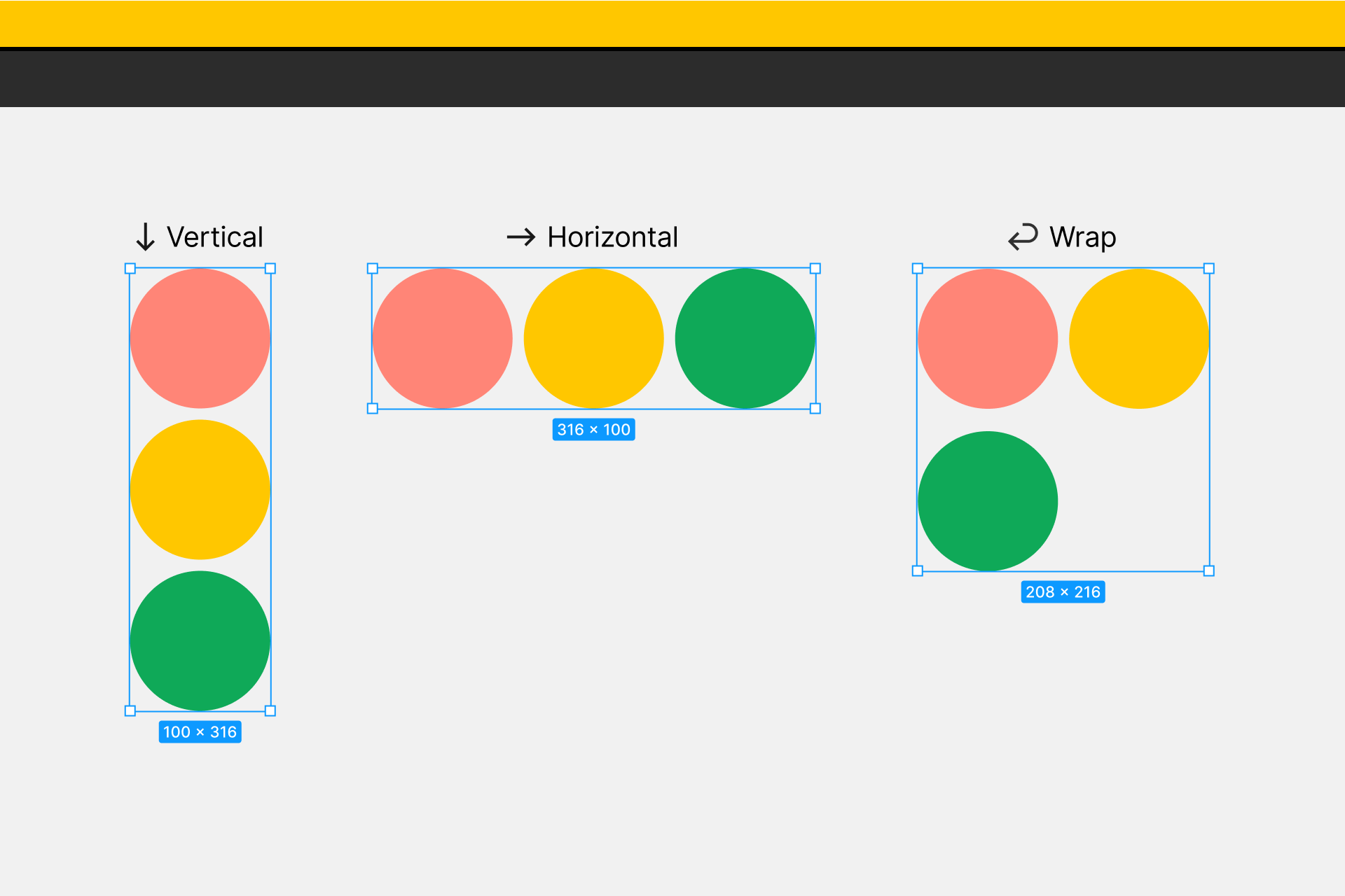 ## Spacing between items You can control the **spacing between items** in an auto layout frame. Unlike smart selection, there isn't a way to adjust the spacing on the canvas. Instead, use the spacing fields in the **Auto layout** section of the right sidebar: - Horizontal space between - Vertical space between Enter a number in the field, nudge the values using your arrow keys, or scrub the field using your cursor.  ## Padding Padding controls the empty or white space between the child objects and boundary of an auto layout frame. You can set padding uniformly, or have different values for top, right, bottom, and left padding. - Enter a single value in the field to set equal padding on all sides, or use CSS shorthand to set individual values. For example, entering `1,2,3,4` sets the values to top: 1, right: 2, bottom: 3, and left: 4 respectively. Or entering `1,2` sets the values to top/bottom: 1 and left/right: 2. - To manually set unique padding for each side, click to open the alignment and distribution settings and adjust each value individually. Note: Negative padding values are not supported.  Tip! Press the `tab` key to navigate between the top, right, bottom, and left input fields. ## Alignment Choose how to align child objects within an auto layout frame. Both the direction of the auto layout frame and the distribution will determine what alignment options you have available. Unlike objects in a regular frame, you can't control the alignment of the objects individually. For that reason, you set the alignment of the child objects on the parent auto layout frame. Use the interactive grid to select from nine layout options for the children in a frame.  If your distribution is set to **Space between**, you have three options for each direction: - vertical Auto layout: Left, Center, Right - horizontal Auto layout: Top, Center, Bottom If your distribution is set to **Packed**, you have the same nine options for each direction: - Top left - Top center - Top right - Left - Center - Right - Bottom left - Bottom center - Bottom right Note: When one or more resizing properties are set to hug contents, some selections won't result in visually different layouts on the canvas. This is because hug contents removes any extra space around the child objects. ## Distribution Once you've set alignment rules for child objects in a frame, choose how those objects will be distributed within that frame. In the alignment panel, click the arrow to select between: - **Packed:** Objects in a frame will be grouped together. Use this option to keep objects in a frame as close as possible and aligned together. - **Space between**: Objects in a frame have the space between them equally distributed along the direction and alignment set for the frame. Use this option to stretch objects across a frame.  ## Resizing One of the most powerful functions of auto layout is its ability to control the dimensions of the objects in an Auto layout frame. Set resizing behavior for parent auto layout frames to adapt to any changes made to their children objects. Resizing settings can be applied for objects on both the X and Y axes individually using the dropdown menus and the resizing panel.  Note: Text layers also have their own resizing properties. Within an auto layout frame, this may produce some useful results. If you want your auto layout frames to be completely fluid, we advise against using fixed size text boxes. Fixed size text layers won't resize to accommodate your text, which may cause overlap between layers in an auto layout frame.**[Learn more about text resizing →](https://help.figma.com/hc/en-us/articles/360039956634)** ### Fixed width or height When an auto layout frame is set to **Fixed** width or height, the values of the frame's dimensions remain the same regardless of the content within them. The size of the frame doesn't respond to changes in the objects within them, like a string of text that changes in length. ### Hug content Set an auto layout frame to **Hug content** to resize itself according to its child objects. The frame will keep the smallest possible dimensions to surround the objects within it, while respecting the padding value. Note: If any child objects within an auto layout frame are set to **Fill container**, the parent frame will no longer hug contents and become **Fixed** for the axis. ### Fill container Objects in an auto layout frame set to **Fill container** stretch to the width and/or height of their parent frame. ## **Constraints and resizing** You can't apply constraints to child objects within an auto layout frame. Instead, you can use the resizing property to define how objects respond as the frame, or the objects in the frame, are resized. You can still apply constraints to an auto layout frame if it's nested within a regular frame. You will see a **Constraints and resizing** section, which allows you to set both the constraints for the Auto layout frame and the resizing behavior for any objects within it. For example: if you created a navigation bar using auto layout, you may want it to adjust to different screen sizes. You can use constraints to make sure the navigation bar responds correctly when its parent frame is resized, and resizing to control how the objects within the navigation bar respond to those changes. 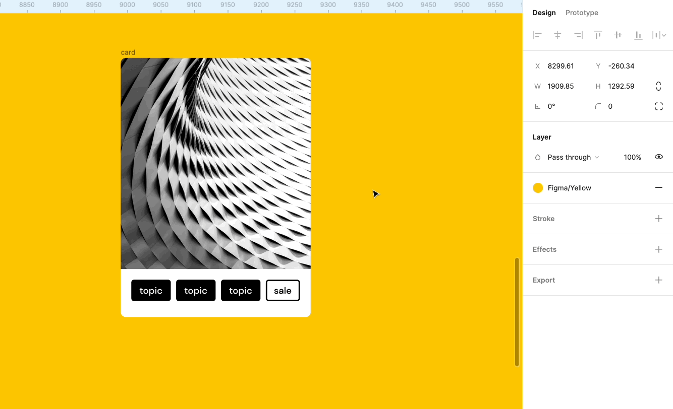 **[Learn more about constraints →](https://help.figma.com/hc/en-us/articles/360039957734)** ## Add objects to an auto layout frame You can add any layer or object to an auto layout frame. 1. Click and drag an object over an auto layout frame. 2. Use the blue indicator to choose where to place the object. 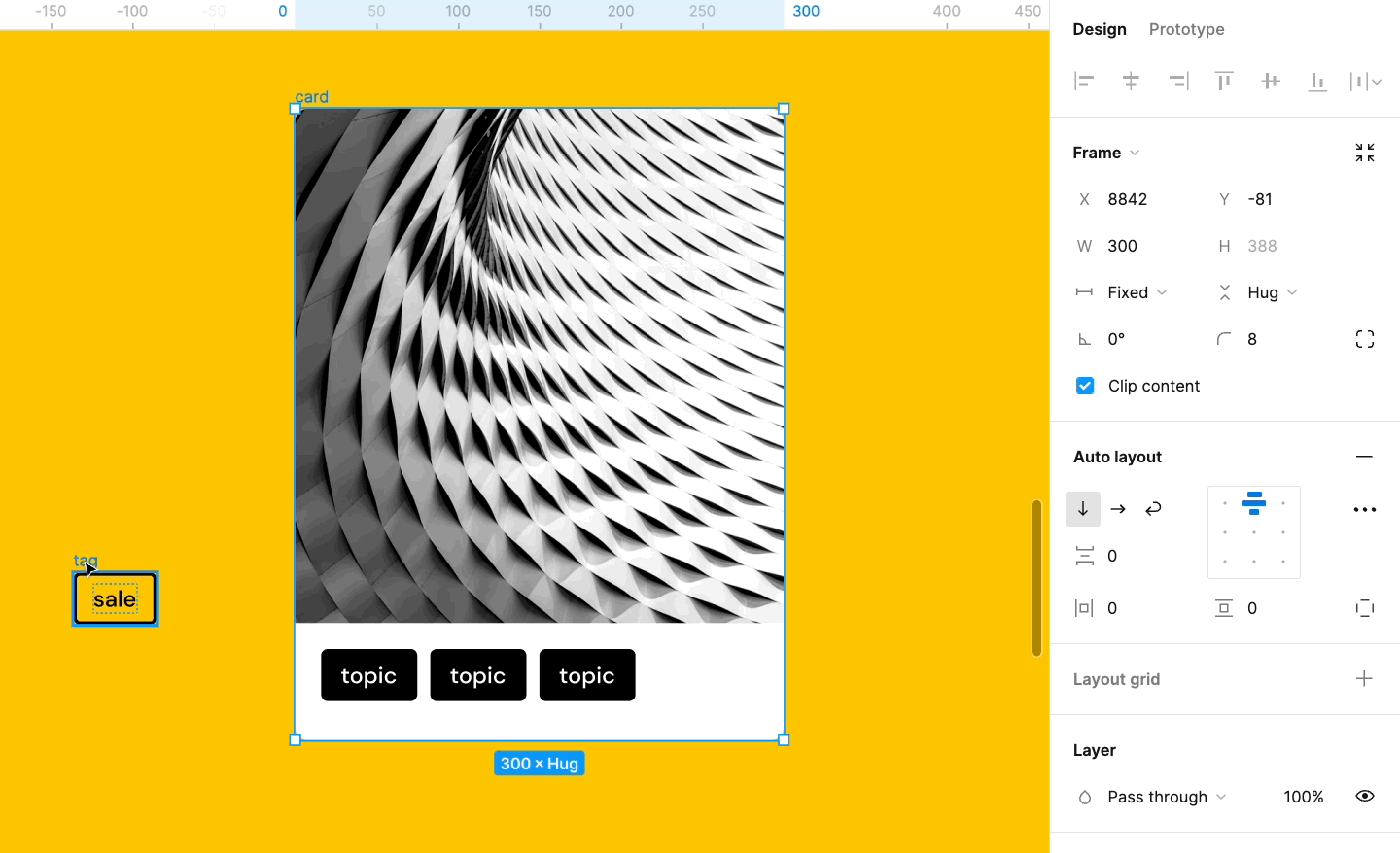 Note: The object's size determines if it can be added to the auto layout frame. If any of the object's dimensions are larger than the parent frame, you won't see the option to add it to the auto layout. Use the modifier key to bypass Figma's default behavior and add larger objects to an auto layout. Or, to add objects to a nested Auto layout. Mac: `⌘ Command` Windows: `Ctrl` [Learn more about parent, child, and sibling relationships →](https://help.figma.com/hc/en-us/articles/360039959014-Parent-child-and-sibling-relationships) ## Nest auto layout frames You can nest an auto layout frame within another auto layout frame. This allows you to combine horizontal and vertical layouts to create complex interfaces. When you nest an auto layout frame, the nested frame will have both parent and child properties. In our example below, there are four levels of auto layout: 1. **Button:** Each button is a horizontal auto layout. This allows the button to grow and shrink as we change the label text. 2. **Button Row:** We then add both buttons to another horizontal auto layout. This allows objects to respond when we make any changes to a sibling's contents. 3. **Post:** We then add our buttons to a vertical auto layout with the other objects in the post. This includes a description, an image and the user's profile. 4. **Timeline:** We've added three to a vertical auto layout to create our timeline. The auto layout frame is the **top-level frame** which sits on the canvas.  You can nest auto layout frames in a couple of ways: - Drag an auto layout frame into an existing Auto layout frame - Create a new auto layout frame around a selection of Auto layout frames (and other objects). 1. Select the auto layout frame, and the other layers you'd like to include. 2. Use the keyboard shortcut Shift + A to add auto layout. 3. Figma will create a frame around your selection, and add auto layout. ## Duplicate objects You can duplicate existing objects to add them to the Auto layout. Figma will add the duplicate to the right (horizontal) or below (vertical) the original object. 1. Select a child object in an Auto layout frame. 2. Duplicate it by using the keyboard shortcut: - Mac: ⌘ Command - D - Windows: Ctrl + D ## Arrange or reorder objects You can change the order that objects appear in an auto layout frame. This is only supported on main components, or auto layout frames outside of a component. 1. Select the child object. If the layer is nested, you'll need to use the modifier key to deep select: - Mac: ⌘ Command - Windows: Ctrl 2. There are a few ways to reorder objects: - Use the arrow keys on your keyboard the object to a new position. - Click-and-drag the object to a new position. ## Remove objects To remove an object from a main component or auto layout frame: - Drag the object outside of the auto layout frame. - Click the to toggle the layer visibility. - Select the object and press the `Delete` or `Backspace` key You can't delete a layer or object from an instance. If you try, Figma will only toggle the layer's visibility instead of removing it. Tip! Toggling a layer or object's visibility will hide it from an auto layout frame. If you want to create a gap in where the object should be, you can adjust the opacity of the object instead. In the right sidebar, update the **Layer** settings to `0%`. When you remove auto layout, you will have access to a frame's regular properties. There are a couple of ways to remove auto layout: - Right-click on the frame and select **Remove auto layout** - In the right sidebar, click the next to **Auto layout** Note: You can't use the **Add auto layout** keyboard shortcut to remove the auto layout property. Using this shortcut will create a new auto layout frame around your current selection. There are a few things to be mindful of when creating prototypes with auto layout. Smart Animate transitions do not take into account the background of a frame. If you want to use a **Slide in** or **Move in** transition with smart animate, you will need to add a background. You can create a rectangle within a regular frame and place your auto layout frame within it. **[Learn more about slide in and move in transitions →](https://help.figma.com/hc/en-us/articles/360039818874-Create-advanced-animations-with-Smart-Animate#h_82a1603b-89e5-4254-91a6-104456c18d32)** To apply scrolling overflow to a frame, you need to have content to extend beyond the frame's bounds. As an auto layout parent's dimensions are content-driven, it will resize to fit the objects. To replicate scrolling overflow you will need to put the auto layout inside a regular frame. Note: Presentation view supports scrolling of long frames by default. You will only need to use this workaround when you want to clip content. As components are frames, you can add auto layout to them. You will need to add auto layout to each component individually.There isn't currently a way to add auto layout in bulk. ### Main components ✅ Adjust vertical and horizontal **Padding **✅ Adjust **Spacing between** objects ✅ Reorder objects within a component ✅ Add new objects ### Component instances ✅ Adjust vertical and horizontal **Padding **✅ Adjust **Spacing between** objects 🚫 Reorder objects within a component 🚫 Add new objects Want to add icons to instances? We recommend adding a placeholder icon, with 0% opacity, to the main component. You can then swap out the icon for another component in your library. Note: The following updates were released November, 2020. ## Update alignment for older auto layout frames In previous versions of auto layout, alignment was controlled at the child object level. This meant you could have different alignments for different child objects in an auto layout frame. We found the behavior uncommon among users, so in November 2020 we moved alignment controls to the parent frame to simplify how auto layout works. With the latest update, all child objects have to be aligned the same way. If you already have auto layout frames with children of different alignments that were created before November 2020, you may see the following:  In order to make adjustments to your auto layout values, you first need to update the frame in order to remove the individual child alignment. After updating your frame:  - Figma will try to maintain your original design visually. In many cases, Figma will add intermediate frames to allow for differing alignments. These frames will be named **Auto-added** frame. - You can immediately undo this change, however, if you click away from the window or refresh the page, you will not be able to undo the update in the future. - If you’ve updated a main component, confirm its instances updated correctly. To create a design with child items with different alignment: 1. Select the item you want to align differently. 2. Add Auto layout to the item using the keyboard shortcut Shift A. 3. Set the newly created frame to **Fill container** in the axis you want the alignment to be in. 4. Set the alignment as needed.Who can use this feature Components are supported on [any team or plan](https://help.figma.com/hc/en-us/articles/360040328273-Choose-a-Figma-Plan). You must be on a Professional, Education, or Organization plan to publish components to libraries. Anyone with edit access to the file can make changes to the main components in that file. Any instance you create is linked to the main component. When you make changes to the main component, Figma will apply any changes you apply to any linked instances. If you are using instances within the same file as your main components, Figma applies changes immediately. If the components are published to a library, you need to publish those changes to see those updates in subscribed files. ## Update components To make sure Figma applies changes to all instances of a component, you will need to edit the main component. You can only edit main components in the original files where they live. - **Unpublished components**: If you're on the Starter plan, or haven't published the components to a library, you can edit your main components like you would any other layers. Figma will automatically apply any changes you make to the main component to any local instances in your file. - **Published components: **Figma will immediately apply any changes you make to any instances in that file. If you want those changes to apply to instances in other files, you will need to publish those changes to the Library. ### Find main components If you're working with instances in a separate file, use the **Go to main component** setting to open the library file. From there, you can apply any changes you want to the main component. 1. Select an instance in the current file. 2. Open the **Design** tab in the right sidebar. 3. Click in the instance section to open the library file. Once you select the main component selected, you can make any changes. Figma will make sure those changes are applied to any linked instances. Note: If you accessed the main component from another file, Figma will give you the option to **Return to instance** after making your changes. ## Push overrides to main component There may be situations where you want changes you've applied to an instance to apply to the main component as well. You can use the **Push overrides to main component** setting to apply any overrides to the main component. This will also update any other instances of that component. You can only push overrides if the main component is in the same file as the instance. It's not possible to push overrides to components in another file, including published libraries. Note: It's not possible to push overrides to a component that's nested within another component. You will need to make those changes to the main component itself. 1. Select the instance with your overrides applied to it. You need to select the parent frame of the instance, not a sublayer. 2. In the right sidebar, click next to the component name. 3. Select **Push overrides to main component** from the options. 4. Figma will apply your overrides to the main component. ## Publish changes to the library If you make changes to a published style or component, this will only apply those changes to instances in the current file. If you want those changes to be reflected in your library, you will also need to publish those changes to the library. Figma will display a blue dot on the icon in the **Assets** panel of the left sidebar to let you know if there are any updates that need to be published: 1. Click either the **Assets** panel at the top of the left sidebar to open the library modal. 2. Add a description of any decisions or changes. This will show in the [file's version history](https://help.figma.com/hc/en-us/articles/360038006754), and the **Updates** tab of the Libraries modal. 3. View a list of **changes** to the library. This details any styles and components added, modified, or removed. 4. Choose which changes you want to publish: - Check individual components you do want to publish - Uncheck individual components you don't want to publish - Uncheck **Changes** to deselect all styles and components 5. When you've finalized your styles and components, click the **Publish** button. Figma will show a notification to confirm your file has been successfully published.  **[Publish styles and components →](https://help.figma.com/hc/en-us/articles/360041051154)** Note: By default, Figma will open the main component file in a new tab. Figma won't show you the **Return to instance** prompt, but you can switch between tabs to return to the original instance.Before you start Who can use this feature Only people with can edit access to the file can make changes to a layer's position, dimensions, or alignment. You can use your arrow keys to nudge the position of your layers. Figma allows you to set two default nudge amounts: **small nudge** and **big nudge**. By default, small nudge is set to `1` and big nudge set to `10`. Both of these values are in resolution-independent points. ## Adjust nudge settings 1. Click on the menu. 2. Go to **Preferences > Nudge amount...** 3. Enter your desired **Small nudge** and **Big nudge** in the fields provided. 4. Click outside the window or use the icon to apply and close.Before you start Who can use this feature Users on any [plan](https://help.figma.com/hc/en-us/articles/360040328273) can create Components. Users on a Starter team can't publish Components to a Library. Users with can edit access to a file can create and edit components. Users with can view access to a file can use components from a [library](https://help.figma.com/hc/en-us/articles/360025508373), if they have access to it. You can create a component out of any collection of objects or layers. components can be as simple as shapes, buttons or fields, or more complex design like cards and menus. Tip! As you create components and build out your design system, you'll find the need for components that are similar to each other, with only slight differences. Variants allow you to group and organize similar components into a single container. This simplifies your component library and makes it easier for everyone to find what they need. [**Learn how to create and use variants →**](https://help.figma.com/hc/en-us/articles/360056440594) You can create a single component out of selection of layers. Or, create individual components in bulk from a selection of objects. ## Create a single component There are a few ways to create a component. First, you'll need to select the layers you'd like to include in the component. 1. Select the layers you’d like to be included in the component. 2. You then have a few different methods for create a component: - Click **Create component** in the toolbar. - Right-click on your selection and choose **Create component**. - Use the keyboard shortcuts: - **Mac**: ⌥ Option - ⌘ Command - K - **Windows**: Ctrl + Alt + K 3. Figma will nest the layers within a special component frame_._ Identify components in the **Layers** panel using the purple icon. 4. In the right sidebar, add a **Description** and **Documentation link** for collaborators. Collaborators and developers can view this information in the [Inspect panel](https://help.figma.com/hc/en-us/articles/360055203533). Tip! Figma will create a custom button if you add a link from any of the following domains: - Github - Notion - Storybook - Zeroheight - Confluence - Dropbox Paper ## Create components in bulk By default, the **Create component** action will create a single component from your selection. You can also create components in bulk. This allows you to select multiple groups or frames and create components out of them. Create multiple components from: - Objects and layers in frames - Objects and layers in groups - Single layers, like a path or vector network - Layers in a boolean operation Note: If you select more than one layer that isn't on one of the above configurations, Figma will create a component for each individual layer. 1. Select the layers you want to create components from, 2. Click the next to **Create component** in the toolbar. 3. Select **Create Multiple components** from the options. 4. Figma will create a component for each frame, group, boolean operation, or path. 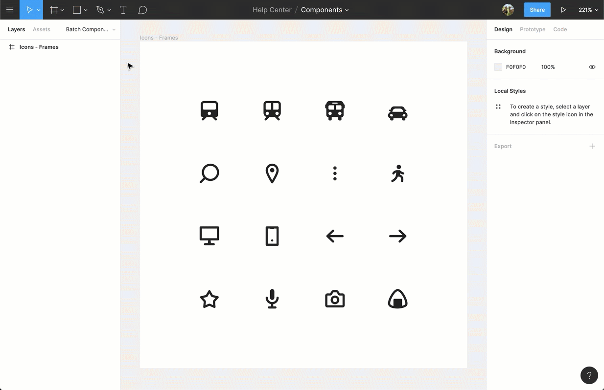Before you start Who can use this feature Users with can edit access to a file can create and edit components. Users with can view access to the original file can use components from that Library. Check out these video tutorials about components:
Components are elements you can reuse across your designs. They help to create and manage consistent designs across projects.
You can create components from any layers or objects you've designed. These could be a whole range of things like buttons, icons, layouts, and more.
There are two aspects to a Component:
A Main Component defines the properties of the Component.
An Instance is a copy of the Component you can reuse in your designs. Instances are linked to the main Component and receive any updates made to the Component.
You can create components to use within a single file. Or, you can use Team Library to share components and Styles across files and projects.
Read these articles to learn more detailed and specific information about components.
Make changes to components and instancesBefore you start
Who can use this feature
Anyone with can edit access to a file can publish the file as a library.
Components are elements of your designs that you want to reuse - you can think of them like building blocks. Components help keep your designs consistent and allow you to quickly apply changes across multiple files and projects. They can be basic elements made up of a few layers, like buttons or icons. Or more elaborate combinations of other elements, like toolbars and menus.
Styles are sets of properties that can be applied to objects across your team's designs. You can use Styles to define attributes for color, text, stroke, fill, effects and layout grids.
Styles and components live in the files they are originally created in. To find and access styles and components across your files and projects, you can publish them as a library. This allows you to enable that library in your teams, drafts, or files.
Access components from the Assets panel in the left sidebar, and styles using the Style icon next to any relevant property.
## Build libraries Create the styles and main components that define your brand. Publish these styles and components as a library. - [Styles in Figma](https://help.figma.com/hc/en-us/articles/360039238753-Styles-in-Figma "Styles in Figma") - [Manage and share styles](https://help.figma.com/hc/en-us/articles/360039820134-Manage-and-share-styles "Manage and share styles") - [Apply Styles to layers and objects](https://help.figma.com/hc/en-us/articles/360040316193-Apply-Styles-to-layers-and-objects "Apply Styles to layers and objects") - [Create styles for colors, text, effects and, layout grids](https://help.figma.com/hc/en-us/articles/360038746534-Create-styles-for-colors-text-effects-and-layout-grids "Create styles for colors, text, effects and, layout grids") - [Create and use variants](https://help.figma.com/hc/en-us/articles/360056440594-Create-and-use-variants "Create and use variants") - [Create components to reuse in designs](https://help.figma.com/hc/en-us/articles/360038663154-Create-components-to-reuse-in-designs "Create components to reuse in designs") Continue to develop, iterate and refine your styles and components, and publish your changes to the library. Figma will keep a detailed record of your changes in the file's version history. ## Access libraries Enable libraries in team files to allow members to view and use them across their files. Designers and collaborators receive updates to styles and components, making sure they're always using the latest version. ## Use styles and components Create local instances of components and apply styles to layers in your files. Override properties of local instances or detach them to customize further. Swap individual instances or swap entire style and component libraries. - [Create an instance of a component](https://help.figma.com/hc/en-us/articles/360039150173 "Create an instance of a component") - [Apply overrides to instances](https://help.figma.com/hc/en-us/articles/360039150733 "Apply overrides to instances") - [Swap between instances in a file](https://help.figma.com/hc/en-us/articles/360039150413 "Swap between component instances in a file") - [Detach instances from their main component](https://help.figma.com/hc/en-us/articles/360038665754 "Detach an instance from the component") - [Swap style and component libraries](https://help.figma.com/hc/en-us/articles/4404856784663) There are a few different contexts for swapping your libraries: - Manage missing libraries - Swap between style themes - Swap styles and instances in bulkBefore you start Who can use this feature Anyone with can edit access can create prototypes. Anyone with can view access can play back prototypes in Presentation view. Figma’s prototyping features allow you to create interactive flows that explore how a user may interact with your designs. Prototypes are a fantastic way to: - Preview interactions and user flows - Share and iterate on ideas - Get feedback from collaborators - Test interactions with users - Present your designs to stakeholders Watch our video on prototyping below. Or, check out our [Prototype & Collaboration Playlist](https://www.youtube.com/playlist?list=PLXDU_eVOJTx7aqRW3Skp1aRT9ktC3ctqA) on Youtube.
With prototyping in Figma, you can create multiple flows for your prototype in one page to preview a user's full journey and experience through your designs.
A flow is the network of frames and connections in a single page. A prototype can map out a user's entire journey through your app or website, or it can focus on a specific segment of it via its own flow. For example: your prototype covers all possible interactions on an eCommerce site. Within the prototype, you have flows for creating an account, adding items to a cart, and checking out.
Figma creates a flow starting point when you add your first connection between two frames. There are a few other ways to add a flow starting point to your prototype:
With the starting frame selected, click in the Flow starting point section of the right sidebar.
Right-click on the frame, then click Add starting point.
Duplicate a frame with an existing starting point.
When it's time to test your designs, you can share the entire prototype or copy the link to a flow starting point.
Learn more about starting points and flows →
Note: A top-level frame can be part of multiple flows, but can only have one starting point. Frames nested within a top-level starting frame can have connections that navigate the user around multiple flows. For example, Log in and Sign up buttons can be nested in the same starting point frame, then be connected to frames in separate flows for each experience.
Select the hotspot for the connection.
Click to create the connection.
Drag it to the destination.
If there are no existing connections, Figma will make the first frame a starting point.

Open the Prototype tab in the right sidebar
Add interactions
Set interaction details
Apply an animation
Preview your animation

Select a Device and Model
Preview your prototype
Select Background color
Set the prototype's Starting Frame

Get started
Prototype actions, triggers and animations
Advanced interactions
A hotspot is where the Interaction takes place. A hotspot can be any object within the original frame e.g. a link, button, image or icon, etc.
Connections are the blue arrows or "noodles" that connect the hotspot to the destination. We apply the interaction and animation settings via the connection.
A flow is the network of connected frames that form a path through a prototype. Each flow has its own starting point. You can have multiple flows within a prototype.
The starting point is the first frame of a flow. Set multiple starting points to show different flows of the prototype in Presentation view.
The trigger determines what type of interaction with the hotspot will cause the prototype to advance. This could be a mouse or touch interaction e.g. tap, drag, click, hover, etc.
The destination is where the transition ends. This must be a top-level frame - a frame that is added directly to the canvas - and not an object within a frame. If we think of moving from A to B, A is the hotspot and B is the destination.
The action defines the type of progression is occurring in the prototype. For example, the action could be to navigate to another frame, or open an external URL.
The animation settings determine how the prototype moves from one frame to the other. You can control the type of animation, as well as the speed and direction.
A transition is the type of animation. This defines how the action moves to the destination.
The direction controls the direction that the transition comes from. Choose between left, right, top or bottom.
The duration controls the time it takes to complete the animation. The shorter the duration, the faster the transition. Select a duration between 1ms and 10000ms (10 seconds).
Easing affects the acceleration of the animation, i.e. whether it starts slow or fast. This allows you to build animations that feel more natural.
Overlays are frames that appear above the current screen or frame. You can use overlays to create tool-tips, interactive menus, alerts, or confirmations.
Overflow behavior allows you to define how your prototype responds to scrolling. This allows you to create more advanced user interactions e.g. carousels, galleries, or interactive maps.
Choose which device will be shown when presenting your prototype. Define both the device and the model.
The background color lets you define the color in the background of your prototype.
If you have a prototype with portrait and landscape frames, you can select an orientation. The orientation is set for the entire prototype. It's not possible to switch between portrait and landscape view within a prototype.
A preview will show you how something will look or work in the prototype. We show previews for both animations and prototype device settings.Before you start
Who can use this feature
Anyone with can edit access can create styles.
Use styles to define the color, text and any effects applied to objects; or to define the structure and appearance of layout grids.
Create styles for:
Paints and colors: fill, stroke, background color
Text: font family, size, line height, spacing
Effects: drop shadow, inner shadow, layer blur, background blur
Layout grids: row, column, grid
Whenever you make a change to a style's properties - like updating a text style's color from red to blue - Figma will apply those changes to any objects using that style.
Like components, styles can be shared by publishing them to your team library. This allows you to easily establish and maintain consistent styles across your team projects.
Learn more about when to use styles in our blog post: Best practices: components, styles, and shared libraries.Before you Start
Who can use this feature
Anyone with can edit access can import Files to a team. Anyone can import Files to their Drafts.
Users with Edit access can import image or vector files into a File
Moving files between tools doesn't need to be painful. You can import a range of different file types into Figma.
This includes entire design files from Sketch or Figma, as well as individual Image and Vector files.
There are many different ways to import Files into Figma. The best method will depend on what type of File you are wanting to import.
I want to import:
The table below details which methods are supported for each File type.
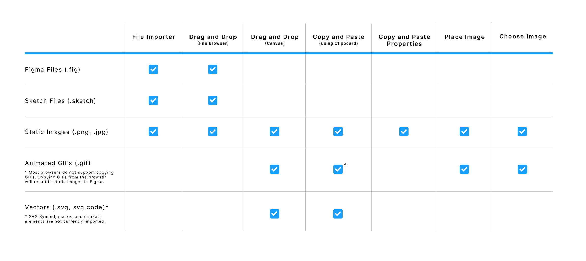
There are many ways you can add images to Figma. - [Drag and drop](https://help.figma.com/hc/en-us/articles/360040028034) images onto the Canvas - [Import files](https://help.figma.com/hc/en-us/articles/360041003114) via the File Browser - [Upload an Image as a fill](https://help.figma.com/hc/en-us/articles/360041090073) - [Paste images from your clipboard](https://help.figma.com/hc/en-us/articles/360040615014) - [Copy and paste images between objects](https://help.figma.com/hc/en-us/articles/360040615014) - [Add images to objects in bulk with place image](https://help.figma.com/hc/en-us/articles/360041089973) - [Add animated GIFs to prototypes](https://help.figma.com/hc/en-us/articles/360041486873) Learn more about importing images in our [Add images to your designs](https://help.figma.com/hc/en-us/articles/360040028034) article. Exporting and importing Vectors often requires conversion. Depending on the quality of the exporter/importer, this can often be a lossy process. As SVG is a _lossless_ format, **we recommend exporting SVG files**. You can import vectors via a couple of different methods: - Importing entire Sketch or Figma Files that contain vectors. - Copying layers in other design tools and pasting them in Figma. - Exporting vectors as SVGs and importing them into Figma. Learn more about importing and exporting vectors in our [Copy assets between design tools](https://help.figma.com/hc/en-us/articles/360040030374) article. **Note:** If you are working with large file sizes, especially files with multiple pages and lots of images, then you may encounter issues importing these into Figma. Files still loading or images can't be viewed? We recommend breaking up the original file into smaller files before you try to import again. There are a couple of ways you can import entire design files into Figma. Import them using the file importer or drag and drop files into the file browser. [**Learn how to import files →**](https://help.figma.com/hc/en-us/articles/360041003114) **Missing fonts?** If you're using Figma in the browser then you will need to download the Figma Font Helper to access any locally available fonts. The Figma Desktop app will already have access to local fonts by default. Learn more about managing missing fonts in our [Manage missing fonts](https://help.figma.com/hc/en-us/articles/360039956994) article.Before you start Who can use this feature Users with Edit access to a file can rename layers, including Components. We recommend defining and documenting a component structure within your team or company. This will make it easier to find components in the [Assets panel](https://help.figma.com/hc/en-us/articles/360038663994-Name-and-organize-components#assetspanel). As well as [swapping related component instances](https://help.figma.com/hc/en-us/articles/360039150413). There are many different ways to structure your components. We'll show you how we structure components for the [Assets panel](https://help.figma.com/hc/en-us/articles/360038663994-Name-and-organize-components#assetspanel) and [related components](https://help.figma.com/hc/en-us/articles/360038663994-Name-and-organize-components#h_01EJD65SKA7SQ1WAT0CPZTP4BM). The fastest way to access components in a file is via the **Assets** panel. To open the **Assets** panel**:** - Click on the **Assets** tab in the left sidebar. - Or, use the Keyboard Shortcuts: - **Mac**: ⌥ Option - 2 - **Windows**:: Alt + 2 ## Structure In the **Assets** panel, you will have access to the following components: - **Local Components**: Components you created in this file. - **Private to this file**: Components you created in this file, but didn't publish to the Team Library. - **Used in this file**: Components from other Libraries that you have already used in this file. - **Enabled Libraries**: Any default Libraries that anyone has [enabled in a Team](https://help.figma.com/hc/en-us/articles/360041568033) or [Organization](https://help.figma.com/hc/en-us/articles/360040530413). There will be a heading for each of these sections in the **Assets** panel. We will list all enabled libraries, with their file name as the heading. You can collapse the headings to reduce the space they take up. Or expand them to explore the components within those files. 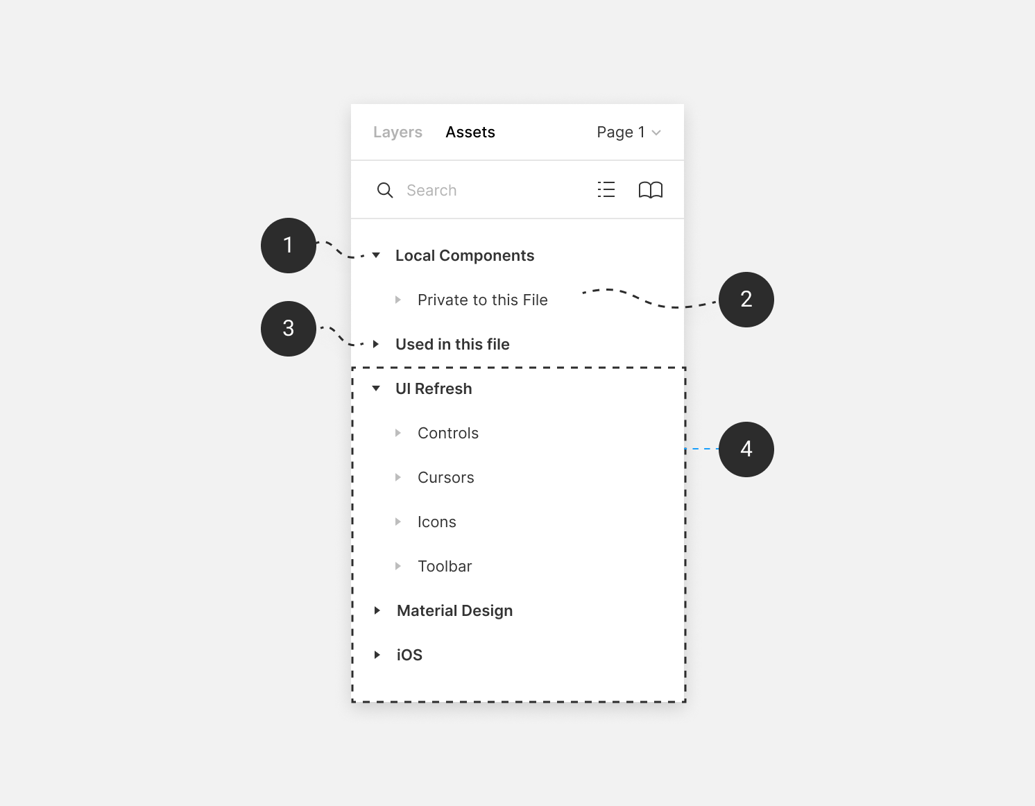 ## Explore library file We display components in a path that mirrors the file's structure. The file path will follow this general structure: `file > page > frame` Each step in the path will represent a heading in the **Assets** panel. You can use the arrows to expand the file path and explore the components within each frame. We display pages in alphabetical order, not the order they are in the original file. 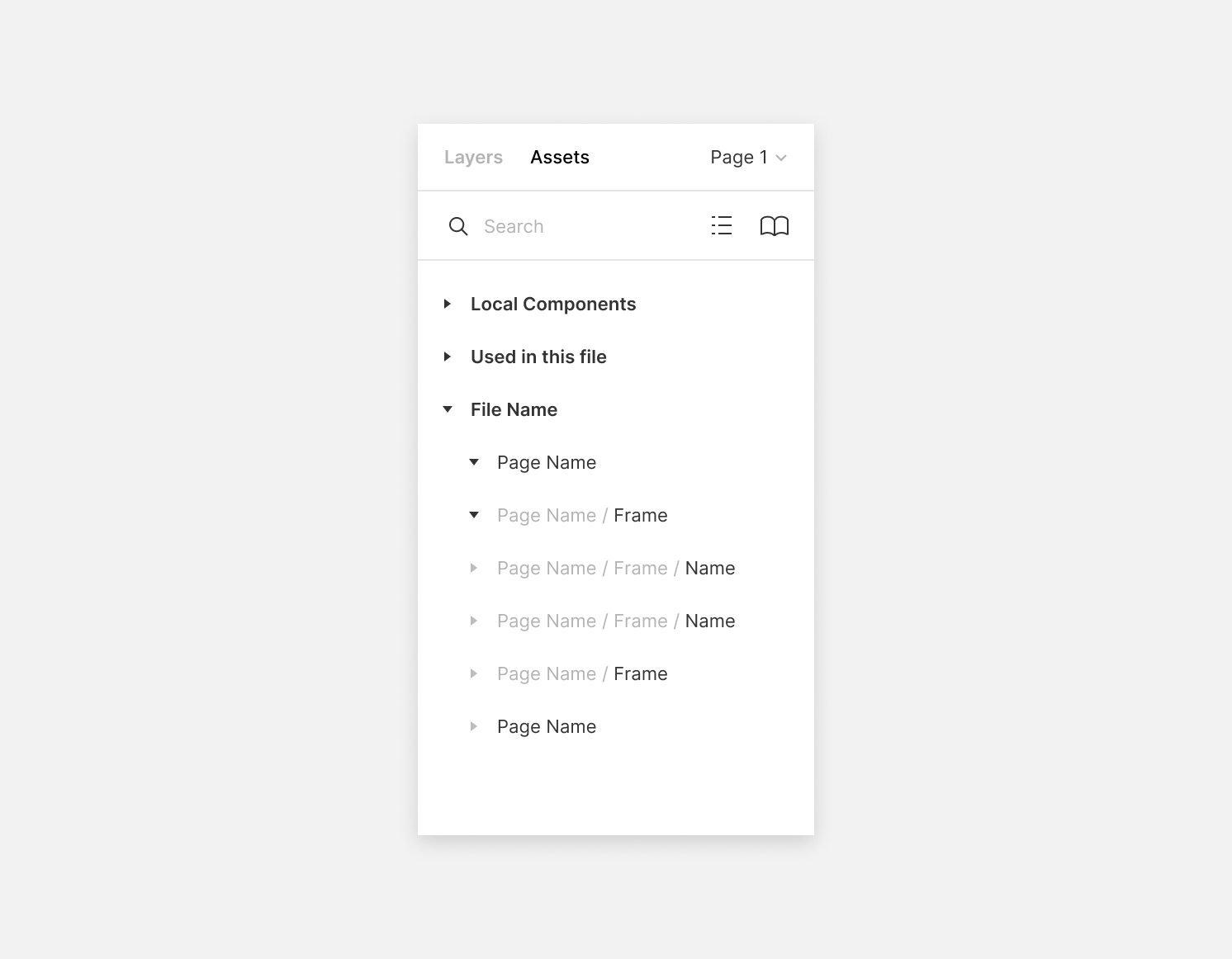 Tip! If you use a slash-separated naming convention, we will group those components together in the [Instance menu](https://help.figma.com/hc/en-us/articles/360039150413). e.g. `file / page / frame /**name**/` You can view the selected Component in **Instance** section in the **Design** tab. You can use this to switch between related components, without leaving the file. We determine related components by: - How you have named the Component. e.g. We will display `**UI/Button/**Active`, `**UI/Button/**Hover` and `**UI/Button/**Inactive` together. - How you have arranged the Component in the origin file. e.g. We treat all Components within the same frame as Related Components.  ## Name Components If you want to add another layer of Organization, you can name your components in a particular way. We recommend you use the slash separated convention e.g. Component/State. Let's say you have named the components in a frame like this: - Login/Active - Login/Hover - Login/Inactive - Create/Active - Create/Hover - Create/Inactive [Learn how to rename layers in bulk →](https://help.figma.com/hc/en-us/articles/360039958934) ## Organize components In this example, we've structured our components based on their location. We've used pages and frames to organize our components into groups. - In our **Figma UI** file, we have the components that make up the Figma UI. - We have created a page for the **Left Sidebar**. The page will house all our components related to that sidebar. - The left sidebar consists of two main panels: the **Layers** panel and the **Assets** panel. We've created a frame for each of these panels. - We support two sizes for each icon: **16px** and **32px**. We add both sets of icons to each respective frame. - To make it easier to differentiate between the icon sizes, we name the components. In the **Layers** panel we use the slash convention to name each Component e.g. **16 / Team Library** or **32 / Team Library**. 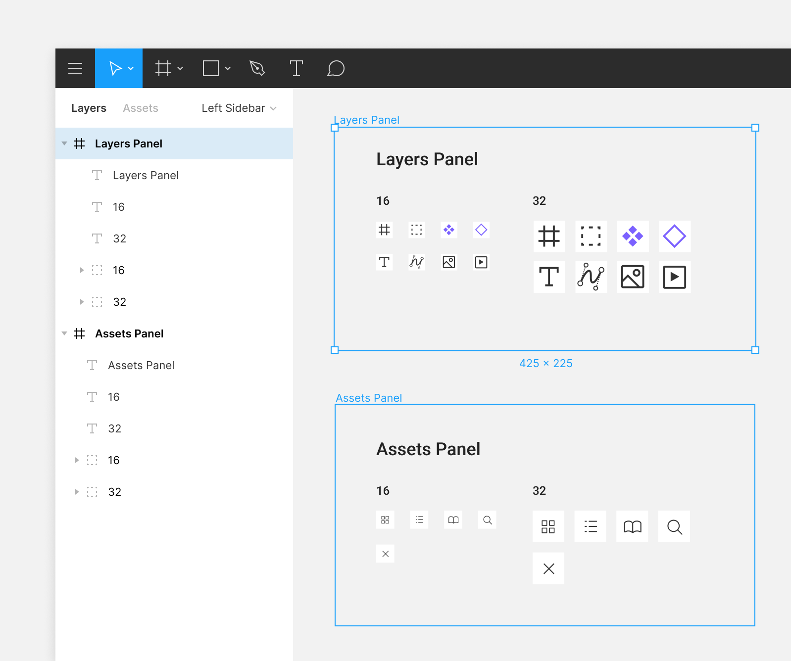 We've created a dialog window - in another file - that needs a close icon. We've already created one of these for the **Assets** panel, so we can use that one again. We need the 32px version of that Component. To find it in the Assets Panel we go to: `Figma UI / Left Sidebar / Assets Panel / 32` We can then drag that Component from the Assets Panel into the file. 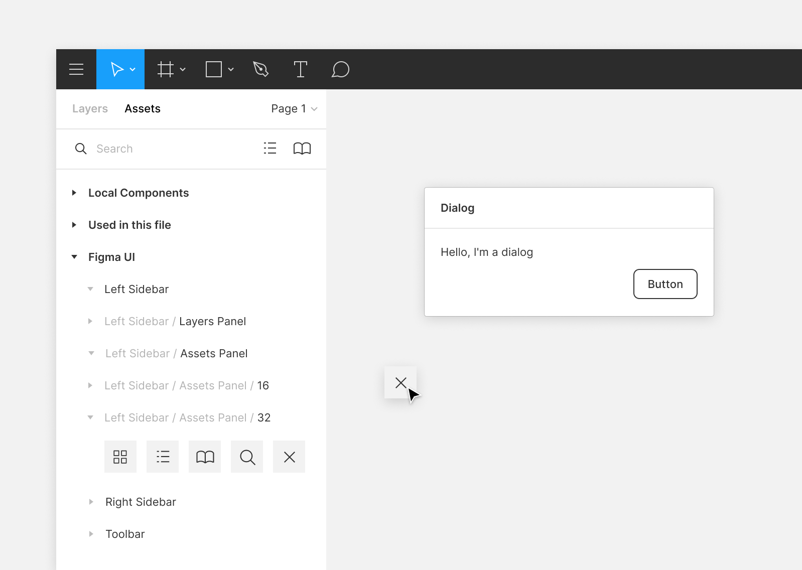 Note: For this approach, you will need to have the library enabled in the **Assets** panel. Learn more about [enabling default libraries](https://help.figma.com/hc/en-us/articles/360038743434).Before you start Who can use this feature Only people with can edit access to the file can make changes to a layer's position, dimensions, or alignment. Every shape, text object, or image you add to the canvas has its own layer. This allows you to adjust each layer individually as you create cohesive and complex designs. In this article, we'll show you how to adjust the alignment, position, dimensions, and rotation of your layers. This applies to individual layers, as well as frames, components, groups, and selections. You'll find most of these properties at the top of the **Design** panel in the right sidebar. You can also adjust a number of these properties on the canvas itself. 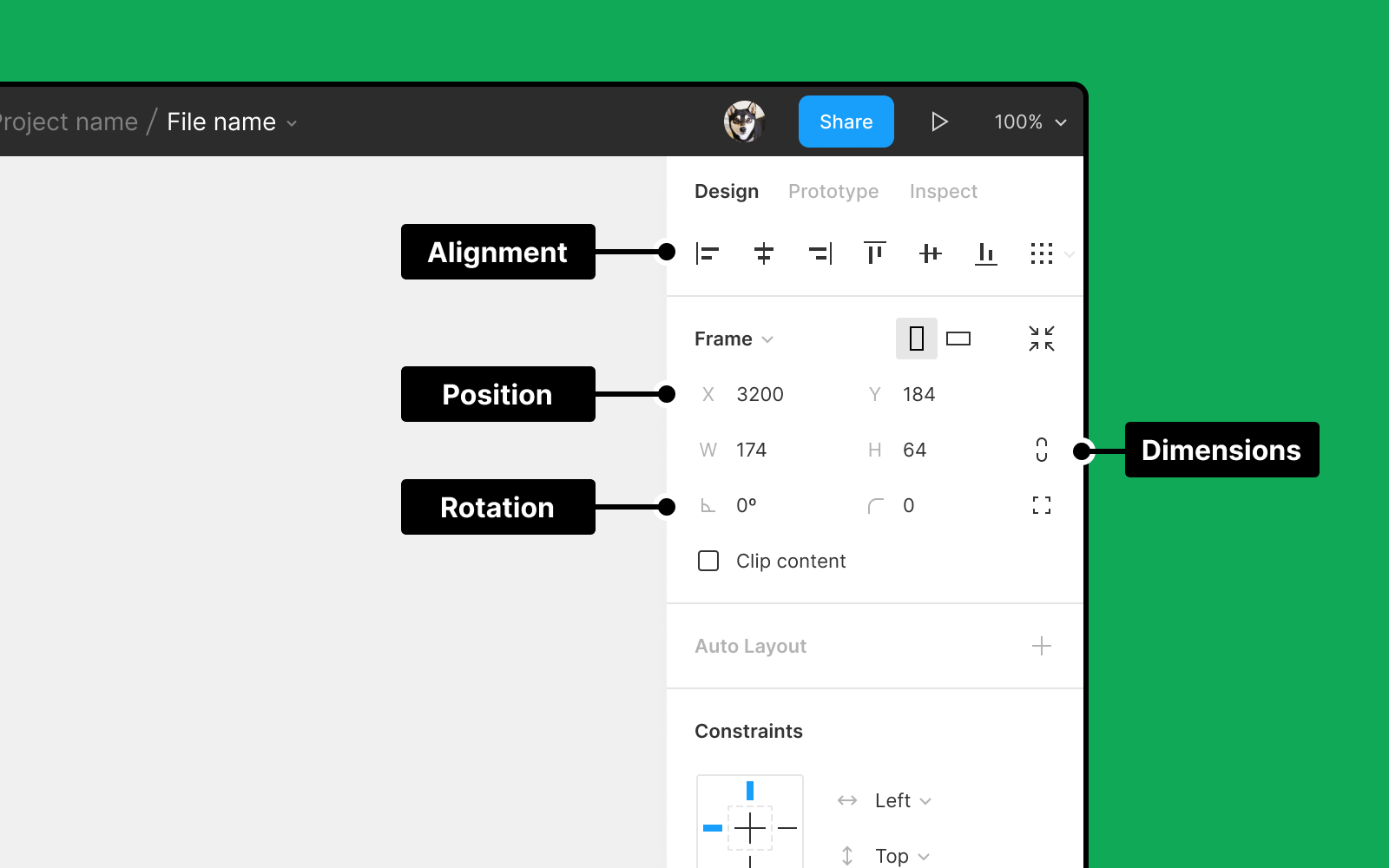 Alignment tools allow you to arrange layers on the canvas in relation to one another. Figma will determine your layer's alignment based on your specific selection. - **Select one object or layer:** Figma will align the layer to its parent. This could be a group, frame, or the containing frame of a component. - **Select multiple layers:** Figma will align layers in relation to each other. Note: There isn't currently a way to align more than one object to their parent. Figma will show you guides on the canvas when moving a selection within its parent container. This helps you align your selection to the vertical and horizontal centers of the parent frame. ### Icon key - Align left - Align horizontal centers - Align right - Align top - Align vertical centers - [Distribute horizontal spacing ↓](https://help.figma.com/hc/en-us/articles/360039956914-Adjust-alignment-rotation-and-position#h_01EW6D0HBY5H525H3Q52SWWEFD) - [Distribute vertical spacing ↓](https://help.figma.com/hc/en-us/articles/360039956914-Adjust-alignment-rotation-and-position#h_01EW6D0HBY5H525H3Q52SWWEFD) - [Tidy up (smart selection) ↓](https://help.figma.com/hc/en-us/articles/360039956914-Adjust-alignment-rotation-and-position#h_01EW6D0YKFKGJTGANGFDTBZBSW) ## Distribution Use distribution to create equal space between layers in a selection. You must have more than one layer or object selected. When using distribute, Figma will retain the position of the outermost objects or layers: - **Distribute horizontal spacing:** both the objects or layers on the outer left and outer right will maintain their position. - **Distribute vertical spacing:** both the top and bottom objects or layers will maintain their position. ## Tidy up Use tidy up to quickly align layers on one-dimension as rows or columns, or combine rows and columns to create two dimensional layouts. You can then adjust the horizontal and vertical spacing between the objects in your selection with smart selections. **[Learn how to use smart selection →](https://help.figma.com/hc/en-us/articles/360040450233)** Depending on your selection, you'll see one of the following options: - Tidy up vertical selection (one dimension) - Tidy up horizontal selection (one dimension) - Tidy up (two dimensions) ### One dimensional selections For a selection on either the horizontal or vertical axis (one dimension), Figma will arrange objects based on the axis they overlap on. Objects on the x axis will have only their horizontal spacing adjusted and objects on the y axis will have only their vertical spacing adjusted. Figma will use the most common spacing in the selection to set the **Space between** value. 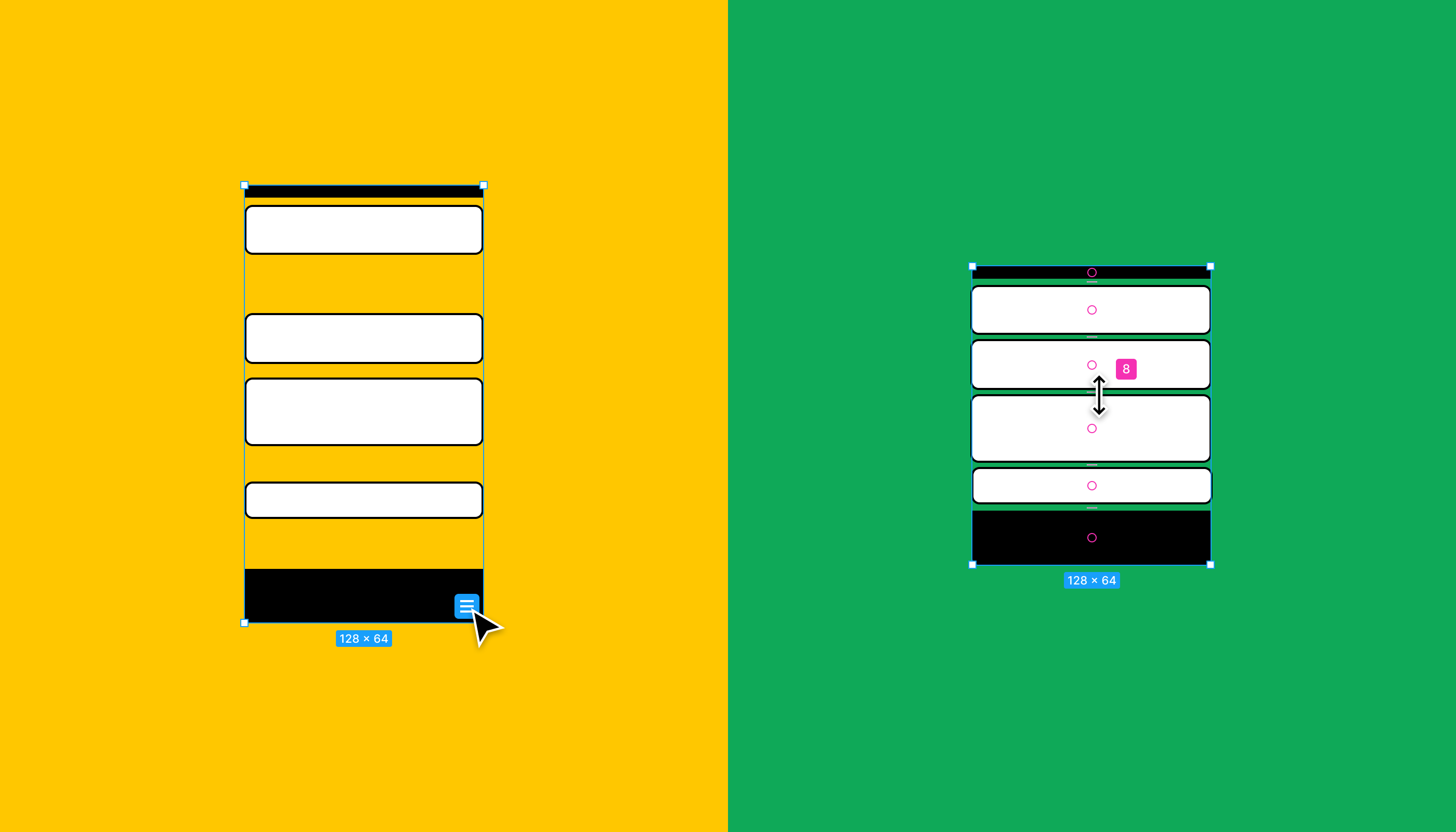 Note: When you use tidy up on a one-dimensional selection, Figma won't automatically align the objects along both axes, but you can use the alignment tools in the right sidebar l to make any further adjustments. ### Two dimensional selections When using tidy up on objects in two dimensions, like a grid, the tidy up process is much stricter. Figma will adjust both the vertical and horizontal spacing between objects. The vertical and horizontal spacing will depend on their starting position and can be the same or unique. Once Figma tidies up the layers, you can adjust the vertical and horizontal spacing Unlike distribute, which repositions objects within the original selection's bounds, tidy up arranges all objects into a grid that aligns with the top-left corner of your selection. 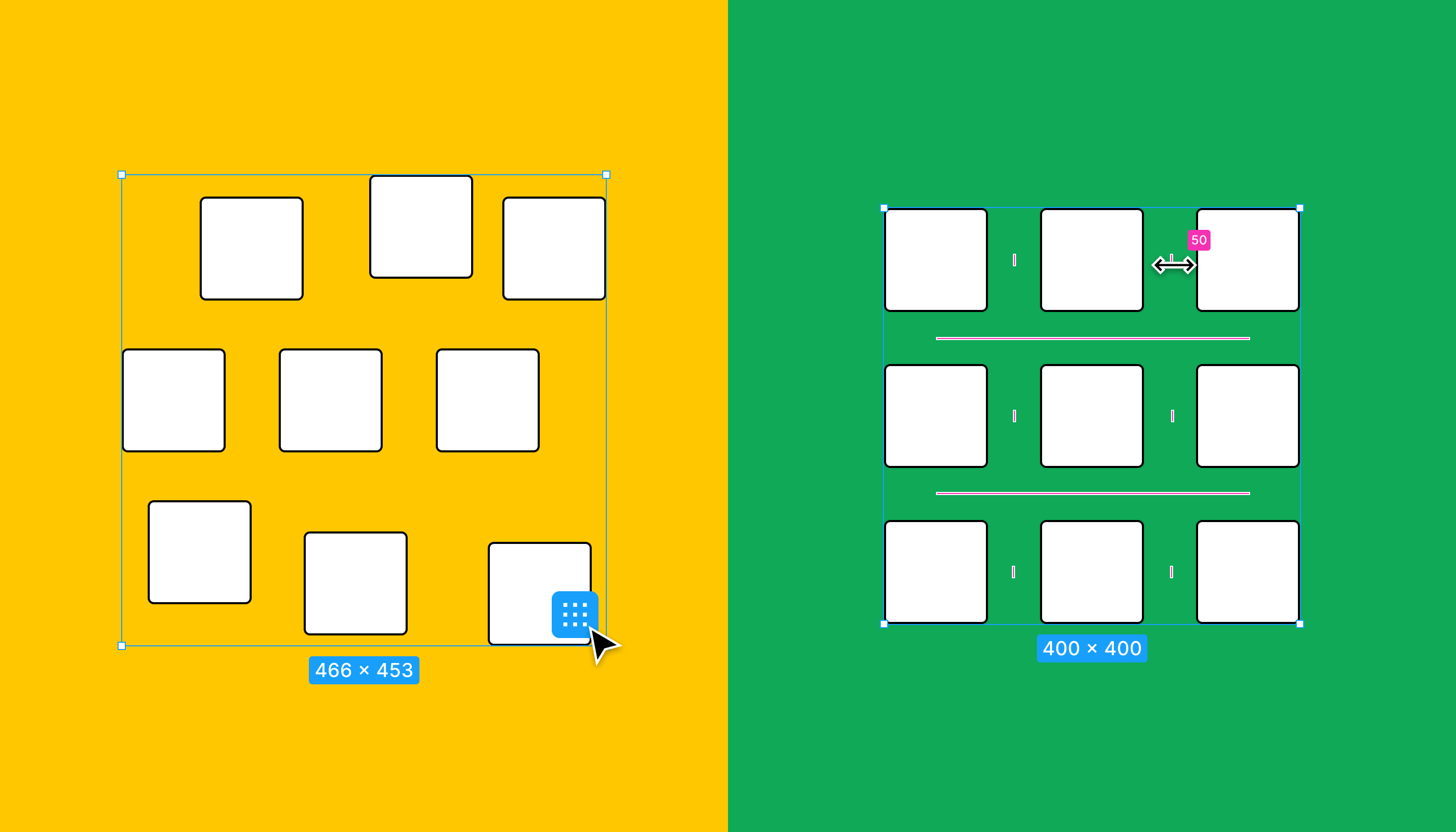 ## Distribute or tidy up If you're using tidy up on a one dimensional selection, you'll notice that this functions similarly to the distribute function. You can think of tidy up as distribute with some extra logic. The main purpose of the tidy up function is to arrange layers so they [meet both the criteria for a smart selection](https://help.figma.com/hc/en-us/articles/360040450233). That is, be an equal distance apart and overlap on either axis. - Distribute will only set a uniform distance between layers, it doesn't require layers to overlap on either axis. Tidy up will perform both, if required. - Tidy up lets you align objects along both axis at the same time. Distribute only works along one axis at a time: distribute horizontal spacing or distribute vertical spacing. For both distribute and tidy up, Figma will show the space between in the or field. This is based on the most common space between value (the mode). Note: If you have **Snap to pixel grid** enabled, you may see subtle discrepancies in spacing between layers. Figma will allow up to 1px of rounding. For example: if you have four layers and the spacing between most of the layers is `20`, but there is only `19` space between two of the layers, Figma will still show the space between as `20`. When **Snap to pixel grid** is disabled, Figma may distribute layers with decimal spacing values. For example: `7.5`. You can adjust the position of layers in the canvas along any of the two dimensions or axes: horizontal (`X axis`) and vertical (`Y axis`). Figma represents a layer's position on the canvas using `X` and `Y` coordinates. These refer to the top-left corner of the layer's bounds. 1. Open the **Design** panel in the right sidebar. 2. Use the `X` and `Y` fields to adjust the layer's coordinates. 3. You can also use basic mathematical equations (`-` `+` `*` `/` `^` `()` ) to quickly adjust the values of the X and Y co-ordinates. You can add an equation before or after the existing value, or replace it with a new equation entirely. [**Learn more about equations ↓**](https://help.figma.com/hc/en-us/articles/360039956914-Adjust-alignment-rotation-and-position#h_01EX2Q8TVSFSX4VSXXXAZG25R8) Note: If you rotate a layer in the canvas, Figma will base the `X` and `Y` co-ordinates of that layer on the original top-left corner of the layer's bounds. ## Nudge layers Use your arrow keys to nudge the position of your layers. Figma allows you to set two default nudge amounts: **small nudge** and **big nudge**. By default, small nudge is set to `1` and big nudge set to `10`. Both of these values are in resolution-independent points. [**Set small and big nudge values →**](https://help.figma.com/hc/en-us/articles/4404575206295) ### Use arrows to nudge layers Use the arrow keys to nudge your selection. The arrow keys will use your small nudge settings, hold down Shift to use the big nudge settings instead. - ← Left - ↓ Down - ↑ Up - → Right Every layer in the canvas will have its own dimensions. To view a layer's dimensions: 1. Select the layer in the canvas or layers panel. 2. View the dimensions in the blue label under the layer's bounding box. 3. You can also view the dimensions of any layer using the `W` and `H` fields in the right sidebar. Select a layer to make changes to a layer's dimensions. There are then a few methods: - To adjust the **width** of a layer: hover over the layer's left or right bounds until the appears. Click and drag to resize. - To adjust the **height** of a layer: hover over the layer's top or bottom bounds until the appears. Click and drag to resize. - To adjust both the **width** and **height** of a layer: hover over any corner of the layer's bounds until the appears. Click and drag to resize. - Adjust both the `W` and `H` fields in the right sidebar. Note: It's not possible to adjust the dimensions of a group itself. If you update the dimensions of a group, Figma will update the dimensions of the layers inside the group instead. ## Constrain proportions The button allows you to constrain the dimensions of the layer to the current proportion. You can find this setting next to the dimension settings (`W` and `H`) in the right sidebar. When this setting is on, Figma will retain the original width to height ratio anytime you resize the layer in the sidebar. If you update either of the `W` and `H` fields, Figma will update the other accordingly. Tip! Hold down the Shift key when drawing to create perfect squares, circles and polygons. Figma will toggle the constrain proportions setting on in the right sidebar. By default, Figma will draw a shape from the top-left. You can hold down the following modifier key to draw a shape from the center instead. Mac: ⌥ Option Windows: Alt Hold down both modifier keys to do both actions. Rotate individual layers, like objects, frames and groups, or a selection of layer. Figma will use the horizontal and vertical center of your selection as the point of rotation. Every layer you add to the canvas will have a default rotation of `0°`. You can rotate your selection `180°` in each direction: - A **positive** angle goes counterclockwise towards `180°` - A **negative** angle goes clockwise towards `-180°` Once you pass `180` in either direction, Figma will count down towards `0°` in that direction. For example: going `15°` past `180°` will give you an angle of `-165°`.  Caution: Figma uses the rotate CSS transform property to apply rotation to a layer or selection. The CSS transform property uses the opposite directions for determining the angle of rotation, which means you'll see the opposite angle in the **Inspect** panel. For example: if you rotate a layer `90°` in the **Design** panel, Figma will translate this to `transform: rotate(-90deg)` in the **Inspect** panel. Find the rotation field at the top of the **Design** panel in the right sidebar. 1. Select the layer(s) or object(s) you want to rotate. 2. In the right sidebar, use the field to enter your desired rotation. ### Canvas 1. Hover just outside one of the layer's bounds until the icon appears. 2. Click and drag to rotate your selection: - Drag clockwise to create a negative angle (towards `-180°` ). - Drag counterclockwise to create a positive angle (towards `180°` ) 3. Hold down Shift to snap rotation values to increments of 15. Note: Figma won't rotate any effects you've applied to a layer or selection. ## Flip layers Another way to replicate rotating layers is to use the **Flip horizontal** and **Flip vertical** transformations. Use the right-click menu to apply a flip transformation, or the keyboard shortcuts: - **Flip horizontal:** ⇧ Shift H - **Flip vertical:** ⇧ Shift V Note: Figma uses the matrix CSS transform property for flip transformations. You can view the CSS values of the transformation in the **Inspect** panel of the right sidebar. Once you have applied a flip transformation to a selection, Figma will continue to use the matrix transformation CSS property, even if you later apply rotation to your selection. Every shape, text object, or image you add to the canvas has its own layer in the canvas. This allows you to adjust each layer individually as you create cohesive and complex designs.  You can adjust the position of layers in the canvas along any of the three dimensions or axes: horizontal (`X axis`), vertical (`Y axis`), and depth (`Z axis`). Unlike the `X` and `Y` axes, there isn't a specific field you can adjust for the `Z axis`. Instead, you adjust the depth (Z axis) or hierarchy of a layer by changing the order in the **Layers** panel. This allows you to move layers to the front or back of the canvas, as well as move layers in or out of groups or frames. **[Learn more about relationships between layers →](https://help.figma.com/hc/en-us/articles/360039959014)** The **Layers** panel in the left sidebar shows you every layer on the current page and reflects the order your layers are currently stacked: the top layer is at the front and the bottom layer is at the back. Tip! If you're familiar with CSS, the layer's depth corresponds to an object's `z-index`. There are a few ways to adjust a layer's order. - 1 ### Layers panel Adjust the order of the layer by changing the layer's position in the **Layers** panel. 1. Open the **Layers** panel in the left sidebar. 2. Click and drag the layer to change it's position in the layer hierarchy: - Move the layer up to bring the layer forward - Move the layer down to send the layer back 3. Release to apply. Note: Layer order works the opposite way inside an auto layout frame. This is because auto layout wasn't designed to support layers that overlap. If you change the order of layers in an auto layout frame, this will change the position and order of the layer within the the frame. Outside of an auto layout frame, changing the layer order won't affect a layer's position on the `X` or `Y` axes. [**Learn more about using auto layout →**](https://help.figma.com/hc/en-us/articles/360040451373) - 2 ### Keyboard shortcuts Bring forward: - Mac: ⌘Command \] - Windows: Ctrl \] Bring to front: - Mac: ⌘ Command ⌥ Option \] - Windows: Ctrl Shift \] Send backward: - Mac: ⌘ Command \[ - Windows: Ctrl \[ Send to back: - Mac: ⌘ Command ⌥ Option \[ - Windows: Ctrl Shift \[ - 3 1. Select the layer(s) in the canvas. 2. Right-click on the selection to open the context menu: 3. Choose from: - Bring forward - Bring to front - Send backward - Send to back Tip! If you make any changes you're not happy with, you can undo the action using the keyboard shortcut: - Mac: ⌘ Command Z - Windows: Ctrl Z ## Equations Some fields in Figma accept equations, this includes the position, dimension, and rotation fields. You can use equations to resize layers by **adding** `+`, **subtracting** `-`, **multiplying** `*`, or **dividing** `/` the existing value. You can also use brackets `(` `)` within the field for more complex equations, or `^` for creating exponents. We've added some examples below but you can use any numbers: - `+ 10` to add 10 to the current value - `- 20` to remove 20 to the current value - `*2` to multiple the current value by 2 - `/4` to divide the current value by 4 - `^2` to create an exponent of the current value to the power of 2 - `(𝑥/2)+6` to divide the current value in two and add 6 (𝑥=current value) - `Mixed+100` to add 100 to two or more selected objects with different values  Equations can also be applied to a mixed selection of values. When an equation is entered into the position, dimension or rotation fields, the change will apply to all selected layers.  Note: You'll need to edit the field and add the equation to the existing number. If you only select the field and add the equation, Figma will replace the existing number instead. ## Scrub fields In addition to manually entering values, you can also "scrub" fields. Scrubbing allows you to quickly adjust a field's value by dragging your active mouse or touchpad. You can use this for **position**, **dimensions**, and **rotation** fields, as well as other layer properties and settings in the right sidebar. 1. Select the layer or object on the canvas. 2. Hover over the label next to the input field until the scrubbing cursor appears. You can also hover the input field itself and hold down the modifier key: - Mac: ⌥ Option - Windows: Alt 3. Click on the icon and drag to change the input value. Drag the cursor left to decrease the value, or drag it right to increase. 4. Change the speed that you scrub the field by moving the cursor towards the top of the screen to increase the scrubbing speed, or towards the bottom of the screen to reduce it. You'll see a notification at the bottom of the screen for the current speed, as well as a difference in the cursor's width. There are four scrubbing speeds: `2x`, `1x`, `1/2`, and `1/4`. Tip! Figma will continue scrubbing the field, even if your cursor goes off the screen. This works if you're using Figma in the browser or [desktop app](https://www.figma.com/downloads).Before you start Who can use this feature Users with Edit access to a File can create and edit Styles. Users with View access to a File that was published can use Styles from that library in Files where they can Edit. Styles allow you to define a set of properties or attributes of an object. You can create Styles for Colors, Text, Effects, and Layout Grids and reuse them across your designs. Apply any Styles from your Local Styles, or apply shared [Styles published to your Team Library](https://help.figma.com/hc/en-us/articles/360039820134-Manage-and-share-Styles#Share_Styles). 1. Select the object(s) you'd like to apply a Style to. 2. In the Properties panel, click the **Style** icon next to the property you want to update. 3. In the **Styles** menu, you will see your Local Styles and any [Styles shared via the Team Library](https://help.figma.com/hc/en-us/articles/360039820134-Manage-and-share-Styles#Share_Styles). Figma orders Styles in the Style panel accordingly: - Alphabetically by team name - Alphabetically by file name - Individual Styles appear in the order they were created. Learn about [grouping and reordering Styles](https://help.figma.com/hc/en-us/articles/360039820134-Manage-and-share-Styles#h_f5afac8e-03c9-4194-b84b-34a8a2ab1a8e). 4. Search and select the Style you want to use to apply it to the select object(s). The Style picker can be viewed as a list or grid. 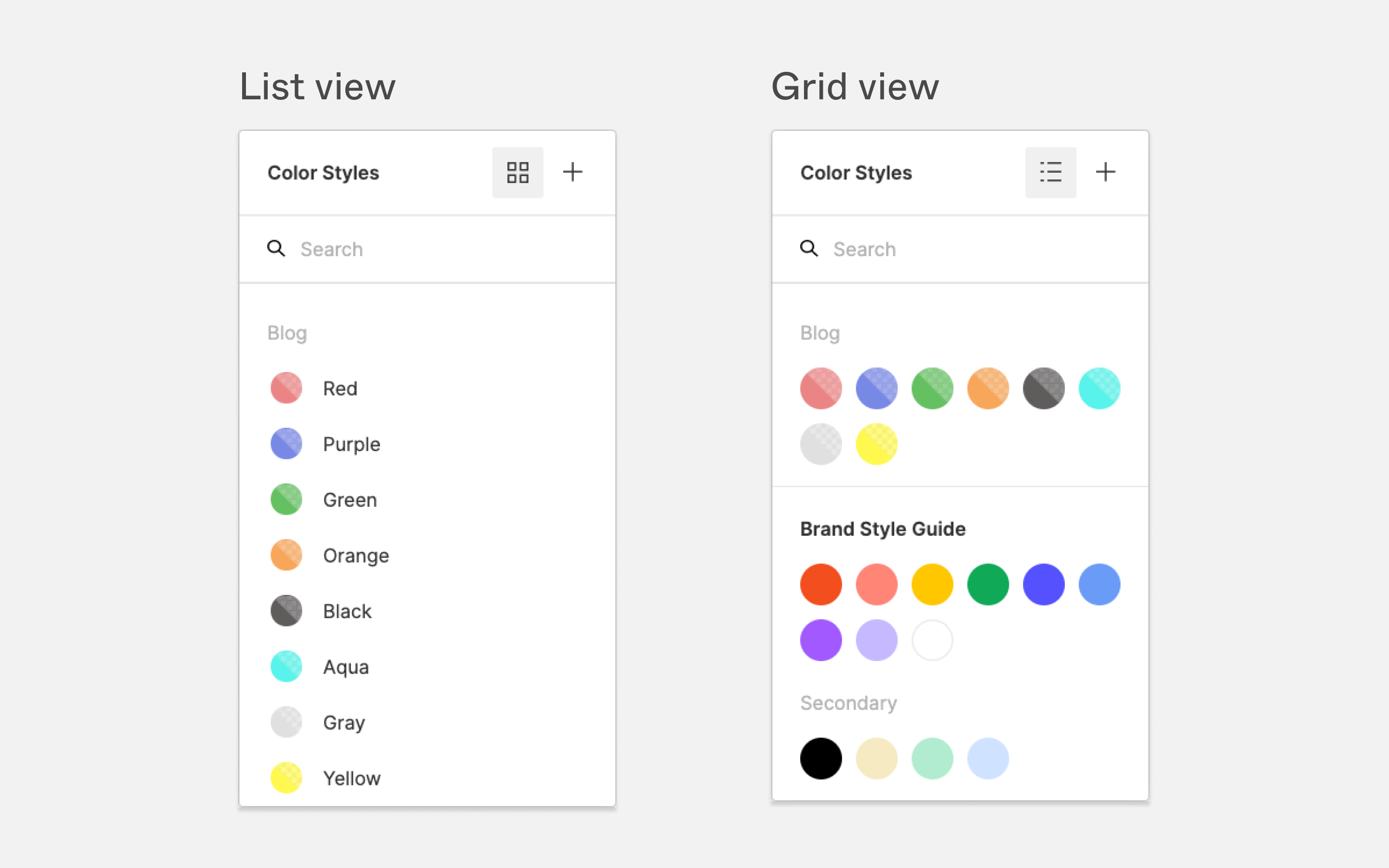 Tip! If you aren't able to access Styles from the properties panel, they may not be shared to your Team Library yet. Learn more about sharing Styles in our [Managing and Sharing Styles](https://www.notion.so/hc/en-us/articles/360039820134) article. You can also [use the color picker](https://help.figma.com/hc/en-us/articles/360041003774) to apply colors from Styles to objects. This is handy for situations when you want to: - Create a custom color that matches some of a Style's properties. For example: use a color from a style at only 50% opacity. - Apply a Color Style to an object or layer in a place that doesn’t support styles. The **c****olor picker** allows you to switch between colors in the file (Document Colors) and from your Libraries. Click the to select a palette from an [enabled library](https://help.figma.com/hc/en-us/articles/360039820134-Manage-and-share-Styles#Share_Styles): 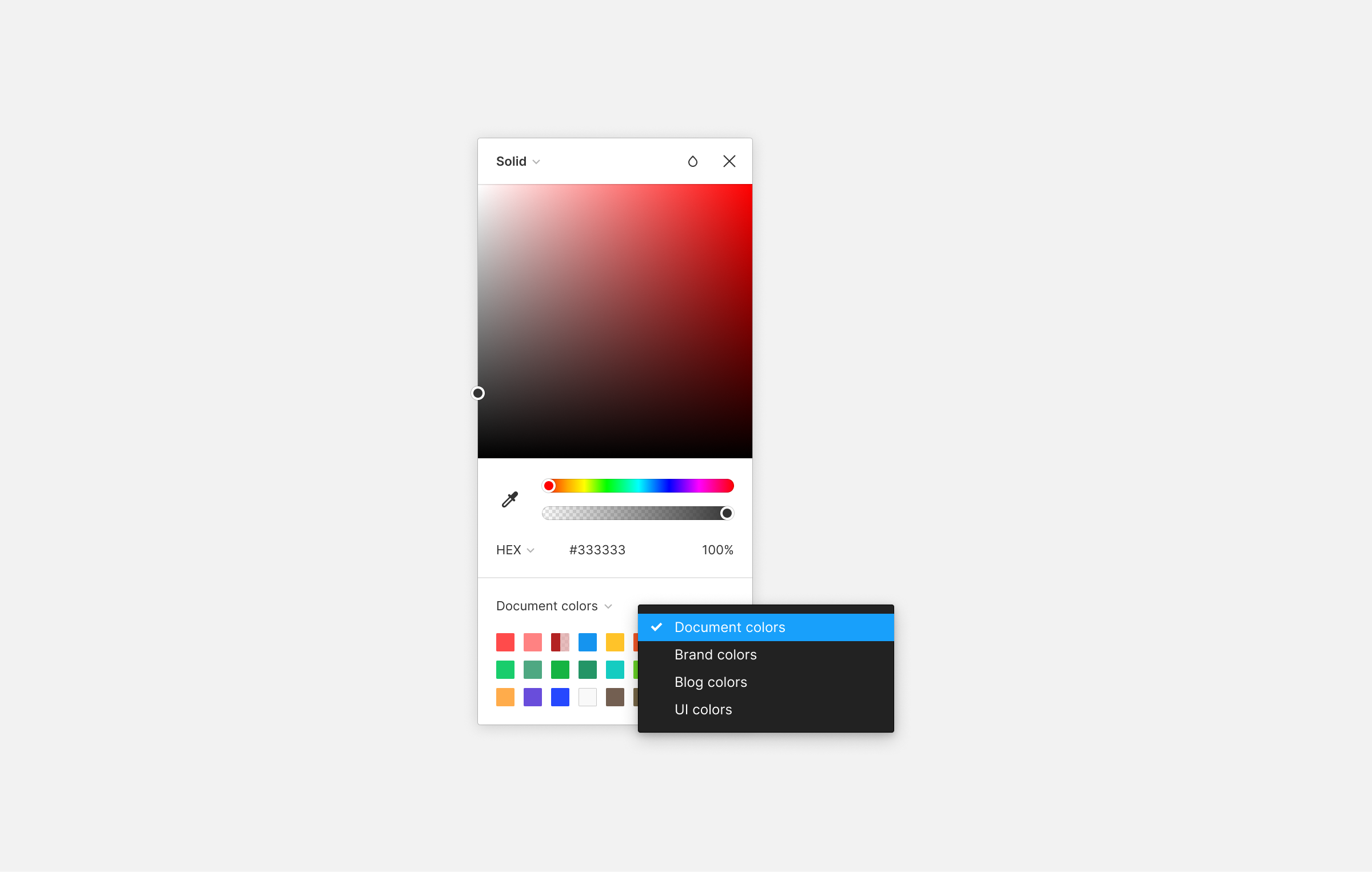 Caution: When you select a style from the color picker, you are only setting the color, not applying a style. You can change the Style that is applied to an object from the Properties panel in right sidebar. 1. Select the object(s) you'd like to update. 2. In the Properties panel, click on the Style next to the relevant property. 3. Use the Style picker to search for and select the new Style. When you detach a style from an object, that object will keep its existing properties. You can then make changes to those properties, as desired. This is useful when using existing Styles as the basis for future Styles or iterations. To detach a Style from an object: 1. Select the object(s) you'd like to remove the Style from. 2. In the Properties panel, hover over the relevant style. 3. Click the **Detach Style** icon when it appears. 4. You can now make any changes you want to the object, independent of the Style. Tip! You can also edit any Style that's applied to an object by selecting the Style and clicking the **Edit** icon in the Color Styles menu. When you [enable a Library for a team](https://help.figma.com/hc/en-us/articles/360039234953) or [an individual file](https://help.figma.com/hc/en-us/articles/360038743434), Figma includes Styles from that [Library](https://www.notion.so/hc/en-us/articles/360041051154) in the Style picker. You can use any Styles you have [can view access](https://help.figma.com/hc/en-us/articles/360039970673#Viewers) to. You can only edit the Style itself if you have [can edit access](https://help.figma.com/hc/en-us/articles/360039970673#h_12f453f4-35ec-464b-ad33-5632c0c1410c) to the original file.Before you start Who can use this feature Anyone with at least can view access to the file can add export settings and export assets. Export your designs from Figma when you're ready to share them with the world. Export settings let you to customize how Figma exports your assets. This allows you to define what you want to export and how you want to export it. Set the format and any relevant settings when you add an export setting to your selection. ## Export to PNG **(Portable Network Graphics)** PNG is a raster graphic or bitmap image format, commonly used for transferring images on the internet. In a bitmap image, each pixel or "bit" represents a single color. These bits are rendered on a" map" to make up the complete image. PNG is a lossless bitmap format, which means the image quality isn't reduced as the asset is compressed. This allows you to keep the original quality of the image when you export it. Figma supports 32-bit PNGs using the RGBA color model. The A in RGBA refers to the alpha channel, which controls the opacity of a pixel. It's not possible to export PNGs without an alpha value. Want to share without exporting? Right click on an object and choose Copy/Paste > Copy as PNG. Figma will add a PNG to your clipboard (2x size by default – but if the object has export settings, Figma will use the largest export setting instead). You can also use these shortcuts: - Mac: Command Shift C - Windows: Control + Shift + c **Supported export settings:** [Contents Only](https://help.figma.com/hc/en-us/articles/360040028114-Guide-to-exports-in-Figma#h_81dd9024-10a0-486d-a8c8-efb038c8ac2a) ## Export to JPG **(Joint Photographic Group)** JPG is also a pixel-based image forma. Unlike PNG, each JG has fixed dimensions. Exporting a JPG is a lossy compression to an image. This results in smaller file sizes, but also a reduced image quality. For this reason, you'll see JPG used in print design and photography as opposed to on the web. **Supported export settings:** [Contents Only](https://help.figma.com/hc/en-us/articles/360040028114-Guide-to-exports-in-Figma#h_81dd9024-10a0-486d-a8c8-efb038c8ac2a) ## Export to SVG **(Scalable Vector Graphics)** SVG is an XML-based vector graphic. These are shapes based on numeric values and coordinates that you can render on any screen. SVG is a scalable format as it doesn't rely on pixels. As you can represent SVGs in scripts or code, SVG is a popular choice for digital design. Figma only supports exports for SVGs at 1x. You can still scale an SVG by adjusting the values in the code, or by using width and height variables. For example: ``. There are some features Figma supports, which aren't supported in the SVG format. - Angular or diamond gradients. Figma will export these as radial gradients. - Figma does not export any background blurs to SVG. You will need to blur those layers directly. - Figma exports any text as glyphs, by default. This means you can't edit the text itself. Disable the **Outline text** setting to preserve text editing. - Figma exports strokes to SVG as fills. **Supported export settings:** - [Contents Only](https://help.figma.com/hc/en-us/articles/360040028114-Guide-to-exports-in-Figma#h_81dd9024-10a0-486d-a8c8-efb038c8ac2a) - [Include "id" Attribute](https://help.figma.com/hc/en-us/articles/360040028114-Guide-to-exports-in-Figma#h_4d1f96c6-2602-4ba1-aedc-ddeddb6c5b29) - [Outline Text](https://help.figma.com/hc/en-us/articles/360040028114-Guide-to-exports-in-Figma#h_69a909a8-98e4-4f7b-9b95-ee633de5c270) - [Simplify Stroke](https://help.figma.com/hc/en-us/articles/360040028114-Guide-to-exports-in-Figma#h_fee7100a-1540-4b62-bd45-e7ad6fa943b7) ## Export to PDF **(Portable Document Format)** PDFs allow you to share complex and interactive layouts. PDFs include text, fonts, vector graphics and images in a fixed-layout. PDFs allow you to render and manipulate individual elements of a design, in any system. This makes it a versatile format as it's independent of software, hardware, or operating system. Xcode, Apple's mobile development language, supports PDF. This makes it a valuable tool in building iOS applications. Use PDFs in Figma to export slide decks or share assets for iOS development. You can also use them for print design mock-ups. - Figma only supports PDF exports at **1x**. Choose another format to export assets at a different scale. - Figma does not currently support exporting editable text. You will not be able to edit any text in a PDF exported from Figma. You can still select and copy text when viewing the PDF in the browser, or other compatible software. ## Extra export settings Access any of these extra settings when you add export settings to your selection. Click in the in the **Export** section of the properties panel to view and adjust any export settings. ### Ignore overlapping layers This option is available via **PNG**, **JPG**, and **SVG** formats. - **Checked:** Figma only includes the selected layers in the export. Any other objects that intersect or overlap the selected object will not affect the export. - **Unchecked:** Figma includes any layers that intersect with the selected layer or group. ### Include bounding box This option is only available when expecting [text layers](https://help.figma.com/hc/en-us/articles/360039956434) via **PNG**, **JPG**, and **SVG** formats. - **Checked:** Figma determines the size of the export based upon the dimensions of the text itself. Figma will trim and discard any space between the characters and the bounding box. - **Unchecked:** Figma determines the size of the export by the text layer's bounding box. If the bounding box is larger than the text, Figma will include the empty space in the export. If it is smaller, Figma will trim and discard the portions of text that fall outside of the bounding box. ### Include "id" attribute This option is only available for **SVG** exports. When checked, Figma will add an "id" tag to the SVG's metadata. Figma bases the "id" on the object's name in the Layers panel. ### Outline text This option is only available for **SVG** exports, Figma checks this setting by default. When checked, Figma will convert any text layers to glyphs. You will need to uncheck this setting if you would like to preserve text editing. This will allow you to adjust any text strings in other systems. ### Simplify stroke In Figma, you can [apply inside, center or outside stroke](https://help.figma.com/hc/en-us/articles/360049283914) to layers. SVG as a format only supports center stroke. Simplify stroke makes sure other systems render inside and outside strokes correctly. This setting is only available for **SVG** export and is checked by default. Simplify stroke is available under the following conditions: - Export format is SVG - The layer is a vector network and not a basic shape - The layer uses inside or outside stroke applied to the vector network Note: If you choose not to simplify stroke, Figma will increase the weight of any strokes and apply a mask. This achieves the same visual result, but requires Figma to add extra lines to the SVGs code. Access the export options in the right sidebar: - Collaborators with `can view` access can access export settings from the **Export** tab of the right sidebar. - Collaborators with `can edit` access can can find the **Export** section in the **Design** tab. ## Make your selection Select which objects and layers you'd like to export.This could be a single layer or object, a selection of objects, or everything on the canvas. You can also [use the slice tool to export a portion of your canvas](https://help.figma.com/hc/en-us/articles/360040028394). ## Add export settings Export settings control how Figma exports your assets, including the scale, format, and other format-specific settings. View, add, and remove export settings in the **Export** section of the right-sidebar. Tip! If you've already applied export settings, you can use the keyboard shortcut to export your selection. - **Mac:** Shift Command E - **Windows:** Shift + Ctrl + E You can then use the **Export Settings** to determine how you'd like us to export them. You can add as many export settings for your selection as you want. These can be a combination of different formats or scales. 1. Click the in the **Export** section of the right sidebar. 2. Select an [export format](https://help.figma.com/hc/en-us/articles/360040028114-Guide-to-exports-in-Figma#h_01EH5EKQWR6TPGA98V1HJKJQ01) using the **Suffix** field. Choose from **PNG**, **SVG**, **JPG**, or **PDF**. 3. Select a scale from the defaults in the list, or use the field provided to enter a custom size or scale_._ Enter a number along with the following letter: - Add an `x` after the value to use it as a multiplier. - Add a `w` after the value to set a fixed width. - Add an `h` after the value to set a fixed height.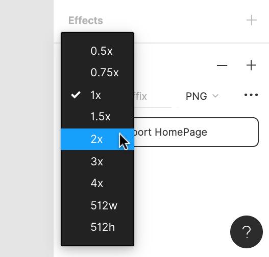 4. Click the to open the **Export options** menu and adjust any [extra export settings](https://help.figma.com/hc/en-us/articles/360040028114-Guide-to-exports-in-Figma#h_01EH5EHPAKTPXV6TK7FE4XAA4T). 5. Click the next to the **Preview** to see a preview of how your assets will look. Tip! Export your design assets at a larger multiplier to create higher resolution exports and reduce blurry exports. This will result in a larger file size and higher resolution. Note: Figma interprets any /'s in layer names as a hierarchy and export your selection within folders. You can rename layers to remove the hierarchy and prevent Figma from exporting assets to hierarchical folders. [**Learn how to rename layers →**](https://help.figma.com/hc/en-us/articles/360039958934) ## Edit or remove an export setting You can remove or edit export settings at any time. 1. Click into one of the setting's fields 2. Click the icon at the top of the **Export** section. 3. We will remove this setting from the current selection. ## Export assets Figma will make a record of any export settings you apply to a selection in the file's **Export** list. This allows you to export every asset recorded in your export list with a single action You can choose to export a specific selection of layers or objects, or export all your assets in bulk. ### Export a specific selection Export any selection with export settings. You can do this when you first apply export settings to a selection, or by making a selection which already has export settings. 1. Select the layers you want to export. 2. Add or adjust any export settings. 3. Click the **Export** button in the right sidebar. 4. Figma will export your current selection. ### Export in bulk Export assets in bulk using the export list. This includes every selection you have added export settings to. 1. Click the menu and select **File** and then **Export** from the options. You can also use the keyboard shortcut: - **macOS:** Shift Command E - **Windows:** Shift + Ctrl + E 2. The **Export** modal will show you all the selections you have Export settings for. For each selection you can: - View the scale, format and dimension of the asset - Hover over the thumbnail or layer name to view the exported file name. - Click on the thumbnail to view that selection in the canvas. 3. Check the box next to any selection(s) you want to export. 4. Click the **Export** button to export any selected assets. Tip! Save your designs as a **.fig** file to export the entire Figma file. This won't include any comments, version history, or permissions from the original file. You can only open .fig files using Figma. 1. Click to open the menu. 2. Select **File > Save local copy**. 3. Figma will download a copy of the file to [your downloads folder](https://help.figma.com/hc/en-us/articles/360040521373).We're exploring other ways of learning and exploring Figma. This article is a written version of our [**Figma for Beginners: Explore ideas**](https://www.youtube.com/watch?v=dXQ7IHkTiMM&list=PLXDU_eVOJTx7QHLShNqIXL1Cgbxj7HlN4&index=2) video tutorial!
Figma is a vector design tool that runs in the browser. Use Figma to brainstorm ideas, iterate on designs, create prototypes, and get feedback at any stage of the creative process.
In this beginners course, we're going to take you through key stages of designing an app in Figma, from the initial wireframes to an interactive prototype.
We'll cover the basics, and introduce more powerful features like Auto Layout, Components, and Prototyping. There's something for everyone, whether you're new to design or new to Figma.
We won't cover all these features in depth, but we'll provide you with resources to continue your Figma education
Get started with Figma
Sign up and create a team
Sign up for a free Figma account at figma.com. With a Figma account, you can create teams - shared workspaces, where you can collaborate on files and organize them in projects.
Choose from a free Starter team or a paid Professional team. If you are a student or educator, you can get access to all of Figma's Professional features for free. Compare plans and teams in Figma →
Visit figma.com/education/apply to apply or learn how to verify your Education status.
Invite people to your team
Once you've created your team, you can invite members to collaborate. This will give them access to all the projects and files in your team. You can choose what level of access each member has.
Explore Figma design
We're pretty sure we have the next million dollar idea - a social media app... for pets! We want some feedback on the general layout, before we start exploring specific elements of our design.
Wireframes are simplified designs that are devoid of any style, like color, type, or imagery. They allow us to map out user flows and explore different ways we can structure our app, without having to design any elements, or add any content.
We'll start our journey by creating some wireframes in Figma design. Create a new file heading to figma.com/new in the browser.
Canvas
The canvas is the backdrop for all of your designs - it's where you'll add all the frames, shapes, text, and images.
There are no bounds to your creativity, but you should know the canvas extends approximately 65,000 points in each direction.
By default, the canvas color is set to #E5E5E5. To change the canvas color:
Click on an empty spot in the canvas to deselect any layers
In the right sidebar, click the swatch in the Background section.
Select a new color using the color picker. Learn how to use the color picker →
Or, click to toggle off the background entirely.
Tip! We mentioned earlier that Figma is a vector design tool. Unlike pixels, which have a fixed dimension, vector paths are resolution-independent. This means you can easily scale them to suit your designs. You can use pixel preview to see how your designs will look when you export them as rasterized (pixel-based) assets. Learn more about pixel preview →
Frames
With the great expanse that is the canvas, you need something to put your designs in. Enter frames. Frames are the containers you place your shape, text, and image layers in. You can think of each frame in the canvas as a single screen of your design.
If you've used other design tools, you might be familiar with artboards. Frames are Figma's version of an artboard! Frames in Figma →
The toolbar contains the tools you need for creating layers. Select the frame tool in the toolbar.
Frame presets, in the sidebar on the right, let us create frames with specific dimensions. We know that we're making a mobile app, so we'll select Google Pixel 2 XL from the presets.
Two exciting things just happened, Figma added a frame to our canvas, and the sidebar on the left is no longer empty. Everything that we add to the canvas will also be added to the layers panel. Let's right-click on this frame and rename it home.
Move around the canvas: To explore more of the the canvas we can use two fingers on a trackpad - or the scroll wheel on a mouse - to pan around. We can also press and hold the space bar and click and drag to pan.
If you're using a trackpad you can use the pinch gestures to zoom in and out. You can also use shortcuts like ⌘Command - + and ⌘Command - - to zoom in our out. For granular control, adjust the zoom level in your view settings.
Create shapes
Now you're ready to add some layers to your frame! As this is a wireframe, you can use shapes, like rectangles and ellipses, to represent more complex aspects of the design.
Select the rectangle tool to create an image for a post on your app's home page.
Just like frames, every layer in the canvas has dimensions. You can adjust a layer's position and dimensions in a few ways.
Position
Click and hold on the layer you want to reposition. Drag the layer to the part of the canvas you'd like to position it on. Release to apply.
To set specific co-ordinates, you can update the
XandYfields for that layer. These co-ordinates correspond to the top-left corner of the layer.
Dimensions
Hover over the bounds of a layer until the cursor appears. Click and drag to change the size of the layer.
To set specific dimensions, you can update the layer's dimensions using the width (W) and height (H) fields in the right sidebar.
Learn more about position and dimensions →
Parents and children
If you look in the layers panel, you can see the rectangle is within the home frame. Some layers, like frames, can contain other layers.
We use the analogy of parents, children, and siblings to describe relationships between layers. You may know these terms if you're familiar with web development or programming.
Parents are layers that contain other layers. Think frames, components, and groups.
Children are layers within a parent. Think of the text and shape layers within a component or group.
Siblings are layers within the same parent. Layers need to be at the same level in the layer hierarchy to be siblings.
If you move the rectangle outside of the frame, the Layers panel will update to reflect the change in that relationship. We call this reparenting. Figma uses the dimensions of the relevant layers to determine whether to reparent.
Learn about layer relationships and reparenting →
Make an avatar
Now we're going to create a shape that represent a user's profile picture, or avatar.
Select the ellipse tool in the menu and click to start drawing the ellipse.
Hold down Shift as we drag to create a perfect circle. This also constrains the proportions of the ellipse.
Release to create the avatar with dimensions of around 30 by 30.
The is toggled on in the right sidebar. If you update one value in the right sidebar, the other will update too.
Click into one of the fields, then use the arrow keys to nudge the ellipse's dimensions to
30.
Quick math! Some fields in Figma accept equations - you can use equations to resize layers by adding, subtracting, multiplying, or dividing the existing value. For example: let's add +10 to the field to set the dimensions of your circle to 40x40.
Layer properties
Colors or paints
New shape layers have a gray fill by default, but we can apply another color or paint to these layers. Paints can be solid colors or gradients, as well as images or animated gifs.
You can apply paints to the fill, stroke, or effect properties of a layer. You can even add more than one paint to a layer and use blend modes to create unique styles or effects.
Paints appear similarly in the right sidebar:
Preview a swatch of the color or a thumbnail of the image or GIF.
View the opacity of the paint applied to this layer.
See the hex color code for solid colors and gradients, or a generic Image or GIF label.
Enter a hex code in the field, or click the swatch to open the color picker.
Select colors from the palette, or apply other fills, like gradients, images, and even animated GIFs.
Click to remove the fill.
Adjust fill or stroke properties
We want our wireframes to appear like outlines instead of solid shapes. We can do this using the stroke property. Strokes work like outlines or borders around our shapes and layers.
Select both shape layers.
View the Fill and Stroke properties in the right sidebar.
Click under Stroke to add a stroke to the layer.
Click next to an existing Fill to remove the fill.
Adjust the color of the stroke:
Enter a hex code directly in the field.
Click the swatch to open the color picker. Select colors from your palette or apply other paints, like gradients, images, and even animated GIFs.
Switch it up! You can quickly change a layer's fill to a stroke by pressing Shift X. This remove the layer's existing fill and applies it as a stroke instead. You can then click the swatch in the >Stroke settings to choose another color.
Align siblings
We've learned how to align layers to their frames, but we can also align layers to each other.
With the layers already selected, click align left.
As the dimension of the avatar layer are smaller, Figma will move this layer so it aligns with the larger image layer.
Text
Now we need a username to go with our avatar. We'll create a default text layer now and cover adjusting text properties later in the series.
Select the text tool in the toolbar.
Click on a spot in the canvas next to our avatar to create a text layer.
Type in
nameas our placeholder text.We want our text layer to align with the center of our avatar. Click on an empty spot in the canvas and drag your cursor to select multiple layers.
We want our text layer to align with the center of our avatar. Drag over multiple layers to select them at once, and click Align vertical center.
We'll also need some text below our image. Press T to select the text tool and click and drag to create another text layer. Add
description.
Nudge values: If you want to make small adjustments to a layer's position, you can use our arrow keys to nudge objects on the canvas. Figma allows you to set two default nudge amounts: small nudge and big nudge. By default, small nudge is set to 1 and big nudge set to 10. Set your small and big nudge values →
Copy and duplicate layers
We want users of our app to be able to engage with each other by commenting, liking, and saving posts. Let's create some icons for these actions.
Press R to select the rectangle tool.
Hold down Shiftagain to constrain the rectangle's proportions and create a perfect square.
Click and drag to draw a rectangle in the canvas. Aim for dimensions of 32x32.
Instead of drawing three separate squares, we can copy the original layer. There are a few ways to copy layers:
Hold down the ⌥ Option (MacOS or Alt (Windows) key, click on the square layer, and drag to create a copy.
Press ⌘ Command-D (Mac) or Ctrl + D (Windows) to duplicate the layer and create the third square.
Figma recognizes the distance between the first two squares and keeps the same distance.
Tip! If we want to change the uniform spacing between them, we can select our layers and update the horizontal spacing field in the right sidebar.
Groups and frames
All these layers make up a single post and we want to make sure these objects stay together. There are two ways we can group or organize layers: groups and frames.
While frames and groups look similar in the layers panel, they have different functions.
A
Groups
Use the shortcut ⌘ Command-G or Ctrl + G to group a selection of layers.
Groups allow us to move around a collection of layers, without having to select each layer individually. Groups don't have properties of the own, only the layers inside the group do.
Use groups to organize your layers or apply properties to layers in bulk.
B
Frames
Use the shortcut ⌘ Command ⌥ Option G (Mac) or Ctrl + G to frame your current selection.
Frames on the other hand, can have their own dimensions and properties, some of which can affect the layers within them. They allow you to access features like constraints, auto layout, prototypes, and more. We'll learn more about frames and their properties later in this series.
Use frames to create distinct containers, like screens in a mobile app design or individual slides in a presentation.
Tip! You can also nest frames within other frames, so you can use frames for design elements like buttons, nav bars or newsfeed posts. If you're familiar with web development, anything you could put in a
divcould be a frame.
We can convert a group to a frame in the right sidebar. Click Group in the position section and select Frame from the menu.
Get components
To make this look more like a real news feed, we'll create a second post. Copy the frame using any of the copy and paste methods we explored above 😉. Then move the post below the original inside your frame.
The feed is starting to take shape, but we're missing some crucial elements to make it look like an app! We need a status bar and a navigation menu to move between pages in our app.
We could make these elements using shapes, or we could rely on components and libraries to speed up the process.
Components are the building blocks of our designs. They can be basic UI elements like buttons or icons, or more elaborate compositions, like toolbars and menus. Guide to components →
Libraries are collections of components and styles. You can use libraries in Figma to create, share, and use components across your files. Guide to libraries →
Note: Design systems combine component libraries, with standards and guidelines for implementing them in code. They're the single source of truth for designers and developers and help to create consistency at scale.
The Figma Community is a space where creators can share resources in the form of design files and plugins. We can look for a component library to use in our wireframes. Duplicate this wireframe UI kit to add it to your drafts →
Professional teams
If you're in a Professional team, you can publish the file as a library to share styles and components from this file with your team.
Components can only be published in a team, so you need to move the fie to a project in your team before publishing.
Open the file in the editor.
Click Drafts in the toolbar to change where the file lives.
Click
file namein the toolbar and select Publish styles and components.Enter a description for the library and press Publish to share it with your team.
You can now make the library available in your wireframe file:
Open the original wireframe file.
Select the Assets panel of the left sidebar.
Click to open the libraries modal.
Toggle the switch to enable the library in the current file.
Starter teams
We can copy components from the Community file in our drafts and paste them in our wireframe file. This is a great option if you have a free Starter team and can't use component libraries.
Any components you paste in the team file will paste as main components and won't be linked to the original file.
We can still access local components from the Assets panel. Find them in the Local to this file section above any enabled libraries.
Use components
Want to resize the left sidebar? Hover over the edge until the cursor appears, then click and drag to resize.
Okay! We need components to represent the status bar at the top of the screen and a floating action button, or a FAB at the bottom.
This generic status bar is perfect. To add this component to our file:
Click on the component in the assets panel and drag it into the canvas.
Position this status bar near the top of frame and release to place.
Align to the top and left.
Let's repeat the process for the FAB and place it in the bottom and right of the frame.
Now we have copies of these components, known as instances. Instances are connected to the main component they originated from.
If you make a change to the main component, Figma will also apply those changes to any instances. This saves you having to manually update every instance, when you want to change properties of your component.
Constraints
Our eventual application will need to adapt to different screen sizes. If we try to resize the frame now, our components doesn't change. We can make sure they respond to different frame sizes using constraints.
At the moment, our constraints are set to top and left by default. We want the status bar to take up the full width of our frame.
Keep the vertical constraints at Top and set our horizontal constraints to Left and Right.
Set the constraints for the FAB to Bottom and Right.
Now when we resize our frame, our components will respond according to their constraints.
Our app is coming together! Let's create another frame for our menu:
Select the frame tool in the toolbar, or press the F key.
Add another Google Pixel 2 XL preset to the canvas.
Let's add some text layers for each page in our app:
Press T to select the text tool and click to create a text layer.
Type menu item in the layer for now.
We want all our text layers to be the same width so we'll set the width to
200.Duplicate the layer to create four more menu items, one for each page in our app.
Let's copy the status bar and FAB from our home page to complete our menu page:
Click to select the status bar.
Hold down shift and click to select the FAB.
Use the shortcut ⌘Command-C (Mac) or Ctrl + C (Windows) to copy them to our clipboard.
Select our menu frame and press ⌘Command-V (Mac) or Ctrl + V (Windows)to paste.
Figma pastes them in the same position in this frame. Nice!
Explore iterations
I think there are some other ways we could lay out this menu page so we can explore some different approaches.
We have a few designs here, but we're not quite sure which approach to take. We could set up a design critique and schedule some time on the calendar... but I wonder if anyone on my team is around to help me choose.
As we've already invited everyone to our team, we don't have to invite them to every file. We can send them a link to the file instead:
Click the Share button in the toolbar.
Click Copy link in the share modal.
Paste the link in our team channel.
Our team has some existing sticky note components, which we love to use for feedback. I'll enable that library in this file, while I'm waiting for my team to arrive.
Tip! Brainstorm ideas, explore designs and get feedback on designs in FigJam files. Guide to FigJam →
Design in multiplayer
Our team member's avatars are showing up in the toolbar. To jump to their location on the canvas, we can click their avatar and enter observation mode.
It sounds like our team loved the simplicity of our first design, but thought a back button would be better than our FAB. Someone suggested the menu could be underneath the rest of our content. I like that idea. Another person pointed out that the centered text makes it hard for users to scan quickly. That's a great point!
It looks like fellow design intern Daniel is creating a new version of the menu, which incorporates some elements of each of our designs. This looks awesome and everyone's on the same page!
I'm glad we got some feedback on our wireframes, before we invested in some higher fidelity designs. Now we know which direction to go in! We'll see you in our next video where we explore color, typography, and imagery.Before you start
Who can use this feature
Anyone with can edit access to a file can create and edit frames.
In Figma, you can add layers directly to the Canvas. If you're designing for a specific device or screen size, you may want to create a container for your designs. This is where frames come in.
If you've used design tools before, you'll be familiar with artboards. Like artboards, frames allow you to choose an area of the canvas to create your designs in.
Unlike traditional artboards, you can also nest frames within other frames. This allows to create more complex design that work together.
Frames also give you access to extra functionality, like Layout Grids, Auto Layout, Constraints, and prototyping.
Create frames in the canvas using the frame tool. There are a few ways to select the frame tool:
Use the keyboard shortcuts F or A
Select the frame tool in the toolbar:
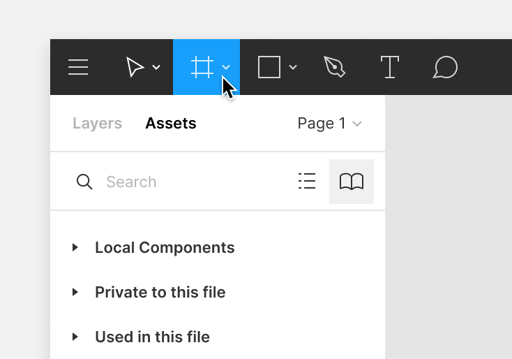
Then you can create a variety of frame sizes in the canvas:
Click in the canvas to create a default frame with 100 x 100 dimensions
Click and drag in the canvas to create a frame with custom dimensions
Use the dropdown in the right sidebar to select a frame preset.
Choose presets for popular device and assets templates:
Phone
Tablet
Desktop
Watch
Paper
Social Media
Figma Community
Click the arrow to expand the section and select a preset from the list.
Identify frames by the in the Layers Panel.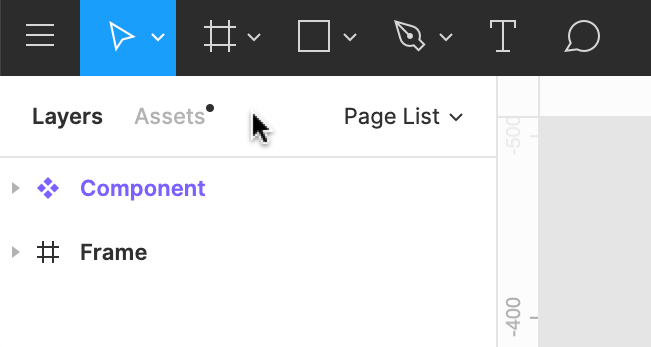
Tip! You can also create a frame around existing objects, whether it's a single layer or selection of layers. Use the frame selection keyboard shortcut:
MacOS: ⌥ Option ⌘ Command G
Windows: Ctrl + Alt + G
There are a few properties associated with frames. Frames support the following properties.
Corner Radius: Round the corner of a frame to create softer edges.
Clip Content: Hide any objects within the frame that extend beyond the frame's bounds.
Layout Grids: Create guidelines to help with the visual structure to your designs.
Auto Layout: Create dynamic Frames that respond to their contents
Fill: Apply a Solid Fill, Gradient, Images (PNG, JPEG, GIF, TIFF and WEBP) to a Frame.
Stroke: Add strokes to a Frame to create a border or outline
Effects: Add a shadow or blurs to a Frame
Extra functionality
Frames allow you to access extra functionality in Figma. You will need to use Frames to use the following features or functions:
Layout Grids: Apply transparent grids, columns, and/or rows to Frames to provide visual structure
Constraints : Define how child objects respond when you resize a Frame. Apply Constraints to objects within a Frame.
Auto Layout: Add Auto Layout to Frames to create dynamic layouts that respond to their contents
Prototyping: Create interactive prototypes that move between Frames in your Canvas
A Frame is a parent object. This means that it can control or influence any child objects you place within it.
Learn more about parent/child relationships in Figma →
Adjust properties of the frame
In the past, it was possible to adjust the properties of child objects when you selected the Frame. Now, you can adjust the properties of the frame itself.
Select a child object by using the keyboard shortcut: Enter or Return.
Press the Tab key to select the next sibling.
Press Shift + Tab to select the previous sibling.
Press Shift + Enter to select the parent
In Figma, you can create frames within other frames. We call this process nesting. This allows you to combine frames with different properties to build complex interfaces.
This creates new hierarchies or relationships:
Top-level frames: Any frame that is directly on the canvas. For a frame to be a top-level frame, you can't nest it within another frame, group, or object.
Nested frame: Any frame that is placed within another frame. You can place frames within top-level frames, or within other nested frames. Nested frames are both a parent and a child.
Children: Any object that is within a frame.
Learn more about parent, child, and sibling relationships.
Top-level frames
Figma bolds top-level frames in the Layers Panel and shows the name of any top-level frames on the canvas: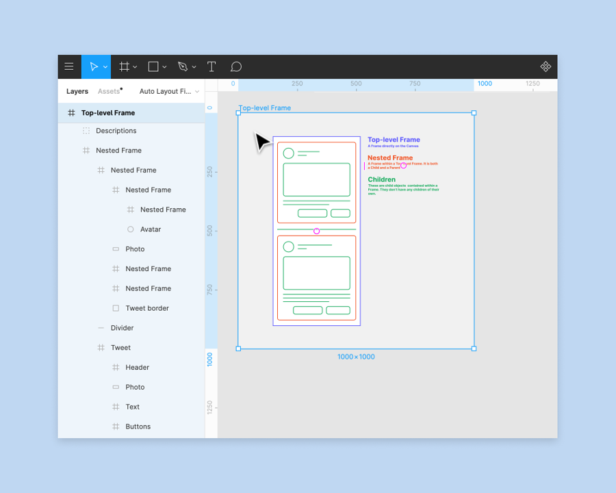
Nested frames
Nested frames are frames that you place within another frame or object. This makes them both a parent and a child. You can place frames within:
Top-level frames
Other nested frames
In groups
In our example below, each of our elements are in their own frame. We have a status bar at the top and a navigation menu at the bottom. We also have a card that includes the details of our Upcoming Tickets.
Using one of our device presets, we can create a top-level frame for our elements. We can add our elements to the top-level frame to build a single screen in our mobile app.
You can interact with frames like any other object on the canvas, including change the size or scale of frames. There are a few ways to change the size of a Frame:
Drag the frame
Drag to resize a frame manually.
Select the frame in the canvas, or Layers Panel in the left sidebar.
Click the handle in one of the corners and drag to resize. Or, click one of the edges and drag.
Tip! To ignore any Constraints on child objects, hold down the modifier key:
macOS: ⌘ Command
Windows: Ctrl
Change the frame preset
Select another frame preset to change the frame's size.
Select the frame.
In the Properties Panel in the right sidebar, select the frame field.
Select a preset from the list.
Choose presets for popular device and assets templates:
Phone
Tablet
Desktop
Watch
Paper
Social Media
Figma Community
Figma will update your frame's dimensions to match the preset.
Note: If you have applied Constraints to any child objects, Figma will resize them to match the new frame preset. Otherwise, objects inside the frame will stay at the original dimensions and position.
Properties Panel
Update the Frame's Width and Height using the Properties Panel in the right sidebar.
Enter a new number in the W and H fields, or hover over the icon to scrub the field. Drag left to decrease and right to increase.
Toggle on the link button next to the Width and Height to constraint resizing to the current proportions.
Tip! You can use the dimension fields to perform calculations. This allows you to quickly scale or resize objects.
% Percentage e.g. 50%
Add e.g. +100
- Subtract, e.g. -20
* Multiply, e.g. *4
/ Divide, e.g. /8
It's not possible to multiply a width or height by a percentage e.g. *50% will result in a value 50x the original, not 50%.
Resize to Fit
You can resize a Frame so that it shrinks or grows to fit its child objects. This will redraw the Frame around the outermost bounds of the objects within it.
Use the keyboard shortcut:
macOS: ⌥ Option Shift ⌘ Command R
Windows:
Click in the top-right corner of the Properties Panel
 Before you Start
Who can use this feature
Users on Any plan can access this functionality
Only users with Edit access can toggle layer visibility off and on
You can toggle a layer's visibility in the Layers Panel. You can still change the position, or adjust the properties of a hidden layer.
Visibility for layers (and properties) is shown with an eye icon.
There are a few ways to toggle a layer's visibility.
Toggle a layer's visibility off and on using the keyboard shortcut:
Mac: Command Shift H
Windows: Control Shift H
You can also toggle a layer's visibility in the Layers Panel. You can toggle layers individually, or hide all child objects in a group or Frame.
Hover over the layer, group or Frame in the Layers Panel.
Click on the visibility icon (the eye) to toggle the layer's visibility off.
The eye will close and the layer will be hidden in the canvas. It will also appear as inactive (greyed out) in the Layers Panel.
Click the closed eye icon to toggle the layer's visibility on again.
Note: When you hide a layer, you won't be able to select it in the canvas. This includes using the Select Layer option in the right-click menu. You can still select the layer in the Layers Panel.Before you Start
Who can use this feature
Anyone with can view access to a file can explore and move around the canvas
The canvas in Figma is the backdrop on which all of your frames, groups, and other layers live. It has a finite size of -65,000 through +65,000 on each axis.
By default, vectors are rendered as resolution-independent paths in the canvas though you can turn on Pixel Preview at 1x and 2x resolutions to enable pixel-precise editing for raster assets.
The default background color of the canvas will be #E5E5E5, but you can change the background color in the Properties Panel by de-selecting any layers and clicking the color picker labeled Background.
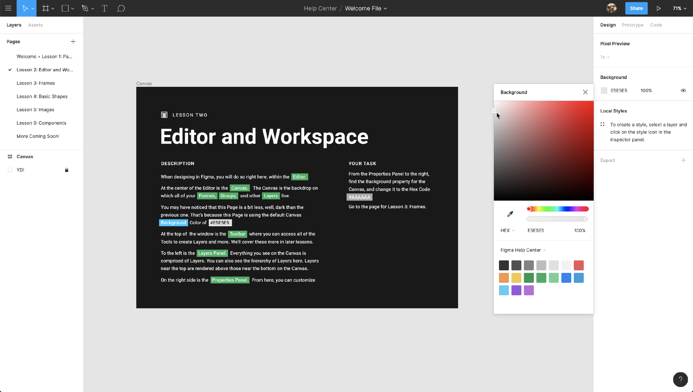
If you like having rulers visible on your canvas, you can use the Shift + R shortcut to enable them. You can also use the search feature under the menu icon to search for rulers.
 Who can use this feature
Anyone with can view access to the file can use components from that library.
Components are UI elements that you can reuse across your designs.
The main component defines the properties of the element.
The instance is a copy of the component you can reuse in your designs.

Create instances
There are a few ways to create instances. Which method you can use depends on whether the components are published or local to the file.
Assets panel
The Assets panel in the left sidebar allows you to search for components to add to your file. You can choose which libraries are available in the Assets panel.
To open the Assets panel:
Select the Assets tab in the left sidebar, or use the shortcut:
Mac: ⌥ Option 2
Windows: Alt + 2
Find the component you want to use:
View Local components created in the current file.
Explore components from enabled libraries. Open the Library modal to manage available libraries.
View private local components and any components Used in the file.
Use the and to switch between grid and list view.
Use the search field to find components from any library you have access to. This includes team or organization libraries and files you have at least can view access to
Click and drag the component into the canvas to create an instance of that component.

Quick insert
Insert instances of components from your keyboard using quick insert. Quick insert opens a Components modal where you can find and view components from enabled libraries.
The Components modal mirrors what you'd see in the Assets panel. Explore components from libraries you have access to:
Recently used components across all your files
Local components in the current file, organized by page
Select an enabled library to explore components in that library

You can keep the modal open while you interact with layers in the canvas or explore layers in the Layers panel.
Use the keyboard shortcut Shift I to open quick insert. This mirrors what you'd see in the Assets panel.
Use the search field to find a specific component. Use your mouse or arrow keys to navigate to the relevant component.
Use the and icons to switch between grid and list view.
Select from Recent components used across your files, or select from an enabled library. If a library isn't showing up here, you'll need to enable the library first. Manage libraries in design files →
To swap: Select or hover over the instance, then hold down ⌥ Option (Mac) or Ctrl (Windows). Swap components and instances →
Press Enter to insert or replace the component.
Click or press Shift I to close quick insert menu.

Tip! You can keep the quick insert modal open and move it around within the file, allowing you to quickly assess components when editing files. It's not possible to minimize the modal.
Copy or duplicate
If you're working in the same file, you can copy a component to create an instance. There are a few ways to copy objects in Figma.
A
Duplicate using the keyboard shortcut
Mac: ⌘ Command D
Windows: Ctrl + D
B
Drag to copy
Hold down ⌥ Option (Mac) or Alt (Windows) and drag to create an instance.
Release the click before you release the modifier key. Otherwise, Figma will move the original component instead of duplicate it.
C
Copy and paste
Copy the component and paste it as an Instance using the keyboard shortcuts:
Mac: ⌘ Command - C and ⌘ Command - V
Windows: Ctrl + C and Ctrl + VBefore you start
Who can use this feature
Users will need can edit access to use every tool in the toolbar. Users with can view access can use some functions in the toolbar.
The toolbar contains a variety of tools and functions you might use when in Figma. What appears in the toolbar depends on what you have selected on the canvas.
Access the toolbar at the top of your screen in Figma.

Click the menu icon to access the main menu. The menu contains Figma's search feature and various other functions organized in the menu.
Search by name, or browse by general section (e.g. file, Edit, View, etc). If there is a keyboard shortcut for the function you're trying to perform, Figma will list it next to the setting.
Back to Files: Open the file Browser in the current location.
File: Perform file-level permissions, including importing and exporting.
Edit: Access undo/redo, copy/paste, and advanced selection functions.
View: Control view settings for layout grids and rulers, perform zoom functions, and navigate within a file.
Object: Apply object-level functions like grouping, framing, rotating, and more.
Text: Format text with bolds or italics, and set size, height, and spacing.
Arrange: Tidy up objects with alignment and distribution functions.
Plugins: View, manage, and run any plugins you have installed.
Integrations: View, manage, and use any applications you have connected.
Preferences: Adjust your preferences.
Libraries: Open the Library modal.
When you open files in the Editor, Figma will select the Move Tool V by default .
The Move tool allows you to select and reorder layers in the Layers Panel, or move objects around on the canvas.
Click the arrow to the right of the Move Tool to access the Scale tool K. This allows you to resize entire objects or layers.
If you've used design tools before, you'll be familiar with Artboards. Like Artboards, frames allow you to choose an area of the canvas to create your designs in.
Use the keyboard shortcuts A or F to select the frame tool. Create a frame with your own dimensions in the canvas, or select a frame size from Figma's presets in the right-hand panel.
Click the arrow next to the frame tool to access the Slice tool. The Slice tool allows you to specify a region of the screen you want to export.
Use the keyboard shortcut S to select the Slice tool.
In addition to drawing your own shapes using the Pen Tool, there are a number of default shapes you can use in Figma. Click the drop down menu to choose from:
Rectangle R
Line L
Arrow Shift L
Ellipse O
Polygon
Star
Place Image ⌥ Option ⌘ Command K
The Pen tool P allows you create custom shapes and icons. Build complex Vector Networks using vector paths, anchor points, and bezier curves.
The Pencil tool allows you to add freehand drawings or annotations to your design files.
Figma will apply some basic smoothing to any paths you create with the Pencil tool. Press the Enter / Return key to edit the path and any anchor points in Vector Edit mode.
MacOS: ⌥ Option P
Windows: Shift P
Text tool
Text is one of the crucial components of interface design. Everything from the placement and arrangement of text, to the choice of font, has a part to play.
Select the Text tool from the Toolbar, or press the T key to add text layers to your file.
Click once in the canvas to add a text layer that grows horizontally
Click and drag to create a text layer that is fixed in size
Learn more about creating text layers.
The Hand Tool allows you to click around within a file without accidentally activating hover outlines, making selections, or moving objects.
If you're using Figma on a device with a touch screen, the Hand Tool allows you to pan around a file using your fingers.
Tip! Press and hold the Space bar to activate the Hand Tool.
The Comment tool allows you to quickly exchange ideas with collaborators. Use comments to respond to feedback, tweak your designs and iterate faster - all from the original design file.
Comments are accessible to anyone with view or edit permissions to the file.
When you have a layer or object selected, you will see the Contextual tools in the center of the toolbar. Which tools you see here will depend on your specific selection.
Edit Object
Click the Edit Object icon to enter Vector Edit mode. This allows you to add, remove, or adjust the individual anchor points within a vector path.
This option will only be available when you select a single vector path. Learn more about working with Vector Networks.
Or, click the Enter / Return key to enter Vector Edit mode.
Reset Instance
You will see this option when your selection includes a Component Instance with overrides. Click the Reset instance icon to reset any Overrides and restore the main Component.
Create Components
Components are elements that you can reuse across your designs. They help to create and manage consistent designs across projects. Click the Create Component icon to create a Component out of your selection.
If you select more than one layer or frames, use the arrow next to the icon to choose how to create Components:
Create Component: Create a single Component from your selection.
Create Multiple Components: Create a Component for each layer or frame in your selection.
MacOS: Control Commmand K
Windows: Ctrl Alt K
Use as Mask
Masks let you show or hide specific portions of a layer or object. Click the Mask icon to create a mask out of the current selection.
When you create a mask, Figma will place every layer within that selection inside a Mask group. Figma will use the outline of the current layer to determine what you can see of any layers underneath.
MacOS: Control Commmand M
Windows: Ctrl Alt M
Boolean Operations and Flatten Selection
Combine shape layers using Boolean operations, or by flattening the selection:
Union Selection: Combine overlapping vector paths into a single path.
Subtract Selection: Remove any overlapping paths from the base layer.
Intersect Selection: Create a single path from any overlapping paths.
Exclude Selection: Create a single path from the part of the layers that don't overlap.
Flatten selection: Create a single layer from the selection.
MacOS: Commmand E
Windows: Ctrl E
Note: This option is only available when you have more than one layer selected.
When you have no layers selected, Figma will show the project and the file name in the middle of the toolbar. This lets you access the following file-level actions:
Publish Styles & Components: Open the Library modal
Show Version History: Open Version History in the right-hand panel
Export: Open the Export List
Duplicate: Make a copy of the file in it's current location
Rename: Give the file another name
Delete: Delete the file for you any collaborators
Move to Project: Change the file's location
Multiplayer and observation mode
See who else is active on the file. This includes anyone who is currently viewing or editing the file.
Click on a users' avatar to enter observation mode and view their actions in real-time. This is great for presentations and design critiques.
Click the Share button to open the share modal. This lets you manage who has access to your file. From the share modal you can:
Present
Click the Present icon to open the file in Presentation View. This lets you preview your designs and interact with any prototypes you've created.
View Settings
Adjust your view settings on your file, including:
Zoom Settings
Pixel Preview
Pixel Grid
Layout Grids
Multiplayer Cursors
When you update these settings, they will only apply to your view of the current file.Before you start
🚧 This feature is currently in beta
Only users with can edit access to a file can create and edit interactive components.
Warning: As with any beta program, this feature is still in development.
You can expect:
Slower prototype load times for larger files
Changed, added, or removed functionality before moving to general availability
Auto layout limitations when presenting a prototype
Observation view limitations when presenting a prototype
Interactive components allow you to create prototype interactions between variants in a component set. Any time you add an instance to your designs, those interactions are set up and ready to go. This saves you time when creating prototypes and prevents unnecessary noodle soup.
Create interactive elements that automatically switch between variants, like buttons that change from hover to pressed states.
Set default interactions at a component level and remove the guesswork when it comes to building prototypes.
Reduce the amount of frames and connections needed to prototype input fields, like a set of checkboxes or toggles.
Before
In the example below we've added all the possible connections for a prototype with three checkboxes. We've duplicated the same frame eight times and have a total of 24 connections between them to create every possible combination.

After
With interactive components, we only need to add an instance of the checkbox to our design and its variant interactions are ready to go. When we view the prototype, Figma automatically switches between the checked and unchecked variants.

You can only create interactive components using variants from the same component set. If you don't have a component set to work with, you'll need to create one first. Learn how to create variants →
Create variant interactions
Interactive components introduces a new prototype action: Change to.
Select the starting variant for the interaction from within the component set.
Navigate to the Prototype tab of the right sidebar.
Click the on the right of the frame's bounding box and drag it to the destination variant. You can also click the in the Interactions section of the Prototype panel, set the action to Change to, then select the destination variant using the dropdown menu.
Once the connection has been made, use the Interaction Details panel to adjust the trigger and action.

Note: The Change to action can only be used on variants in a component set. It's not possible to use this action between two separate components or top-level frames.
Add instances of interactive components to your designs like any other component. The only difference is the instances already have interactions applied for prototyping.
To use interactive components:
Add an instance of an interactive component to a frame in your design.
When you're ready to prototype your design, navigate to the Prototype tab of the right sidebar.
Note: Figma will use the existing rules to preserve any overrides you apply to the default variant in a component set. For example: changing the contents of a button label or swapping an icon.
When you add an instance of a component set to the canvas, you also bring along the other variants in that component set. While you can technically still apply overrides to those other variants, Figma won't reflect those overrides in presentation view.
Add more interactions
When you're building a prototype with interactive components, you can add regular interactions on top of the variant interactions.
In the example below, we have added an interaction with a click trigger on top of the variant interaction with delay.

The interaction order will depend on whether the triggers you use are the same triggers as the variant interactions. Learn more about prototype triggers →
Same triggers
When both interactions use the same trigger, Figma will use the prototype interaction and ignore the variant interaction.
For example:
A toggle switch has an
On click→Change tovariant interaction between the On and Off variants in its component set.You add an
On click→Navigate tointeraction from the toggle switch to another frame.
Figma will navigate to the next frame when the user clicks on the toggle switch.
Different triggers
When you add an interaction with a different trigger, Figma will play both the interaction and the variant interactions.
For example:
A button has an
On hover→Change tovariant interaction between the default and hover variants.You add an
On click→Navigate tointeraction when building your prototype.
Figma will Change to the hover variant on hover , then Navigate to the next frame On click.
View interactions
When using interactive components, you will see separate sections for Interactions and Variant interactions in the Prototype tab of the right sidebar.
Use the Interactions section to create prototype interactions and animations
Use the Variant interactions section view a variant interaction's details
Note: Observation mode when presenting a prototype is not supported for interactive components, but we're working on it!
Edit variant interactions
Add and edit variant interactions from the main component. It's not possible to edit variant interactions from an instance.
To access a component set from an instance and make your edits:
Select the instance.
Click in the Instance section of the right sidebar.
Select Go to main component.
Navigate to the Prototype tab of the right sidebar.
Make your edits to the variant interactions.
Sign up for the interactive components beta
The beta is open to all Figma users regardless of team or plan.
Request access to the interactive components beta using the email address associated with your Figma account.
Figma's goal is to add those who request access to the beta within three business days. A confirmation email is sent to the email address associated with your account once interactive components are turned on for your account.
During this beta, you can always turn off interactive components within a file to improve prototype loading times. If you would like to be removed from the beta entirely, please email support@figma.com.
Provide feedback and get help
The feedback you provide to us during the beta is crucial to make sure we fix any issues and improve the experience before interactive components launch to everyone.
Visit the dedicated Support Forum channel to ask questions, report bugs, provide feedback, and discuss interactive components with fellow beta users.
Anyone with
can editaccess to a file can view and edit variant interactions for interactive components, even if they're not part of the beta. You must be in the beta to create new variant interactions.Any member of the beta with
can editaccess to a file can turn interactive components off and on ↓ when presenting a prototype. This helps to prevent any performance issues from interactive components.Any person with can
view accessto prototype with interactive components can preview the interactions in presentation view.
Interactive components with custom fonts
When using custom fonts on text inside interactive components, keep in mind that prototype viewers might not have those custom fonts installed on their devices.
When this happens:
custom fonts in interactive components playing in presentation view are replaced with Inter for viewers who don't have the font installed on their device
the toolbar in presentation view will include a warning of possible font mismatches
Main components and other text layers using the custom font that aren't part of an interactive component will not be affected. This only applies to instances of interactive components displayed in presentation view.
We recommend using Google fonts for prototypes that are being shared with viewers who may not have access to custom fonts in your designs. If your team is in a Figma Organization plan, you can ensure that all prototype viewers have access to custom fonts in your prototype by uploading them as shared fonts.
Interactive components with auto layout
We’ve added full support for auto layout to the interactive components beta. Interactive components with auto layout now work the same in prototype presentation view as they do in the editor when switching between variants of an instance. This means interactive components will resize and reposition along with their parent frames and siblings according to their auto layout properties.
Learn more about auto layout →
Turn interactive components off or on for a file
During the beta, you can turn interactive components off for a specific file to improve prototype load times. To do so:
Select an interactive component from your canvas or layers panel.
Navigate to the Prototype tab in the right sidebar.
In the Interactive components beta section, check the option to Enable interactive components.

Any member of the beta can publish files with interactive components to the Figma Community.
If you're not part of the beta, you can still duplicate a Figma Community file with interactive components but the feature will be turned off. You can still view and edit variant interactions in the file, but you can't create new interactive components or see them when presenting a prototype.
Explore the playground file →We're exploring other ways of learning and exploring Figma. This article is a written version of our Figma for Beginners: Create designs video tutorial!
While building our low-fidelity wireframes, we learned how to use tools and adjust properties of our layers to change their appearances. We can apply these same skills to create higher-fidelity designs.
In this tutorial, we'll introduce color and typography, place more emphasis on precision and accessibility, and explore features that speed up the design process in Figma.
You may consider these choices at different points in your process. That's fine too, there isn't one journey or path to a finished design.
Use pages
In the previous tutorial, we created some wireframes for our social media app for pets, Petma! To make it easier for our team to find our designs, we'll keep our explorations in the same file.
Figma lets you create multiple pages, each with their own canvas. We can view and navigate pages in the Layers panel of the left sidebar. Click the plus icon to add a page, and give it a descriptive name.
Let's start by building out the home page of our social media app. This is a feed that shows us posts from the pets we follow.
We'll start in a similar way to our wireframing. Press F to select the frame tool, and choose the Google Pixel preset. Then, press the R key and create a rectangle for the image of our post.
Grids and margins
We want some space, a margin, between the image and the frame edge. So we'll change the dimensions of the rectangle to 379 by 285, and center the image within the frame.
Because our frame is 411 points wide, this gives us a margin of 16 points on either side. We can check the margin by selecting the rectangle, holding down alt or option, and hovering the cursor over the frame. Figma will display the distance between the two. Measure distances between layers →
We can use this function to make sure our objects are laid out precisely. We can also use grids to quickly and consistently align layers.
To enforce a grid system, select a frame and click in the Layout grid section of the right sidebar. We can click the grid icon to customize our grid size, or change the grid style to columns or rows.
We're not going to focus on layout grids for this video, so we'll hide them using the keyboard shortcut:
Mac: ⌃ Control-G
Windows: Control + Shift + 4
Place image and image fills, corner radius
The Petma brand is fun and friendly, and we want that to come across in our designs. One way to do that is to round any harsh, pointy corners. Select our rectangle and change the corner radius to 8.
Then, we'll add an avatar for the user. Press the O key to select the ellipse tool and hold down the shift key to draw a perfect circle. We'll make sure it's 40x40, align it to the left edge of the image, and position it 8 points above.
We've been calling these two shapes "images", but they're really not images yet! They still only have a solid grey fill.
Add images to shapes either of these ways:
Click shape menu in the toolbar and select Place image.
The keyboard shortcut ⌘Command-Shift-K (Mac) or Ctrl + Shift + K (Windows).
Select two images to act as our placeholders.
Click Open to confirm. Our cursor now shows we have two images to place. We can see a preview of the first image next to our cursor
Click the avatar to replace the current fill with that image.
Click to add the second image to the main image of the post.
Text and styles
Now we'll add a text layer for our pet's name. Let's press T, click to add a text layer, and type "Name". We can explore all the properties relating to text in the Text section of the right sidebar. Explore text properties →
The Rubik font matches the fun and playful nature of our app, so we'll select that and change the size to 16. We'll align our text and avatar layers to vertical center. Then use our arrows keys to position them 16 points apart.
We need a description to go alongside our image, so we'll duplicate the text layer and add some placeholder text. We'll adjust the width of the text layer to 397 to match the image.
If we want to change the font, size, or weight of our text, we'd have to select them all before updating. Or update them individually. This is manageable with only two text layers, but updating hundreds of text layers later in the design process would be painful!
To save ourselves some time, we'll use Styles. Styles are re-usable properties we can apply to objects. If we need to make changes to the style at a later point, every object using that style will also be updated.
With our text layer selected, click in the text section of the right sidebar.
Click to add a new style
Give it a name "Body"
Click Create Style
Now if we view the text properties in the right sidebar, we can see our style applied. We can apply the style to other layers too.
Select the description.
In the Text section, click .
Select the style from the list.
Color styles and accessibility
Styles aren't just for text. You can also create color styles for fills and strokes, layout grid styles - like the 8 point grid system we mentioned earlier - or effect styles for things like drop shadows and blurs. Let's create a color style while we're here!
Our text layers are black on a white frame. This ultra-high contrast can cause strain on a person's eyes. Let's reduce the contrast to make reading more comfortable. Learn more about accessibility and inclusion in design →
This time, let's select both layers and change the fill to a lighter grey. Let's try this color: #888. Hmmm, this is too light, which could make it hard for low-vision readers to see.
We've already installed the Stark plugin from the Figma Community, which we can use to check the contrast of our layers. Click on the layer and go to the menu, select Plugins and then Stark. We'll choose Contrast Checker from the options.
Oh. Our intuition was right, this color is too light! Let's change this to a darker grey with just a hint of purple #1F132A and check the contrast again.
We can rerun our last plugin, without opening the menu, using the shortcut:
Mac: ⌥Option ⌘Command + P
Windows: Alt Control P
It passes! 🎉🥳 Now that we have an accessible color we're comfortable with, we'll turn it into a color style. We can create this color style from the fill section of the right sidebar.
To see the Styles we've created, we can click on the canvas to deselect everything, and view them in the right sidebar. We can see both our text and color styles.
We can click the adjustment icon to make changes to our style. Let's update the font size of our body text to 18. The text layers that use this style are also updated.
This has had an unintended consequences of moving our perfectly placed layers slightly out of alignment! If only there was a way for the layout of our design to reflow when we make changes. Lucky for us, there is!
Use Auto layout
Auto layout is a property you can add to frames. It allows you to create designs that grow to fill or shrink to fit, and reflow as their contents change. This is great when you need to add new layers, accommodate longer text strings, or maintain alignment as your designs evolve.
Auto layout is a powerful feature with many properties. It can save you so much time, but it can also feel a little daunting. We'll explain some key properties as they come up, but we encourage you to learn more about Auto layout in our other educational resources.
Layers in an auto layout frame can only align in single direction: Horizontal or Vertical.
If we select our post layers and add auto layout using the shortcut Shift + A, our layers form a single vertical auto layout frame. Hmmmm. Let's undo that using the keyboard shortcut:
Mac: ⌘Command-Z
Windows: Ctrl + Z
Instead, we need to create a horizontal auto layout frame for our avatar and name, then combine this with the other layers in our post inside a vertical auto layout frame.
Select the avatar and name layers and create an auto layout frame using the shortcut Shift + A. By default, our auto layout frame already grows to accommodate the size of its contents. If we were to change this text to something longer, the auto layout frame grows with it.
We have the auto layout frame selected. Let's press Enter to select the layers one level below our current selection. Now we can align our selection using the align horizontal centers and align vertical centers tools.
Great! Let's rename our new auto layout frame to Author info.
Let's select our first auto layout frame, and the other layers in our post, and add Auto Layout again using Shift + A. Figma will:
Recognize the existing spacing between those layers
Set the space between items property to 8
Respect the spacing, regardless of how we change the contents within the frame.
If we were to change our text styles again, we'd no longer have any alignment issues. But, if the description gets too long, it goes past the other layers in our frame. That's not what we want!
The description layer currently has a horizontal resizing property of hug contents. This means its width will grow or shrink to accommodate the text.
Let's change this to Fill container, so it will take up all available space instead. When it runs out of space, it will wrap to a new line. Purrrfect!
This also sets the text resizing property to auto height. We can adjust the resizing properties in the text section of the right sidebar.
The final thing we want to do is give our post more empty space around its outer edges. You may have heard of this concept as white space, negative space, or giving objects "room to breathe".
The way we achieve this is through the padding property. Let's add 16 points of padding around the items within our frame. Adding the padding shifted our frame a bit, so we'll just recenter it and we're good to go!
Create and use components
We know that our app's feed will have many posts from our users, so we need some copies of the post we've been crafting!
To make it easier to change aspects of our posts in the future, we can turn this into a component. Before we do, let's give our layers some more descriptive names.
Let's turn this into a component by selecting it and choosing create component from the toolbar, or the shortcut:
Mac: ⌥ Option - ⌘ Command - K
Windows: Ctrl + Alt + K
We probably don't want our main component to live inside our designs. To make it easier for our team to find that component, we'll create a page for our components. In the pages section of the layers tab, click and name the page Components.
Now we can move our component to the new page. Right-click on the main component and select Move to page > Components.
We can now access this component in the Assets panel of the left sidebar. Any components we create in this file are grouped under local components. Let's drag an instance of this component into our frame. Then we'll make a few copies.
Clip content
We want to add some real content to our posts. At the moment, our frame has clip content applied. The Clip content setting is great when we want to hide the parts of our layer that extend beyond the frame's bound.
As we want to edit the contents of our posts, we'll uncheck the Clip content box in the right sidebar.
Our descriptions will vary in length, which will affect how much space each post takes up in our feed. Let's create an Auto Layout frame for our posts, adjust the space between items to 8, and rename the frame to "feed".
Now, if we edit the descriptions, the other cards will shift and adjust to preserve the spacing. Auto layout is saving us a lot of time!
Override properties
Let's use Place image to add real content to our posts. Figma supports static images as well as animated GIFs for fills. GIFs don't play in the canvas, but we'll see it in action when we view our prototype later.
When we change properties of an instance, like we did by adding a new image, we are performing an override. Overrides only apply to the specific instance and don't affect the main component.
We can use overrides to change lots of aspects of an instance - the contents of a text layer, strokes and fills, and effects like blurs and shadows.
There are some properties that we can't override. This includes the order of our layers, and any constraints or layout grids we've applied. Learn more about supported overrides →
Create icons with vector networks
Our app is really starting to take shape. But, we're missing a navigation bar at the top of the screen. It should contain a way search for users and posts, and a menu, which we'll use to navigated around our app.
As part of that process, we'll need to create menu and search icons for our navigation bar.
Icon design is a discipline of its own and there are entire programs dedicated to their creation. You don't have to become an icon design master to create custom shapes and intricate icons in Figma. Try browsing the Figma Community for some inspiration!
We can combine basic shapes to create icons. Or we could use the pen tool to create our own custom shapes from scratch. We'll start by creating a 32 by 32 frame for our icon.
We want precision for this kind of work, so we'll use the shortcut Shift + 2 to zoom to our selection. Next, we'll select the Pen tool and enter vector edit mode.
Note: Any shapes we create with the pen tool are vector networks. Vector networks allow you to create lines and curves that connect two or more points. Unlike traditional vector paths where you need to plot points on a single closed path, Vector networks allow you to create complex shapes that are made up of multiple paths.
Click on a spot in the frame to create the first point, when we move the cursor, we can see a line extending from our first point.
Hold down Shift to draw a perfectly horizontal line.
Click again to add a second point.
Save your shape and exit vector edit mode by hitting the Enter key.
We can adjust its position and dimensions, to ensure its width is 14. Then we can duplicate it twice to create our other two lines.
We want to round the ends of our lines:
Select our lines
In the Stroke section of the right sidebar, select the round cap. Much better!
Finally, drag to position them in the center of the frame.
We've adjusted some of the basic properties of our menu icon, but there's more properties to customize. Try adjusting the stroke weight, or explore the advanced stroke menu. Adjust stroke properties →
Let's rename our frame to "icon / menu", turn it into a component, and send it to the components page.
Make a search icon
Let's make one more icon, a magnifying glass for search!
Start the same as before, with a 32 by 32 frame.
Use the ellipse tool to draw a 16 by 16 circle.
Switch the fill and stroke properties using the Shift + X shortcut.
To draw the handle of our magnifying glass, we'll use the pen tool.
Hold Shift to snap to a 45 degree angles while drawing, and overlap the circle.
We want to round the line again, but this time, we only need to round one point. Press the Enter key to access vector edit mode.
Select just the point we want to edit, and change the cap to round.
Hit Enter again to leave vector edit mode.
We need a way to combine these layers. Boolean operations allow us to create new shapes, without modifying the underlying layers. There are four boolean operations:
Union
Subtract
Intersect
Exclude.
We'll select both of our layers and choose Union selection to combine these two shapes into one. Our layers now have one fill color. We can now position the union group in the center of the frame.
Let's rename our frame to "icon / search", turn it into a component, and send it to the components page.
Create our navigation bar
Next, we'll create a navigation bar component to sit at the top of our screen. This will incorporate the icons we've just created.
Let's head over to our components page to create a navbar alongside our other components.
Our navbar will take up the full width of our screen, so we'll create a frame that's 411 by 80.
Now we'll add some icons. Open the Assets tab, drag in an instance of our menu, and place it on the left side of the frame.
Make sure it's 8 points from the left and bottom.
Repeat for the search icon on the right side.
For this icon, change the horizontal constraints to right.
We need to add a logo and a status bar to our navigation bar. To save you some time and through the magic of editing, we'll use some components we created earlier.
Grab the Petma logo from the assets panel and drop it in the center of our frame.
Set the horizontal constraints to center.
Create an instance of the status bar, place it at the top .
Set the constraints to left and right.
Rename this to "navbar"
Turn it into a component.
If we return to our design page, we can now drag in an instance of our navbar component, and place it at the top of the page, then reposition the feed just below that.
FAB, Go to Component, Return to Instance, and Effects
The last component we want to add to our designs is a floating action button. This button will be used to create a new post in our feed. We created this component earlier, which consists of a circle and a plus icon.
Let's drag a copy of that into our frame and place it 32 points from the bottom right corner, and set the constraints to bottom and right to match.
This looks pretty good, but we want the button to look it's above the rest of the content. It is a floating action button after all.
With the instance selected, we can click reveal in library in the right sidebar to take us directly to the main component.
Under Effects in the right sidebar, click the plus icon to add a drop shadow. Shadow is a great way to communicate elevation.
We can click the effects icon to open the settings and make this drop shadow softer by changing the blur to 12.
With the main component selected, we can click the notification at the bottom of the screen to go back to where we were working.
Scrolling, fix position, and device frames
These are all of the elements we want to include in our home page. Let's see how it looks by presenting it!
Presentation view allows us to preview our designs in the browser. We can use Present when building interactive prototypes, running usability tests, or even presenting slides.
Click the Present in the toolbar to open presentation view in a new tab. We can make our prototype more realistic by adding a device frame.
Open the Prototype tab, click Show prototype settings.
Choose a device frame from the list.
See how that looks in presentation view. Not bad!
Tip! If you don't like the way your prototype displays, you can cycle through different view options using the Z key.
The feed extends past the bottom of the device, but we can't scroll down to see it. Let's head back to the editor to customize the scrolling behavior.
Select the frame.
Set the overflow behavior to Vertical scrolling.
Back in Presentation view, scroll to access the rest of our posts in the feed.
But wait! We don't want our navbar or FAB to scroll.
In the editor, we'll select both layers.
Switch to the Design tab in the right sidebar.
In the Constraints section, check the box next to Fix position when scrolling.
In the layers panel, we can see Figma has moved our status bar to a new FIXED section at the top of the frame. If we scroll up and down in presentation view, both layers stay in place.
Wow! We covered a lot of features in this video. If you got confused along the way, or have any questions, don't worry - Figma's Help Center has hundreds of helpful resources to explore.
When we check back again, we're going to create an interactive prototype, share it with our team, and incorporate their feedback into our final designs.Before you start
Who can use this feature
Anyone with can edit access to a file can create and edit styles.
Anyone with can view access to a published file can use styles from that library in files they can edit.
Styles allow you to define a set of properties or attributes of an object. You can create styles for colors, text, effects, and layout grids so you can reuse them across your designs.
Local styles are styles that exist in the current file. You can access local styles in the right sidebar when nothing is selected, or from the style picker.
To view styles from other published files, you can view them in the style picker for a selected property. Learn more about enabling libraries in a file →
Once you have created at least one style within a file, you can view them in the Local styles section of the right sidebar.
You'll need to make sure you have nothing selected in the canvas first:
Click on an empty spot in the canvas
Press
Escto deselect your current selection
View any local styles in the Design panel of the right sidebar. Figma groups styles by type:
Text
Color
Effect
Layout grid
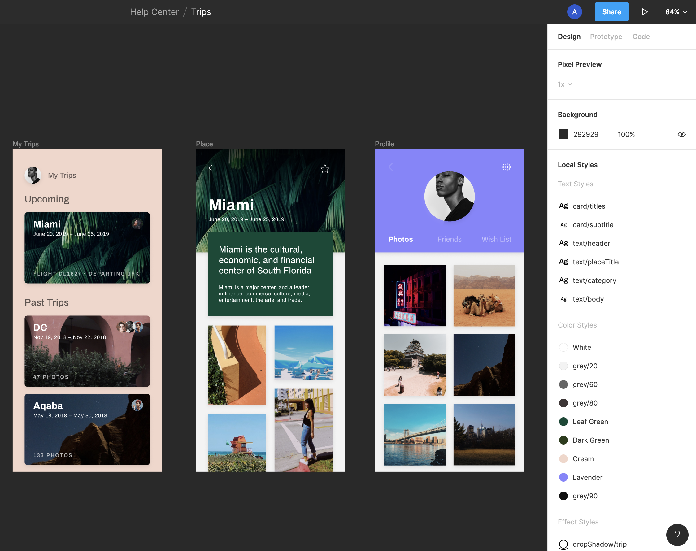
Style picker
View local styles, and styles from other libraries, in the style picker.
Click the styles icon next to the relevant property in the right sidebar. Figma will open the style picker which lets you to view any styles available for that property.
The default order for styles in the style panel is:
Alphabetically by team name
Alphabetically by file name
Individual styles are in the same order as they appear in the right sidebar
You can toggle between list and grid views
Tip! If you are viewing a style from a different file, you can view the style in the original library file. Right-click on the style in the style picker and choose Go to style definition.

To make changes to a style, you will need to edit the style definition in its original file. It's not possible to make changes to the style from another file.
Tip! Access the original style when you view the style in the right sidebar. Right-click the style and select Go to style definition to open the file and edit the style there.
Group styles
To make finding and selecting styles easier, you can organize your styles into groups. This can be done by using the / naming convention and by creating folders.
Group by folder
You can group styles by creating folders from the Design tab of the right sidebar. Folders will be reflected from the Local styles section of the right sidebar and in the style picker when you click for a given property.

To create a folder:
Select one or more styles:
Press Shift and click to select a range styles
Press ⌘ Command / Control and click to select multiple non-adjacent styles.
Right-click the selected style(s) and click Add new folder.
Name the new folder and press Return / Enter to save.
Once created, the styles in the folder will be renamed according to their new heirarchy within the styles list. In the example below, the style Brand / Fuchsia was moved to the Blog folder within the Brand folder, which renamed the style to Brand / Blog / Fuchsia.

To delete a folder and the styles in it, right-click the folder name and select Delete. You can also move all styles to another location to keep the styles and delete the folder.
Group by name
Grouping styles using the slash naming convention involves adding a prefix to your style names so Figma groups them under the same heading.
In the example below, we use the slash naming convention to name and organize our styles:
Blog/colorBrand Style Guide/ColorSecondary/Color

Tip! Styles appear in the styles panel in the order they appear in the Local styles list. To change the order your styles appear, you can update by clicking and dragging them in the Local styles list from the file in which they were created.
Reorder and move styles
When you view the Local styles section in the right sidebar, you can see every style in the current file, grouped by the style type: text, color, effect, and layout grids.
By default, Figma will show styles in the order they were added. To make them easier to find and navigate, you can change the order or folder they appear.
Select one or more styles:
Press and hold Shift and click to select a range styles.
Press and hold ⌘ Command / Control and click to select multiple non-adjacent styles.
Drag the style to change the order or move them to a new folder.
Release the mouse.
Repeat for any other styles.
Moving a style from one folder to another changes the name for the style to reflect its place in the hierarchy. For example, moving the color style Brand Style Guide / blue to the Blog folder will also change the style name to Blog / blue.

Note: You can only adjust the order for local Styles, Figma sorts styles in the style picker differently.
Edit styles
You can edit local styles from the right sidebar and from the style picker.
Right sidebar: hover over the style, then click the adjust icon when it appears.
Style picker: right-click on the style and select Edit style from the options.

View styles and their properties at the top of the Edit style panel.
View or update the Name of the style.
Add or update the style description, which displays when hovering over the style in the style picker.
View or make changes to any properties of the style.
Click on the icon to hide or show the property on any objects the style is applied to
Click the icon to remove the property from the style
Any changes you make to the style here will update any objects in the file that use this style.
Move styles
Unlike components, you can easily move styles between files without losing the connections between them.
You can't move the style from the original library file to another file. instead, you open the file you want to move it to and bring the style into that file.
Open the file you want to move the style into.
If you haven't already, you'll need to enable the library for that style in the file.
Open the style picker from any relevant property.
Right-click on the style you want to move and select Move style definition into this file.
Delete styles
If you would like to remove one or more styles, you can do this directly from the panel.
Select one or more styles:
Press and hold Shift and click to select a range styles.
Press and hold ⌘ Command / Control and click to select multiple non-adjacent styles.
Select Delete style or Delete all from the options.
Figma will remove the style and you will no longer be able to use it. Any objects using that style will keep their properties, but are detached from the style.
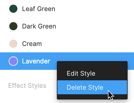
To access your styles in other files and projects, you can publish them to a team library. You can publish styles on their own, or alongside any components.
You can publish styles in a free Starter teams plan, but not components. You will need to be on the Professional or Figma Organization plan to publish components.
Publish styles to a library
Open the Assets panel in the left sidebar and click the Library icon. Or, use the keyboard shortcuts:
Mac: ⌥ Option + 3
Windows: Alt - 3
In the Current file section, click Publish next to the file name.
Add a description of the changes you've made to the file. Figma will include your description in the version history of the file.
Click the icon next to Styles and components section to view a list of all styles and components.
Click Publish to share them as a library.
When you publish changes to a library, Figma will prompt anyone using this library to receive updates. This makes sure any layers that use these styles use the most recent version.
Use styles from a library
When you enable a library for a file, anyone with can edit access to that file can access those styles and components.
View any style from that library in the style picker.
View any styles from that library as a separate palette in the color picker.
Use any styles that are shared with you. Learn how to apply styles →
Edit styles from files you have
can editaccess to.
Last updated