
Ant Design
How to implement ANT Design with React
Following the Ant Design specification, we developed a React UI library antd that contains a set of high quality components and demos for building rich, interactive user interfaces.
✨ Features
🌈 Enterprise-class UI designed for web applications.
📦 A set of high-quality React components out of the box.
🛡 Written in TypeScript with predictable static types.
⚙️ Whole package of design resources and development tools.
🌍 Internationalization support for dozens of languages.
🎨 Powerful theme customization in every detail.
_Source: _Ant Design
I have found ANT Design as the smart option to design our web applications using react. It provides us high quality components which we will be observing while developing the project, in the article later on. If you look around to the documentation provided by ANT and observe its demo of different features, you will find ANT as the better option for you application. So we will be developing a simple react application using following ANT Components. So, let’s start!
ANT Components
There are a lot of beautiful and useful components provided by ANT Design. But I will brief you about some of the basic components that we will be using to built a system with React and ANT in this article.
1. Layout
Layout is basically a wrapper, which consist of Header, Footer, Sider, Content and layout itself. You can modify plenty of things for your layout. Please refer to layout documentation of ANT for more.
 Layout given by ANT
2. Grid
ANT Design is a 24 Grid System.The column Grid system in ANT Design is a value of 1–24 to represent its range spans. You can use Row for rows and Col for columns and you can have 24 columns in a row. You can define a col span lik <Col span={8}> for columns of three equal widths. Learn more here.
 Grid system of ANT
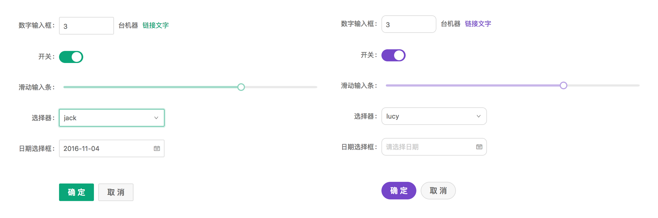
3. Form ANT provides high performance Form Component with data scope management which includes data collection, verification and styles. Learn more about forms here.
4. Input It is a basic widget for getting the user input as a text field. You can use input group, text area, format tooltip input and many more from input. Learn more here.
5. Radio Radio is used to select a single state from multiple options. You can check out different use cases of Radio in Ant from here.
6. Switch If you need to have switching between two states that is on-off state you can use Switch. I was really impressed with the pending state implemented in switch by ANT. For knowing more about it, please refer the document here.
7. Slider Slider component is used for displaying current value or the range of the value. ANT provides the better component for using Slider. Learn more here.
8. Select Select component allows us to select a value or set of values from the options available to us. There are many use cases of the select component defined by ANT. Learn more here.
9. Message We use message as the feedback in response to the operations performed by the user. We use message component for displaying feedback such as success, error, warning, etc. Message is displayed at top-center and will be dismissed automatically. Learn more here.
10. Table ****We can use Table to display a collection of structured data in rows. We can define dataSource and columns to display rows data and columns of the table. Learn more here.
11. Empty
You can use this component when there is nothing to display in your page or your component. I gives good User Experience as well. Learn more about Empty here.
 ANT Empty Component
Create React App
We somewhat touched the basic components we will be using now. So, now let’s create a new react project named **react-ant **with typescript.
Install React Router
We will be using React Router to navigate to different pages of the application. Let’s install them as well.
Install ANT Design
So, finally we install ANT Design to our system with following command.
Also import antd css to the index file, index.tsx.
Create Fake Json Server
We will be using the Fake Json Server for storing and retrieving our data locally. I am using it because our application is small and we will be storing and retrieving the data later on. Install Json Server with following command.
Create a folder named _Server _and create a file named _db.json _to record our data. We create a users collection in db.json which will be holding our users data later on.
Next thing you need to do is to create json-server.json file to the root of the project and it will hold port for our server.
For running the json server you run following command on your terminal. Keep your server running.
Install Axios
Axios is the promise based HTTP client for the browser and node.js. We will be using Axios as well in the application. So, lets’s install it.
Create Layout
Now we start structuring our application with files and folder. First of all we will create two folders inside src and give them the name components and config respectively. We will add route configuration and layout in config folder and different pages and layouts in components folder. For your easiness, I am going to provide the screen shot of files and folder that we are going to create.
 Project Structure of REACT-ANT
Also delete the unnecessary files and logos that we will not be using from the project. So, now we will start our code with** App.tsx**.
Now we define our route for different pages and we define our layout on the ApplicationRoutes.tsx file. I have added all the routes, but you can add those routes after adding those components for not getting error. I have also added the header component and content here and grabbed the sider component form layout. You can separate them as well, if you want cleaner code.
We have imported SideNav from sidebar.tsx, so we add that immediately. For that create a file named sidebar.tsx inside layouts folder in components directory. We define menu and menu items for the sidebar and we use the awesome icons provided by Ant.
Now the missing part is our list page and the form, so we work to complete them.
Create List
We are using table to display list of user data entered by the user. We define columns and data for the table. Moreover, we add a button to navigate to the Form to fill it up and add in the table. We grab the data from our json server using axios. So let’s see how our table is going to look like.
Create Form
We are going to implement a lot of above mentioned components to design our form and obviously, we will be using json server to store the user data. We have applied basic validation for our form as well. Moreover, you can look at the code and get known to various components and their interaction in the system. So let’s create our form.
For using the _Empty component, _we will be adding two more pages _files.tsx _and videos.tsx with no data. You can implement Empty component as given below.
Also the files page looks like.
Demo
For checking our system to perform as expected, please make sure that our Front end and Server is running properly. Run react project with following command if you haven’t done yet.
Also make sure our json server is working perfectly.
Boom! You will get the empty user list with a beautiful layout and bunch of menus on the sidebar. It looks cool!
 Empty Table
Navigate to Add user and you will get this user form. It looks more cool!
 User Form
Now fill up all the fields and click save or click back to navigate to the list page. You will see the loading on save button until the form gets submitted. Lets see how it looks like.
 New user added with a success message
This is how you can add new users and let’s see our empty components by navigating to videos from left menu.
 Video page with no data
We implemented some of the basic components of Ant Design with React. There are a lot more components and designs provided by Ant. It is so easy to use and much efficient for the user experience. You can add more attributes to the application we developed just now, using other Ant Components. You can refer to my github link of the project for any confusions or you can write it down on the comments below as well. I will be covering more parts of ANT Design in upcoming articles too. Stay Tuned!
Github: https://github.com/SudeepTimalsina/ReactAnt
Ant Design of React
Following the Ant Design specification, we developed a React UI library antd that contains a set of high quality components and demos for building rich, interactive user interfaces. +
+
✨ Features#
🌈 Enterprise-class UI designed for web applications.
📦 A set of high-quality React components out of the box.
🛡 Written in TypeScript with predictable static types.
⚙️ Whole package of design resources and development tools.
🌍 Internationalization support for dozens of languages.
🎨 Powerful theme customization in every detail.
Environment Support#
Modern browsers and Internet Explorer 11 (with polyfills)
Server-side Rendering
 IE / Edge
 Firefox
 Chrome
 Safari
 Opera
Opera
 Electron
IE11, Edge
last 2 versions
last 2 versions
last 2 versions
last 2 versions
last 2 versions
Polyfills are needed for IE browsers. We recommend @babel/preset-env for it. You can set targets config if you are using umi.
We drop support of IE8 after
antd@2.0, We drop support of React 15 and IE9/10 afterantd@4.0,
Version#
Stable:

You can subscribe to this feed for new version notifications: https://github.com/ant-design/ant-design/releases.atom
Installation#
Using npm or yarn#
We recommend using npm or yarn to install, it not only makes development easier, but also allow you to take advantage of the rich ecosystem of Javascript packages and tooling.
If you are in a bad network environment, you can try other registries and tools like cnpm.
Import in Browser#
Add script and link tags in your browser and use the global variable antd.
We provide antd.js antd.css and antd.min.js antd.min.css under antd/dist in antd's npm package. You can also download these files directly from  ,
, or unpkg.
We strongly discourage loading the entire files this will add bloat to your application and make it more difficult to receive bugfixes and updates. Antd is intended to be used in conjunction with a build tool, such as webpack, which will make it easy to import only the parts of antd that you are using.
Note: you should import react/react-dom/moment before using antd.js.
Usage#
And import stylesheets manually:
Use modularized antd#
antd supports ES modules tree shaking by default for JS part.
TypeScript#
antd provides a built-in ts definition, don't install @types/antd.
Links#
CodeSandbox Template for bug reports
Getting Started
Ant Design React is dedicated to providing a good development experience for programmers. Before starting, it is recommended to learn React and ES2015 first, and correctly install and configure Node.js v8 or above.
The official guide also assumes that you have intermediate knowledge about HTML, CSS, and JavaScript, and React. If you are just starting to learn front-end or React, it may not be the best idea to use the UI framework as your first step.
Finally, if you are working in a local development environment, please refer to Install and Initialization section of "Use in create-react-app".
Your First Example#
Here is a simple online codesandbox demo of an Ant Design component to show the usage of Ant Design React.
Follow the steps below to play around with Ant Design yourself:
1. Create a codesandbox#
Visit http://u.ant.design/codesandbox-repro to create a codesandbox -- don't forget to press the save button as well to create a new instance.
2. Use and modify an antd component#
Replace the contents of index.js with the following code. As you can see, there is no difference between antd's components and typical React components.
If you have already set things up by following the Install and Initialization section of "Use in create-react-app", replace the content of /src/index.js as follows:
3. Explore more components#
You can view the list of components in the side menu of the Components page, such as the Alert component. Plenty of examples are also provided in the component pages and API documentation as well.
Click the "Open in Editor" icon in the first example to open an editor with source code to use out-of-the-box. Now you can import the Alert component into the codesandbox:
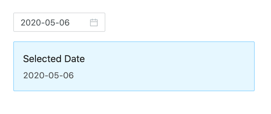
Now add the following jsx inside the render function.
Select a date, and you can see the effect in the preview area on the right:
OK! Now that you know the basics of using antd components, you are welcome to explore more components in the codesandbox. When reporting a bug with ant design, we also strongly recommend using codesandbox to provide a reproducible demo as well.
4. Next Steps#
During actual real-world project development, you will most likely need a development workflow consisting of compile/build/deploy/lint/debug/ deployment. You can read the following documents on the subject or use the following scaffolds and examples provided below:
More scaffolds at Scaffold Market
Test with Jest#
If you use create-react-app follow the instructions here instead.
Jest does not support esm modules, and Ant Design uses them. In order to test your Ant Design application with Jest you have to add the following to your Jest config :
Import on Demand#
antd supports tree shaking of ES modules, so using import { Button } from 'antd'; would drop js code you didn't use.
If you see logs like in the screenshot below, you might still be using webpack@1.x or have a wrong webpack config which can't support tree shaking.

Customize your Workflow#
If you want to customize your workflow, we recommend using webpack to build and debug code. You can try out plenty of boilerplates available in the React ecosystem.
There are also some scaffolds which have already been integrated into antd, so you can try and start with one of these and even contribute.
Real project with umi
In real project development, you may need data flow solutions such as Redux or MobX. Ant Design React is a UI library that can be used with data flow solutions and application frameworks in any React ecosystem. Based on the business scenario, we launched a pluggable enterprise-level application framework umi, which is recommended for use in the project.
And umi is a routing-based framework that supports next.js-like conventional routing and various advanced routing functions, such as routing-level on-demand loading. With a complete plugin system that covers every life cycle from source code to build product, umi is able to support various functional extensions and business needs; meanwhile Umi UI is provided to enhance the development experience and development efficiency through Visual Aided Programming (VAP).
You may also be interested in Ant Design Pro, an Out-of-box UI solution for enterprise applications based on umi, dva and ant design.
This article will guide you to create a simple application from zero using Umi, dva and antd.
Install Umi#
It is recommended to use yarn to create an application and execute the following command.
If you use npm, you can execute
npx @umijs/create-umi-appwith the same effect.And if you want to use a fixed version of antd, you can install additional antd dependency in your project, and the antd dependencies declared in package.json will be used first.
Create Routes#
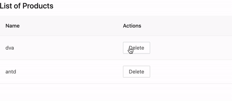
We need to write an application displaying the list of products. The first step is to create a route.
If you don't have npx, you need to install it first to execute the commands under node_modules.
Then create a /products route,
In .umirc.ts configured in routing, if there is need to internationalization, can configure locale enable antd internationalization:
run yarn start then open http://localhost:8000/products in your browser and you should see the corresponding page.
Write UI Components#
As your application grows and you notice you are sharing UI elements between multiple pages (or using them multiple times on the same page), in umi it's called reusable components.
Let's create a ProductList component that we can use in multiple places to show a list of products.
Create src/components/ProductList.tsx by typing:
Simple data management solution#
@umijs/plugin-model is a simple data flow scheme based on the hooks paradigm, which can replace dva to perform global data flow in the middle stage under certain circumstances. We agree that the files in the src/models directory are the model files defined by the project. Each file needs to export a function by default, the function defines a hook, and files that do not meet the specifications will be filtered out.
The file name corresponds to the name of the final model, and you can consume the data in the model through the API provided by the plug-in.
Let's take a simple table as an example. First you need to create a new file src/models/useProductList.ts.
Edit src/pages/products.tsx and replace with the following:
Refresh your browser, you should see the following result:
ProLayout#
A standard mid-to-back page generally requires a layout. This layout is often highly similar. ProLayout encapsulates commonly used menus, breadcrumbs, page headers and other functions, provides an independent framework and works out of the box Advanced layout components.
And supports three modes of side, mix, and top, and it also has built-in menu selection, the menu generates breadcrumbs, and automatically sets the logic of the page title. Can help you start a project quickly.
The method of use is also extremely simple, requiring only a few simple settings.
Click here Quick Start.
ProTable#
Many data in an admin page does not need to be shared across pages, and models are sometimes not needed.
ProTable provides preset logic to handle loading, pagination and search forms, which can greatly reduce the amount of code, click here Quick Start.
Build#
Now that we've written our application and verified that it works in development, it's time to get it ready for deployment to our users. To do so, execute the following command:
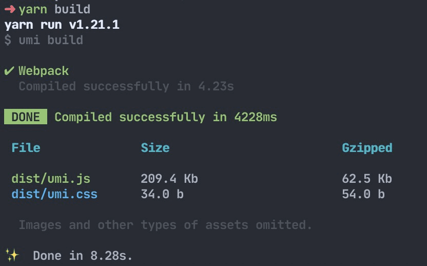
The build command packages up all of the assets that make up your application —— JavaScript, templates, CSS, web fonts, images, and more. Then you can find these files in the dist/ directory.
What's Next#
We have completed a simple application, but you may still have lots of questions, such as:
How to handle onError globally and locally?
How to handle routes?
How to mock data?
How to deploy?
ant so on...
You can:
Visit umi official website and dva official website
Know the umi routes
Scaffolding out of the box Ant Design Pro
Advanced Layout ProLayout
Advanced Table ProTable
Use in create-react-app
create-react-app is one of the best React application development tools. We are going to use antd within it and modify the webpack config for some customized needs.
Install and Initialization#
Before all start, you may need install yarn.
The tool will create and initialize environment and dependencies automatically, please try config your proxy setting or use another npm registry if any network errors happen during it.
Then we go inside antd-demo and start it.
Open the browser at http://localhost:3000/. It renders a header saying "Welcome to React" on the page.
Import antd#
Below is the default directory structure.
Now we install antd from yarn or npm.
Modify src/App.js, import Button component from antd.
Add antd/dist/antd.css at the top of src/App.css.
Ok, you should now see a blue primary button displayed on the page. Next you can choose any components of antd to develop your application. Visit other workflows of create-react-app at its User Guide.
We are successfully running antd components now, go build your own application!
Test with Jest#
create-react-app comes with jest built in. Jest does not support esm modules, and Ant Design uses them. In order to test your Ant Design application with Jest you have to add the following to your package.json :
Advanced Guides#
In the real world, we usually have to modify default webpack config for custom needs such as themes. We can achieve that by using craco which is one of create-react-app's custom config solutions.
Install craco and modify the scripts field in package.json.
Then create a craco.config.js at root directory of your project for further overriding.
Customize Theme#
According to the Customize Theme documentation, we need to modify less variables via loader like less-loader. We can use craco-less to achieve that,
First we should modify src/App.css to src/App.less, then import less file instead.
Then install craco-less and modify craco.config.js like below.
By adding modifyVars option of less-loader here, we should see a green button rendered on the page after rebooting the server now.
We provide built-in dark theme and compact theme in antd, you can reference to Use dark or compact theme.
You could also try react-app-rewired and customize-cra to customize create-react-app webpack config like craco did.
eject#
You can also eject your application using yarn run eject for a custom setup of create-react-app, although you should dig into it by yourself.
Summary#
Finally, we used antd with create-react-app successfully, the source code of this guide was pushed to create-react-app-antd which you could clone and use it directly.
Next part, We will introduce how to use antd in TypeScript and Umi, let's keep moving!
Customize Theme
Ant Design allows you to customize our design tokens to satisfy UI diversity from business or brand requirements, including primary color, border radius, border color, etc.
Ant Design Less variables#
We are using Less as the development language for styling. A set of less variables are defined for each design aspect that can be customized to your needs.
There are some major variables below, all less variables could be found in Default Variables.
Please report an issue if the existing list of variables is not enough for you.
How to do it#
We will use modifyVars provided by less.js to override the default values of the variables, You can use this example as a live playground. We now introduce some popular way to do it depends on different workflow.
Customize in webpack#
We take a typical webpack.config.js file as example to customize its less-loader options.
Note:
Don't exclude
node_modules/antdwhen using less-loader.lessOptionsusage is supported at less-loader@6.0.0.
Customize in Umi#
You can easily use theme field in .umirc.ts or config/config.ts file of your project root directory if you are using Umi, which could be an object or a javascript file path.
Or just a javascript file path:
Customize in create-react-app#
Follow Use in create-react-app.
Customize in less file#
Another approach to customize theme is creating a less file within variables to override antd.less.
Note: This way will load the styles of all components, regardless of your demand, which cause style option of babel-plugin-import not working.
Dynamic theme#
Runtime update theme color please ref this doc.
How to avoid modifying global styles?#
Currently ant-design is designed as a whole experience and modify global styles (eg body etc). If you need to integrate ant-design as a part of an existing website, it's likely you want to prevent ant-design to override global styles.
While there's no canonical way to do it, you can take one of the following paths :
Configure webpack to load an alternate less file and scope global styles#
It's possible to configure webpack to load an alternate less file:
Where the src/myStylesReplacement.less file loads the same files as the index.less file, but loads them within the scope of a top-level selector : the result is that all of the "global" styles are being applied with the #antd scope.
Use a postcss processor to scope all styles#
See an example of usage with gulp and postcss-prefixwrap.
Not working?#
You must import styles as less format. A common mistake would be importing multiple copied of styles that some of them are css format to override the less styles.
If you import styles by specifying the
styleoption of babel-plugin-import, change it from'css'totrue, which will import thelessversion of antd.If you import styles from
'antd/dist/antd.css', change it toantd/dist/antd.less.
Official Themes 🌈#
We have some official themes, try them out and give us some feedback!
🌑 Dark Theme (supported in 4.0.0+)
📦 Compact Theme (supported in 4.1.0+)
Use dark or compact theme#
Method 1: using Umi 3
If you're using Umi 3:
Method 2: Import antd/dist/antd.dark.less or antd/dist/antd.compact.less in the style file:
If the project does not use Less, you can import antd.dark.css or antd/dist/antd.compact.css in the CSS file:
Note that you don't need to import
antd/dist/antd.lessorantd/dist/antd.cssanymore, please remove it, and remove babel-plugin-importstyleconfig too. You can't enable two or more theme at the same time by this method.
Method 3: using less-loader in webpack.config.js to introduce as needed:
Related Articles#
Replace Moment.js
You might want to replace Moment.js with another date library (**Ant design currently supports dayjs and **date-fns) to reduce bundle size. We provide two ways to customize:
Custom component#
The first way is to use generatePicker (or generateCalendar) to help create Picker components.
First, we initialize an antd demo with create-react-app. You can refer to Use in TypeScript, or you can start directly here init antd
DatePicker.tsx#
Create src/components/DatePicker.tsx.
For example:
TimePicker.tsx#
Create src/components/TimePicker.tsx.
For example:
Calendar.tsx#
Create src/components/Calendar.tsx.
For example:
Export Custom component#
Create src/components/index.tsx.
For example:
Use Custom component#
Modify src/App.tsx,import dayjs and custom component.
If the above steps do not work correctly, you can refer to antd4-generate-picker/antd-ts.
If you need JavaScript code, you can refer to antd4-generate-picker/antd-demo.
If you use umi, you can reference antd4-use-dayjs-replace-moment.
antd-dayjs-webpack-plugin#
We also provide another implementation, which we provide with antd-dayjs-webpack-plugin, replacing momentjs with Day.js directly without changing a line of existing code. More info can be found at antd-dayjs-webpack-plugin.
Use date-fns#
date-fns currently supports custom component methods similar to dayjs. The difference is that the parameter types used are different. Support is provided in antd 4.5.0 and above.
For Example:
DatePicker.tsx#
Create src/components/DatePicker.tsx.
Code as follows:
FAQ:
Design Critiques
What are Design Critiques?
In Design Critiques, UX Engineers meet with the Design Manager at least once per sprint to present their design progress and planning for group discussion.
Our Goals
Go Deeper on Core Design Concepts
These sessions are an opportunity to empower you with a more nuanced understanding of UI/UX that you can carry into interviews.
Reinforce the Curriculum
By walking through active projects together throughout development, we'll naturally encounter clear, real-world case studies that provide examples of best practices.
Level Up Your Product's Quality
Design Critiques are a great opportunity to practice giving and receiving feedback in the context of team development.
Agenda
Pick Volunteers
We'll pick on a few UX Engineers to walk us through what they're working on!
Design Lead Presentations
Introduction
Each UX Engineer on the presenting team should give a very brief introduction of themselves and their design experience, then they should introduce their product to provide context.
Product Demo
With someone sharing their screen, the UX Engineer should collaboratively walk through either the live deployed version or a relevant local version of the product. The Design Manager facilitates a group discussion identifying aspects of the product demonstrating good UI/UX principles as well as aspects needing improvement.
Planning Artifact Presentation
With someone sharing their screen, the Design Leads should collaboratively walk through any design planning artifacts they've got (e.g. user flows, wireframes). The Design Manager facilitates a group discussion about the artifacts, the general design direction, and UI/UX concerns relevant to their product.
Now read on to see how Product Reviews work in Labs.
Last updated